Colored Pencil Artwork by Andrew Purdy on Stonehenge
“Macelleria” 16” x 24” colored pencil on Stonehenge paper
The image above is a butcher in Florence, Italy tending to customers inside the Grand Central Market near El Domo. It took Andrew 6-7 months to complete.
“Urban Patina” 24” x 16” colored pencils on Stonehenge paper
This is a building in San Francisco, CA up the street from the TransAmerica pyramid building (visible in the background). The unique green exterior of the Sentinel Building is the home of Francis Ford Coppola’s "American Zoetrope Studios.” At street level is the Zoetrope Cafe. "I was drawn (no pun intended) to the weathered and worn look of this structure in direct contrast to its newer architectural neighbors. " -Andrew Purdy
Andrew took this photo atop a refurbished firetruck-turned tour vehicle, which afforded him an elevated vantage point of this spectacular building.
The drawing took 12 months to complete.
The above image is the piece Andrew is currently working on. It is 12”x 18” and is of a twisted cypress tree at La Jolla Cove near San Diego, CA. The many shapes within the contorted branches of the tree are what originally attracted Andrew to this scene.
"As you may conclude from these pieces that detail is the goal of my subject matter and Stonehenge has been the only substrate that cooperates completely with my application of fine details and heavy burnishing. I add the use of the Icarus Board during my process to aid in the blending steps.
Although I love Stonehenge paper, not much of its surface is left to be seen when I am done. And if the surface is to remain visible, it is as highlights."
Check out more of Andrew Purdy's artwork here: AndrewPurdyArt.com
3 Sheets Editions By Serio Press & Ryan McIntosh On Coventry Rag
Three Sheets Editions Inaugural Release
By Ryan McIntosh
"This Too Shall Soon Pass"
This Too Shall Soon Pass is the inaugural print release for our new publishing program 3 Sheets Editions. With each project, we aim to invent new ideas by exploiting aspects unique to the printing process, as well as experimenting with new ways of creating prints. By having our entire print studio at their disposal to execute their projects, artists have the freedom to express their creativity.
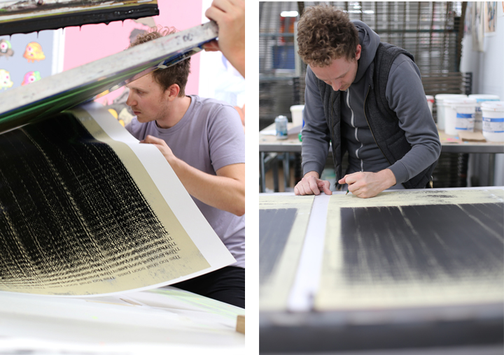
McIntosh used some distinctive techniques for This Too Shall Soon Pass. By sprinkling powdered graphite directly on to the screen during printing, the graphite was integrated into the ink itself, creating in each print a unique texture and color where the graphite landed. He burnished each sheet onto the bottom of the screen, creating even more texture where the ink touches the paper.
The final result lends itself to the concept of his original text paintings, created by force-feeding a single sheet of paper dozens of times through a computer printer until the text gets printed so heavily that it becomes just a large black void. The added texture further obscures the text, creating a rough landscape for the words to reside. The text itself is derived from an old medieval proverb, basically meaning that both the best and worst of times will soon pass.
Ryan McIntosh is a Los Angeles based contemporary artist. He was recently spotlight featured in the January 2017 issue of American Art Collector magazine. He has had recent solo exhibition in 2015-16 at Stone Malone Gallery (LA), Gold Haus Gallery (LA) and included in group exhibitions at Planthouse Gallery (NYC) and Season Gallery (Seattle). He received his MFA from Rhode Island School of Design and a BFA from University of Arizona.
This Too Shall Soon Pass
24" x 36"
2 Color Serigraph w/ Graphite Integration
Coventry Rag 320 gsm
Edition: 32
The Most In-depth Review on Stonehenge Aqua you will ever see.
A Revolutionary Design. A New Look for Legion's New Artist Pads.
Art is about connections. Between structure and the whole, ideas and the viewer, the medium and the maker. No matter what the piece of art, all of its elements must work together. Everything must be connected.
At Legion, our art is paper. And now we are proud to announce our new redesign, a bold disruptive look that takes three of our papers, new and old, and connects them so you know that you are getting the quality, consistency and substance you demand for your art.

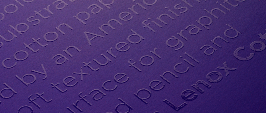
It was time to break tradition. To create something the market had never touched upon. The design-savvy covers strip away the clutter of conventional pad covers, using a varnish text against a solid background color to capture the attention of the artist without being intrusive. Designed for the artist’s eye, the clean, bold type tells you the paper, a beautiful gloss overlay paints an ephemeral verbal picture of exactly what that paper can do.
Orange on purple? That’s Stonehenge Light. Red on orange? That’s Yupo Medium. And so on and so forth. The papers haven’t changed, we’ve just made it easier for you to find them on the shelf and given them a look you'd be proud to leave out in your studio or on your coffee table.
Together, all these covers will connect all of our brands under an umbrella that any novice can recognize and any artist can appreciate. And connections are what it’s all about.
We are Legion. We are paper.


