Somerset

Printmaker, Kathy Anderson, Uses Somerset for Linocuts and Etchings

Kathryn Anderson is a printmaking artist living and creating in Washington State in the US. She derives much inspiration from the beautiful Pacific Northwest region. Her work reflects her love for the natural world and her connections to the animals who inhabit it.Birds, forests, myth, and magic are often recurring themes in her work.

How did you come across Somerset?

{KA} There is a wonderful community of artists on Instagram! I have come to know the work of so many talented printmakers all over the world. I have found that printmakers are very kind and willing to share their knowledge about how they create their beautiful work and are quite patient about responding to my questions.

Among the artists whose work I truly admire, and I’ve often found that Somerset paper was a recurring theme of their successful work. Once I tried Somerset papers with my linocut prints and etchings I was hooked!

What qualities does Somerset have that works with your techniques?

{KA} Somerset papers are consistently perfect. The quality is exceptional, and the range of colors and textures allows me to use Somerset paper with both linocut prints and etchings. I can confidently know that my editions will be archival, consistent, and clean.

Somerset Satin is sized perfectly for linocut, and the Somerset velvet and textured papers can be dampened to work beautifully for etchings while yielding sharp fine details.

What is your favorite type of Somerset and why?

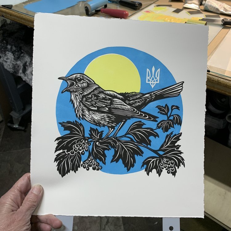
{KA} I use Somerset Satin paper exclusively for creating linocut prints. I’ve tried lots of other papers and Somerset Satin is far and away my favorite. The delicious smoothness of the surface is the perfect receptor for the ink and yields wonderfully sharp, clean prints. I love the weight of the paper too; it is strong and stable.

I teach linocut classes and I provide Somerset Satin paper for my students. There are a lot of variables that affect the print quality, but by starting them off with the best paper, their first experience with linocut printing is a positive one with great outcomes!

What is your process like?

Linocut

ETCHING

Watch Kathy’s Aquatint Process.


Choosing a Silkscreen Paper

Choosing a paper for screenprinting should be easy, right? If you can screenprint on a t-shirt or a piece of wood, how hard can choosing a paper be? If you're making a quick, inexpensive poster - choosing a paper can be simple. But when it comes to making a high-quality print - something to be sold, something that will last, something to hang on a wall or in frame, something to show in a gallery - it's a little more involved.

There's always personal preference - what look are you trying to achieve? This will help determine the color, texture and possibly weight. But beyond that there are other aspects to consider as paper quality plays a large role in the value and quality of your print. More "commercial", poster-type papers can react in unexpected ways, causing printing issues, as well as not being able to stand up to sunlight and the test of time. 

We're fortunate to have worked with hundreds of printers around the world going back fifty years. Our papers have been used for screenprints by a wide range of artists & printers - from small poster shops to some of the 20th and 21st century icons. Over the years, we've continued to improve our papers to meet the demands of our customers.

For this article, we asked some accomplished screenprinters to share some information that could help guide your paper decision-making. How do they collaborate with artists to choose the right paper? Which paper fit their needs and why? Although there are similarities among many of the printers, each printer has their own unique methods and favorite substrates. 

In general, here are some key things their responses had in common:

1.      Ability to hold many layers of color without warping. 

Lightly or non-sized papers will allow the ink to sink into the paper. A surface-sized paper will keep the ink on the surface and allow layer upon layer to be printed.

2.      Dimensional stability 

Look for a paper that will not greatly stretch or contract during the printing process (a paper with good dimensional stability). This is crucial for holding registration for printing multiple overlays of colors. 

3.      Texture

A smoother paper will produce a sharper image capturing more detail especially for photographic silkscreen. When using a more heavily textured sheet the finish/surface will become a more pronounced part of the final image.  

4.      Weight

Heavier papers are typically better for stability and to keep the paper from buckling. The general rule of thumb is the larger the sheet size the heavier the weight; it will make handling the paper a lot easier if it has some heft.

Master Printer & Owner of Serio Press, Tony Clough, working on a Cleon Peterson print using Coventry Rag. 

Master Printer & Owner of Serio Press, Tony Clough, working on a Cleon Peterson print using Coventry Rag. 

Trina Faundeen, Serio Press

What is your go to paper? Why?

We like the Coventry because it comes in different sizes and can accommodate larger print sizes at a great price and quality. Most of the time, it comes down to pricing and size for the artists. Since we do fine art serigraph printing using water based inks, we prefer 100% cotton paper, since that is what is used traditionally for fine art printing. Some of the commercial papers on the market, even though they are made for silkscreen printing, react in unexpected ways and can cause problems such as mis-registrations, waviness of the paper, and can sometime make the ink colors look dull. The cotton fibers are more durable, and receive the ink well.

What are your alternatives?

Stonehenge 22x30 is a good alternative for smaller prints. Arches and Rives are more expensive, but have a very soft texture that is beautiful. If the artist chooses something other than Coventry, it is usually because they are looking for a different texture or shade or even weight. We’ve used Arturo Cover for a light cold press watercolor paper texture, and Arches Rough for an extreme texture (although it was difficult to get the printing consistent). We’ve also used Yupo to recreate art that was originally painted on matte mylar.

When it comes to color, Sirio Ultra Black is our new go-to black paper. The Arches Cover black, although not as black are Sirio Ultra Black, is also great as a more traditional choice for black paper, at a higher price point. Colorplan also has some bright white papers that are useful, as most of the cotton papers are a "natural" white. The Somerset is the only rag paper that we can get that comes in that Radiant White so we've used that a few times. We would also use the Colorplan for any colors where the artist wants the paper to be colored beyond the more subtle hues that are available from the rag paper makers.

What current trends are you noticing?

Most of our clients prefer using the 100% cotton paper, because they want to differentiate their fine art prints from the more casual poster prints done on the commercial papers. However, there are an increasing amount of artists who want something more unique. They are interested in different textures and finishes - such as the Mirri Holographic & Sparkle. They want to know that the paper is high quality and archival though, so it's nice to know that we can trust that the paper from Legion is reliable for fine art prints. For instance, we've printed a few editions using the Sirio Ultra Black, because even though it's cellulose, it's made using virgin fibers, which makes the paper more durable. People like that they have reliable alternatives for the papers that are not 100% cotton.

Kozyndan Bunny Skull on Colorplan Ebony

Kozyndan Bunny Skull on Colorplan Ebony

Kozyndan Bunny Skull on Mirri Sparkle Silver

Kozyndan Bunny Skull on Mirri Sparkle Silver

What are the most colors you’ve laid down on a sheet?

Tony, the Master Printer, printed a 39 color print on Coventry Rag 320 gsm by Carlos Almaraz "Night Theatre" 47 5/8" x 32 3/8" when he was printing at Modern Multiples. At Serio Press, the most he has done was by an artist named Tristan Eaton, published by Uncommon Editions, called "Medusa" with 24 colors, also on Coventry Rag 320 gsm.

Do the artists choose papers according to their own style? Do they look to the printer to choose the paper?

We guide the process pretty heavily, since many of the artists do not know the available options. Our go-to paper is Coventry Rag, due to its quality, price point, and size choices. We can print up to 38x58 right now, so the 44x60 is great for that. When they are looking for something different, I work with them to figure out what is within their budget that will fit with their artwork. We look at the swatch books together if they are local to our studio. 


Luther Davis, BRT Printshop

Protest Posters, Glenn Howowitz The Stack Shack 2007, Kate Shepard on Coventry 335gsm

Protest Posters, Glenn Howowitz The Stack Shack 2007, Kate Shepard on Coventry 335gsm

What is your go to paper? Why?

Coventry Rag Smooth.  It’s a durable, stiff and smooth paper that is easy to print on because it doesn’t warp when laying down a lot of color. Also is economically priced.

With lower quality papers one runs the risk of what we call "potato chipping" where the forces of expansion and contraction of multiple coats of ink warp the paper.  Because we are printing with water-based inks and often trying to lay down large fields of color, paper stability is key to a positive end result.

What are your alternatives?

I prefer papers with a smooth finish like Coventry Rag Smooth or Somerset Satin. The smoothness allows me to apply less pressure. After that, Somerset Velvet, with a bit more tooth, but never a paper with a heavy texture.

We use Rising Museum Board when we need to go big. The fact that you can go all the way to 60"x104" really helps when an edition has a lot of colors; sometimes exact registration of paper from a roll is challenging.

We also used Mirricard Gold recently because it is more gold than any of our inks are available in. It really makes a project pop.

What current trends are you noticing?

Artists like the brightness of the Somerset Radiant White and that it’s a 100% cotton and acid-free paper. Papers that will stand the test of time and that are 100% cotton are important. They also look for something that feels substantial, or has a heavier weight. I find artists printing their work by silkscreen want to stand apart from the digital trend. There’s nothing like Somerset Satin for quality.

What are the most colors you’ve laid down on a sheet?

220  colors is our record. It was on Rising Museum Board 4 ply 40”x60”.

Do the artists choose papers according to their own style? What do the artists look for in a paper as opposed to the printer?

We do try to match the aesthetics of the artists, but on a paper like Coventry, we could most likely match the look of their work or what they’re trying to achieve creatively.

From the grand catalog of papers, we default to smooth, strong, heavy papers that hold color.


Karl Larocca, Kayrock Screenprinting

What is your go to paper? Why?

Coventry Rag Smooth 290gsm. We like it because of it’s dimensional stability, heavy weight and affordability. We actually print on the opposite side on Coventry because we like the smoothness. We use Coventry mostly because colors lay on the paper well. It has everything we are looking for in a paper including great pricing.

Most commercial papers aren’t as good for tearing a deckled edge as 100% cotton papers (cotton papers are softer and easier to tear).

Ideologie und Utopie des Design, Björn Meyer-Ebrecht, on Rising Museum Board

Ideologie und Utopie des Design, Björn Meyer-Ebrecht, on Rising Museum Board

What are your alternatives?

If we are using a halftone, we use Stonehenge Paper since the Coventry is better for continuous tones.  

We also use Rising for collages or if we need the thickness of a board.

What current trends are you noticing?

We’ve noticed a trend in grey papers.  When artists request grey, we’ll use Colorplan, they have a nice range of colors for this.

What are the most colors you’ve laid down on a sheet?

About 30 colors is the most we’ve put down. We use waterbased inks so we don’t lay down too many colors.

Do the artists choose papers according to their own style? What do the artists look for in a paper as opposed to the printer?

We usually show the artists the papers that are available. Sometimes they specify if they want a deckled edge or a certain tone; or for fine art prints, we’ll tend to show the artist 100% cotton papers.


Gary LichtensteinGary Lichtenstein Editions

"Love Rocks," Cey Adams, 2017 on Coventry Rag. An edition of 100 produced exclusively for God's Love We Deliver, NYC

"Love Rocks," Cey Adams, 2017 on Coventry Rag. An edition of 100 produced exclusively for God's Love We Deliver, NYC

What is your go to paper? Why?

Coventry Rag 290gsm or 320gsm. It’s a beautiful and stable sheet that doesn’t dent easily and it works extremely well with silkscreen.

What are your alternatives?

Rising Museum Board is a great alternative. It’s a really strong board that doesn’t dent easily and holds each layer of color nicely.

Lately I’ve also been using a lot of Stonehenge Aqua Hotpress and Coldpress watercolor paper for Silkscreen. 

A few years ago we switched from oil to water-based ink which affects the papers we use. We now tend to use heavier papers such as Rising Museum Board and Coventry Rag 320gsm to ensure the paper doesn’t buckle.

Because I use so many different papers from Legion, I can sometimes test out a few different papers for one project to find a favorite and more importantly see which papers work best for a particular print.

What current trends are you noticing?

We’ve noticed many artists creating collage, which could result in laying down more layers, so we will use Coventry 320gsm or Rising Museum Board for a sturdier sheet.

Artists are also interested in incorporating their own hand work, such as painting over or around the print. This is when Stonehenge Aqua is a good choice since it’s mostly used for watercolor.

What are the most colors you’ve laid down on a sheet?

I’ve put down 120 colors in the 80’s on Lenox Paper, but our average is about 25-30 per screenprint.

Do the artists choose papers according to their own style? Do they look to the printer to choose the paper? What’s the process like?

We choose the paper based on the style of the artists’ work. There are a lot of ideas that come into play when selecting the paper. I first see what papers are readily available in the studio. We usually have a good amount of options on hand. I’ll see how much handling and layers of color are included to determine the weight of the sheet. It also depends on how large the print will be. If the artist is looking to print a larger piece, I’ll use Rising Museum Board 40”x60”. Other factors have to be considered though: Rising Museum Board doesn’t roll, so a finished print will be harder and more expensive to ship. 


sawtooth.JPG

Alex Carlisle, Sawtooth Editions

What is your go to paper? Why?

Coventry Rag 320gsm for water based inks is our go to. We look for a paper with good sizing so it doesn’t grow or shrink, especially when laying down multiple colors. We noticed when we do our first hit of color, some papers tend to slightly expand; the internal and external sizing of Coventry helps us to avoid that. Sometimes we seal the paper to ensure exact registration.

What are your alternatives?

When we need a more stable and stiff sheet for heavier enamel lay downs, we then go to Rising Museum Board 2 ply and 4 ply.

What current trends are you noticing?

We’ve noticed artists want their prints larger and larger. Our next edition will be using Rising Museum Board 4ply 60”x104”. But when it comes to paper trends, I tend to just stick with Coventry because it still gives me the weight, size and quality I’m looking for.

What are the most colors you’ve laid down on a sheet?

I’ve laid down 55 colors once on Coventry Rag. After that the most I’ve done is 30 colors for an artist, Tristan Eaton.

Do the artists choose papers according to their own style? Do they look to the printer to choose the paper? What’s the process like?

I always suggest Coventry Rag because I know it works well, unless the artist specifies something else. The artist usually goes with what we recommend. It has the right price point and quality.

Sawtooth Editions

Sawtooth Editions


Art on Paper in Miami

Just a few of our favorites at Art on Paper in Miami on our papers. With so many amazing pieces to choose from, look out for more favorites to come!
New Figures, 2015 was created by Richard Prince using multiple color silkscreen with collage on Coventry Rag and Lanaquarelle 48x35 inches. The incredible artwork was shown at Art on Paper in Miami by Two Palms

Rhona Hoffman Gallery shows off Coventry Rag Vellum by Nathaniel Mary Quinn using black charcoal, sot pastel and oil pastel.

Durham Press Portfolio of 5 Screenprints by James Nares on Somerset Satin White 300gsm.

Last Day to Collect your Alphabet Cards!

X is for Xylophonist, Anemone Letterpress, Colorplan Factory Yellow 350gsm


Z is for ZAP!, Lady Pilot Letterpress, Sorbet Duplex Kiwi/Blue Ice


P is for Pinecone, Albertine Press, Somerset Satin Radiant White 500gsm


M is for Metal Type, Starshaped Press, Stonehenge Fawn 250gsm,


V is for Very Sweet Vintage Vixens, Sugarcube Press, Lanaquarelle CP 300lb


F is for Fly, Flywheel Press, WILD 850gsm


Do you know your ABC's for the 2014 Stationery Show?

Wondering what the next Stationery Show promotional project will be? Hope you know your ABC's for our FOURTH annual Stationery Show project!

Organized by Flywheel Press and sponsored by Legion, we are all super excited to watch this year’s project grow to become our best yet! As 27 different fine art papers were sent out, 26 Alphabet cards are beginning to fly in from amazing designers (who are allNSS exhibitors).

As done in the past, attendees of NSS will participate in a scavenger hunt to collect all 26 letters. Once you have A through Z, stop by Legion's booth (3330) to stack your cards in packaging created by Lady Pilot Letterpress.  

The National Stationery Show is just around the corner (May 18th) and we are ready to blow you away with our ABC’s.

To the left is a sneak preview to some of the many cards we are recieving for the 2014 Stationery Show by Albertine Press, A Favorite Design, The Nic Studio and Sugarcube Press. 

Stayed posted to our FacebookTwitter and Blog for more info on our Alphabet cards! Designer list with their booth numbers will be coming soon!