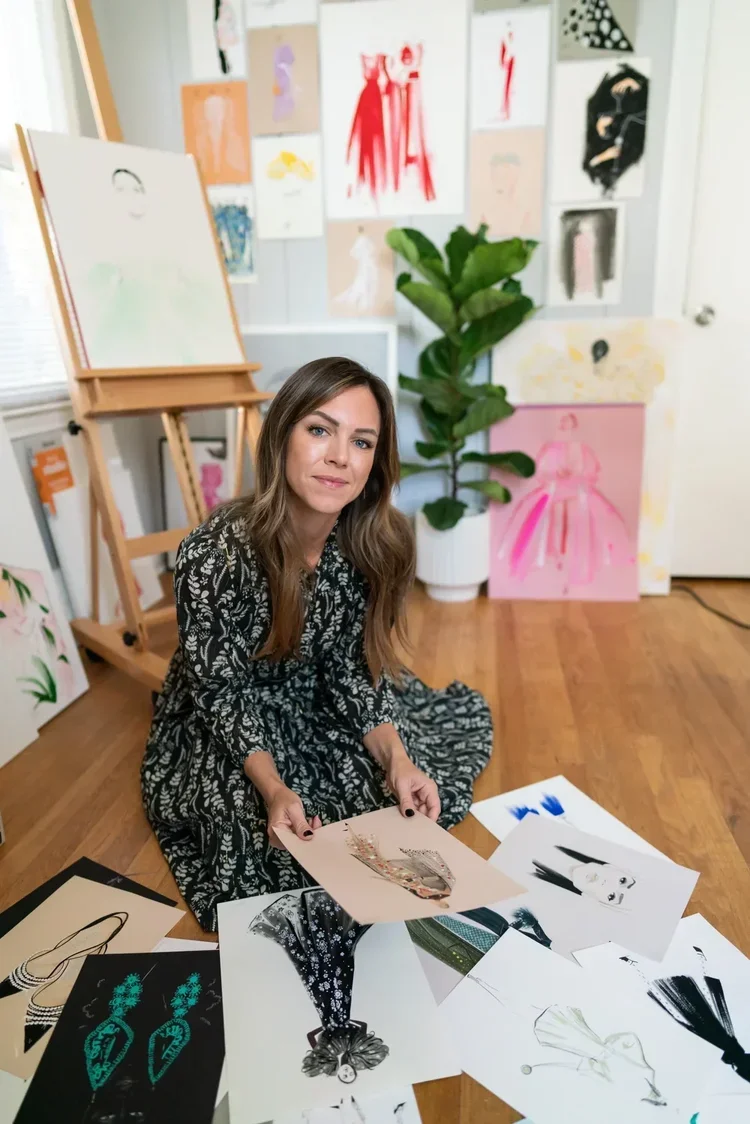
Artist Program: Darra Sargent
Darra was born and raised in Baltimore, a city with an incredible creative energy and a deeply rooted arts community that shaped her from an early age. Creativity was always part of her home life, too. Her dad was a musician, and her mom worked as a hairstylist. Even though their careers were different, they both approached their work with creativity, and that had a big influence on her.
Darra’s been making art for as long as she can remember. Even as a kid, she was always creating and looking for ways to express herself. Growing up in Baltimore, surrounded by both community and creativity at home, naturally inspired her to pursue art from a young age.
Walk Us Through Your Creative Process
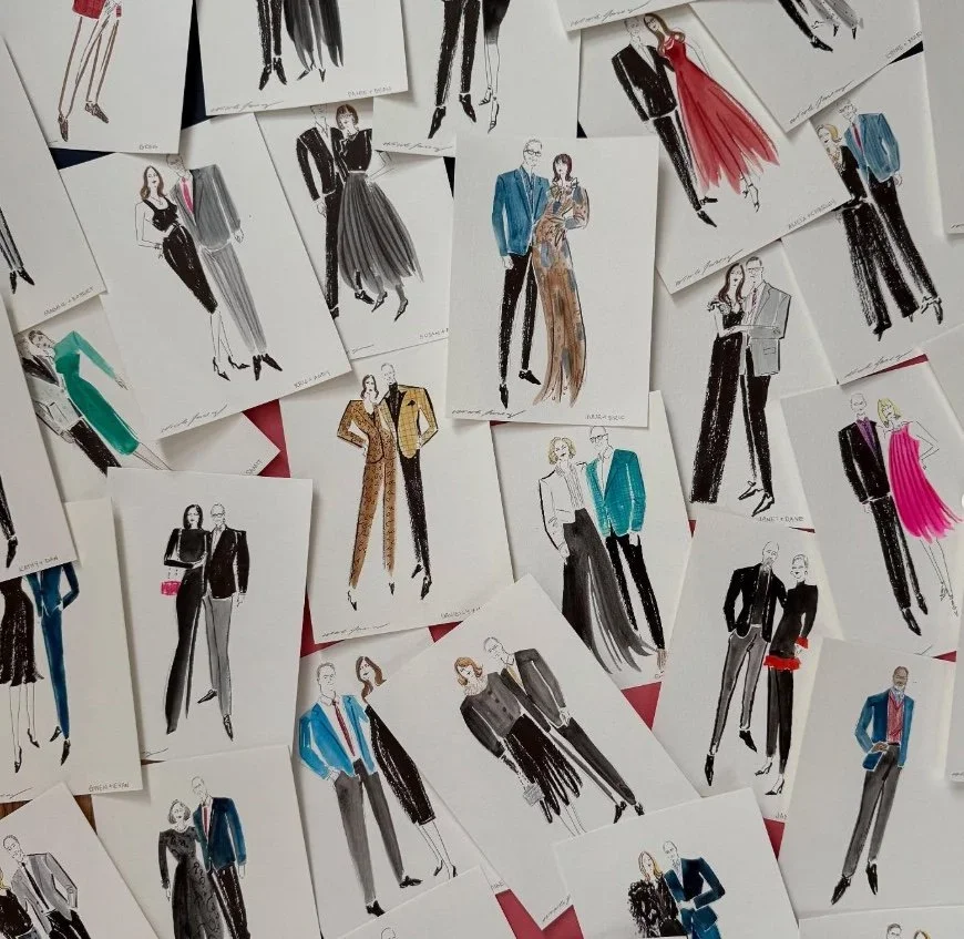
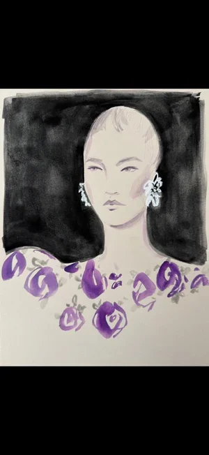
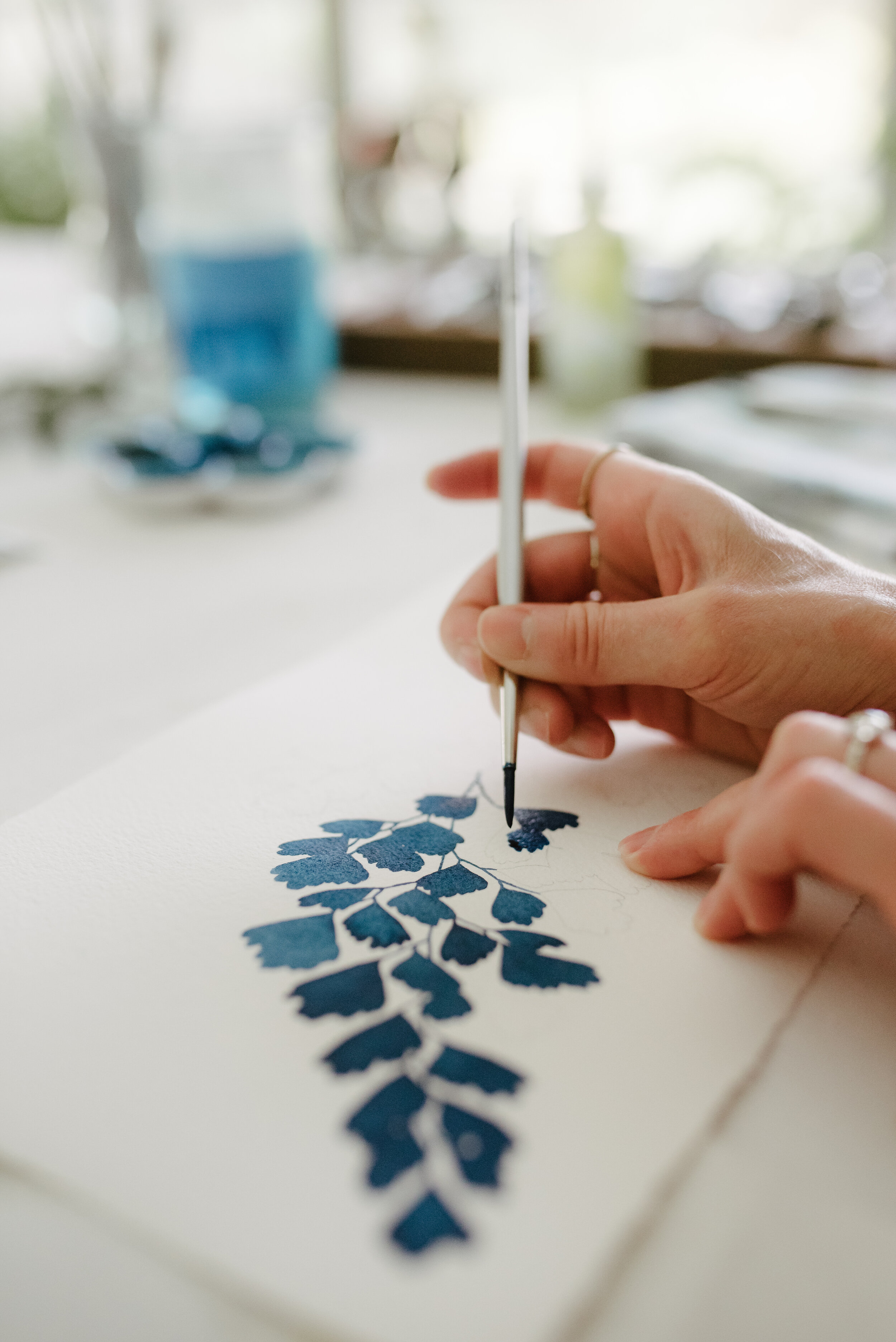
My creative process really depends on the medium. With digital work, I’m very precise and methodical, but watercolor gives me the chance to let go of control and embrace unpredictability, which is something I’ve really grown to love creatively.
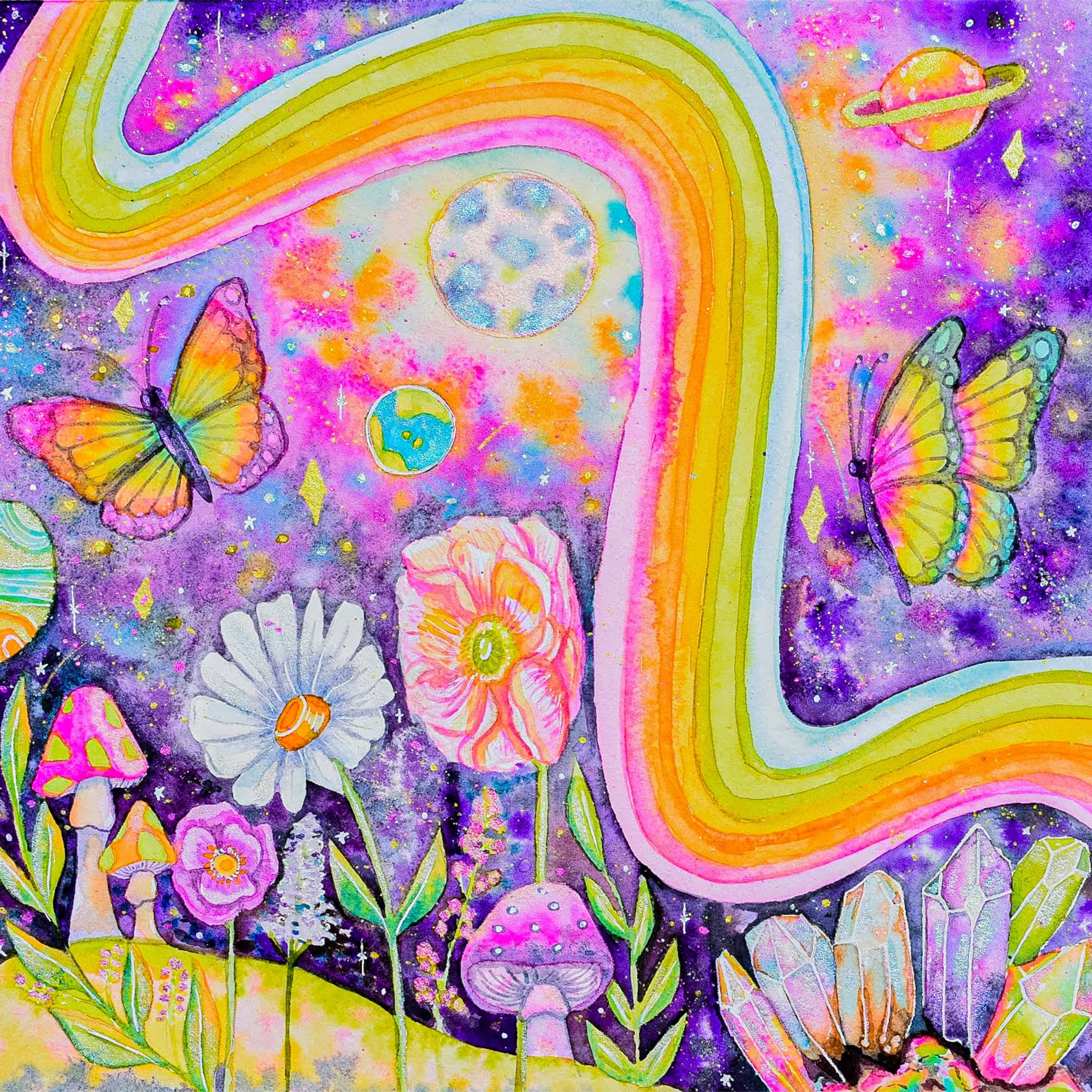
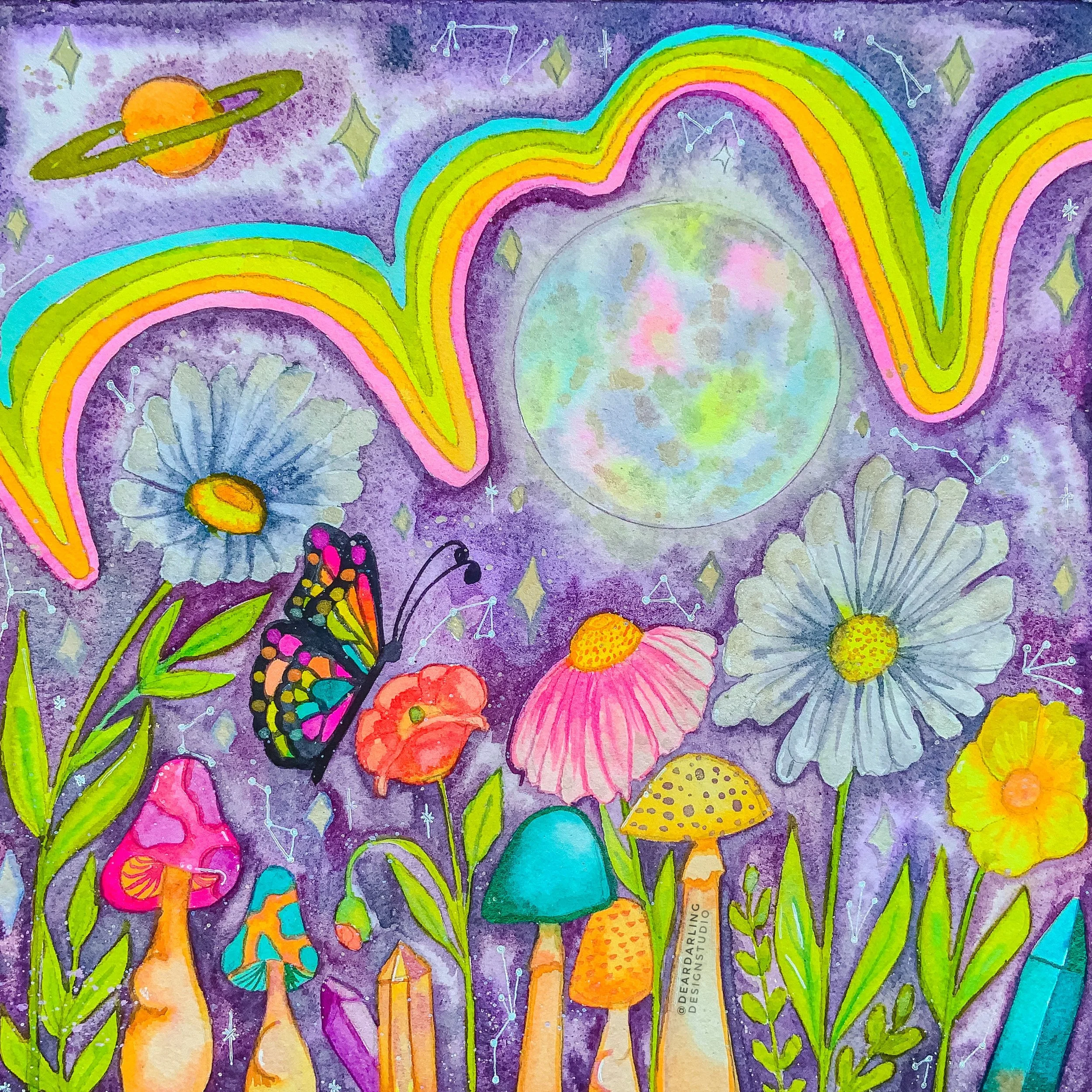
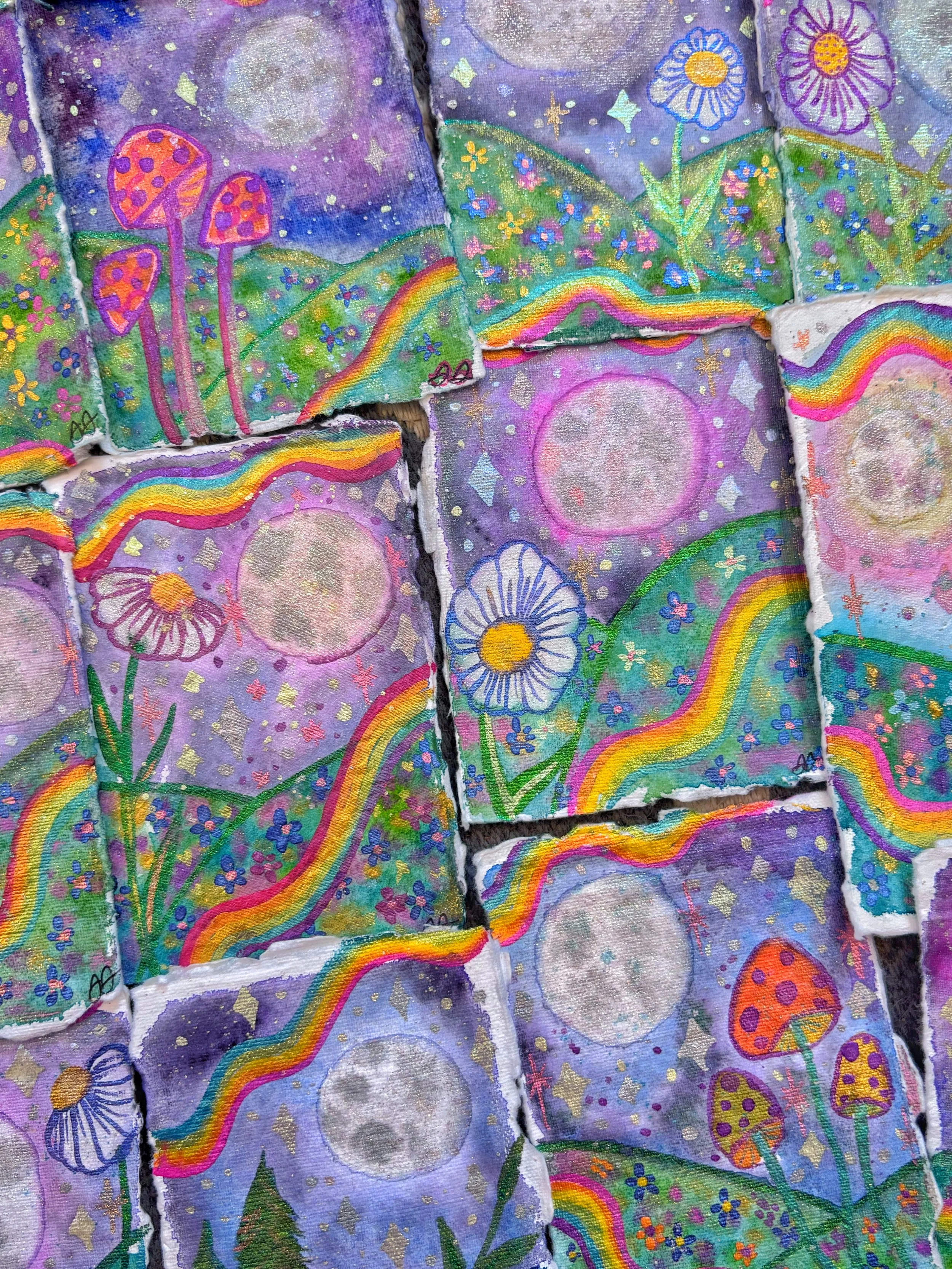
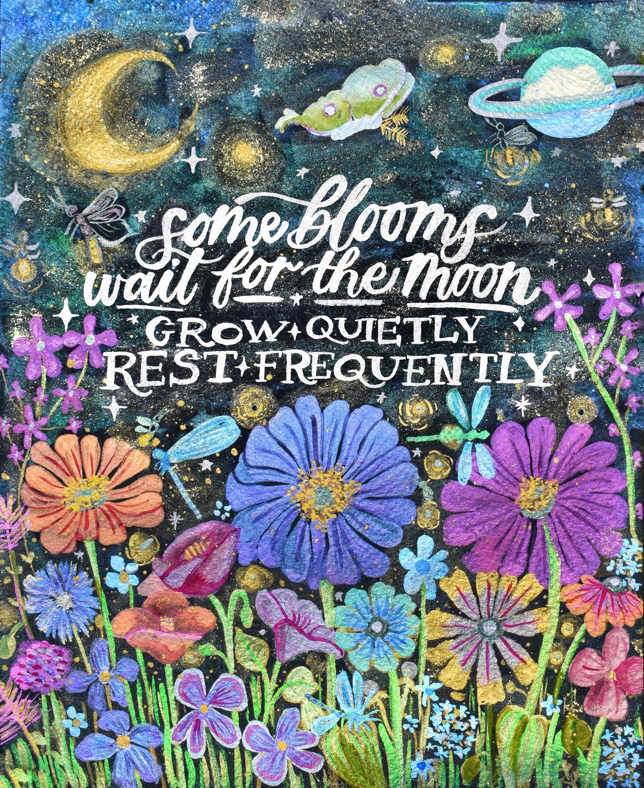
Most of my watercolor pieces begin with a wet-on-wet background using only magenta, yellow, and blue, allowing the colors to naturally mix and create unexpected tones. I’ll layer in metallic and glitter paints for added dimension and then sketch my compositions digitally on my iPad before transferring them onto paper.
I’m inspired by contrast, balancing free-flowing, organic color with detailed, intentional composition, and I love using holographic and color-shifting paints that change depending on how you view the piece.
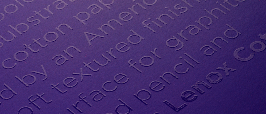
What Matters Most to You When Selecting Paper?
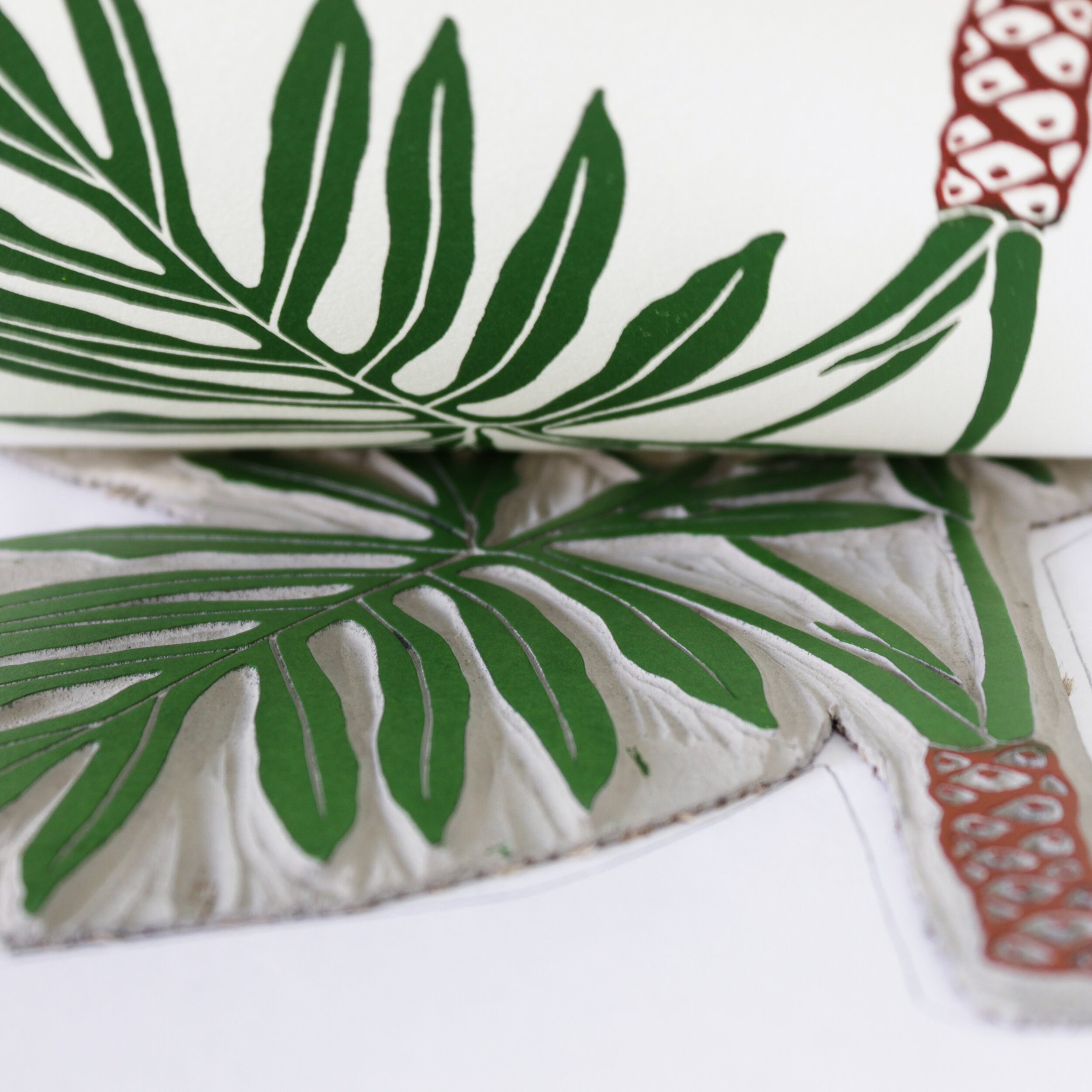
Texture matters most to me when selecting paper. I’m really drawn to cold press because I love that toothy, almost sandpaper-like feel, it holds watercolor beautifully and gives the work so much more depth and vibrancy. I’ve tested the same paintings on different papers, and the difference is huge. Even with great paint, if the paper isn’t absorbing color properly, the piece can fall flat.
I especially love papers like Legion Stonehenge because they stay sturdy under a lot of water without buckling, which is important for the wet-on-wet techniques I use to create those fluid, tie-dye-like backgrounds.
How Did You Discover Legion?
I first discovered Legion through Yupo paper around 2017 after seeing artists use it for alcohol ink work online. Later, when my favorite watercolor paper brand disappeared, I started testing a bunch of different papers to find a replacement, Arches, Strathmore and Legion included.
As soon as I tried Stonehenge Cold Press, I knew it was the one. The texture, the way it absorbs color, and how well it holds up to heavy water techniques instantly stood out to me. I’ve been using it ever since.
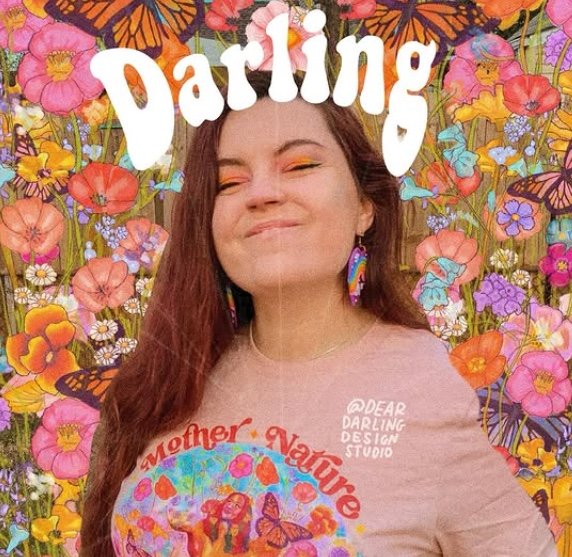
What Do You Hope People Take Away from Your Work?
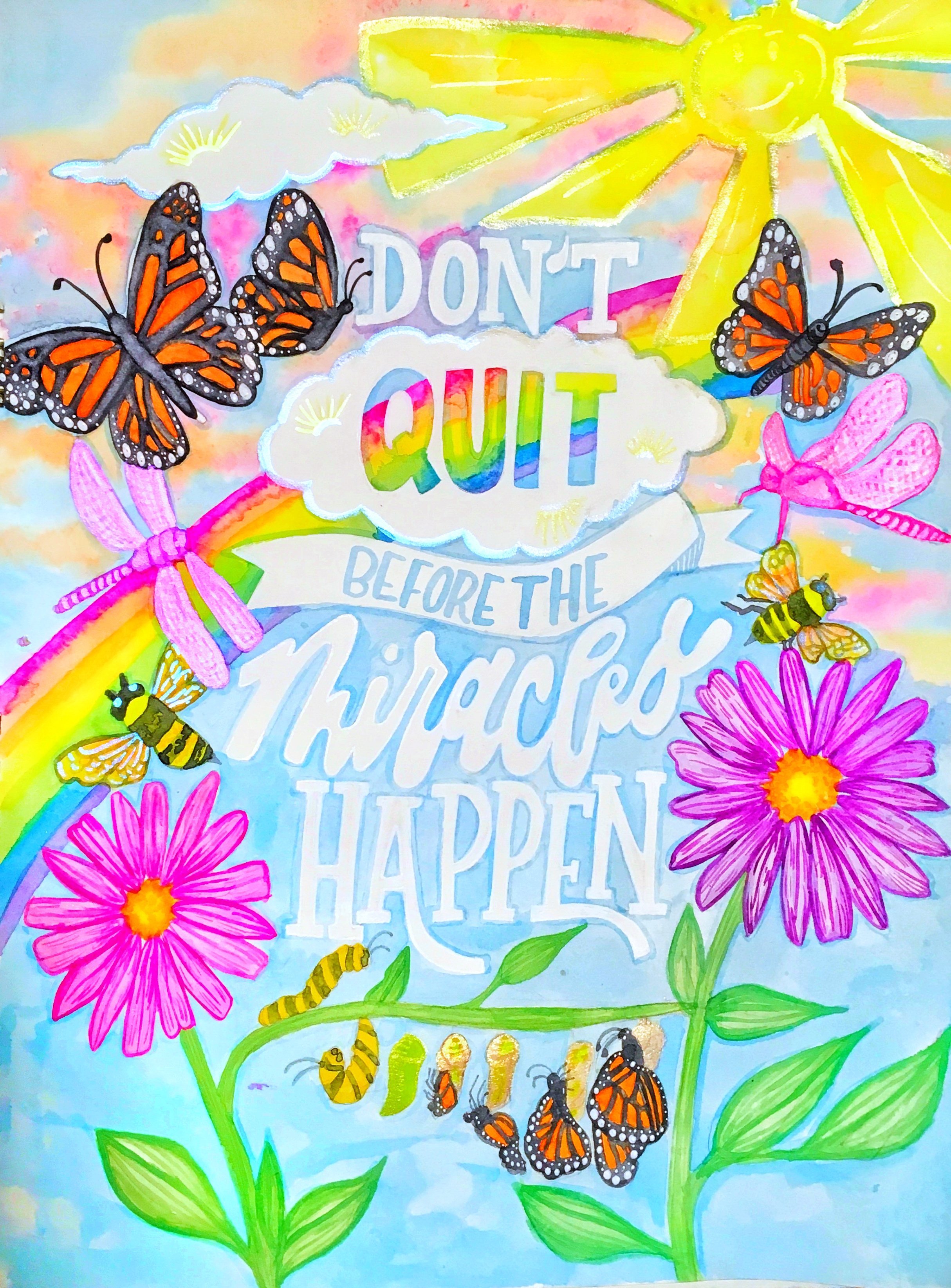
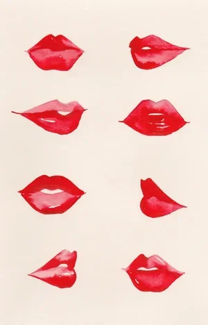
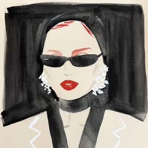
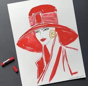
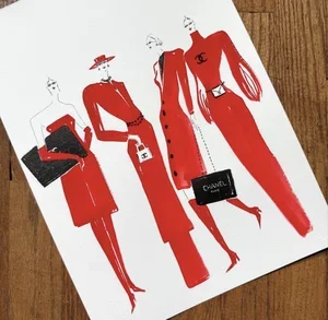
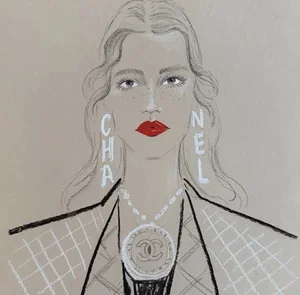
I hope people take away that it’s okay to be unapologetically feminine. My work is colorful, playful, and full of things like rainbows and bright florals, but it also speaks to serious issues and encourages people, especially women, to speak up for themselves.
I think there’s power in embracing joy, softness, and femininity without shame. For so long, we’ve been told that “girly” things are something to outgrow or be embarrassed by, but I want my work to remind people that there’s strength in that joy and authenticity. Especially in difficult times, we need every bit of color, happiness, and light we can hold onto.