Try this! @vanessa_paints_ galaxy painting using Stonehenge Aqua Hotpress Black. (not drawn to scale)
Materials used:
‘The Sprout Creative handmade watercolors
Princeton Brushes
Arteza chalk pastels
Uniball Signo white gel pen
Try this! @vanessa_paints_ galaxy painting using Stonehenge Aqua Hotpress Black. (not drawn to scale)
‘The Sprout Creative handmade watercolors
Princeton Brushes
Arteza chalk pastels
Uniball Signo white gel pen
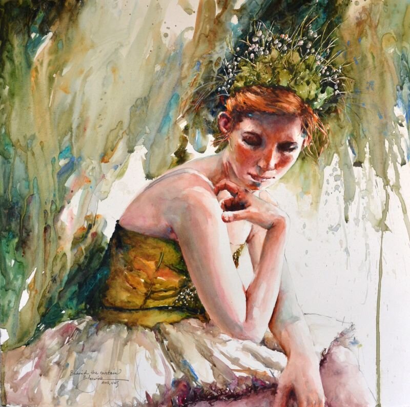
Behind the Curtain by Bev Jozwiak, 2019, Stonehenge Aqua Hotpress 140lb
The style Bev Jozwiak is currently working in seems to be the direct result of her own personal journey. Art has been in her life for as long as she can remember. She is the first formally trained artist in her family, but by no means the first artist. Her great aunts, grandmother, aunt and father all painted before her. She graduated with honor from Western Washington University, with a Fine Arts degree and an Art History minor.
Whether painting in Acrylic or watercolor the goal is the same; to create an impressionistic painting with rich varied color, good design, great values, and to create a piece that will last by using archival materials. She never wants the viewer to think her paintings look like photographs, but rather to see the brushwork, and the love and energy that goes into each and every piece.
Jozwiak’s skill as a painter has garnered her national acclaim as one of America’s premier painters. The result of hard work and years of painting has not gone unrewarded. Bev has had a plethora of successful one woman shows for prestigious galleries. She has lost count of how many articles in major art magazines she has had. She is the author of “Painting Life with Life, a 164 page watercolor book, and has her signature status in every major watercolor society, including the American Watercolor Society in New York. Bev believes in keeping original art affordable and accessible to everyone. She does not foresee a time when she would ever quit painting, or become complacent with what she does. She hopes to always study, grow, and continue on this personal artistic journey.
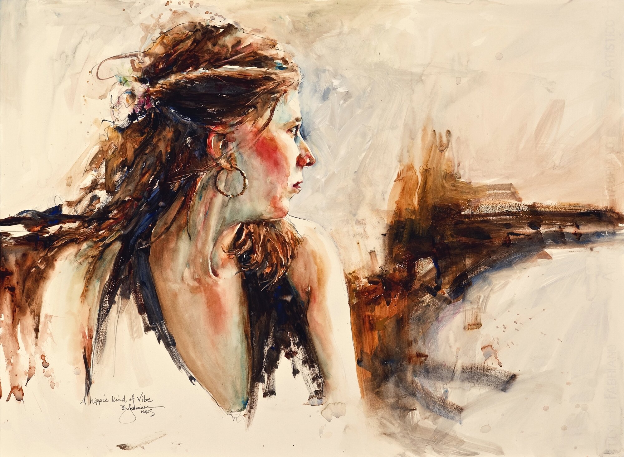
A Hippie Kind of Vibe by Bev Jozwiak on Stonehenge Aqua Hotpress 140lb
Stonehenge Aqua 140lb. Hotpress is my go to paper. And Occasionally 280 lb. too, which has just a bit more tooth. I have had problems with the sizing on other papers, getting batches that were “pilly” and really hard to paint on. I have not had one bad batch with Stonehenge. It is the just the right amount of slickness.
Unlike some watercolor painters who paint in thin layers building up to their finished pieces, I use a very direct method of painting. Hotpress is made for this, as the paint lays more on the surface, than with cold or rough papers. It is also very easy to lift out areas of paint, either with a brush for a light touch, or with a magic eraser to really get back to the white of the paper.
Palette: Alvin Heritage Palette or John Pike Palette
Paints: (Cheap Joes Art supply is where I get most of my supplies) Online.
Winsor and Newton (unless noted)
Yellow Ochre
Burnt Sienna
Sap Green (Holbein)
French Ultra Marine Blue (I have been using Daniel Smith lately, but either work)
Cobalt Blue
Manganese Blue Hue
Permanent Alizarin Crimson
Rose Madder Genuine (or Permanent Rose)
Cadmium Red (or Joes Red from Cheap Joes)
Cadmium Orange
Winsor Blue (Red Shade)
Winsor Green (Blue Shade).
New Gamboge or Joe’s Yellow (Cheap Joe’s American Journey)
Janet Rose Violet (Cheap Joe’s American Journey)
Aureolin
Naples Yellow
Yellow Gray (Holbein)
Verditer (Holbein)
Don Andrews Turquois
Brushes: Cheap Joes Golden Fleece
#10 round
1” Flat
#4 round for details
· *I also use the legend or the dream catcher (from Cheap Joes) when I need a brush that holds a more water. #8 round is my favorite.
· Kolinsky DaVinci Maestro #12 (A very good mop brush)
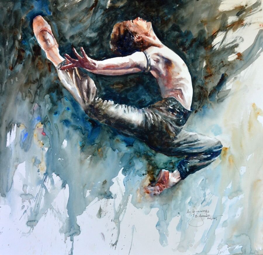
As if on Wings by Bev Jozwiak, 2019, Stonehenge Aqua Hotpress 140lb
I am a very fast and direct painter; as a matter of fact I am almost done with my second book, which is called, “Confident brushstrokes”. While I do have some work that is more layered and “traditional”, my own favorites are the ones with bold confident, purposeful brushstrokes.
It is hard to choose one piece to be a favorite. It is usually a recent piece, and then in a year, I don’t like it at all. I am always growing in my art, and don’t ever want to paint on rote, or get in a rut of painting the exact same thing. I like my crow/raven pieces simply because I love to paint blacks. I add a plethora of colors next to each other, and yet manage to have it still read as the color black.
My ballet pieces are also some of my favorites. My youngest daughter was a professional ballet dancer. I grew to love ballet and all the rituals involved in that art form.
At this very moment my favorite piece is called “Stand Tall”. I was very happy with all the colors in this man’s face. I really wasn’t expecting the painting to turn out, as I was just experimenting with throwing rubbing alcohol at my paper as I was painting. The texture it created was unexpected, and really gave this piece a unique look that I was very pleased with in the end.
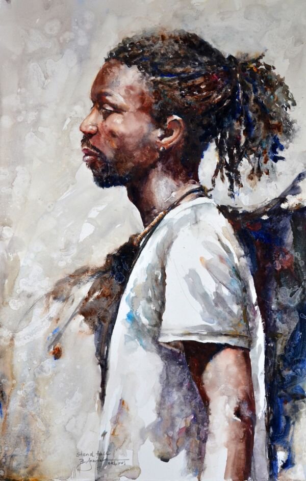
Stand Tall by Bev Jozwiak, 2019, Stonehenge Aqua Hotpress 140lb

Ballet Profiles by Bev Jozwiak, 2018, Stonehenge Aqua Hotpress 140lb
If I could choose to be anything in the world, I would not make another choice. I love to paint. Being an artist is not what I do, it is who I am. Getting to create a thing of beauty, and show the world what I see through my eyes, has been a gift that I am beyond grateful for.
If you have always wanted to be able to paint, what are you waiting for? Start on your journey today. Every day adds a layer of knowledge, brick by brick honing your craft, until you have the skills to say what you want to say. It all starts and ends by putting “miles on the brush”.
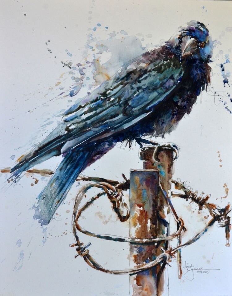
Wired by Bev Jozwiak, 2020, Stonehenge Aqua Hotpress 140lb

Introducing our Artist of the Month for September, Hannah Rose! We’re so excited to feature Hannah’s work using Yupo. Stay tuned on our Instagram for more of Hannah’s work, tutorials and an introduction to new Yupo products.
Tell us about yourself and your work.
My name is Hannah Rose and I am a mixed media artist from England. I specialize in fluid media, and I can be inspired by anything from music to landscapes. Most of my inspiration comes from nature. I started working with fluids because I immediately enjoyed what I was doing, and I believe that is so important for an artist.
How did you find Yupo and starting with it?
I started using Yupo a year ago. I had come across it by looking at other fluid media artists on Instagram, and watching YouTube tutorials to teach myself what I needed to be able to create the beautiful marble like patterns. I started with a light weight Yupo but now use the full range.
How does Yupo make your style unique?
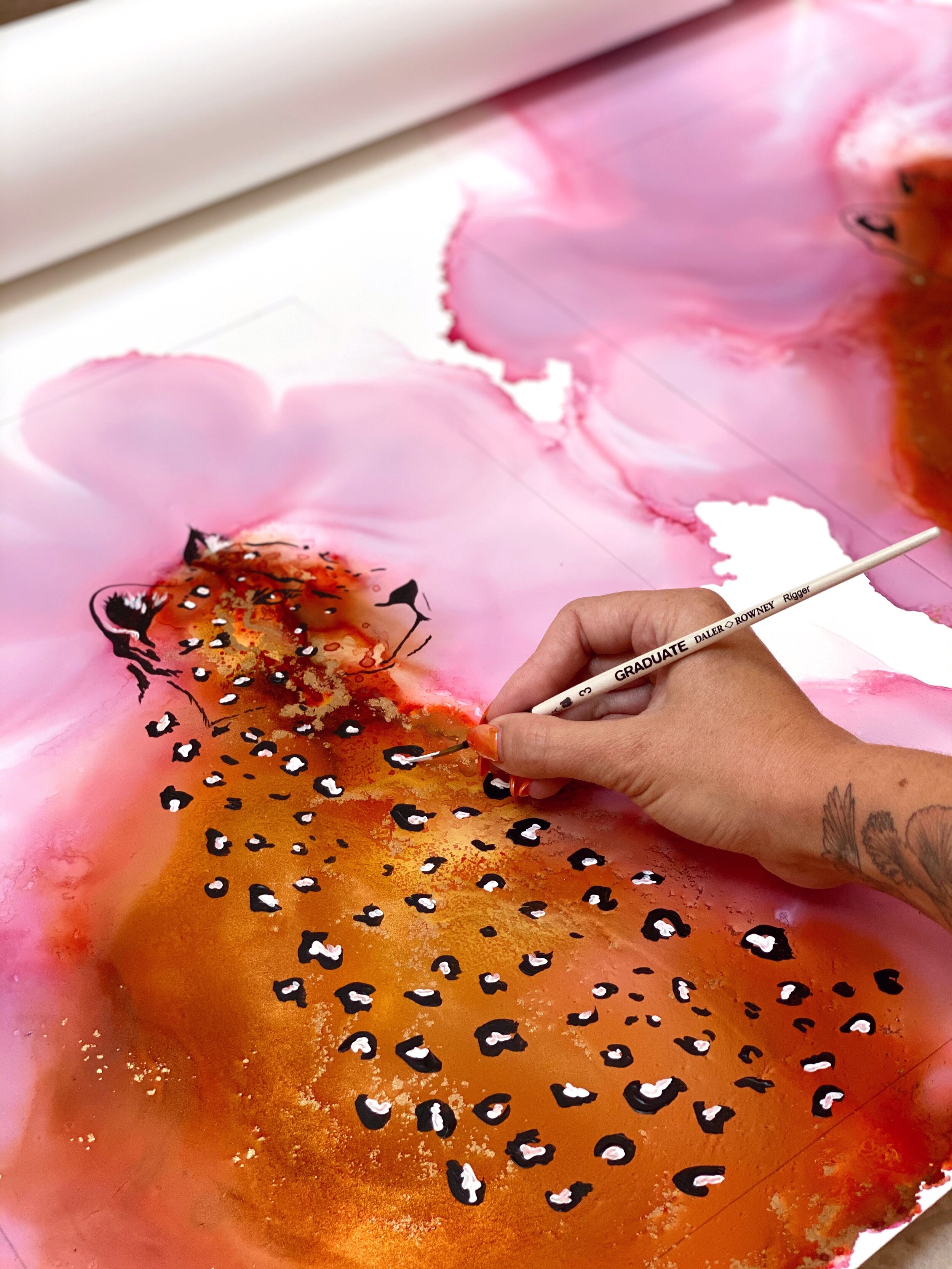
It allows me to create textures and depths to my fluid work that I have never seen before. The paper is unlike anything I had ever used. The fact I can then layer different media on top of the Yupo means I can create some really unique pieces for example. I feel I have no limitations when using Yupo.

Why do you use Yupo?
Mostly it’s because of the texture and flexibility of it. It is by far my favourite paper I’ve ever worked with. The range of sizes are so helpful in allowing me to work across a range of pieces. Also, it was immediately an enjoyable experience to work with, this was really important to me, and so I’ve never looked back.
What’s your process like working on Yupo?
Depending on the commission, I will work slightly differently. For the larger ones I love to spread out the large rolls across my studio floor. This allows me to free paint and without restrictions. For smaller works, the pads are perfect. I like to clean the surface of the paper down first with paper towel and a little bit of alcohol, then get painting.
What other materials do you use with Yupo?
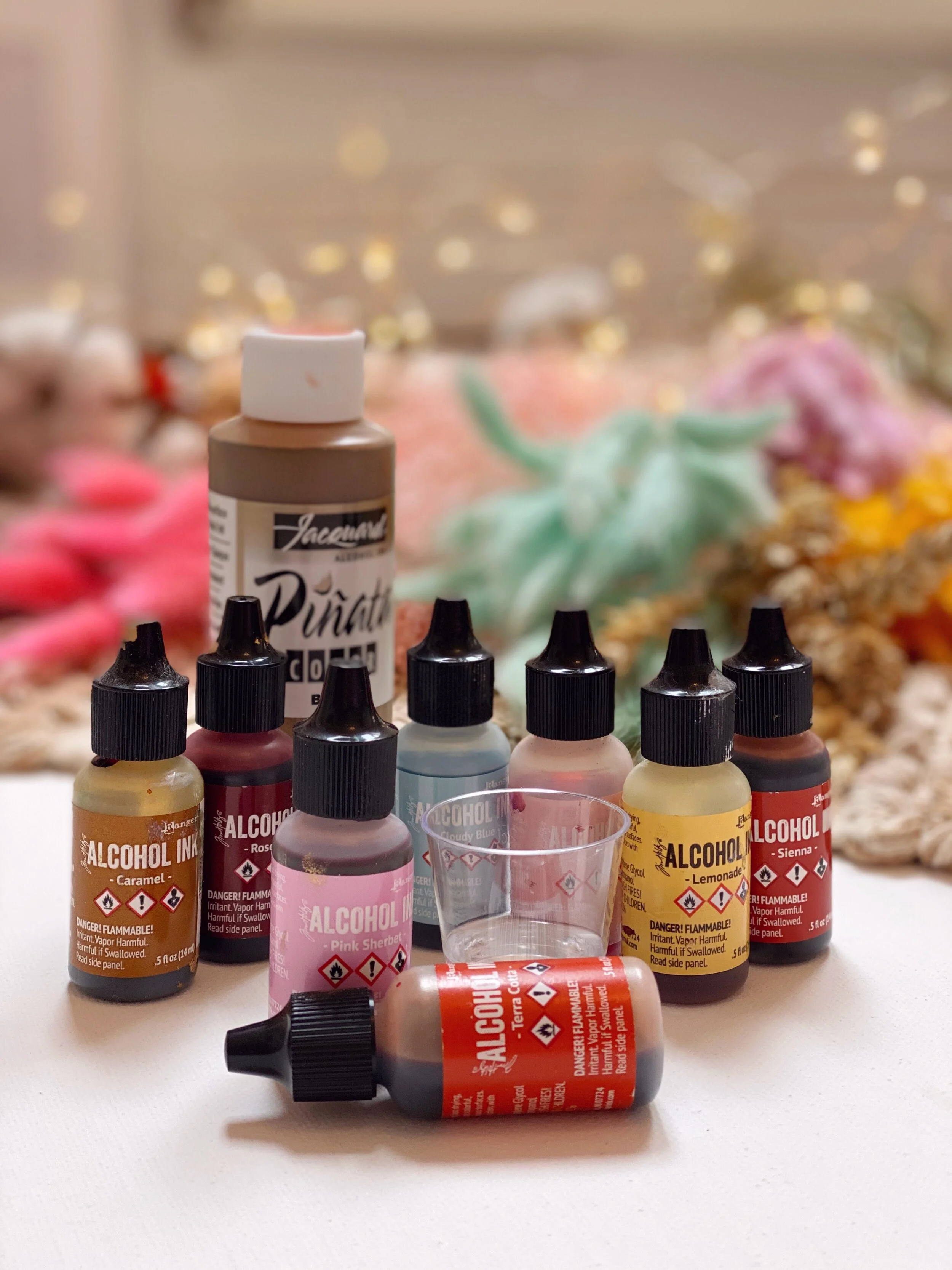
For inks I always use Tim Holtz and Jacquard Piñata. I adore Tim’s colour range, and the pigments are beyond beautiful. I cannot live without Jacquard’s brass ink. For acrylics I always use Daler Rowney, for the range of colours and ease of use. I will then seal my work with 3 layers of Krylon Kamar Clear Varnish. I will then apply 3 coats of Krylon UV Resistant Clear Acrylic Coating (Gloss). This helps the inks set and keeps them protected.
What advice do you have for artists starting with Yupo?
Starting with Yupo I would say there’s a massive range in sizes, so you don’t have to get a big roll to start. I started on light then worked my way through the different options. My advice is to get the paper and just play. Don’t pressure yourself to try and create something beautiful, it is important to enjoy what you are doing, and the different techniques you could use. Art should be enjoyed and not a forced chore, there are no rules.
Do you have a favorite project or piece?
That’s really hard! My favourite projects at the moment are the mountains I am working on for Autumn and Winter. The new Yupo Medium Rounds are the perfect base.


Anything else you’d like to share?
I have been so lucky to have a wonderful supportive relationship with Legion paper. To me, their customer service is brilliant. They support artists by creating such wonderful papers for us to explore on. I believe the Yupo range is second to none.
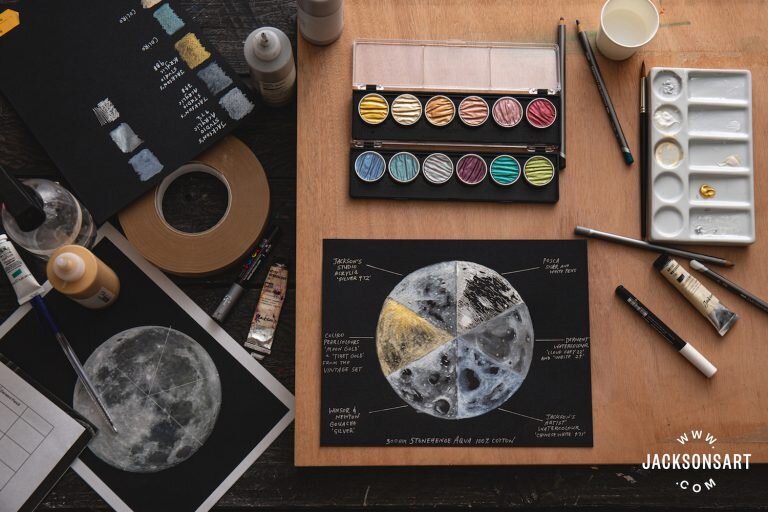
Written by Clare McNamara on Jackson’s Art Blog
The newest addition of Legion’s watercolor papers: Stonehenge Aqua Black. This 100% cotton paper, produced in 300 gsm, is a hard-wearing watercolour surface. Cold-pressed, with a medium-rough surface texture, the paper is the same quality on each side and is acid, chlorine, OBA (Optical Brightening Agent) and lignin free. This is an archivally sound watercolour paper that provides a mirror world of possibilities when painting light and shadow using water-based materials.

Because it is a dense, cotton paper, with a fairly hard size, Stonehenge Aqua Black has an exceptionally short bleed that allows for superb control of almost every water-based medium, whether applied directly or diluted in a wash. When painting on a black surface, the surface itself will most likely be the darkest tonal value of your image, so you need to work in reverse to achieve a depth of tone—drawing out areas of light and building up layers from the dark. Due to the restrained bleed of Stonehenge Aqua Black and the blending control this allows, tonal values can be obtained by layering varying dilutions of paint, without them bleeding into one another.
Stonehenge Aqua Black comes as a pad or sheets rather than as a pre-stretched block. While it claims to be buckle-resistant, it is prone to very slight warping with the addition of water, when using gouache, watercolour paint, and watercolour pencil. That being said, it eventually dries to a relatively flat state, similar to that of other 300 gsm watercolour papers. Therefore, you may still want to stretch your paper before you begin painting. Samples that were left in water overnight remained black and were able to withstand scrubbing without wearing away. It would take excessive scrubbing for this paper to deteriorate.
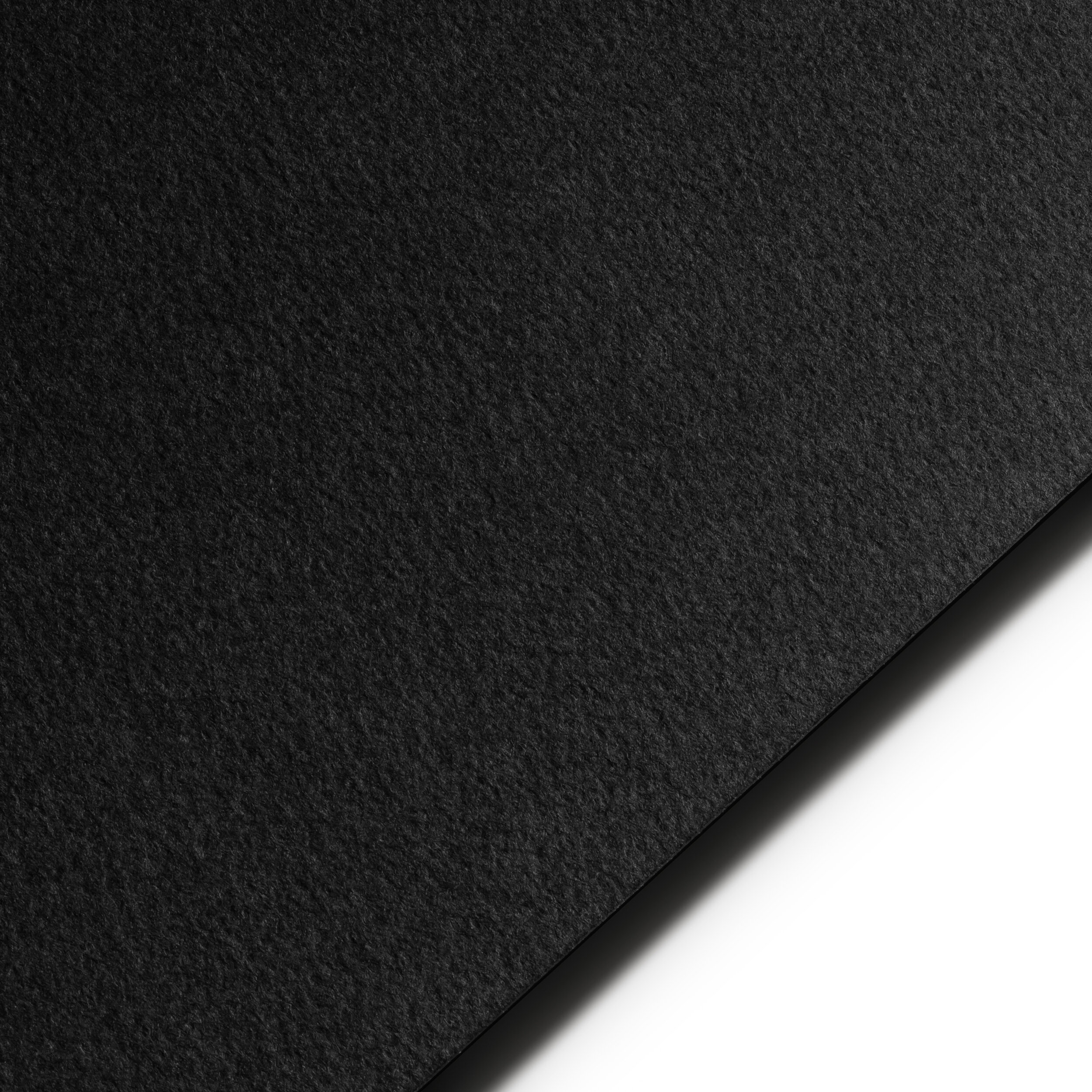
As it has a medium-rough texture and hard size, the paper has the right level of absorbency for wet media as it can take washes while keeping pigment on the surface. This feature is very important with black paper, as it can often absorb lighter colours so much that they disappear. We found the paper’s absorbency was suitable across the variety of mediums we tested.
This was one of the most satisfying mediums to apply. Because it was so easy to control, I was able to build up several layers of paint and produce a wide range of tonal values, by diluting with plenty of water. I noticed a small amount of buckling in the paper while I was working, but this flattened out once it dried. The vibrancy of the silver colour remained bright and reflective both wet and dry.
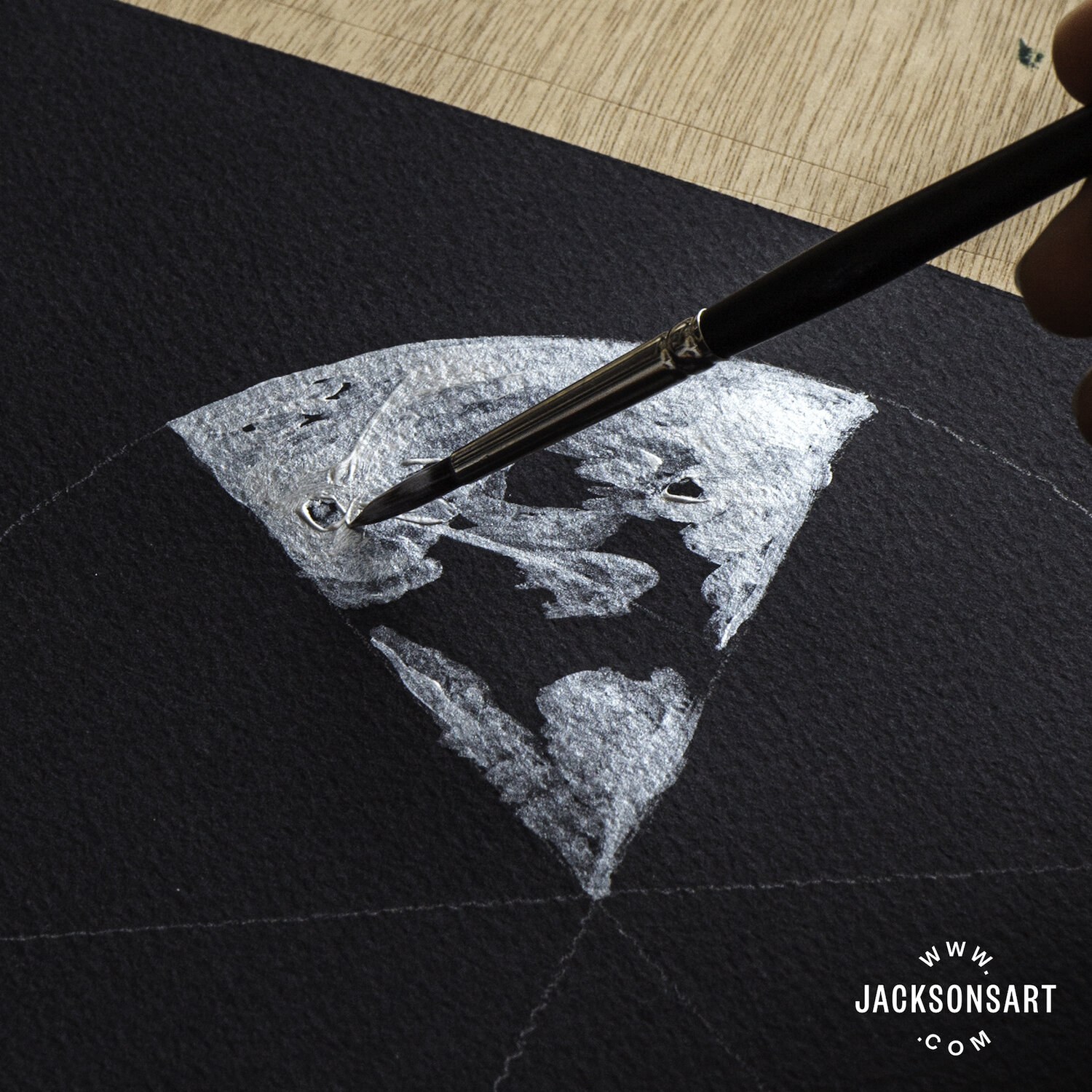
Jackson’s Studio Acrylic – Silver 972
With the addition of a little water, these paints burst to life, sparkling in pools in the valleyed grooves of the pan. While they are a little less easy to control than the acrylic or gouache, they handled well on the paper and had an exceptional amount of lift. Many layers could be applied without damaging the paper, though I found it had warped slightly upon drying. Stonehenge Aqua Black seems made for metallic watercolours of this kind—the bright sheen of the paint remains just as strong when dry, and is further accentuated by the matt black of the paper, which appears even darker by contrast.

This was another excellent medium to work with on Stonehenge Aqua Black as it was easy to control and with an equally metallic luminescence to the acrylic. The gouache, when built up in dense layers, resembled hammered silver on the texture of the paper, or applied sparingly as a wash, appeared like distant stars. Once dried, it could be almost completely lifted from the paper and there was no sign of warping or buckling whatsoever.

Applying watercolour paint thickly was the most effective way to avoid it absorbing into the paper too much. On the Stonehenge Aqua Black, the paint dried to a ghostly pale blue rather than a white. Unlike the metallics, the watercolour paint dried unpredictably, with irregular pooling in the texture of the surface and some slight warping in the paper. With the combination of the paper’s dry rough textured finish and the various drying tones, I found the results of the watercolour paint harder to predict, but full of potential for experimentation.

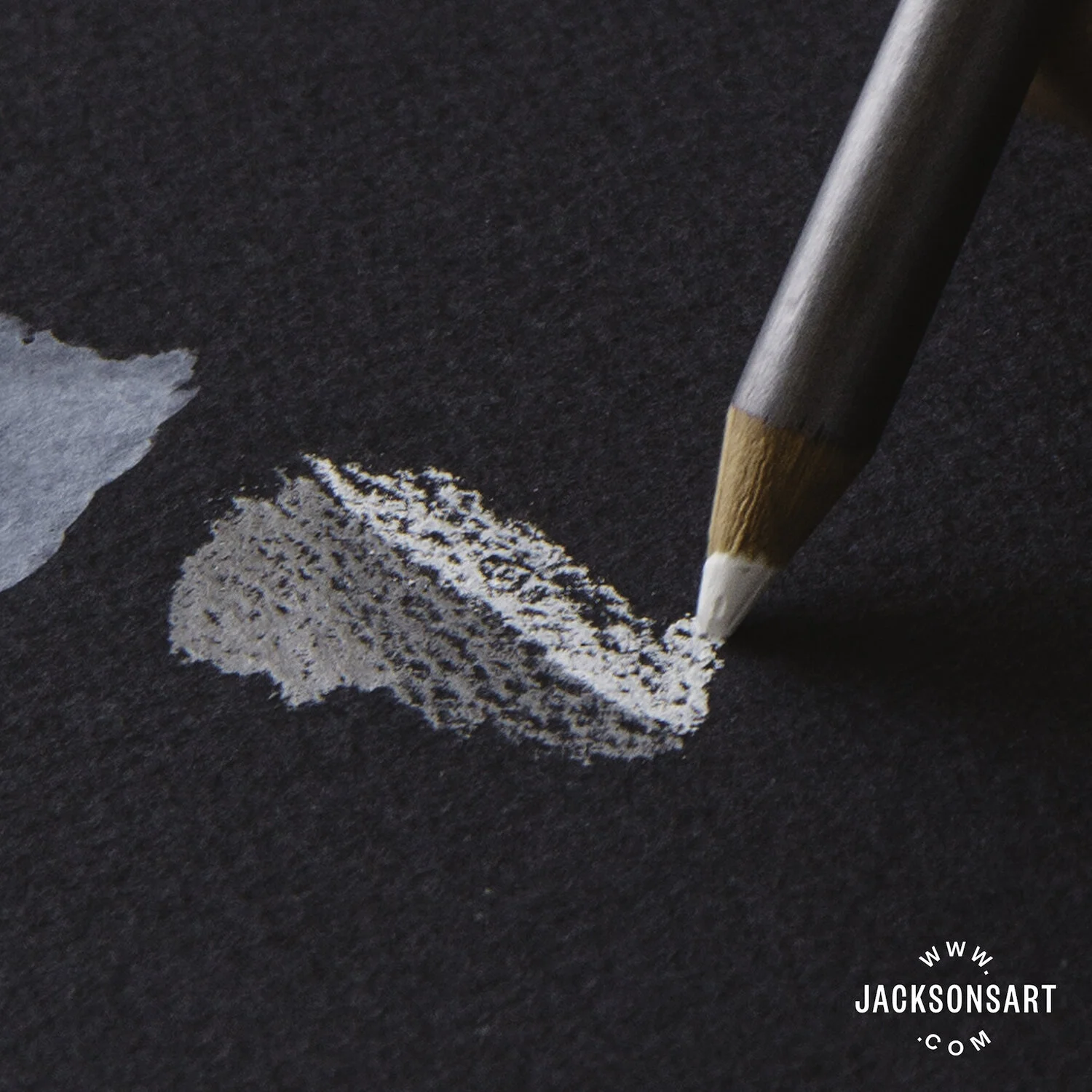
Applying the watercolour pencils with a light pressure prevented them from rubbing the texture of the paper flat, so it retained it’s shape, texture and absorption qualities. The pigment remained visible when wet and absorbed with a lot of coverage into the paper. Once dried to a matt finish, it was harder to lift back to the original black tones of the paper, without leaving grey smoky patches.
Using these pens on black watercolour paper felt definitive, as it was harder to conceal your marks and impossible to lift them back off the paper with water. The ink sat on the surface and lines remained sharp and clear, without bleed. Occasionally and unpredictably, the friction between the semi-rough texture of the paper and the plastic pen tip caused the nib to scratch, splatter, and spit out ink.

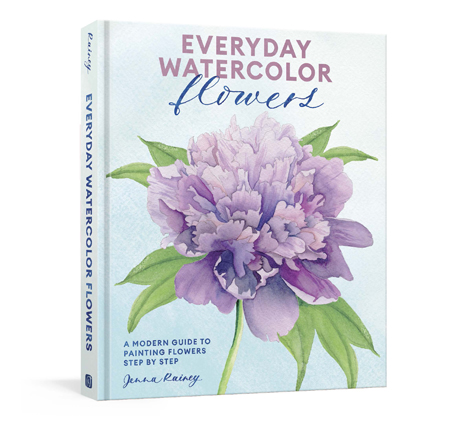
Artist, Jenna Rainey, shares easy-to-follow ways to paint a wide range of botanicals, all in her fresh, modern style that appeals to the next generation of watercolor artists and creatives, from beginners to hobbyists. With gorgeously illustrated instructions for both loose and realistic watercolor depictions of more than 25 flowers, leaves, and plants, organized by form and shape, Everyday Watercolor Flowers is every nature-lover’s answer to capturing that beauty on paper.
Jenna uses Stonehenge Aqua Coldpress 140lb for all of her watercolor paintings.
Here’s a sneak peek of drawing Cherry Blossoms in Everyday Watercolor Flowers.