Legion's honored Masthay Studios has chosen to print their incredible hand carved letterpress posters on some of our papers. The unique process tells a great story. Read about it in an interview with printmaker, AJ Masthay.
Could you start by introducing yourself and Masthay Studios?
Of course, my name is Aaron “AJ” Masthay and my history as a printmaker goes back well over 20 years. In 2001 I founded the boutique letterpress shop Masthay Studios where I specialized in creating our unique brand of hand carved letterpress gig posters. My shop is currently based out of Hartford, CT where we service clients in the music and special event industries from across the country and internationally.
How did you get involved in concert and event printing? How do you make an old concept into modern day art?
Excellent questions as the answers to both are inherently tied together. I attended the Hartford Art School back in the mid 90’s where I learned all the classic printmaking techniques - etching, lithography, relief printing, etc. The only medium I was not exposed to is the same medium that is the industry standard in gig posters - silkscreening. My primary focus in school was lithography, using both stones and plates. If you had told me back then that I would make a name for myself doing relief printing I would have laughed.
There’s only one thing that rivals my love of the visual arts, and thats my love of live music, specifically the jamband scene (Grateful Dead, Phish, etc). Being a poor college student at the time, I noticed that people often created and sold artwork at these concerts in the parking lots prior to the event. I figured “I can do that” and began seeking out a printing press of my own. Due to my ignorance of silkscreening, I leaned towards relief printing as a fairly quick and inexpensive way to set up a functioning print shop. With the help of one of my printmaking professors I tracked down and purchased my first press, a Vandercook Universal I. I spent the next few years honing my craft and striving to push the boundaries of the medium, that and following bands around the country. Over those years I was lucky enough to develop an audience for my work, people began collecting my prints and actually seeking me out at the concerts to purchase them in person. I eventually began being contacted by bands and merchandise companies asking to create editions for their concerts, exposing my work to an even broader audience, and gaining more clients. As they say, the rest is history.

Where can people find and purchase your prints?
My work can primarily be purchased online, either through my own website Masthaystudios.com or through my gallery representation at BottleneckGallery.com. Facebook, Twitter and Instagram are all great ways to keep informed of new works being released from the studio and to see works in progress. We also send an email newsletter if someone is so inclined to subscribe you can do so at http://masthaystudios.bigcartel.com/email-signup.
What processes do you use? Could you tell us about ‘suicide printing’?
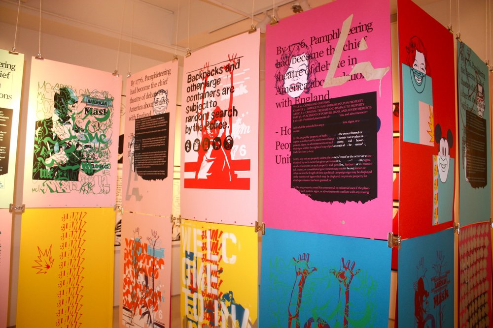
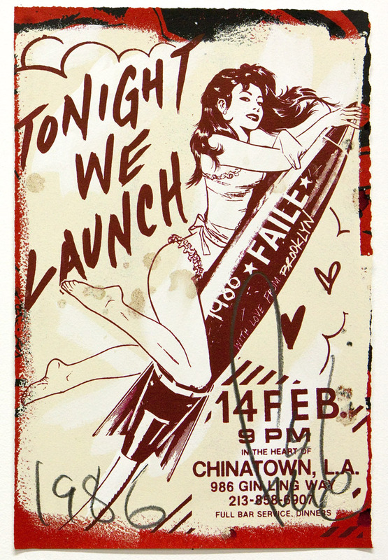
I specialize in reduction linoleum block prints. It’s a process where I not only hand carve my plate from a sheet of linoleum, but I go back and carve away at the same plate between each color. This is where the nickname “suicide printing” comes from, by recarving the plate it makes it impossible to go back and increase the edition size or reprint an edition. Once you make those cuts there’s no turning back…
This process is what sets my work apart in the industry. By layering 7-10 passes of ink on a print it gives my work a physical depth, the inks literally stand off of the paper tempting the viewer to reach out and touch them. I also use oil based inks which give my work a high gloss finish, incredibly vibrant colors and an aroma that my hard core collectors cherish almost as much as the visual art.
I’ve created numerous videos explaining the process behind my work, they can be viewed through my Youtube channel at https://www.youtube.com/user/ajmasthay. Each edition is handcrafted from start to finish, truly a labor of love.
We love to hear you are using Stonehenge for most of your prints. What parts of the process work particularly well with Stonehenge? Are there any challenges?
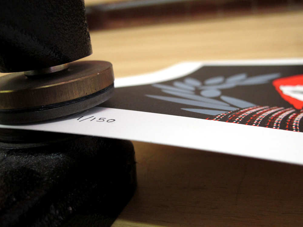
Stonehenge is my “go to” paper stock for the majority of my main editions. It has the perfect blend of strength and absorbency to handle the multiple, thick layers of ink that I apply. It also has the structure to withstand the rigors of being run through my press on numerous passes. I tend to treat my gigposters more like fine art prints so the fact that it is made with 100% cotton rag is important to me and the deckle edge has become a signature of my work, again not something normally seen in the poster world.
Do you use different shades of Stonehenge? If so, how do you match the colors with the design of the print? Which shade is your favorite?
I primarily use the warm white shade of Stonehenge as it really compliments the bright colors I tend to use in my work. I did just recently use the creme color stonehenge on a collaboration print with another well known Grateful Dead artist, Richard Biffle. We wanted to keep this print simpler in design and color scheme so it was important that the paper act as an additional tone in the piece, making the creme a perfect choice.
How does the Stonehenge paper affect the design/your personal style?
I actually don’t just print on Stonehenge, I also do my initial sketches and drawings on it. My entire printmaking process starts with a full scale drawing of the image in pastel and charcoal. It’s an important step as this chalk drawing is then literally run through my printing press onto a blank sheet of linoleum, leaving a reversed image on the plate and essentially creating a roadmap showing me where to carve each color. By using Stonehenge from initial concept to final product I know what the results will be, there are no surprises… usually - this is printmaking after all.
What processes are you using on Mirri Paper? How do you revolve your design and print methods around Mirri Paper?
The Mirri papers are some of the most exciting paper stocks Ive seen in some time. In my industry there are a few different print categories within an edition. There’s the Show Edition - the prints sent to the band to be sold at the venue during the event, the Artist Edition - a small run of the edition designated for the artist to sell, and variants. Variants are extremely small runs, sometimes single prints, within the edition. They typically are on different, more funky, papers which make the Mirri product line a perfect choice. Since many of my inks are transparent and allow the paper to show through, these variants require additional white base layers of ink to be laid down in order to get true colors. But for some stocks such as the Mirri sparkle or the holographic foils, areas of the base layers are carved away to allow the paper to clearly show through in the finished image. These create some amazing effects and when paired with the small print runs, producing some of my most sought after and collectable prints of each edition.

Anything else you think is important to include that the art community might want to know?
I’d just like to say what a pleasure it’s been working with Legion. I am being exposed to new products that pair perfectly with my work and help me to continue to push the boundaries of my medium. It’s certainly a partnership and collaboration I look forward to continuing.