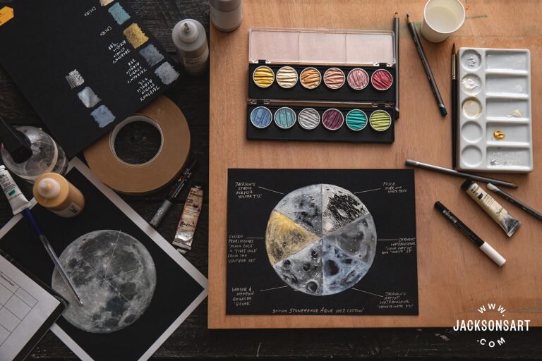
Try this! @vanessa_paints_ galaxy painting using Stonehenge Aqua Hotpress Black. (not drawn to scale)
Materials used:
‘The Sprout Creative handmade watercolors
Princeton Brushes
Arteza chalk pastels
Uniball Signo white gel pen
Try this! @vanessa_paints_ galaxy painting using Stonehenge Aqua Hotpress Black. (not drawn to scale)
‘The Sprout Creative handmade watercolors
Princeton Brushes
Arteza chalk pastels
Uniball Signo white gel pen
Written by Clare McNamara on Jackson’s Art Blog
The newest addition of Legion’s watercolor papers: Stonehenge Aqua Black. This 100% cotton paper, produced in 300 gsm, is a hard-wearing watercolour surface. Cold-pressed, with a medium-rough surface texture, the paper is the same quality on each side and is acid, chlorine, OBA (Optical Brightening Agent) and lignin free. This is an archivally sound watercolour paper that provides a mirror world of possibilities when painting light and shadow using water-based materials.

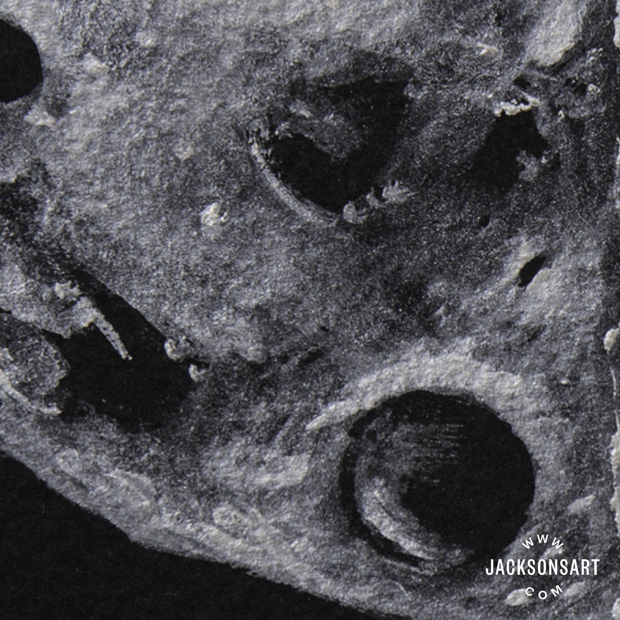
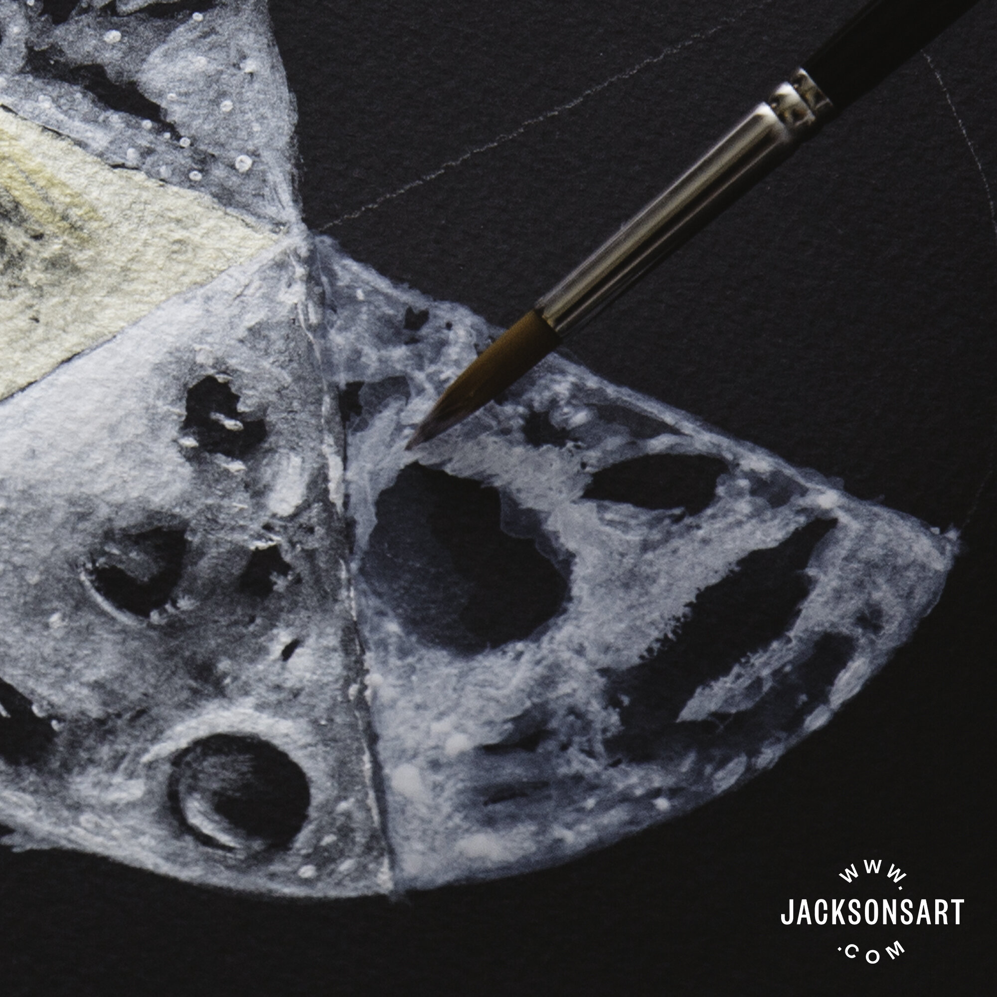
Because it is a dense, cotton paper, with a fairly hard size, Stonehenge Aqua Black has an exceptionally short bleed that allows for superb control of almost every water-based medium, whether applied directly or diluted in a wash. When painting on a black surface, the surface itself will most likely be the darkest tonal value of your image, so you need to work in reverse to achieve a depth of tone—drawing out areas of light and building up layers from the dark. Due to the restrained bleed of Stonehenge Aqua Black and the blending control this allows, tonal values can be obtained by layering varying dilutions of paint, without them bleeding into one another.
Stonehenge Aqua Black comes as a pad or sheets rather than as a pre-stretched block. While it claims to be buckle-resistant, it is prone to very slight warping with the addition of water, when using gouache, watercolour paint, and watercolour pencil. That being said, it eventually dries to a relatively flat state, similar to that of other 300 gsm watercolour papers. Therefore, you may still want to stretch your paper before you begin painting. Samples that were left in water overnight remained black and were able to withstand scrubbing without wearing away. It would take excessive scrubbing for this paper to deteriorate.
As it has a medium-rough texture and hard size, the paper has the right level of absorbency for wet media as it can take washes while keeping pigment on the surface. This feature is very important with black paper, as it can often absorb lighter colours so much that they disappear. We found the paper’s absorbency was suitable across the variety of mediums we tested.
This was one of the most satisfying mediums to apply. Because it was so easy to control, I was able to build up several layers of paint and produce a wide range of tonal values, by diluting with plenty of water. I noticed a small amount of buckling in the paper while I was working, but this flattened out once it dried. The vibrancy of the silver colour remained bright and reflective both wet and dry.
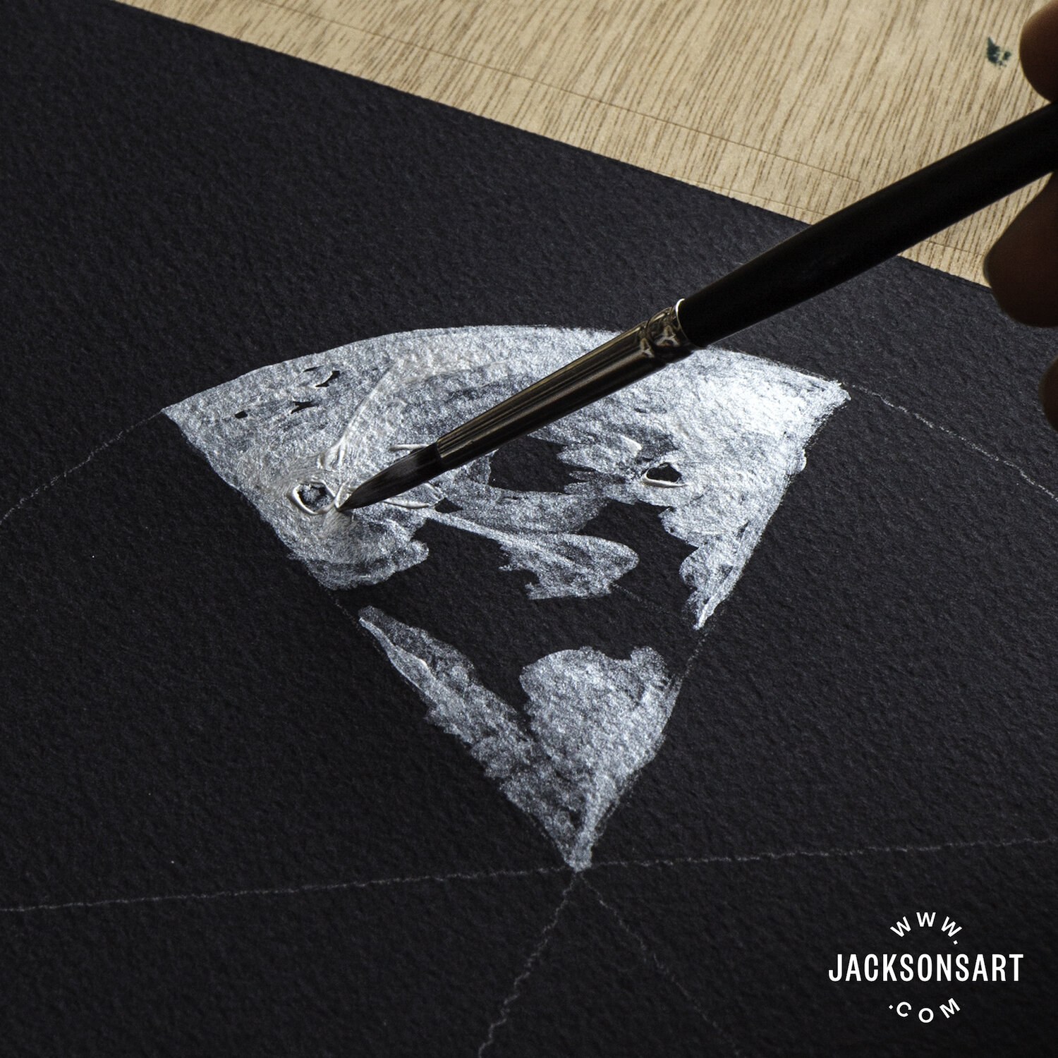
Jackson’s Studio Acrylic – Silver 972
With the addition of a little water, these paints burst to life, sparkling in pools in the valleyed grooves of the pan. While they are a little less easy to control than the acrylic or gouache, they handled well on the paper and had an exceptional amount of lift. Many layers could be applied without damaging the paper, though I found it had warped slightly upon drying. Stonehenge Aqua Black seems made for metallic watercolours of this kind—the bright sheen of the paint remains just as strong when dry, and is further accentuated by the matt black of the paper, which appears even darker by contrast.

This was another excellent medium to work with on Stonehenge Aqua Black as it was easy to control and with an equally metallic luminescence to the acrylic. The gouache, when built up in dense layers, resembled hammered silver on the texture of the paper, or applied sparingly as a wash, appeared like distant stars. Once dried, it could be almost completely lifted from the paper and there was no sign of warping or buckling whatsoever.

Applying watercolour paint thickly was the most effective way to avoid it absorbing into the paper too much. On the Stonehenge Aqua Black, the paint dried to a ghostly pale blue rather than a white. Unlike the metallics, the watercolour paint dried unpredictably, with irregular pooling in the texture of the surface and some slight warping in the paper. With the combination of the paper’s dry rough textured finish and the various drying tones, I found the results of the watercolour paint harder to predict, but full of potential for experimentation.

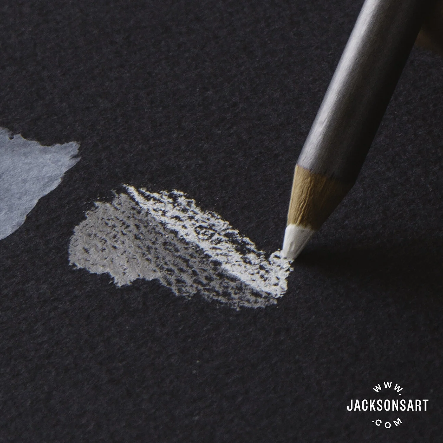
Applying the watercolour pencils with a light pressure prevented them from rubbing the texture of the paper flat, so it retained it’s shape, texture and absorption qualities. The pigment remained visible when wet and absorbed with a lot of coverage into the paper. Once dried to a matt finish, it was harder to lift back to the original black tones of the paper, without leaving grey smoky patches.
Using these pens on black watercolour paper felt definitive, as it was harder to conceal your marks and impossible to lift them back off the paper with water. The ink sat on the surface and lines remained sharp and clear, without bleed. Occasionally and unpredictably, the friction between the semi-rough texture of the paper and the plastic pen tip caused the nib to scratch, splatter, and spit out ink.