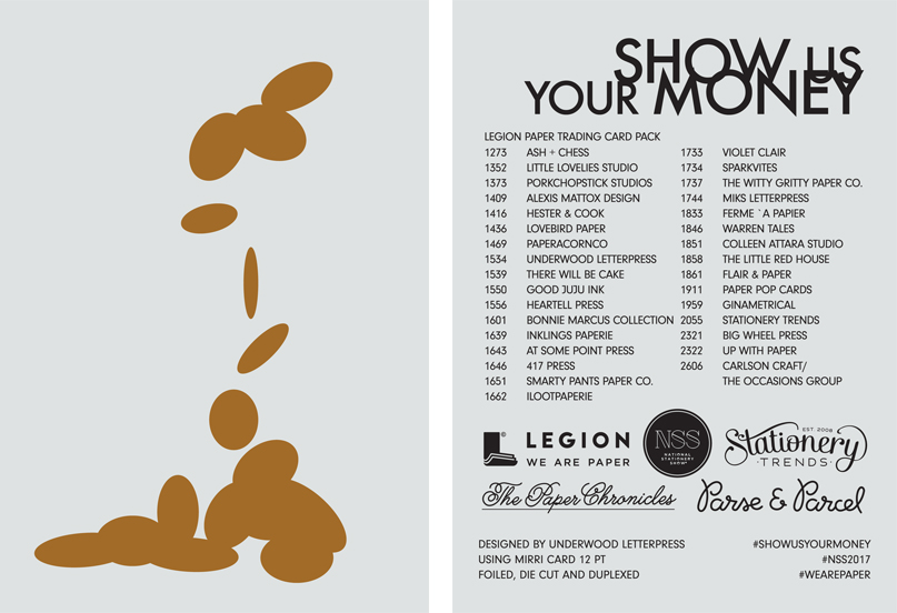
Here's your sneak peek at the 2018 National Stationery Show promotion project with the theme of Stamps! The project is well on its way. The designers have been selected and papers are now being chosen. We're so excited to be working with Sarah Schwartz from The Paper Chronicles and Stationery Trends, Parse & Parcel , the Stationery Show and our packaging designers, Rifle Paper Co., along with 22 designers to carry out the project.
Here's the crew: Hester & Cook; Pinwheel Print Shop; ilootpaperie; Halifax Paper Hearts; Pinky Weber Studio; Paper Bandit Press; Up With Paper/UWP Luxe; Page Stationery; Typoflora; Good JuJu Ink; Smarty Pants Paper; Boss Dotty Paper Co.; Gotamago; Lily & Val; Ginger P. Designs; Inklings Paperie; The Regional Assembly of Text; The Imagination Spot; Euni + Co.; Collen Attara; Albertine Press; and Fresh Out of Ink.
How does it work? Be sure to attend the National Stationery Show beginning May 20th. Grab your checklist that will be given out at the show with the full list of designers and their booth numbers. Stop by each booth to collect their stamp. Once all the stamps are collected, swing by Legion's booth to collect your box made by Rifle Paper Co. to store the 22 collected stamps.
There will so many different designs, printing techniques, papers, shapes, sizes all within one box. Here are just a few of what you'll see.
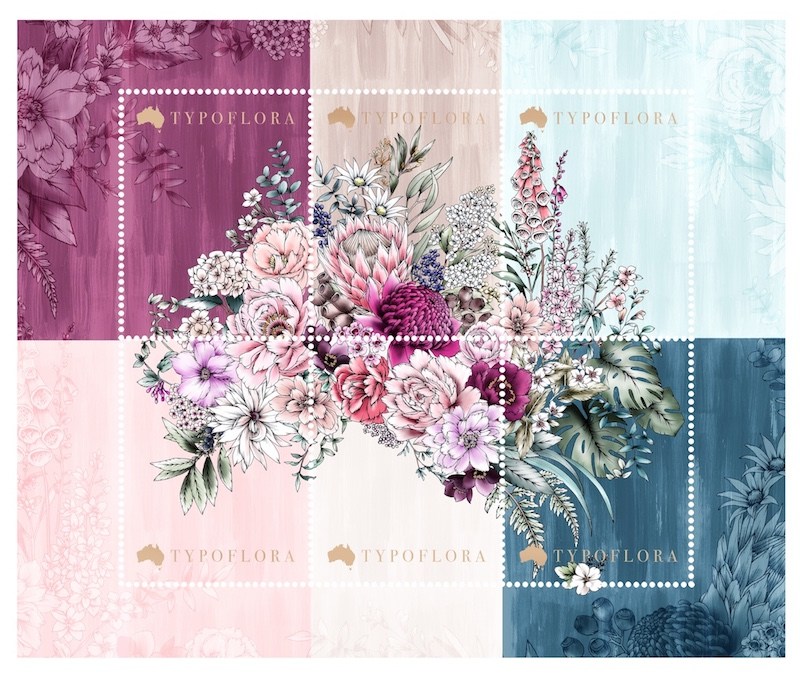
Typoflora's Stamp Design that will be printed on Canson Infinity Paper.

Up With Paper's Design printing on Stonehenge Paper.

Good JuJu Ink's design that will be printed on Rising Museum Board.
Stay updated on more designs to come! Let the countdown begin!