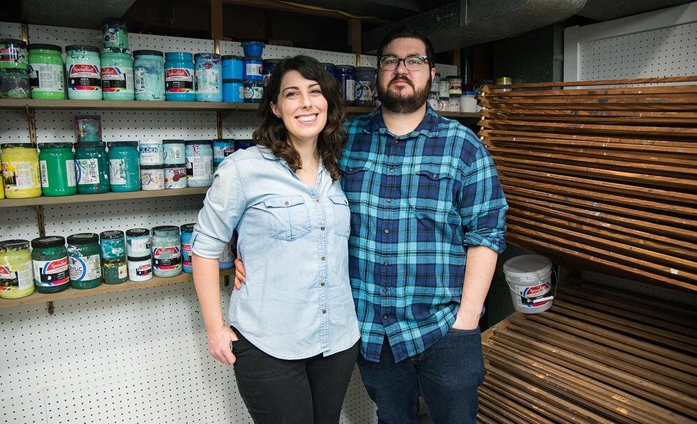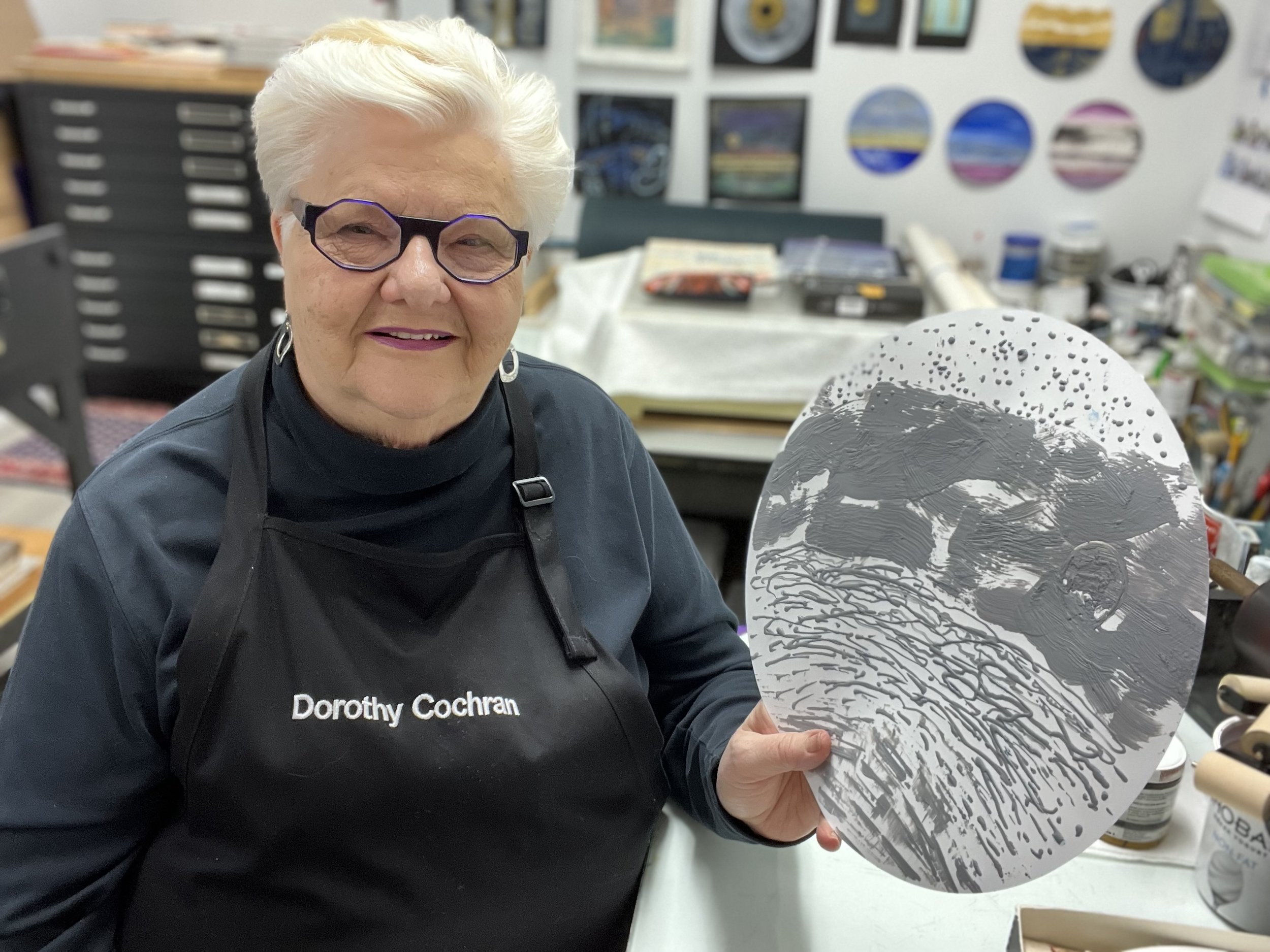
Tell us about yourself and your work.
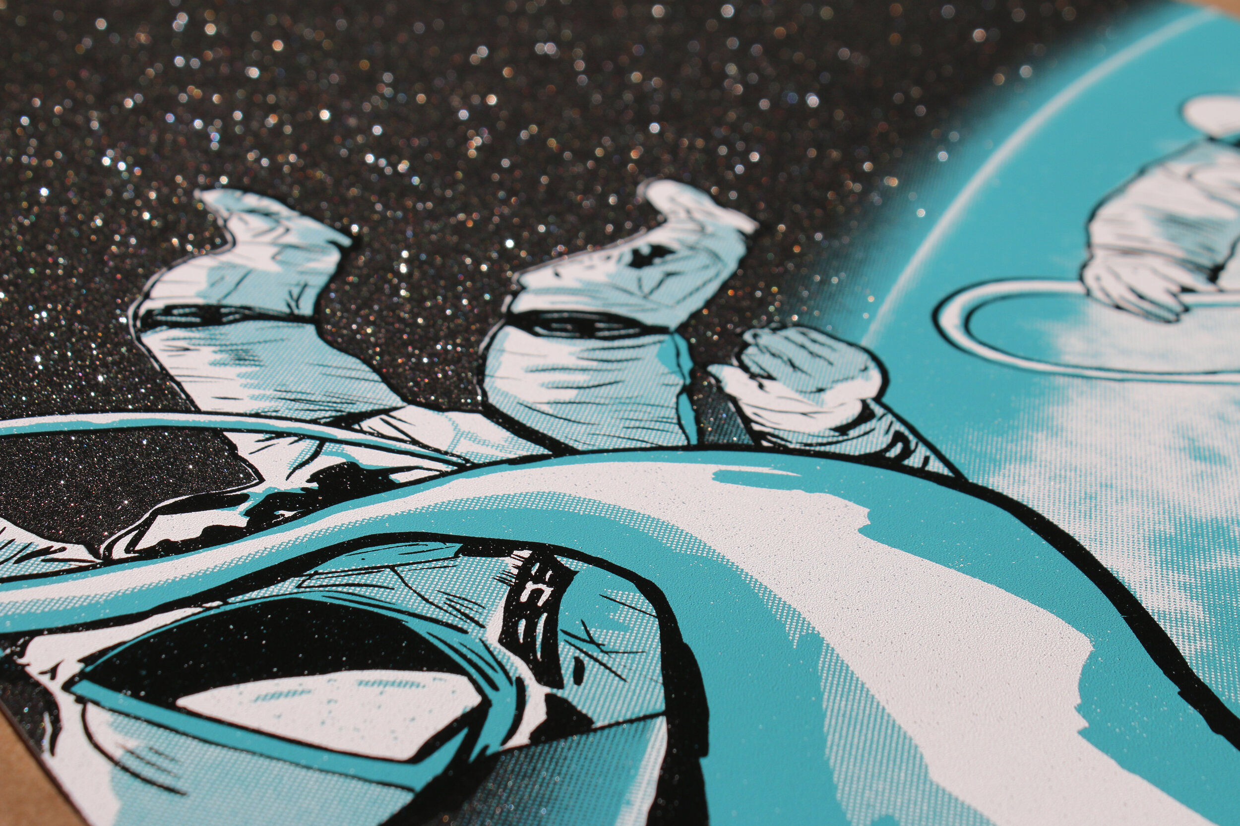
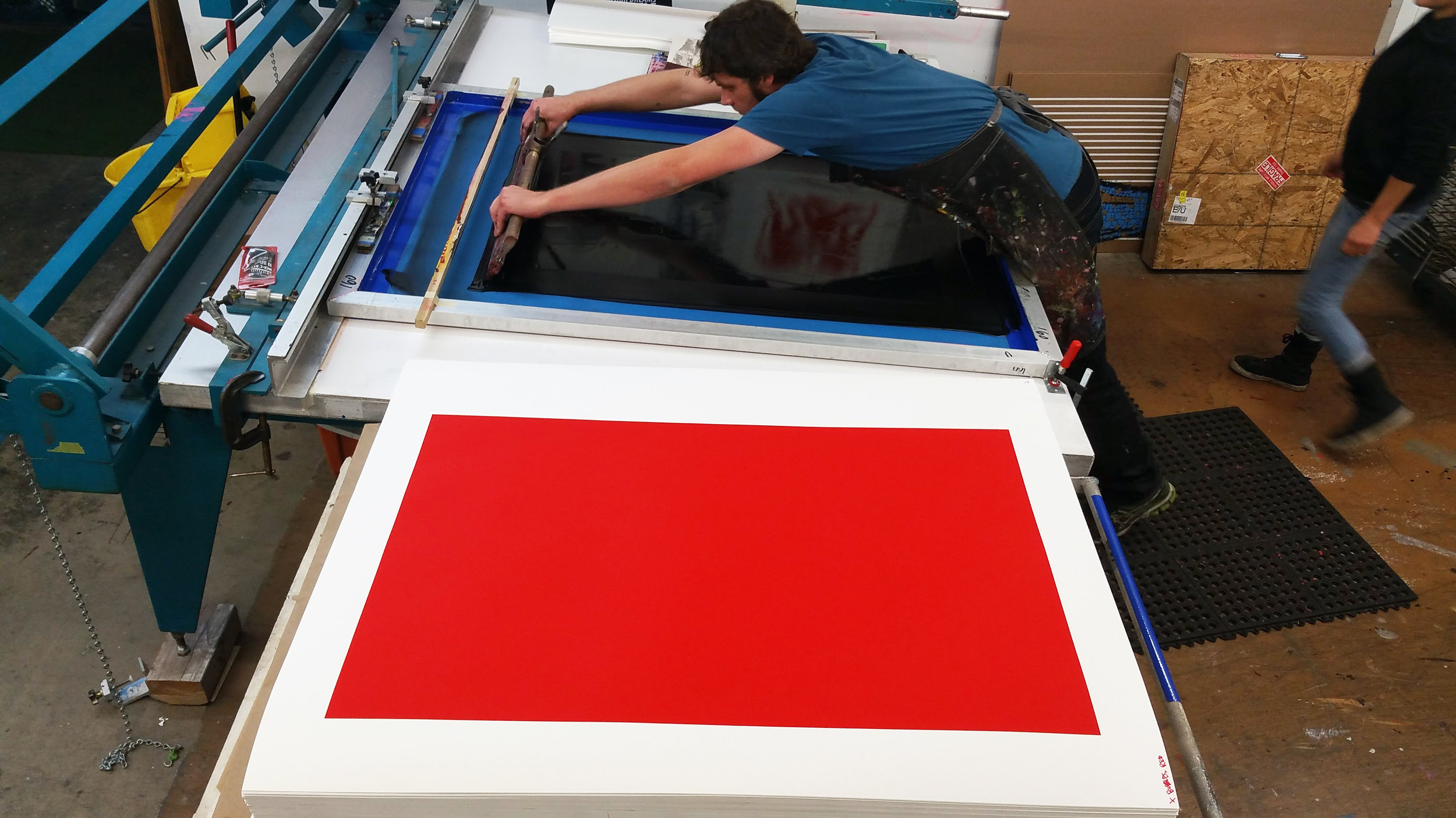
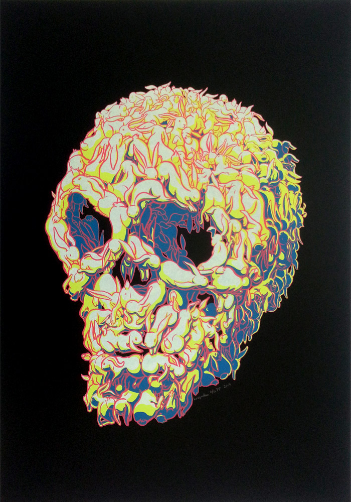
I am a long-time professional painter/printmaker working in a broad range of print techniques. I specialize in using innovative processes to update traditional ways of making a printmaking plate in my studio practice. My works on paper are primarily focused on relief and intaglio methods which include monotype/monoprint and collagraph to name a few. Ten years ago, I discovered encaustic (hot wax) and added those methods to my practice. Printmaking processes excite me, and I enjoy sharing my knowledge with other artists. There is magic in the pressing of paper to plate, a birth and a marriage all at once. Experiencing that emotion is like no other and is central to my artmaking. I am inspired by the working of solar systems, metaphysical thought, microscopic science and the bounty of nature. My teaching experience encompasses universities, museums, art centers and national workshops. I currently work at the Montclair Art Museum in NJ and do online and in person workshops throughout the country.
What are your go-to materials?
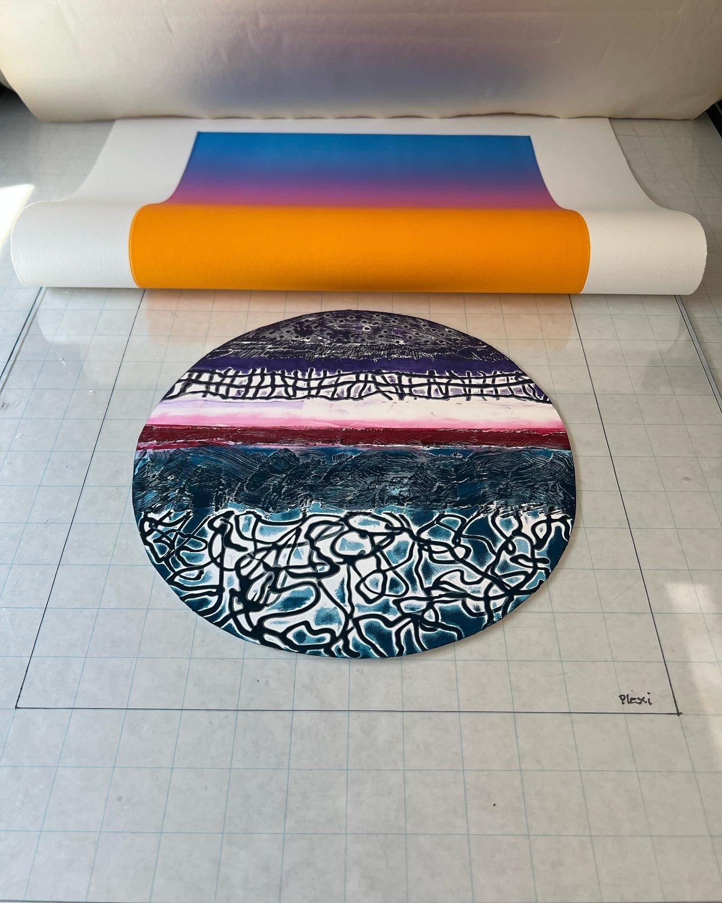
I just love YUPO! More than ten years ago, I happened to view a watercolor done on it while traveling in California. I researched the material and tried to imagine how I could use it with printmaking. I began experimenting with watercolor and various inks using YUPO as a monotype plate, both with a press and hand printed. Later I combined other types of print plates using the YUPO to print multiple colors and shapes in layers. Most recently, I have been making encaustic collagraphs with YUPO as the substrate, printing them as intaglio and/or relief using traditional and non-traditional papers including Evolon.

What is the most important characteristic of a paper for you?
There are many reasons why I choose to work with a paper. It must be archival and stand the rigors of the various print techniques I use. This is even more important when I choose to use it as a plate.
What is it about Yupo. That works well for your artwork/style?

I have been working with YUPO for many years now and enjoy its tough smooth surface. Depending on my process, I will choose either the light or heavy weight to use. My plates are often used over and over making the cleaning and storage of the YUPO plates both easy and a pleasure. Cutting the YUPO is simple with scissors or knife blade for stencil making and shaped plates. I like the different sizes which come in pads, sheets and rolls which I find convenient for myself and for my students. As my iconic works are circular in nature, the recent YUPO precut circles save me lots of time when I am layering plates and don’t need to cut them.
Any advice for artists using Yupo?
LOL, yes!! If you are interested in printmaking, take the YUPO and do things to it and then do some more! I have successfully experimented with creating dry points, adding carborundum, acrylic gels and making shaped plates and stencils. I highly recommend using YUPO to create wax print plates that are collagraph like with their high/low textural surfaces. The wax cools immediately and the plate is ready to ink and print quickly. There is no end to the possibilities with making YUPO work as a plate in print processes. I hope you look me up and take a workshop or let me give one to your group!