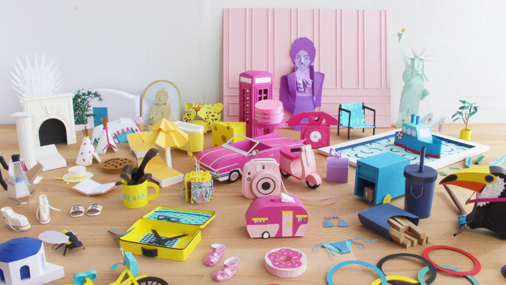
Lorraine Nam is a Paper Illustrator based in Brooklyn, New York. She creates 3-dimensional paper objects for photographs and animations. Lorraine started the 100 Days of Paper project with a set of papers she discovered after scouring the Legion's paper heaven (or sample room). From the thousands of papers, Lorraine chose to use Colorplan, Mirri, Rising Museum Board and Plike for the project.
How did you get into paper sculpting?
My background is in illustration and while I was at art school at RISD, I started experimenting with using paper as my medium. I first used paper as my base and starting cutting into it to create these intricate cut paper pieces. After that, I started experimenting with what I could do with paper and it evolved into more of these 3-dimensional forms. That was about 3 years ago and I've been working with 3-Dimensional paper ever since.
What was your inspiration for the 100 days project? What motivated you from start to finish?
I first heard about the 100 days project through Elle Luna, who started the movement. She challenged people on Instagram to start a project and work on it for a consecutive 100 days. I had seen many people that I follow on Instagram start the project and grow their skill and I wanted to see what I could learn from this experience. Now that I'm at the other end having finished the project, I am really proud of what I was able to accomplish. My skill level has grown and I am much faster at finishing a piece. What kept me going was knowing how accomplished I would feel at the end of the day. To tell the truth, there were definitely plenty of days where all I wanted to do after working 9-5 was sit on my sofa, watch Netflix, and zone out but I realized that even if I worked on something for 30 mins or an hour, I would feel much more accomplished about my day.
How did you choose among our thousands of papers? Which papers did you end up choosing?
That was the hardest part! A lot of the papers I chose were from the Colorplan line which has a great selection of colors and weight - both factors that are really important to me when I work on a piece. Another line that I loved using was the Brillance line of Mirri Sparkle, a glitter paper, and Plike (a matte, rubbery paper) that made all the dark blacks really matte.
Which piece was most difficult? Which was your favorite?
My most difficult piece was the convertible car and while it was not actually too difficult to make, it did take me longer than expected to complete (3 days).
How did the paper effect the piece you were creating?
After I decide on what I should make and any sketches that happen, the first decision I make is color. I start to build a color palette by pulling all the sheets of colored paper together to make sure they sit nicely and think about what color the body of whatever I'm making is. Then I think about the weight or the thickness of the paper. If it's something that needs to stand on its own or hold something up, I choose a heavier weight. In terms of texture, I tend to gravitate towards smooth papers which are easier to glue together. The glittery paper was difficult to glue but it was just so pretty that I had to use it!
What’s next?
I'm getting ready to open my studio doors for Bushwick Open Studios the first weekend of October! I've done it for the past 2 years and it's always a fun time. It's really great to talk to people in person about my work and share ideas. In terms of projects, my sister and I have been talking about doing a collaboration. She's a hand letterer so we're thinking of combining type with paper and coincidentally, she's also started the 100 days project recently which I like to think I helped inspire.
Ilootpaperie chose Mirri Pak Silver 16pt for their National Stationery Show Class of 70' trading card. The reflection of the Mirri Pak along with the design gave the card the full 70's effect.
How did you come to select the paper you used? Have you worked with it before?
When we found out that we could choose any of the stock from Legion Paper - we eagerly scoured the offerings like kids in a candy store; there were so many and all so beautiful! Although we had never worked with the Mirri Pak Silver 16pt, it stood out immediately as we thought it really embodied the theme of NSS Class of 70s, conjuring up visions of disco balls.
What was your experience with the paper?
We loved it - it was really fun to play around with such a different paper stock.
How did the paper affect the design of your baseball card?
It really enhanced and elevated our trading card design - it allowed us to achieve a similar impact of foil printing but in a different way altogether. So funky! For another layer of pop, we were really excited to be able to experiment with printing white ink on the Mirri as well. We felt all these elements really took Pierre our Bandit's rookie card to the next level.
What print methods did you use and what worked well with the paper? Any particular challenges?
Our trading cards were printed using the HP Indigo Digital printer; we did ask Legion Paper to provide the version of the Mirri Pak with the sapphire coating that is required for paper used with HP Indigo printers. Once we got the paper with the Sapphire coating - the ink coated on beautifully.
Legion's honored Masthay Studios has chosen to print their incredible hand carved letterpress posters on some of our papers. The unique process tells a great story. Read about it in an interview with printmaker, AJ Masthay.
Could you start by introducing yourself and Masthay Studios?
Of course, my name is Aaron “AJ” Masthay and my history as a printmaker goes back well over 20 years. In 2001 I founded the boutique letterpress shop Masthay Studios where I specialized in creating our unique brand of hand carved letterpress gig posters. My shop is currently based out of Hartford, CT where we service clients in the music and special event industries from across the country and internationally.
How did you get involved in concert and event printing? How do you make an old concept into modern day art?
Excellent questions as the answers to both are inherently tied together. I attended the Hartford Art School back in the mid 90’s where I learned all the classic printmaking techniques - etching, lithography, relief printing, etc. The only medium I was not exposed to is the same medium that is the industry standard in gig posters - silkscreening. My primary focus in school was lithography, using both stones and plates. If you had told me back then that I would make a name for myself doing relief printing I would have laughed.
There’s only one thing that rivals my love of the visual arts, and thats my love of live music, specifically the jamband scene (Grateful Dead, Phish, etc). Being a poor college student at the time, I noticed that people often created and sold artwork at these concerts in the parking lots prior to the event. I figured “I can do that” and began seeking out a printing press of my own. Due to my ignorance of silkscreening, I leaned towards relief printing as a fairly quick and inexpensive way to set up a functioning print shop. With the help of one of my printmaking professors I tracked down and purchased my first press, a Vandercook Universal I. I spent the next few years honing my craft and striving to push the boundaries of the medium, that and following bands around the country. Over those years I was lucky enough to develop an audience for my work, people began collecting my prints and actually seeking me out at the concerts to purchase them in person. I eventually began being contacted by bands and merchandise companies asking to create editions for their concerts, exposing my work to an even broader audience, and gaining more clients. As they say, the rest is history.
Where can people find and purchase your prints?
My work can primarily be purchased online, either through my own website Masthaystudios.com or through my gallery representation at BottleneckGallery.com. Facebook, Twitter and Instagram are all great ways to keep informed of new works being released from the studio and to see works in progress. We also send an email newsletter if someone is so inclined to subscribe you can do so at http://masthaystudios.bigcartel.com/email-signup.
What processes do you use? Could you tell us about ‘suicide printing’?
I specialize in reduction linoleum block prints. It’s a process where I not only hand carve my plate from a sheet of linoleum, but I go back and carve away at the same plate between each color. This is where the nickname “suicide printing” comes from, by recarving the plate it makes it impossible to go back and increase the edition size or reprint an edition. Once you make those cuts there’s no turning back…
This process is what sets my work apart in the industry. By layering 7-10 passes of ink on a print it gives my work a physical depth, the inks literally stand off of the paper tempting the viewer to reach out and touch them. I also use oil based inks which give my work a high gloss finish, incredibly vibrant colors and an aroma that my hard core collectors cherish almost as much as the visual art.
I’ve created numerous videos explaining the process behind my work, they can be viewed through my Youtube channel at https://www.youtube.com/user/ajmasthay. Each edition is handcrafted from start to finish, truly a labor of love.
We love to hear you are using Stonehenge for most of your prints. What parts of the process work particularly well with Stonehenge? Are there any challenges?
Stonehenge is my “go to” paper stock for the majority of my main editions. It has the perfect blend of strength and absorbency to handle the multiple, thick layers of ink that I apply. It also has the structure to withstand the rigors of being run through my press on numerous passes. I tend to treat my gigposters more like fine art prints so the fact that it is made with 100% cotton rag is important to me and the deckle edge has become a signature of my work, again not something normally seen in the poster world.
Do you use different shades of Stonehenge? If so, how do you match the colors with the design of the print? Which shade is your favorite?
I primarily use the warm white shade of Stonehenge as it really compliments the bright colors I tend to use in my work. I did just recently use the creme color stonehenge on a collaboration print with another well known Grateful Dead artist, Richard Biffle. We wanted to keep this print simpler in design and color scheme so it was important that the paper act as an additional tone in the piece, making the creme a perfect choice.
How does the Stonehenge paper affect the design/your personal style?
I actually don’t just print on Stonehenge, I also do my initial sketches and drawings on it. My entire printmaking process starts with a full scale drawing of the image in pastel and charcoal. It’s an important step as this chalk drawing is then literally run through my printing press onto a blank sheet of linoleum, leaving a reversed image on the plate and essentially creating a roadmap showing me where to carve each color. By using Stonehenge from initial concept to final product I know what the results will be, there are no surprises… usually - this is printmaking after all.
What processes are you using on Mirri Paper? How do you revolve your design and print methods around Mirri Paper?
The Mirri papers are some of the most exciting paper stocks Ive seen in some time. In my industry there are a few different print categories within an edition. There’s the Show Edition - the prints sent to the band to be sold at the venue during the event, the Artist Edition - a small run of the edition designated for the artist to sell, and variants. Variants are extremely small runs, sometimes single prints, within the edition. They typically are on different, more funky, papers which make the Mirri product line a perfect choice. Since many of my inks are transparent and allow the paper to show through, these variants require additional white base layers of ink to be laid down in order to get true colors. But for some stocks such as the Mirri sparkle or the holographic foils, areas of the base layers are carved away to allow the paper to clearly show through in the finished image. These create some amazing effects and when paired with the small print runs, producing some of my most sought after and collectable prints of each edition.
Anything else you think is important to include that the art community might want to know?
I’d just like to say what a pleasure it’s been working with Legion. I am being exposed to new products that pair perfectly with my work and help me to continue to push the boundaries of my medium. It’s certainly a partnership and collaboration I look forward to continuing.
English wine producer Hush Heath Estate has created a limited edition presentation box housing 1 bottle of Balfour Brut Rosé 2010 and 2 Balfour Crystal Glasses. The gift set is sold at £76 and produced in the traditional Balfour brand colours of copper and green.
Balfour Brut Rosé 2010 is produced on the Hush Heath Estate which dates back to 1503. Located in the Kent countryside, Hush Heath Estate is the only English vineyard dedicated to the creation of Rosé sparkling wine.
The presentation box was cardboard engineered by Concept Packaging Ltd using Mirri materials. The box design was printed onto Mirri Pak Ultra 315mic silver material, which was mounted to a 1500mic white lined Smurfit Kappa greyboard. The internal fitment holding the bottle and two glasses was printed on MirriNor.
MirriNor is a silver laminated board that combines a high quality, metallic film from Mirri with a Smurfit Kappa patented microflute corrugated board. MirriNor is a strong, lightweight material. A 2 sided MirriNor 800mic material was used for the presentation box. As it is metallic both sides, the board could be folded to hold the glasses and bottle and reveal a metallic effect throughout, adding to the level of presentation. The MirriNor fitment was printed both sides in Balfour branded colours.
Hush Heath Marketing Manager Hilary Green commented, “We chose Mirri because it’s a fantastic material to communicate the premium nature of this presentation gift pack. The MirriNor fitment inside holds the wine and glasses in place securely and matches the metallic effect on the outer box perfectly, producing an overall sophisticated luxurious result”.
The artwork was processed using Color-Logic at the repro stage, allowing for the metallic colours to be referenced and reprinted on future production runs using the Color-Logic design suite. The box was UV litho printed and varnished inline by Color-logic licensed printer Oriel, based in Hull.
Richard Gillgrass, Managing Director at Celloglas and Mirri commented, “The Balfour Brut Rosé gift box combines two Mirri materials to create a stunning result. Mirri is a popular choice for premium gift packaging across many market sectors including high end drinks, cosmetics and confectionary. This is due to it’s high quality nature and wide range of metallic options available”.
500 copies of the limited edition presentation box were produced and are now on sale via the Hush Heath website shop www.hushheath.com
 How did you get into paper sculpting?