What is your go to paper? Why?
Coventry Rag Smooth. It’s a durable, stiff and smooth paper that is easy to print on because it doesn’t warp when laying down a lot of color. Also is economically priced.
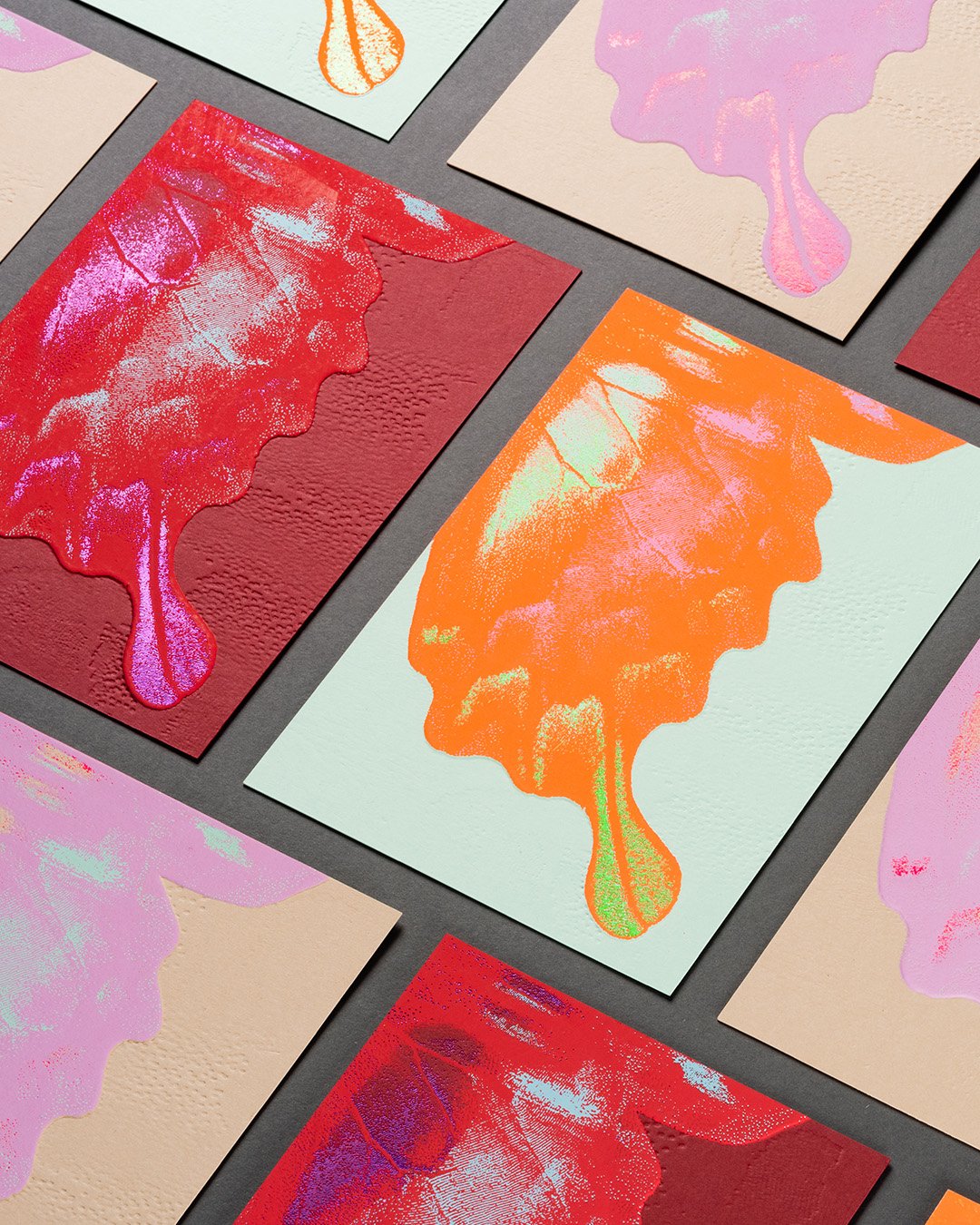
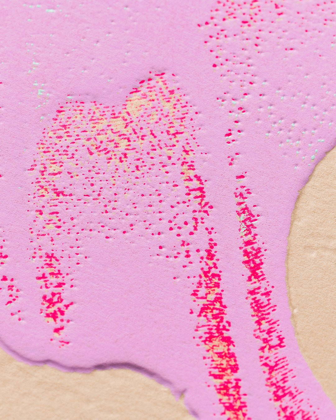
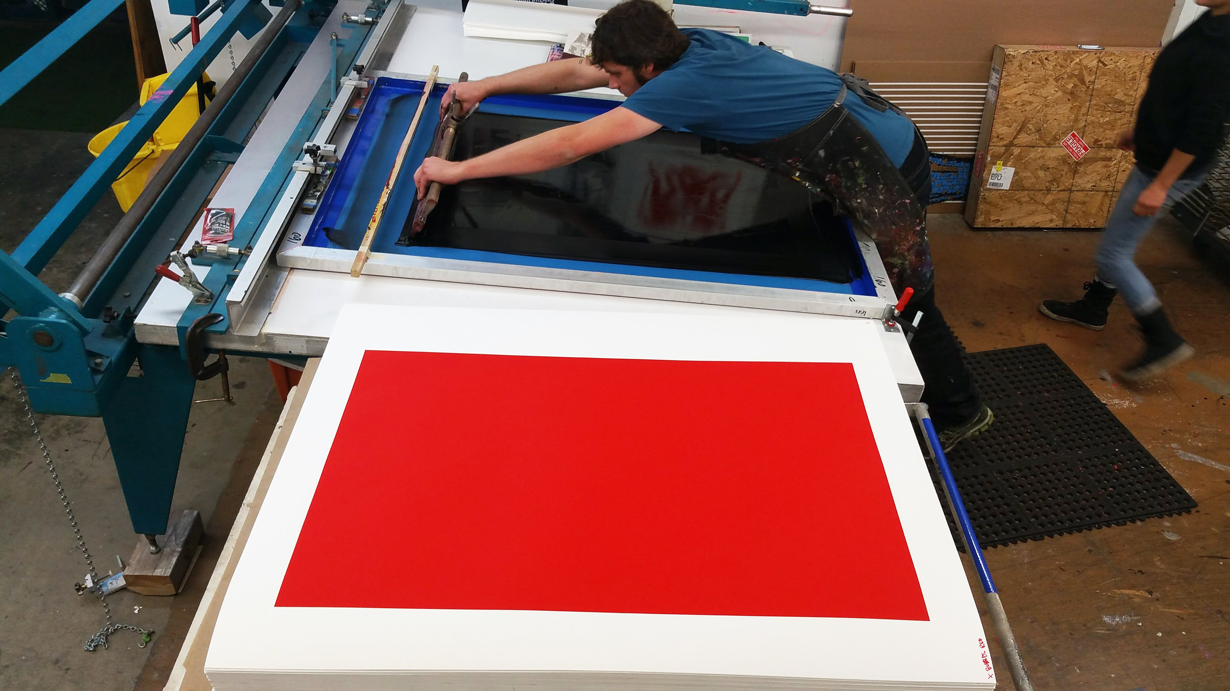
With lower quality papers one runs the risk of what we call "potato chipping" where the forces of expansion and contraction of multiple coats of ink warp the paper. Because we are printing with water-based inks and often trying to lay down large fields of color, paper stability is key to a positive end result.
What are your alternatives?
I prefer papers with a smooth finish like Coventry Rag Smooth or Somerset Satin. The smoothness allows me to apply less pressure. After that, Somerset Velvet, with a bit more tooth, but never a paper with a heavy texture.
We use Rising Museum Board when we need to go big. The fact that you can go all the way to 60"x104" really helps when an edition has a lot of colors; sometimes exact registration of paper from a roll is challenging.
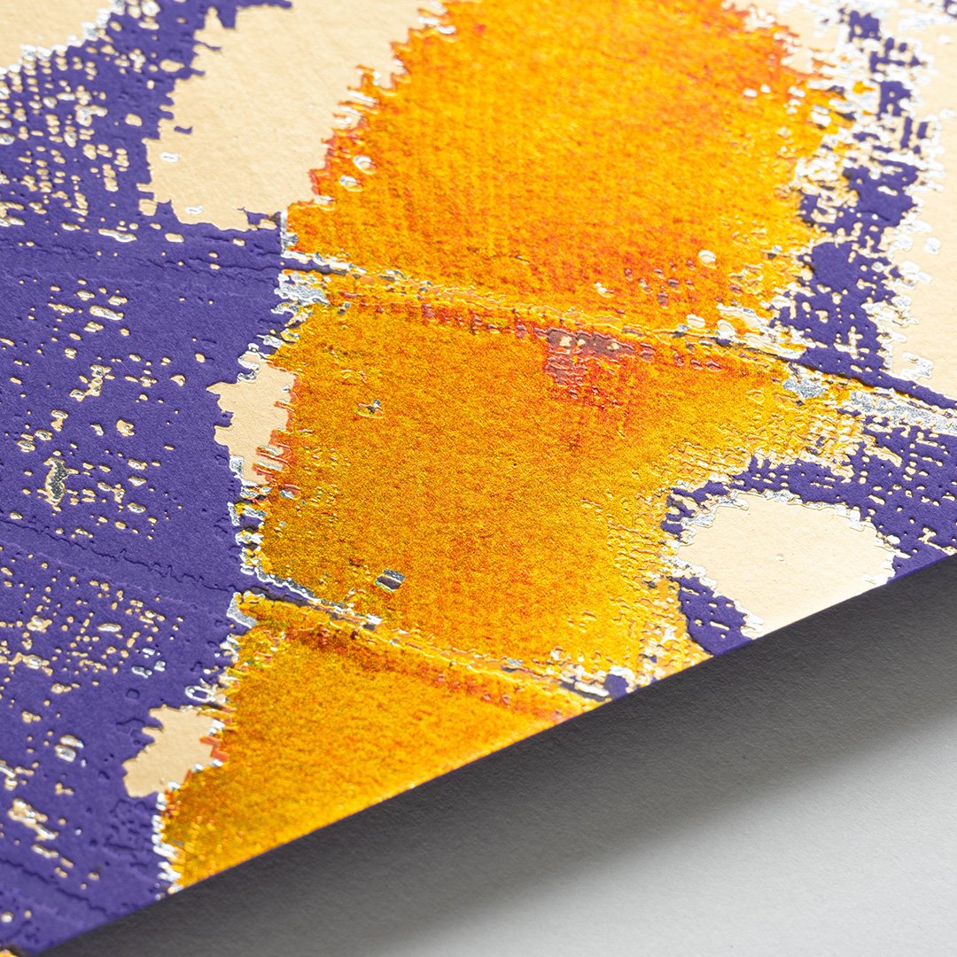
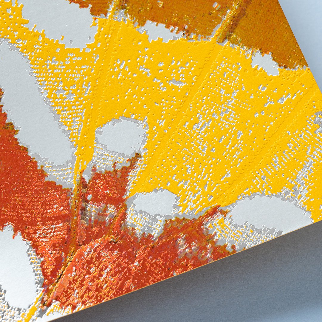
We also used Mirricard Gold recently because it is more gold than any of our inks are available in. It really makes a project pop.
What current trends are you noticing?
Artists like the brightness of the Somerset Radiant White and that it’s a 100% cotton and acid-free paper. Papers that will stand the test of time and that are 100% cotton are important. They also look for something that feels substantial, or has a heavier weight. I find artists printing their work by silkscreen want to stand apart from the digital trend. There’s nothing like Somerset Satin for quality.
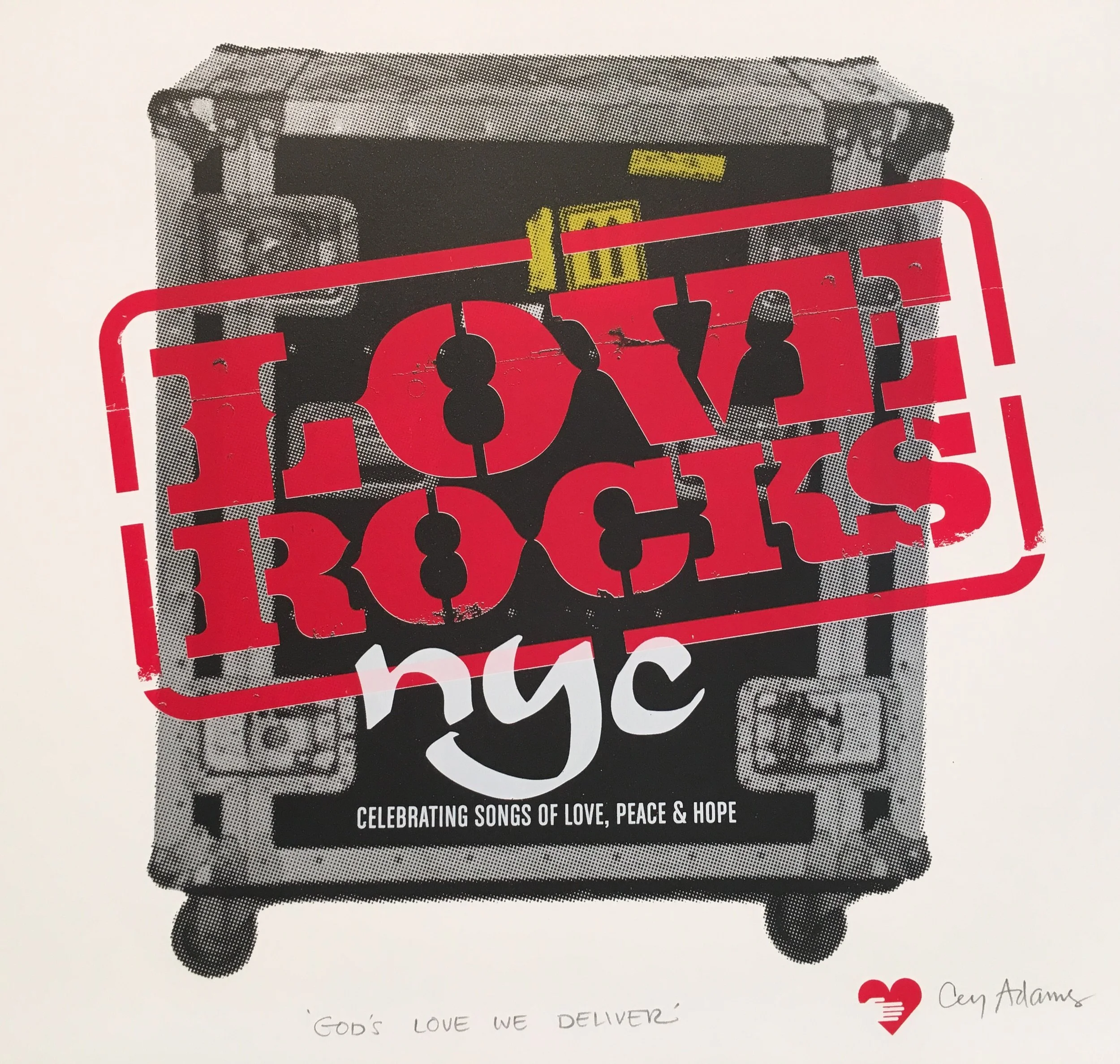
What are the most colors you’ve laid down on a sheet?
220 colors is our record. It was on Rising Museum Board 4 ply 40”x60”.
Do the artists choose papers according to their own style? What do the artists look for in a paper as opposed to the printer?
We do try to match the aesthetics of the artists, but on a paper like Coventry, we could most likely match the look of their work or what they’re trying to achieve creatively.
From the grand catalog of papers, we default to smooth, strong, heavy papers that hold color.