letterpress

Get the Scoop on Strathmore Pure Cotton from Color Box Design & Letterpress

It was great to celebrate the 70th anniversary of the National Stationery Show with the Class of 70' trading cards! We loved how the set came together. Now let's see what the participants thought...

First up, Color Box Design & Letterpress going neon with Strathmore Pure Cotton Chino

How did you come to select the paper you used? Have you worked with it before?

I have worked with Strathmore Cotton, but not this color. Since we are a letterpress printer I love soft papers that will allow a nice impression which the Pure Cotton paper does!  It’s so nice that more cotton papers are being introduced and with color, it’s something we’ve been missing for a while.

How did the paper affect the design of your baseball card?

I love to work with colored papers to see how the color changes based on the paper color, I used fluorescent inks to get the color as bright as possible on the Chino color. I like the way it is muted and bright all at the same time.

What print methods did you use and what worked well with the paper? Any particular challenges?

My card was printed letterpress on one of our Vandercook 4 proof presses, I chose the paper because I knew it would work well with letterpress. 

I didn’t have any challenges at all.

California Takes on Sirio Ultra Black

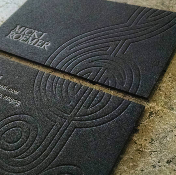
We were excited to see the new Sirio Ultra Black this year in our 5th annual National Stationery Show scavenger hunt and even more thrilled to hear the reviews from designer Brad Woods at Maginating and printer Ronnie Williams from DeFrance Printing. This intense shade of black performed incredibly to create a clean and rich piece.

Why did you choose this paper?

We chose it because Marc recommended it. For the past couple of NSS/Legion promo pieces, I've contacted Marc, asked him what paper he would recommend, and go with his recommendation. Simple as that!

Is this your first time working with the paper?

It sure is!

How did the Sirio effect your design?

Design wise, it was a blank slate until I knew which paper stock we'd be using. Once we knew it was going to be this ultra-rich 680 GSM Sirio, I felt it would be striking it we kept the design fairly simple: let the contrast between the paper and two colors of foil tell the whole story.

When you're dealing with a colored paper as rich as the Sirio, you know that a large part of the design is the paper itself. And if you know what it's like to work with black stock, the simplicity tells a pretty compelling story. We'd worked with other thick, black stock in the past and it had been a bit of a mess. In fact, with the other paper, we'd had to slip-sheet each piece just to keep things clean. Over time, the paper began to show through both colors of foil! This is not the case with the Sirio. It's very clean and very dark. Initially we wondered if we'd encounter a problem with the white foil, particularly since the edges of the lettering would have nowhere to hide. But it wasn't a problem. Ever. That may partially be due to the fact that we work with one of the best letterpress printers in the country, DeFrance Printing. But Ronnie Williams, General Manager (and master letterpress printer) told me there were simply no issues with either the white or bronze foil - and there's a pretty decent amount of coverage with the bronze foil. It was a low-maintenance paper that was extremely flexible with the foil's adhesive. They didn't have to use any special foil, it was a standard off-the-shelf stock.

Would you recommend Sirio to other printers/designers?

Absolutely - you will not be disappointed!

National Stationery Show Scavenger Hunt Kicks off Tomorrow!

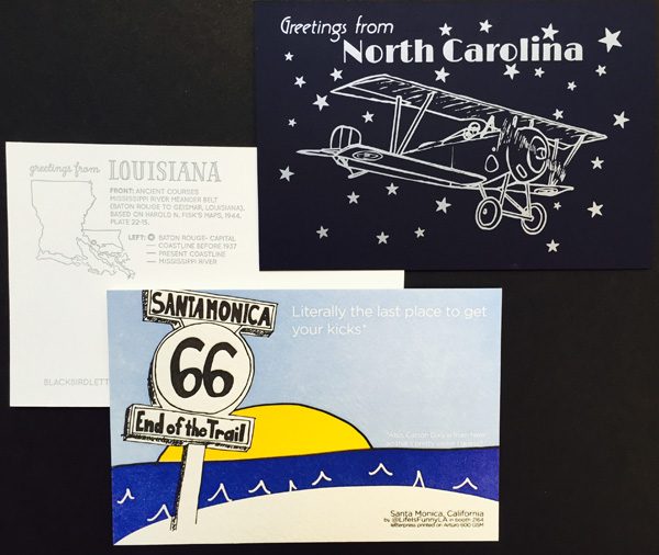
The National Stationery Show begins tomorrow, May 17th. Stop by any of the exhibiting booths for a checklist to begin the search! Once you have successfully visited and collected the designers post cards, head over to the Legion booth (#2774) to stash your cards away and collect the post cards of the participants that couldn't make it to the show this year. 

Greeting from: Lady Pilot Letterpress from North Carolina using Plike, Blackbird Letterpress from Louisiana using Savoy, and Life is Funny Press from Sant Monica using Arturo.