NSS

NSS 2017 Promotion: Show us the Money!

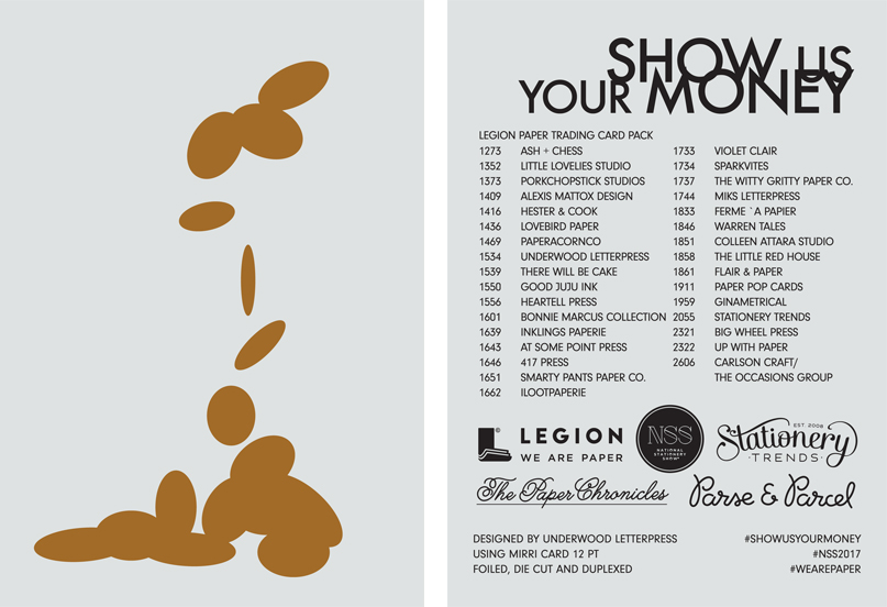
We're getting ready for yet another National Stationery Show promotion project with Sarah Schwartz from The Paper Chronicles and Stationery Trends, Jill DiNicolantonio from Parse and Parcel and NSS. After working with 32 designers, the set is almost complete and ready to go for the show. 

Attending NSS? Here's the deal...

Collect the trading card from each participating exhibitor using the checklist designed by Underwood Letterpress. Once you've collected all 32, bring them to Legion's booth (Booth 2633) to stash your money in the wallet beautifully designed by Reyn Paper Co and printed by Henry + Co. 

Don't forget to snap a photo of your set and tag us @legionpaper ! 

Arturo Stats with Good Juju Ink!

Good Juju Ink chose Arturo Buttercream 260gsm for their NSS Class of 70 trading card. Here's why...

How did you come to select the paper you used? Have you worked with it before?

I selected the Arturo Buttercream because I've only had a limited experience working with colored paper as a medium for dual printing processes (foil stamping + four color digital), and I was genuinely excited to use this project as an excuse to branch out from what I'm used to! In this particular situation, I wanted a yellow paper with texture to give the trading card that "old school"/vintage vibe of ye olde paper goods. I wanted an authentic mellow yellow for our class of '70!

What was your experience with the paper? 

Since I'd never used the Arturo Buttercream, I was a little skeptical of how it would take to the digital printing...but it turned out spectacularly. The colors showed up crystal clear and maintained the richness of pigmentation they would have had on white paper, and the "Golden Gate Bridge" orange foil pressed beautifully atop the texture of this thick stock. 

How did the paper affect the design of your baseball card?

While I created the design before I knew what paper I would be using, I can honestly say the paper was what made the card's design truly some of my best work.  It has given me the confidence (and the excitement!!) to move forward with using more colored papers in the future.  The paper adds such a level of sophistication, whimsy, and genre authenticity that you simply can't reproduce using your average printer's house stock---I can't believe I haven't dabbled in the realm of colored papers until now. This could not have been a better experience. 

ilootpaperie Made the NSS Class of 70's Trading Cards Shine


Ilootpaperie chose Mirri Pak Silver 16pt for their National Stationery Show Class of 70' trading card. The reflection of the Mirri Pak along with the design gave the card the full 70's effect. 

How did you come to select the paper you used? Have you worked with it before? 

When we found out that we could choose any of the stock from Legion Paper - we eagerly scoured the offerings like kids in a candy store; there were so many and all so beautiful! Although we had never worked with the Mirri Pak Silver 16pt, it stood out immediately as we thought it really embodied the theme of NSS Class of 70s, conjuring up visions of disco balls.  

What was your experience with the paper? 

We loved it - it was really fun to play around with such a different paper stock. 

How did the paper affect the design of your baseball card? 

It really enhanced and elevated our trading card design - it allowed us to achieve a similar impact of foil printing but in a different way altogether. So funky! For another layer of pop, we were really excited to be able to experiment with printing white ink on the Mirri as well. We felt all these elements really took Pierre our Bandit's rookie card to the next level. 

What print methods did you use and what worked well with the paper? Any particular challenges? 

Our trading cards were printed using the HP Indigo Digital printer; we did ask Legion Paper to provide the version of the Mirri Pak with the sapphire coating that is required for paper used with HP Indigo printers. Once we got the paper with the Sapphire coating - the ink coated on beautifully. 


Get the Scoop on Strathmore Pure Cotton from Color Box Design & Letterpress

It was great to celebrate the 70th anniversary of the National Stationery Show with the Class of 70' trading cards! We loved how the set came together. Now let's see what the participants thought...

First up, Color Box Design & Letterpress going neon with Strathmore Pure Cotton Chino

How did you come to select the paper you used? Have you worked with it before?

I have worked with Strathmore Cotton, but not this color. Since we are a letterpress printer I love soft papers that will allow a nice impression which the Pure Cotton paper does!  It’s so nice that more cotton papers are being introduced and with color, it’s something we’ve been missing for a while.

How did the paper affect the design of your baseball card?

I love to work with colored papers to see how the color changes based on the paper color, I used fluorescent inks to get the color as bright as possible on the Chino color. I like the way it is muted and bright all at the same time.

What print methods did you use and what worked well with the paper? Any particular challenges?

My card was printed letterpress on one of our Vandercook 4 proof presses, I chose the paper because I knew it would work well with letterpress. 

I didn’t have any challenges at all.

Collect your Class of 70' NSS Cards

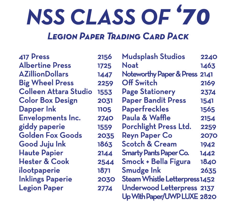
We are gearing up to celebrate the 70th anniversary of the National Stationery Show with Sarah Schwartz from The Paper Chronicles and Stationery Trends, Jill DiNicolantonio from Parse and Parcel and NSS. We've been working wtih 30 exhibitors to create a trading card pack on a variety of papers distributed by Legion and we couldn't be more excited to share the complete set.

Attending NSS? Here's the deal...

Collect the trading card from each participating exhibitor. Once you've collected all 30, bring them to Legion's booth to stash your cards in a match box beautifully designed by Reyn Paper Co and printed by Henry + Co.