Arturo

Arturo Stats with Good Juju Ink!

Good Juju Ink chose Arturo Buttercream 260gsm for their NSS Class of 70 trading card. Here's why...

How did you come to select the paper you used? Have you worked with it before?

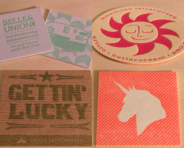
I selected the Arturo Buttercream because I've only had a limited experience working with colored paper as a medium for dual printing processes (foil stamping + four color digital), and I was genuinely excited to use this project as an excuse to branch out from what I'm used to! In this particular situation, I wanted a yellow paper with texture to give the trading card that "old school"/vintage vibe of ye olde paper goods. I wanted an authentic mellow yellow for our class of '70!

What was your experience with the paper? 

Since I'd never used the Arturo Buttercream, I was a little skeptical of how it would take to the digital printing...but it turned out spectacularly. The colors showed up crystal clear and maintained the richness of pigmentation they would have had on white paper, and the "Golden Gate Bridge" orange foil pressed beautifully atop the texture of this thick stock. 

How did the paper affect the design of your baseball card?

While I created the design before I knew what paper I would be using, I can honestly say the paper was what made the card's design truly some of my best work.  It has given me the confidence (and the excitement!!) to move forward with using more colored papers in the future.  The paper adds such a level of sophistication, whimsy, and genre authenticity that you simply can't reproduce using your average printer's house stock---I can't believe I haven't dabbled in the realm of colored papers until now. This could not have been a better experience. 

National Stationery Show Scavenger Hunt Kicks off Tomorrow!

The National Stationery Show begins tomorrow, May 17th. Stop by any of the exhibiting booths for a checklist to begin the search! Once you have successfully visited and collected the designers post cards, head over to the Legion booth (#2774) to stash your cards away and collect the post cards of the participants that couldn't make it to the show this year. 

Greeting from: Lady Pilot Letterpress from North Carolina using Plike, Blackbird Letterpress from Louisiana using Savoy, and Life is Funny Press from Sant Monica using Arturo.

In Light of Spring Weather in NY...Alphabet Cards for NSS!

We are finally starting to see some Spring weather in New York.. just in time for the National Stationery Show coming up in only 12 days! 

I is for Iris Germanica, May Day Studio, Saunders Waterford 140lb HP

U is for Underwater, Blackbird Letterpress, Pescia White 300gsm

B is for Bee, Maginating & Defrance Printing, Arturo Soft White 600gsm

L is for Lake, Paisley Tree Press, Artistico HP Extra White 140#

BINGO Papers...Round Two

On this rainy Thursday (in NYC at least) we're featuring tokens with cheery, bright spring colors.

Today's Bingo Tokens provided by:

Belle & Union, Letterpress on Gmund Cotton New Grey, 222lb

Igloo Letterpress, Letterpress on Gmund Savanna Tindalo, 300gsm

Anemone Letterpress, Letterpress on Arturo Buttercream and Pale Blue, 260gsm

Pistachio Press, Letterpress on NEENAH Printable Blotter, 158lb

Paper Boat Studios, Letterpress and Laminated on Colorplan Amethyst/Lavender and Lockwood Green/Park Green, 350gsm


“Dissolution of a Plant” - a five-color letterpress edition

“Dissolution of a Plant” is an five-color letterpress edition of 100 prints designed by Chicago’s Sonnenzimmer and printed by one of our favorites - Providence’s DWRI Letterpress.  

Measuring 7 x 9 inches, the artwork was printed on Arturo White 300gsm. Each print has been blind-debossed with the edition number, artist’s name, and the insignia of the printer and ships with a corresponding certifiate of authenticity.  

Edition of 100 and available right now at Tiny Showcase.

Thanks to The Poster District for the great find.