Somerset Velvet Black is Back!

stcuthberts_somersetblack.jpg

The long awaited return of Somerset Velvet Black printmaking paper has finally happened. After a 5 year absence, St Cuthberts Mill have reformulated its famous Somerset Black and re-introduced it to the market.

Somerset Black still has a deep warm shade of black, with an even darker core, and its surface retains the beautiful mid-textured finish of the other ‘velvet’ finished in the Somerset range. The internal structure of the sheet exhibits even darker fibers, which gives some dramatic results when laser etched.

somerset_velvet_black.jpg

Somerset Black is an archival sheet made with 100% cotton, being both acid free and fade resistant. It has an alkaline pH, and reaches 6+ on the Blue Wool Scale for fade resistance.

Much work has gone into reformulating the Somerset paper, using new black pigments, to give a sheet worthy to have the Somerset name.

Somerset Black is now available in a 280gsm in 30” x 44” bearing the Somerset watermarks and 4 deckle edges, plus a 22” x 30” sheet with the Somerset watermark and 3 deckle edges.

Somerset Black is suitable for Block/Relief Printing, Embossing, Intaglio/Etching, Hand Lithography, Letterpress, Silkscreen/Serigraphy, Laser Cutting/Etching, and Pastel.

PLI.Ē Project

Paper: Mirri Rainbow

Paper: Mirri Rainbow

The PLI.Ē Project is a series of pop-up events featuring an exhibition of photographs and paper works by artist Pauline Loctin (aka Miss Cloudy) and motion photographer Melika Dez. But it’s more than that. It’s a combination of dance, architecture, movement, design, travel and, of course, paper.

By matching the folds of ballet dancers with the art of folded paper, these two artists offer you a series of photographs taking place in some of the most beautiful cities in the world: Rome, Paris, New York and Montreal.

PLI.É is 14 dancers from 6 internationally renowned dance companies from 4 international cities and dressed in 16 folded and hand-made paper dresses. Each city, paper and dancer were specifically selected to create meaning within each photograph.

Paper: Colorplan (multiple colors)

Paper: Colorplan (multiple colors)

Paper: Colorplan Bright Red

Paper: Colorplan Bright Red

Where the project all began.

(Pauline [PL])

I met a photographer, Melika Dez, that specializes in movement photography, including all kinds of dancing: ballet, street dancing, aerial. After our meeting, Melika came across my installations and paper dresses and asked if I could create some dresses for some of the dancers she works with. I was excited because I’ve never created paper dresses for anyone to actually move in, let alone dance in. And the collaboration began.

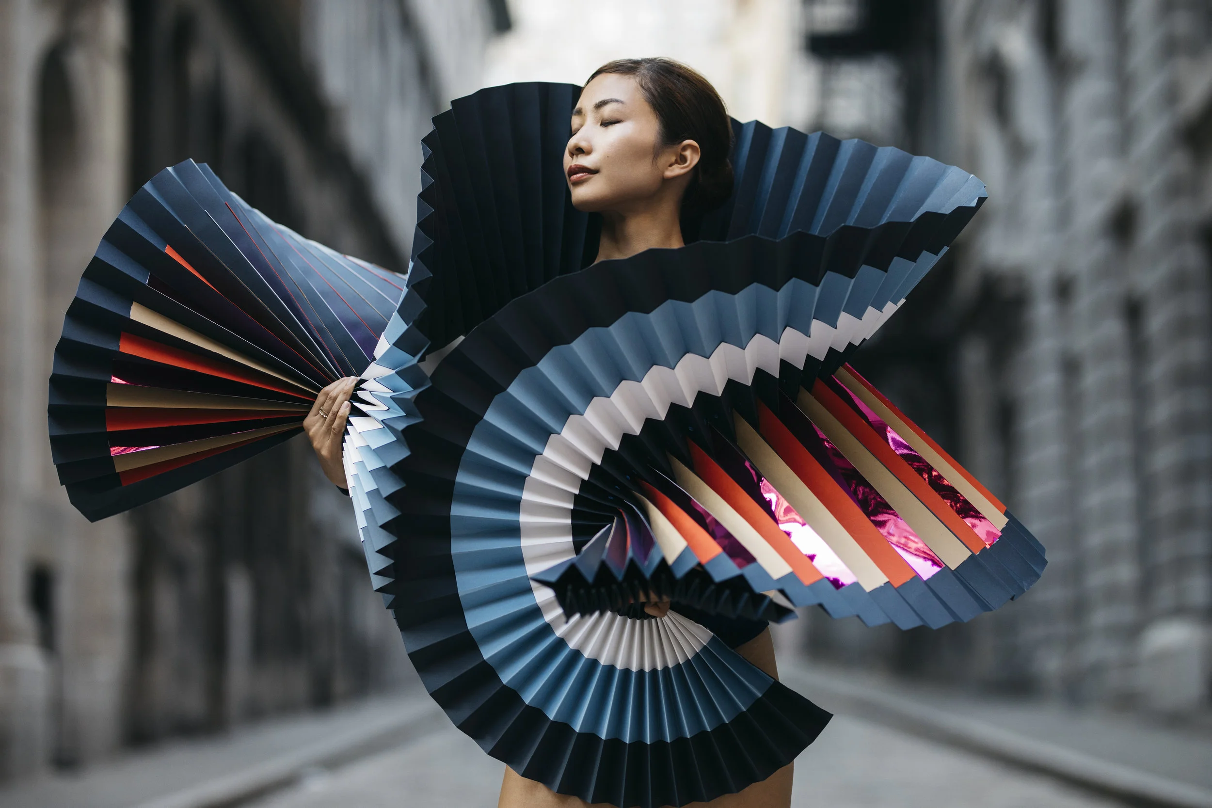
We began with shooting two dancers from NYC, Michael Jackson and Akua Noni Parker, in a studio in Montreal. I created my first white tutu for the dancers and immediately noticed the potential. I wanted to create something even more different, something no one has ever seen before. I needed to steer away from white paper and get involved in more color. So I created colorful accessories, scarfs, hats and masks. I made a large red flower dress, and an African scarf consisting of so many different colors and detail, you could barely tell it was paper.

After a successful photoshoot in the studio, we decided to take it one step further. Melika shoots with a unique style, street dancing, so why not take it to the streets, our first challenge. The street photoshoot would begin in New York City, working with six different dancers. The more costumes I began making, the more I wanted to do. Every time I finished one, I had a new idea. Legion Paper came in just in time after noticing the very start of the project. This is where I was able to take my creativity further, with their endless selection of papers, papers I’ve never seen before. There were so many things to do with this new library of papers. 

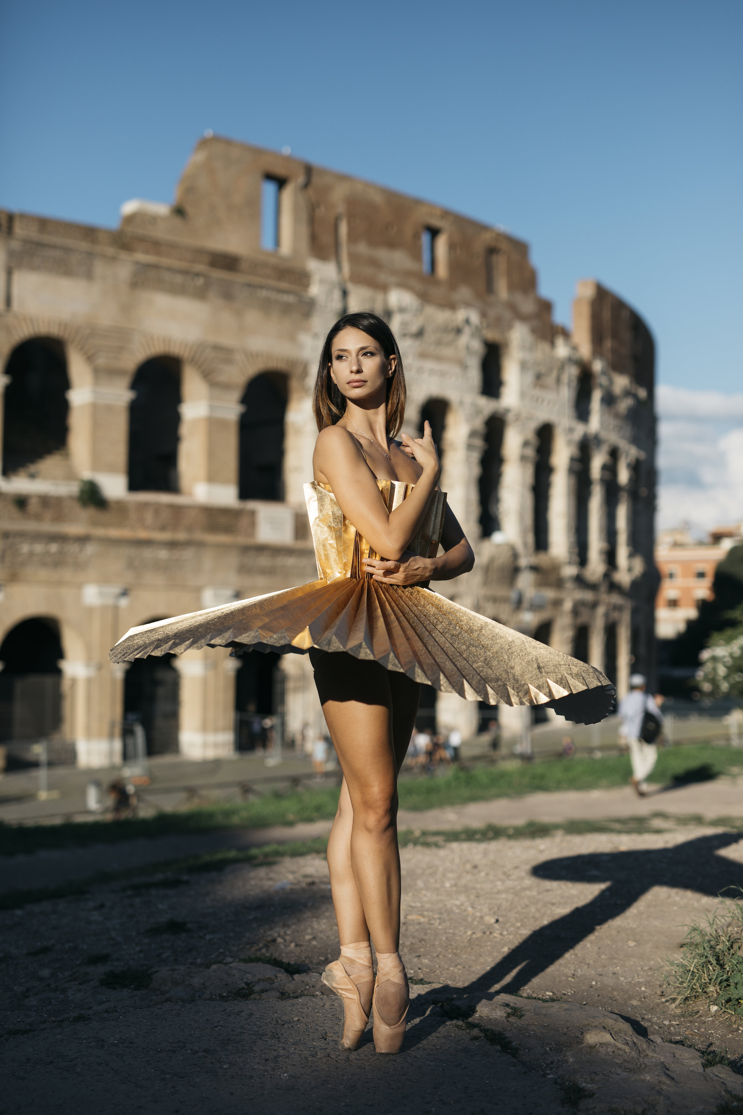
The project began to grow, and new cities were added. The PLI.Ē Project traveled to Paris then Rome, and Montreal, but wasn’t going to stop there. More cities will be added, and the first exhibition is opening in Montreal. It’s just the beginning!

How did Cultural Diversity play a part in the PLI.É Project?

(Pauline [PL] and Melika [MD])

We wanted to highlight the beauty of bodily differences among dancers. Too often, dancers are judged for their body and movements: their color and curves. They spend days looking at themselves through mirrors. Throughout the PLI.É Project, the participating dancers saw themselves in a positive way. Some even say it was the first time they saw themselves in a photo and saw their beauty.

The fragility of the papers accentuates the incredible strength of the dancers. Strength that is also present in their own stories.

Paper: Mirri Gunmetal

Paper: Mirri Gunmetal

Paper: Mirri Gold

Paper: Mirri Gold

Which papers did you use for the project?

[PL]

I started with the papers I had locally. When Legion reached out with my many different papers, there was so much I wanted to do with all the different and beautiful options. It helps with creativity to see all the different paper options in front of you. I had no idea how much variety there is. “Paper” is a very broad term.

I fell in love immediately with all the Colorplan colors. We used so many of them. The blues, browns, reds. We even used several in one dress with imperial blue as the base and colored stripes on top. There are so many papers, but the quality of Colorplan is a step above.

We also used a variety of Mirri Papers. They were so different from anything I’ve seen before. The Mirri card colors used were copper, gun metal, purple, pink and blue. We also used Mirri Sparkle, and Mirri Rainbow. All in the 12pt weight, since it’s not too heavy to fold, or too light for the tutu to stay in place. Mirri reflects light creating a beautiful photograph and stunning tutu.

Papers: Colorplan Bitter Chocolate, Baghdad Brown, Nubuck Brown, Harvest, Stone

Papers: Colorplan Bitter Chocolate, Baghdad Brown, Nubuck Brown, Harvest, Stone

How did the locations and dancers’ personalities affect the papers you chose?

[PL and MD]

Both the place and paper choices strongly effected the effect we were looking for. All components were considered at each photoshoot. We actually chose different papers specifically for each dancer. We wanted to fit the dress to their personalities. Melika said, in her photography, she tends to find a location that suits the dancers and their movements. Each dancer moves differently.

One of the most meaningful photoshoots, was the group shot using flesh tone papers (Colorplan Harvest, Stone, Nubuck Brown). We wanted to steer away from the stereotypical pink tutu. We adapted the color of the paper to the dancers’ skin tone and want to emphasize the beauty of unconventional features as well as the importance of culture. This photoshoot was done in Brooklyn, with the Brooklyn Bridge in the background, surrounded by stone to match the colors of the papers.

We used Mirri Rainbow at key locations in Montreal with skylines and concrete. To us. Mirri Rainbow has a modern look that match the modern buildings of Montreal. We wouldn’t use this type of paper in a place like Rome, where the architecture is older and has an antique feel. In Rome, we used Colorplan Bright Red. We felt red matches the fiery personality of the Italian culture and was the Italian ballerinas favorite color. Lastly, Mirri Sparkle was used in Paris, to make a fashion statement, to symbolize the twinkling lights of the city at night.

Paper: Colorplan White Frost

Paper: Colorplan White Frost

Paper: Mirri Rainbow

Paper: Mirri Rainbow

What worked well with the papers? Any obstacles?

[PL]

Of course, creating dresses or any type of clothing with paper is a challenge… especially when dancers have to move in them!

It actually rained for some of the shots. I was surprised how well the papers help up, especially the Mirri. Colorplan still held together well, but rain was more visible on the paper. The rain did give it a different and interesting look we liked! Most papers wouldn’t have stood up to the rain.

Folding the paper was a lot of physical work, but it all folded very well. This was the way we chose the papers we did.

Sizing the models was another challenge. I used my own body for the fitting and since each model was different, we used Velcro and paper clips to enclose the back. We also added Velcro on the inside at the waist area to make it more comfortable, although there was no complaining of discomfort!

Paper: Colorplan (multiple colors)

Paper: Colorplan (multiple colors)

What’s next?

[PL]

We aren’t finished yet! We would love to add more cities. Possibly London and Tokyo. Also Rio because one of the dancers we worked with was from there. And Cuba, because they have some of the most amazing dancers in the world. We want to open more exhibitions after the first in Montreal in cities all around the world.

There’s more to come!

Mirri Copper

Mirri Copper

Colorplan Harvest and Ebony

Colorplan Harvest and Ebony

The Colorplan Difference

Colorplan - Studio - HR-3.jpg

81 Years in the Making

Since its launch in 1936, Colorplan has been continually refined , perfected, and pushed to its limits; the designers and craftspeople that continue to make it their first choice have played their part too. It performs exceptionally well - on every printing process from letterpress to digital. 

It's made to stand up to endless transformations - from business cards and boxes to paper bags and works of art. It's available all over the world - consistently beautiful on seven continents. And every one of its 50 colors and 8 weights is made, sustainability, in England. Colorplan represents an exceptional achievement in papermaking. 

Here are some of the qualities that making Colorplan the preferred choice.

cpdifference2.jpg

Intense Color Formulas

Colorplan's creation is an exacting art. The 50 colors are a unique blend, mixed from more than 50 high-intensity dyes and pigments supported by creativity, color science and generations of craft. Making each unique blend requires an absolute precision, where the color's formula is standardized within the strictest measures of optical tolerance. The outcome is that every Colorplan shade occupies its own dimension in color space defined by hue (tint), saturation (strength), and value (darkness or lightness).

Critically, the full color is added to the pulp before the papermaking process so that the pigments saturate deep inside the paper fibers helping them resist the effects of UV radiation, so that when the paper is folded, the color runs through the whole sheet. Colorplan's through-the-sheet deep-dyed vibrancy is demonstrated to most powerful effect in the high-octane shades of Fushia Pink, Purple, Mandarin, bringing impact to all applications. 

Purity Principle 

Colorplan White Frost is one of our most popular shades. it epitomizes the critical principle applied to all of our seven whites where every paper in Colorplan's exceptional white range is made acid-free, creating papers of exceptional longevity and opacity, idea when applications demand longer lasting purity and brilliance. These whites are made using pulp that is free of lignin. Present in wood cells, if lignin is not removed, it oxidizes (same chemical process that turns newspapers yellow.) The longevity makes it perfect for use in books, posters and for limited editions prints.

Innovative Chemistry 

Colorplan - Studio - HR-66.jpg

Unique Chemistry makes Colorplan. Its innovations in papermaking are exemplified in Ebony, an intense carbon-free black of such superior chemistry that it withstands rub against other surfaces and eliminates tarnish when foiled. This same laboratory expertise is key to every new color challenge tackled, with Ebony's 2011 launch in 2001 being a proud breakthrough in paper science.

It's also exceptionally lightfast and offers considerable resistance to fading, a quality of primary importance in luxury packaging applications. 

Pioneering Sustainability 

New standards are being set in papermaking process of Colorplan to make a positive contribution back to the environment. All the pulp is sourced from managed forests (for every tree felled, three are planted).

Pulp enters the process at 1% to 99% water, then becomes 93% solid material before the remaining extracted water is returned to the river in pristine condition. Bi-products from the production process are used in agriculture, and the chain of custody ensures that Colorplan is FSC certified. Colorplan strives to reduce the paper's environmental impact and are at ISO certification level in reducing energy consumption and waste generation without any compromise on quality. 

Bespoke Possibilities

Colorplan - Studio - HR-74.jpg

Colorplan has been tailored to match a specific creative requirement; if there's a color you need that isn't already one of the 50 shades in the range, our experts will create it. A bespoke color could be created from a paint chip, a sketchbook or a fabric swatch. 

Bespoke making of Colorplan can also be delivered in a custom sheet size and weight. Colorplan has mirrored color trends in popular culture, but when that's not quite enough, we're here to help create a unique color signature. 

Unsurpassed Testing 

Colorplan passes a series of 8 tests that confirm it superior quality and versatility including: eight, thickness, smoothness, surface integrity, absorption, moisture content. relative humidity and bursting strength. 

Papermaking with a twin wire creates the same surface on both sides of the paper, meaning the same results whichever side printed. A combination of fiber lengths is also critical. Long, flexible fibers give strength for creasing and folding; short fibers enhance formation, bulk, and surface for print. Supported by the remarkable internal structure, Colorplan's signature is a unique antique surface that in gently tactile but smartly uniform and which holds printed color exceptionally well. 

CPdifference.jpg

Supremely Versatile

Internal strength, breadth of range and a unique surface texture all lie at the heart of Colorplan's amazing versatility.  It has been a great performer with letterpress and litho, as well as a selection of colors coated for the digital press. It also responds beautifully to specialist processes like ebossing adn foil blocking, and at the finishers it folds and builds wit crisp, true lines into bags, boxes, envelopes and an endless list of final applications. 

Transforming Paper

The possibilities of Colorplan are endless. A range of services to customize, convert and transform Colorplan are offered from sheets cut to size, 25 embossing patterns, and a suite of envelopes available through converters. 

Worldwide Availability

Colorplan can be found and ordered in more than 65 countries. The global export builds on a dream that began with the founder, George Frederick Smith, a pioneer in paper who traveled the world by land and sea to forge international friendships, connections and partnerships, some of which continue to this day.

Whether you're printing in San Francisco or Sydney, or building a brand that reaches across every major marketplace, when you order Colorplan you can trust it will be consistent in every aspect, from continent to continent. 

Colorplan_book2.jpg

Choosing a Silkscreen Paper

Choosing a paper for screenprinting should be easy, right? If you can screenprint on a t-shirt or a piece of wood, how hard can choosing a paper be? If you're making a quick, inexpensive poster - choosing a paper can be simple. But when it comes to making a high-quality print - something to be sold, something that will last, something to hang on a wall or in frame, something to show in a gallery - it's a little more involved.

There's always personal preference - what look are you trying to achieve? This will help determine the color, texture and possibly weight. But beyond that there are other aspects to consider as paper quality plays a large role in the value and quality of your print. More "commercial", poster-type papers can react in unexpected ways, causing printing issues, as well as not being able to stand up to sunlight and the test of time. 

We're fortunate to have worked with hundreds of printers around the world going back fifty years. Our papers have been used for screenprints by a wide range of artists & printers - from small poster shops to some of the 20th and 21st century icons. Over the years, we've continued to improve our papers to meet the demands of our customers.

For this article, we asked some accomplished screenprinters to share some information that could help guide your paper decision-making. How do they collaborate with artists to choose the right paper? Which paper fit their needs and why? Although there are similarities among many of the printers, each printer has their own unique methods and favorite substrates. 

In general, here are some key things their responses had in common:

1.      Ability to hold many layers of color without warping. 

Lightly or non-sized papers will allow the ink to sink into the paper. A surface-sized paper will keep the ink on the surface and allow layer upon layer to be printed.

2.      Dimensional stability 

Look for a paper that will not greatly stretch or contract during the printing process (a paper with good dimensional stability). This is crucial for holding registration for printing multiple overlays of colors. 

3.      Texture

A smoother paper will produce a sharper image capturing more detail especially for photographic silkscreen. When using a more heavily textured sheet the finish/surface will become a more pronounced part of the final image.  

4.      Weight

Heavier papers are typically better for stability and to keep the paper from buckling. The general rule of thumb is the larger the sheet size the heavier the weight; it will make handling the paper a lot easier if it has some heft.

Master Printer & Owner of Serio Press, Tony Clough, working on a Cleon Peterson print using Coventry Rag. 

Master Printer & Owner of Serio Press, Tony Clough, working on a Cleon Peterson print using Coventry Rag. 

Trina Faundeen, Serio Press

What is your go to paper? Why?

We like the Coventry because it comes in different sizes and can accommodate larger print sizes at a great price and quality. Most of the time, it comes down to pricing and size for the artists. Since we do fine art serigraph printing using water based inks, we prefer 100% cotton paper, since that is what is used traditionally for fine art printing. Some of the commercial papers on the market, even though they are made for silkscreen printing, react in unexpected ways and can cause problems such as mis-registrations, waviness of the paper, and can sometime make the ink colors look dull. The cotton fibers are more durable, and receive the ink well.

What are your alternatives?

Stonehenge 22x30 is a good alternative for smaller prints. Arches and Rives are more expensive, but have a very soft texture that is beautiful. If the artist chooses something other than Coventry, it is usually because they are looking for a different texture or shade or even weight. We’ve used Arturo Cover for a light cold press watercolor paper texture, and Arches Rough for an extreme texture (although it was difficult to get the printing consistent). We’ve also used Yupo to recreate art that was originally painted on matte mylar.

When it comes to color, Sirio Ultra Black is our new go-to black paper. The Arches Cover black, although not as black are Sirio Ultra Black, is also great as a more traditional choice for black paper, at a higher price point. Colorplan also has some bright white papers that are useful, as most of the cotton papers are a "natural" white. The Somerset is the only rag paper that we can get that comes in that Radiant White so we've used that a few times. We would also use the Colorplan for any colors where the artist wants the paper to be colored beyond the more subtle hues that are available from the rag paper makers.

What current trends are you noticing?

Most of our clients prefer using the 100% cotton paper, because they want to differentiate their fine art prints from the more casual poster prints done on the commercial papers. However, there are an increasing amount of artists who want something more unique. They are interested in different textures and finishes - such as the Mirri Holographic & Sparkle. They want to know that the paper is high quality and archival though, so it's nice to know that we can trust that the paper from Legion is reliable for fine art prints. For instance, we've printed a few editions using the Sirio Ultra Black, because even though it's cellulose, it's made using virgin fibers, which makes the paper more durable. People like that they have reliable alternatives for the papers that are not 100% cotton.

Kozyndan Bunny Skull on Colorplan Ebony

Kozyndan Bunny Skull on Colorplan Ebony

Kozyndan Bunny Skull on Mirri Sparkle Silver

Kozyndan Bunny Skull on Mirri Sparkle Silver

What are the most colors you’ve laid down on a sheet?

Tony, the Master Printer, printed a 39 color print on Coventry Rag 320 gsm by Carlos Almaraz "Night Theatre" 47 5/8" x 32 3/8" when he was printing at Modern Multiples. At Serio Press, the most he has done was by an artist named Tristan Eaton, published by Uncommon Editions, called "Medusa" with 24 colors, also on Coventry Rag 320 gsm.

Do the artists choose papers according to their own style? Do they look to the printer to choose the paper?

We guide the process pretty heavily, since many of the artists do not know the available options. Our go-to paper is Coventry Rag, due to its quality, price point, and size choices. We can print up to 38x58 right now, so the 44x60 is great for that. When they are looking for something different, I work with them to figure out what is within their budget that will fit with their artwork. We look at the swatch books together if they are local to our studio. 


Luther Davis, BRT Printshop

Protest Posters, Glenn Howowitz The Stack Shack 2007, Kate Shepard on Coventry 335gsm

Protest Posters, Glenn Howowitz The Stack Shack 2007, Kate Shepard on Coventry 335gsm

What is your go to paper? Why?

Coventry Rag Smooth.  It’s a durable, stiff and smooth paper that is easy to print on because it doesn’t warp when laying down a lot of color. Also is economically priced.

With lower quality papers one runs the risk of what we call "potato chipping" where the forces of expansion and contraction of multiple coats of ink warp the paper.  Because we are printing with water-based inks and often trying to lay down large fields of color, paper stability is key to a positive end result.

What are your alternatives?

I prefer papers with a smooth finish like Coventry Rag Smooth or Somerset Satin. The smoothness allows me to apply less pressure. After that, Somerset Velvet, with a bit more tooth, but never a paper with a heavy texture.

We use Rising Museum Board when we need to go big. The fact that you can go all the way to 60"x104" really helps when an edition has a lot of colors; sometimes exact registration of paper from a roll is challenging.

We also used Mirricard Gold recently because it is more gold than any of our inks are available in. It really makes a project pop.

What current trends are you noticing?

Artists like the brightness of the Somerset Radiant White and that it’s a 100% cotton and acid-free paper. Papers that will stand the test of time and that are 100% cotton are important. They also look for something that feels substantial, or has a heavier weight. I find artists printing their work by silkscreen want to stand apart from the digital trend. There’s nothing like Somerset Satin for quality.

What are the most colors you’ve laid down on a sheet?

220  colors is our record. It was on Rising Museum Board 4 ply 40”x60”.

Do the artists choose papers according to their own style? What do the artists look for in a paper as opposed to the printer?

We do try to match the aesthetics of the artists, but on a paper like Coventry, we could most likely match the look of their work or what they’re trying to achieve creatively.

From the grand catalog of papers, we default to smooth, strong, heavy papers that hold color.


Karl Larocca, Kayrock Screenprinting

What is your go to paper? Why?

Coventry Rag Smooth 290gsm. We like it because of it’s dimensional stability, heavy weight and affordability. We actually print on the opposite side on Coventry because we like the smoothness. We use Coventry mostly because colors lay on the paper well. It has everything we are looking for in a paper including great pricing.

Most commercial papers aren’t as good for tearing a deckled edge as 100% cotton papers (cotton papers are softer and easier to tear).

Ideologie und Utopie des Design, Björn Meyer-Ebrecht, on Rising Museum Board

Ideologie und Utopie des Design, Björn Meyer-Ebrecht, on Rising Museum Board

What are your alternatives?

If we are using a halftone, we use Stonehenge Paper since the Coventry is better for continuous tones.  

We also use Rising for collages or if we need the thickness of a board.

What current trends are you noticing?

We’ve noticed a trend in grey papers.  When artists request grey, we’ll use Colorplan, they have a nice range of colors for this.

What are the most colors you’ve laid down on a sheet?

About 30 colors is the most we’ve put down. We use waterbased inks so we don’t lay down too many colors.

Do the artists choose papers according to their own style? What do the artists look for in a paper as opposed to the printer?

We usually show the artists the papers that are available. Sometimes they specify if they want a deckled edge or a certain tone; or for fine art prints, we’ll tend to show the artist 100% cotton papers.


Gary LichtensteinGary Lichtenstein Editions

"Love Rocks," Cey Adams, 2017 on Coventry Rag. An edition of 100 produced exclusively for God's Love We Deliver, NYC

"Love Rocks," Cey Adams, 2017 on Coventry Rag. An edition of 100 produced exclusively for God's Love We Deliver, NYC

What is your go to paper? Why?

Coventry Rag 290gsm or 320gsm. It’s a beautiful and stable sheet that doesn’t dent easily and it works extremely well with silkscreen.

What are your alternatives?

Rising Museum Board is a great alternative. It’s a really strong board that doesn’t dent easily and holds each layer of color nicely.

Lately I’ve also been using a lot of Stonehenge Aqua Hotpress and Coldpress watercolor paper for Silkscreen. 

A few years ago we switched from oil to water-based ink which affects the papers we use. We now tend to use heavier papers such as Rising Museum Board and Coventry Rag 320gsm to ensure the paper doesn’t buckle.

Because I use so many different papers from Legion, I can sometimes test out a few different papers for one project to find a favorite and more importantly see which papers work best for a particular print.

What current trends are you noticing?

We’ve noticed many artists creating collage, which could result in laying down more layers, so we will use Coventry 320gsm or Rising Museum Board for a sturdier sheet.

Artists are also interested in incorporating their own hand work, such as painting over or around the print. This is when Stonehenge Aqua is a good choice since it’s mostly used for watercolor.

What are the most colors you’ve laid down on a sheet?

I’ve put down 120 colors in the 80’s on Lenox Paper, but our average is about 25-30 per screenprint.

Do the artists choose papers according to their own style? Do they look to the printer to choose the paper? What’s the process like?

We choose the paper based on the style of the artists’ work. There are a lot of ideas that come into play when selecting the paper. I first see what papers are readily available in the studio. We usually have a good amount of options on hand. I’ll see how much handling and layers of color are included to determine the weight of the sheet. It also depends on how large the print will be. If the artist is looking to print a larger piece, I’ll use Rising Museum Board 40”x60”. Other factors have to be considered though: Rising Museum Board doesn’t roll, so a finished print will be harder and more expensive to ship. 


sawtooth.JPG

Alex Carlisle, Sawtooth Editions

What is your go to paper? Why?

Coventry Rag 320gsm for water based inks is our go to. We look for a paper with good sizing so it doesn’t grow or shrink, especially when laying down multiple colors. We noticed when we do our first hit of color, some papers tend to slightly expand; the internal and external sizing of Coventry helps us to avoid that. Sometimes we seal the paper to ensure exact registration.

What are your alternatives?

When we need a more stable and stiff sheet for heavier enamel lay downs, we then go to Rising Museum Board 2 ply and 4 ply.

What current trends are you noticing?

We’ve noticed artists want their prints larger and larger. Our next edition will be using Rising Museum Board 4ply 60”x104”. But when it comes to paper trends, I tend to just stick with Coventry because it still gives me the weight, size and quality I’m looking for.

What are the most colors you’ve laid down on a sheet?

I’ve laid down 55 colors once on Coventry Rag. After that the most I’ve done is 30 colors for an artist, Tristan Eaton.

Do the artists choose papers according to their own style? Do they look to the printer to choose the paper? What’s the process like?

I always suggest Coventry Rag because I know it works well, unless the artist specifies something else. The artist usually goes with what we recommend. It has the right price point and quality.

Sawtooth Editions

Sawtooth Editions


July is World Watercolor Month!

World Watercolor Month is back! Get ready for the ultimate challenge of 31 watercolors in 31 days starting July 1st.

Here's how it works: Grab some watercolors and make a watercolor painting or sketch each day during the month (or whenever you can join in), and share your work online for others around the world to enjoy! Use the hashtag #WorldWatercolorMonth when posting your art and use it to meet other watercolor artists around the globe!

Visit Doodlewashed on Instagram for some inspiration and ideas on what to paint.

World Watercolor Month helps raise awareness for Dreaming Zebra Foundation to get art supplies for kids who need them.

Legion is excited to sponsor and help celebrate World Watercolor Month!

Visit www.worldwatercolormonth.com for more info!