We’re so excited to feature the first artist of our new program, Legion’s Artist of the Month Program. We’ve been honored to work with incredible artists across nearly every medium we can think of. Part of the excitement has always been introducing artists to new surfaces, planting that seed and watching it grow. Learn more or apply to our program here.
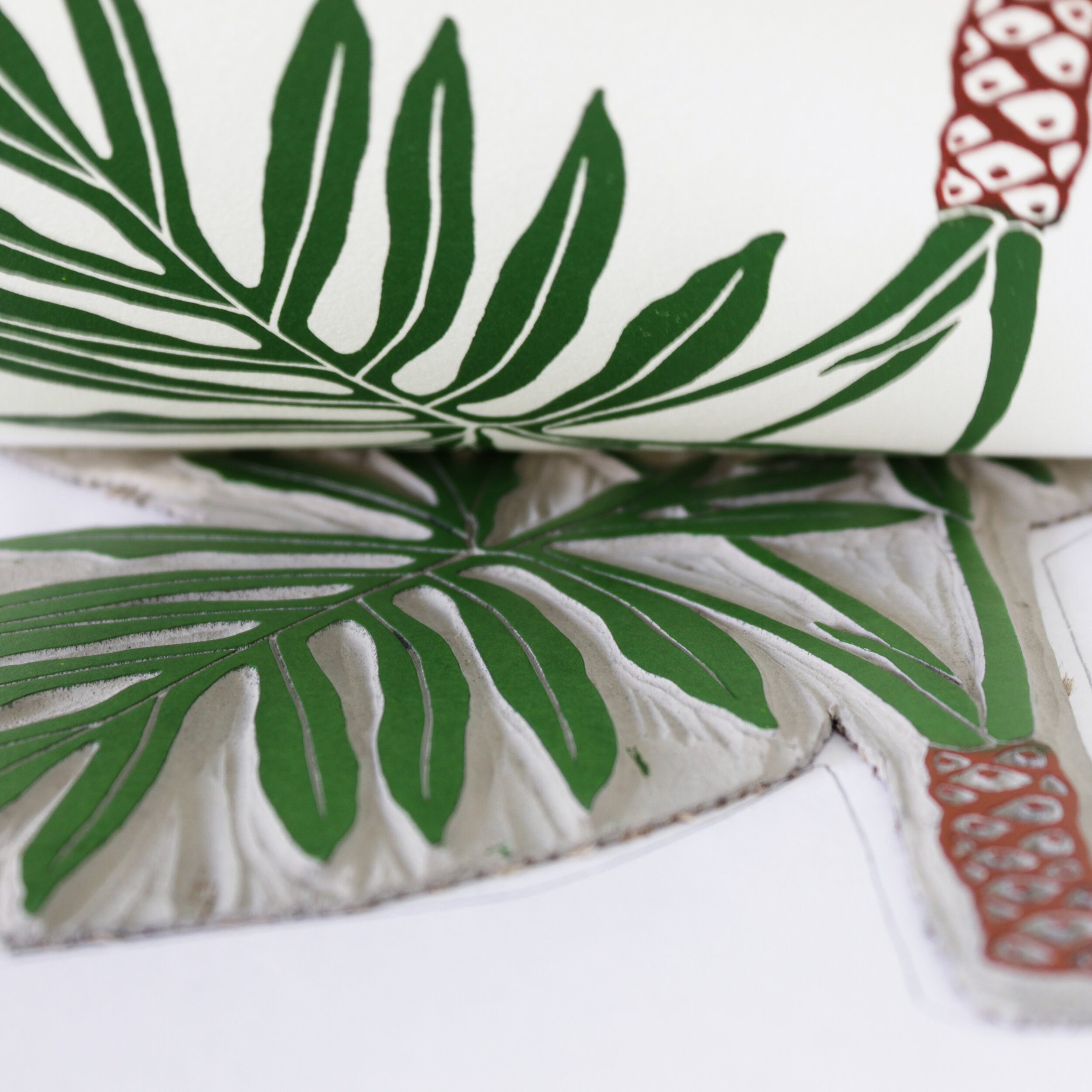
Introducing botanical artist and owner of Living Pattern, Jenny. After exploring several surfaces for Jenny’s block prints, we were able to work together to find her perfect match, Stonehenge. We will be featuring Jenny’s art on Stonehenge White 250gsm and Stonehenge Black 250gsm throughout the month of August. Learn more about Jenny below and follow our social media for featured posts!

Tell us about yourself and your work.
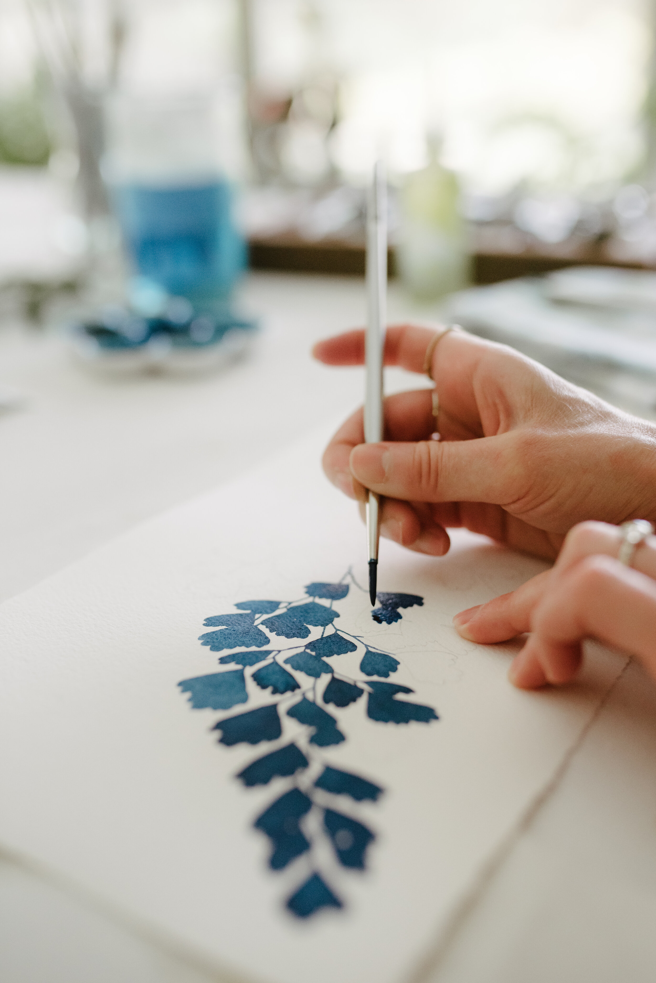
Hi, my name is Jenny. I go by @livingpattern on social media where I've been sharing my work since 2013. I took my art career full-time that year, it was the best jump I've ever made. Currently, I am exploring watercolor and printmaking. Both mediums are translated similarly, inspired by graphic and minimal block printing with simple shapes that focus on patterns in nature. I am endlessly searching for the eye-catchers of the natural world.
What’s your process like from start to finish?
My watercolor and printmaking process both involve a new fascination. Both processes start with a sketch. With watercolor, I simply transfer my design to paper then lay the color in. I flatten all of my watercolors then sign them. With printmaking, my design is transferred onto a linoleum block. I carve the block, then ink the carving. Then test proofing begins to check my carving details. If all looks good, I begin printing the run.
You tested a few different papers to find a favorite. What did you find throughout the testing?
I tested several papers, what I liked about Stonehenge was how smooth and accepting of ink it was. The 250 gsm is also a nice weight, I had trouble with the 115-175 gsm papers arriving with creases or bends that were hard to get out.
The white of the paper was also a big factor for me because I wanted a paper that wasn't too stark white but not beige or cream either. I was looking for a contemporary white that went well with white mats or white frames found in modern/ minimalist homes.


Do you use the same paper for your block prints and watercolor prints?
For printmaking, I use Stonehenge White and Black 250gsm paper. For watercolor, I use Arches Cold Pressed 140 lb Bright White paper.
What other materials do you use (aside from the paper)?
For printmaking, I use Battleship Grey linoleum, Flexcut tools, and Cranfield relief inks. For watercolor, I use Mision watercolors and Silverwhite brushes.
Tell us about one of your favorite projects!
Easy! I worked with an amazing firm, Studio Tack, to design large scale original watercolors for a newly designed hotel. Studio Tack is an extremely talented team and I am honored they chose my work for the hotel. I created 8 large scale pieces for the lobby/ dining areas and each room has Living Pattern prints in it! Click here for the link.
What do you hope to achieve with your work?
My work aims to bring appreciation to the stunning details found in nature.
Any advice to artists first starting out?
You never arrive, your art is ever-evolving just like you! Do not question your art, do not listen to other people's opinions of your art and share it without hesitation straight from your soul.
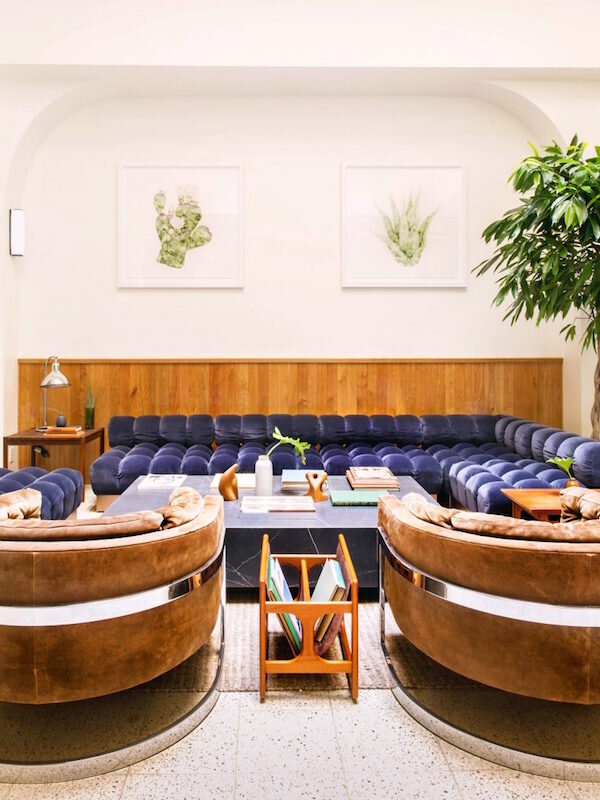
Tilden Hotel