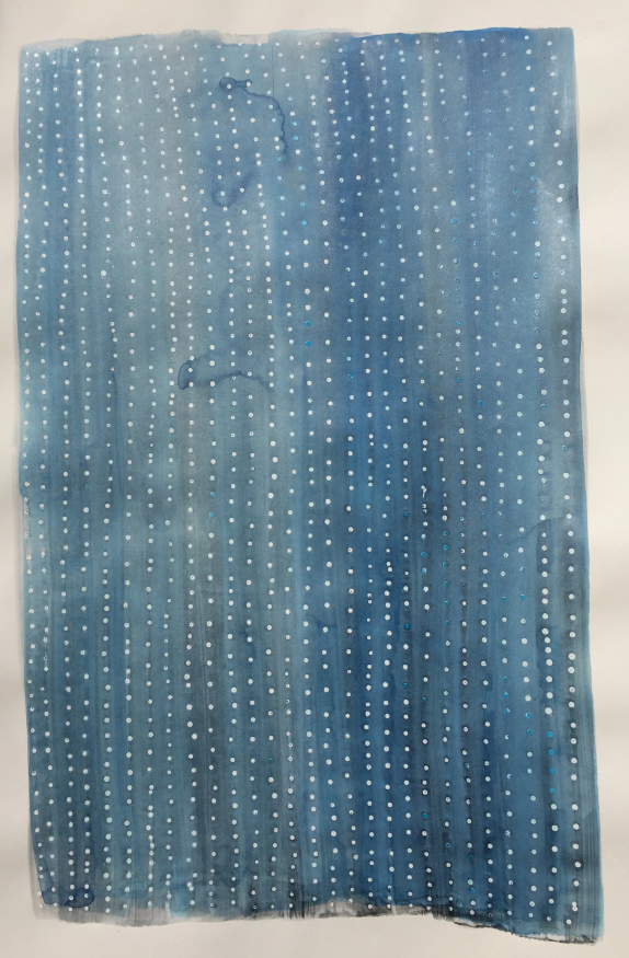
Art by Joshua Henderson
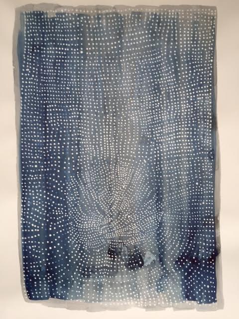
“Historically, silverpoint was deemed an important medium, as apprentices to Old Masters had to earn the right to paint by first demonstrating proficiency in silverpoint. It was the chosen training methodology because it is notoriously difficult to master. Furthermore, the bioactive element ages as it transitions through oxidation. This gives the drawings a subtle reflective patina unique to silver. The oxidation process and patina remind us that life experience is what gives us our own unique “patina” as we age. Our perception of life, our stories, and the nature of our thoughts are exhibited on our faces.”
- Joshua Henderson
How did you get started with Silverpoint?
{JH} I began working with Silverpoint shortly after coming home to a massive tormented oil painting I was working on. My life had completely fallen apart at that time and when my painting on the wall had greeted me the way it did I realized I didn’t want to come home to a dark tormented painting and other people probably don’t want to either. My work was an expression of sadness, trauma and mental illness, but I didn’t want to contribute more sadness to this world. This stimulated my search for a new medium. Shortly after I began searching I took a drawing workshop with Steven Assael and on his materials list he had listed silverpoint as an optional material. I had heard about the medium but had never used it. I was never interested in it before, but when I saw it listed this time I imagined it to be the exact medium I was looking for. It’s minimalistic, subtle and elegant, yet considered to be one of the most challenging mediums to master.

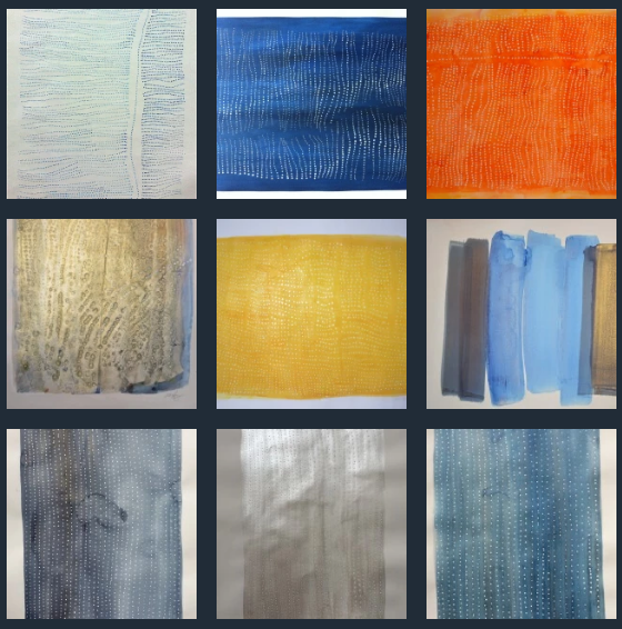
The Last Samurai | .999-Silver and 24K-Gold on Legion Art Coated Cover| 9”x12”

The Monkey Wrench Gang | .999-Silver and 24K-Gold on Legion Art Coated Cover| 9”x12”
What is your process like from start to finish?
{JH} My entire drawing process is an act of exploration, indicative to my experience of life. In the initial stages there is only blank space, both in my mind and on the sheet of paper. I call it “The White Void” and just about every time I begin a new drawing it causes me to enter into the existential phase of the process - an undetermined amount of interstitial time when I feel compelled to answer the questions: “What is the fundamental value of drawing, especially in our time?”, “What is my reason and purpose for drawing?” and “How does my drawing contribute to the progress of the human species?”
Only after I give up on trying to answer these debilitating questions do I begin actually making marks in the white void. The first marks are made so lightly that they are barely visible. They indicate potential place holders for the overall composition, although I rarely commit to them.
As things progresses, I slowly darken certain areas in an effort to lead myself and potential viewers through some sense of design between lines, a variety of forms, shadows and atmosphere. Due to my process being explorative I try keep my drawings as open as I can, from start to finish.
Why do you use Legion Art Coated Cover?
{JH} I use Legion Art Coated Cover, an almost velveteen surfaced paper, because it is durable and can withstand silverpoint without easily tearing. This feature of the paper allows silver to build up and appear darker than other papers. Additionally, its surface is uniquely dynamic in that a variety of textures within a single drawing are possible. As an example, the paper is similar to the texture of human skin, but becomes increasingly smooth when silver is built up in layers, yet becomes embossed with rivets when the silver wire is heavily dragged across its surface. These features allow a variety of layers and textures and make this dynamic paper ideal for silverpoint drawing.
What other tools do you do use?
{JH} The tools I use in my drawings are: paper, silver (or some other metal), a metal file, a chair, a table, a skeleton and a variety of other references.
What other mediums do you work with?
{JH} I’ve used a variety of other mediums, although I haven’t tried ice-carving or pottery yet. I’m relatively proficient at stone carving, clay modeling, casting, oil painting, drawing with charcoal, graphite, pen and ink, colored pencils, crocheting, digital painting and wood carving.
Silverpoint is special to me for a number of reasons: It’s a very simple and direct drawing technique, yet somehow the most challenging medium of all the mediums I’ve tried; if not technically then psychologically, for me it’s both. It’s not “eye candy” like painting and it’s not sharing space with us as sculptures do. It’s a subtle medium all it’s own that requires intense focus; the drawing process becomes a reflective puzzle and I like that.
Additionally, I think the properties of the element silver are incredible. It’s a bioactive element that basically attaches itself to and suffocates bacteria. It’s not a dry or a wet medium, yet it feels like both. When I’m drawing with silverpoint I feel like I’m painting and stone carving at the same time, but it’s more than that and it’s less than that and that’s a mysterious feeling I like very much.

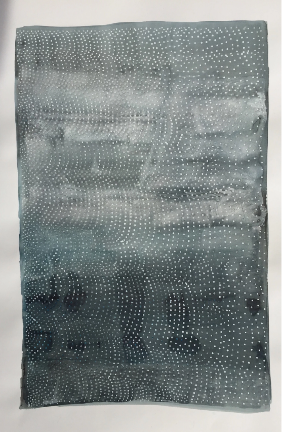
Art by Joshua Henderson
What else should we know about you and your work?
{JH} No one should know anything about me or my work. I’m not more unique than anyone else. I was, however, clinically diagnosed recently as “manic bi-polar with psychosis” it’s been a ride. This diagnosis has solidified my interest in connecting psychology directly to the drawing practice. The value of silverpoint drawing for me is in the optimistic resilience cultivated by exercising the mind with it. I believe the fundamental value of drawing is to process ideas and emotions. To me this means nurturing healthy mindsets. Leonardo used silverpoint to design things, I use silverpoint to design the mind.
Any advice for someone looking to get started working with Silver?
{JH} Jump in and get started, enjoy the exploration and what you find, remember to have patience with yourself and when a silverpoint drawing seems like a failed drawing keep working on it. Don’t worry about erasing or restarting; work through it, even if the paper tears, let your mistakes exist among your best work.