Art on Paper in Miami

Just a few of our favorites at Art on Paper in Miami on our papers. With so many amazing pieces to choose from, look out for more favorites to come!
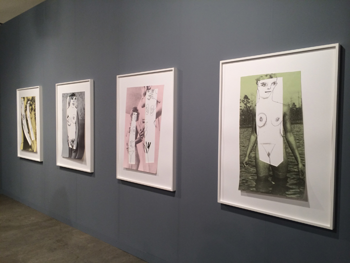
New Figures, 2015 was created by Richard Prince using multiple color silkscreen with collage on Coventry Rag and Lanaquarelle 48x35 inches. The incredible artwork was shown at Art on Paper in Miami by Two Palms

Rhona Hoffman Gallery shows off Coventry Rag Vellum by Nathaniel Mary Quinn using black charcoal, sot pastel and oil pastel.

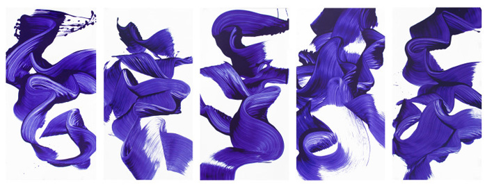
Durham Press Portfolio of 5 Screenprints by James Nares on Somerset Satin White 300gsm.

Montserrat College of Art Viewbook with Colorplan

The Monsterrat College of Art Viewbook, printed by Franklin Printing, used offset 5 colors (CMYK +PMS match), stamped with a clear foil on the cover and perfect bound by Superior Finishing. It was printed on Colorplan 270gsm Cool Blue, Natural, White Frost and Pale Grey. 

The designers, Jan Moscowitz, Eric Lee and Jeffrey Newell from Studio laPlancha, were inspired by the Montserrat, a college of creativity. They wanted to design the book with full strong colors throughout the inside, and minimal, clean and fresh, "barely there" colors on the cover. 

Artists, and by default, art schools, love the properties of paper. There is no other medium that would substitute for ink on paper.

Montserrat College of Art is a small learning community for students deeply engaged in art and design in Berverly, Mass. The white covers of the admission catalog represents an escape to the sea, as Montserrat College is for many students. 


The Boston Printmakers 2015 North American Print Biennial

Congratulations to Coco Berkman from the Boston Printmakers for being selected as a winner in the 2015 North American Print Biennial. 

Gloucester Artist Printmaker, Coco Berkman’s linoleum prints reflect her love of drawing from her own imagination and from images gleaned from literature. She uses sharp Japanese carving tools to cut her drawings from a sheet of linoleum which she then prints with oil based inks onto heavy archival paper, one color at a time, working from the lightest colors to the darkest. An intuitive and improvisational process, each edition of Berkman’s work takes several weeks to complete. 


Down in the Grey Zone, 2015 8 color reductive linoleum print Plate: 18” X 24”  Paper: 22” X 30” Oil based ink on Arches 88 Edition of 8

My 8 color reductive linoleum print,”Down in the Grey Zone” was created for a Boston Printmaker’s show that will be held from May until September 2015 at The Art Complex Museum in Duxbury, Ma. The show is called “Look Again” and we printmakers were asked to choose a print from the museum’s  permanent collection and create a new work of our own inspired by our chosen print. I chose Warrington Colescott’s satirical etching, “Down in the Green Zone”, a riff on the “Green Zone” in Baghdad which he portrayed as a den of servicemen drinking, gambling, and watching strippers dancing on the tables. I borrowed from his sense of humor as well a similar color palette to create an image that portrays the lighter side of life in a nursing home, a scenario very familiar to me for a few years now as I’ve spent hours visiting my aging parents in their individual nursing homes. Indeed there is a lighter side to life there...yes, there is drinking and gambling and rowdy behavior. The caregiver’s are sent out on a regular basis to bring back beer and Chinese food. [Please don’t say I told!]  In addition, my mother at 82 years old met the love of her life, “Herbie” in her nursing home. Our entire family attended their wedding ceremony last June on the nursing home’s Sunbrella-ed outdoor patio.