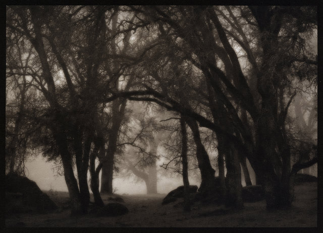
According to the latest research, your print design doesn’t have to compete with the digital world, but only offer a calmer, more soothing alternative. And that starts with selecting a soft-hued quality sheet. In “Barely There,” the inaugural Colorplan Directions you’ll see first-hand how you can lure weary minds to your work by exercising the power of subtlety.
Research shows our attention is increasingly overloaded by interacting with the digital world and the real world simultaneously. As we increasingly suffer from a sense of over-stimulation, a predominance of the color white aids mental clarity, and projects a message of calm, cleanliness, and freshness.
As “Barely There” deftly demonstrates, a subtle white-on-white color direction provides a refreshing, minimalist and timeless approach, reinvigorating fashion, graphics, technology and interiors. Bright White, Mist, Natural, Pristine White and Vellum are all Colorplan options that enable you to attract the audience you want as you offer this refreshing alternative to our frenetic world.
Fine art photographer and master printer, Kerik Kouklis, has been testing and using our Revere Platinum paper for quite some time. Here's his report excerpted from his blog:
"In other very good news, Legion Paper is bringing back one of my all-time favorites, Revere Platinum. Although it used to be somewhat inconsistent, the currently-retired Revere Platinum was one of the best papers I ever used when it was good. Magnani, the 600-year-old Italian paper mill that made the paper went out of business a couple years ago. I don't know who the new manufacturer is, but the few samples I've tried have printed extremely well. It's a little heavier at 320 gsm and has a pleasant off-white color without being too yellow.
I've made both straight platinum/palladium and gum over platinum/palladium prints with this paper that are just beautiful. This paper also required pre-shrinking for multiple layer printing. In fact, double-shrink may be necessary. I am still testing... I believe this paper will also be available in the next 4 to 6 weeks from Bostick & Sullivan, NY Central Art Supply, Talas and others.
My understanding is that the price of this paper will be roughly 30% less than Arches Platine. Michael Ginsberg from Legion Paper has pursued this tirelessly and my hat is off to him for making it happen. The man is passionate about paper and he's been in the business a long time. Here are a couple of sample prints on the new Revere Platinum."
All images, Kerik Kouklis
10x12 Palladium Print on Revere Platinum
10x12 Gum Bichromate Over Palladium Print on Revere Platinum
A new collection by the renowned Italian paper mill Fedrigoni are now available in the U.S. Each brings something unique to our collection of 3,000 papers. These papers are all available on Letterpresspaper.com or contact us for larger inquiries. Check it out:
Sirio Ultra Black
The most unique, intense shade of “Black” satin-smooth text and cover paper Legion Paper’s ever seen. It’s also unique in that it’s available in six weights, from a 78 lb. Text up to a 250 lb. Cover. A great choice for packaging applications, it takes embossing & debossing, is suitable for offset printing, letterpress printing and serigraphy.
Pergamenata
Created to simulate aged natural parchment, this paper is semi-translucent, with the crisp snap, mottled look and hard feel you would expect from an actual sheet of parchment. Available in several weights and colors, including some with a metallic surface.
Sirio Pearl
We hand selected seven colors from this pearlescent range to complement our existing palette of metallic papers, adding to the broadest range of metallic colors available in the U.S. market.
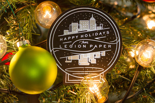
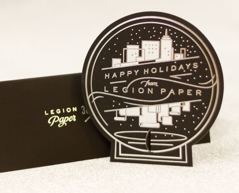
This holiday season, we had the pleasure in working with designer Jennet Liaw and printer Mama's Sauce to create our holiday card. We were determined to send a card that wasn't immediately tossed!
What was the directive from Legion and how did you translate that to your design?
[Jennet Liaw, designer] The brief was very open-ended, which made it great fun for me to design completely from the direction of spotlighting the paper itself, and to play with printing technique choices - this is something clients are often stingy on. With great suggestions from Nick and Hogan, I knew I wanted to apply a foil, as well as make a die cut, so I kept the stroke weight simple and illustrative to balance out those techniques into the clean aesthetic that I personally like.. made extra special for the holidays with sparkle and shine.
Did you revolve your design around the paper or the other way around? If so, how did the paper inspire the design? /The base paper is Sirio Ultrablack – by all accounts the blackest paper we’ve ever seen – how did that affect the design?
[JL] It seemed counterintuitive at first to use the blackest black to create a card for the holidays, a time usually associated with festive reds and greens, or warmth and earthiness. But it was an opportunity to create a high contrast effect, perfect to show off just how incredibly black Legion's paper was, and how beautifully bright the white/foil that Mama's printing would create. I enjoyed that the final product was a gently alternative take on the holidays - crisp like the wintry air and festive in a clean way.
What print methods did you use and what worked well with the paper? Were there any particular challenges?
[Hogan Birney, printer] We ended up choosing Hot Foil Stamping for the entire piece as it is the best way to letterpress light colors on dark papers. The metallic foils work great as they cover very nicely and provide that shine that foil stamping is known for. A shine that works really well with the holiday theme and we knew would tie in with the Mirri Sparkle Paper. White foil is a bit tricky on dark papers and larger coverage areas, but since this piece was run 1 at a time, we had some flexibility and were able to get the white foil looking great.
We know you were a little hesitant in using the Mirri Sparkle. Having worked with it – what are your feelings now, both in terms of design and in terms of working with it in production? Would you use it/recommend it again?
[JL] It's an incredible paper. I had shoved the folder of samples in my suitcase to review while traveling, and when I casually drew out the Sparkle at the airport, it turned literally heads. After working with it, I know that a dominant paper like that can't be a second thought or late decision - it's definitely the star. I'm a believer in going full force, all the way, with any design decision - if sparkle is the goal, Mirri Sparkle is an awesome choice.
What finishing did you use and what worked well with the paper?
[HB] The cards were trimmed using a custom cutting die, created to mimic the shape of a snow globe. The card size and design direction that Jennet took allowed us to use the exterior portions for a border that would incorporate punch-out directions and a stand for creating a sort of 3 dimensional snow globe. The Sirio Black mounted to the Mirri Sparkle die cut extremely well due to its dense nature and slightly coated surface on the sparkle side. Being that it was a thicker paper, the die cut created a nice bevel on the face side of the card.
Designing for a paper company – where the goal is to highlight the paper as well as the company – does that change your process at all?
[JL] Definitely - there's a place in everyone's heart for NYC, where Legion is based, so a subtle snow globe format was the perfect setting. Having that in mind also offered an opportunity for me to play with the forms of the iconic skyline - As I looked through images of the NY skyline over the water, I was inspired to put a twist on it by reflecting the buildings as scrolls of Legion paper - the star of the whole project. Also, if you look closely, the background pattern of the card has Legion's logo woven into each corner (one of which punches out to become the "foot" of the standing globe)
Anything else you think is important to include that the design community might want to know?
[HB] I think that it is important to note what can really be done with a simple piece. This is only a 2/0 (2 color on one side only print) that has a very dynamic and interesting look. By using different paper colors mounted together and making great use of the space from a design standpoint, it opens up room for the materials and process to really shine. Its very easy to get caught up in trying to get 4 colors on one side and 2 on the other that are printed, but by keeping things simple, not only does it help with production consistency with processes like ours, but it also helps with your production costs without sacrificing a unique look.