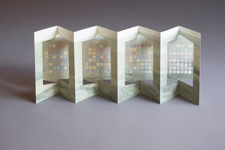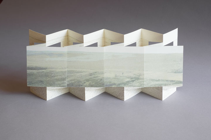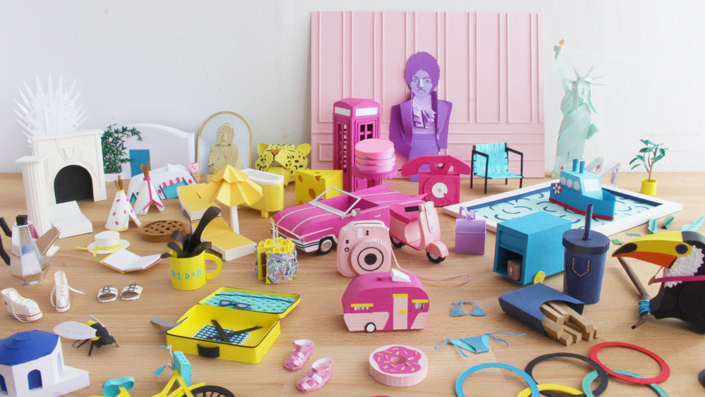
Lorraine Nam is a Paper Illustrator based in Brooklyn, New York. She creates 3-dimensional paper objects for photographs and animations. Lorraine started the 100 Days of Paper project with a set of papers she discovered after scouring the Legion's paper heaven (or sample room). From the thousands of papers, Lorraine chose to use Colorplan, Mirri, Rising Museum Board and Plike for the project.
 How did you get into paper sculpting?
My background is in illustration and while I was at art school at RISD, I started experimenting with using paper as my medium. I first used paper as my base and starting cutting into it to create these intricate cut paper pieces. After that, I started experimenting with what I could do with paper and it evolved into more of these 3-dimensional forms. That was about 3 years ago and I've been working with 3-Dimensional paper ever since.
What was your inspiration for the 100 days project? What motivated you from start to finish?
I first heard about the 100 days project through Elle Luna, who started the movement. She challenged people on Instagram to start a project and work on it for a consecutive 100 days. I had seen many people that I follow on Instagram start the project and grow their skill and I wanted to see what I could learn from this experience. Now that I'm at the other end having finished the project, I am really proud of what I was able to accomplish. My skill level has grown and I am much faster at finishing a piece. What kept me going was knowing how accomplished I would feel at the end of the day. To tell the truth, there were definitely plenty of days where all I wanted to do after working 9-5 was sit on my sofa, watch Netflix, and zone out but I realized that even if I worked on something for 30 mins or an hour, I would feel much more accomplished about my day.
How did you choose among our thousands of papers? Which papers did you end up choosing?
That was the hardest part! A lot of the papers I chose were from the Colorplan line which has a great selection of colors and weight - both factors that are really important to me when I work on a piece. Another line that I loved using was the Brillance line of Mirri Sparkle, a glitter paper, and Plike (a matte, rubbery paper) that made all the dark blacks really matte.

Which piece was most difficult? Which was your favorite?
My most difficult piece was the convertible car and while it was not actually too difficult to make, it did take me longer than expected to complete (3 days).
How did the paper effect the piece you were creating?
After I decide on what I should make and any sketches that happen, the first decision I make is color. I start to build a color palette by pulling all the sheets of colored paper together to make sure they sit nicely and think about what color the body of whatever I'm making is. Then I think about the weight or the thickness of the paper. If it's something that needs to stand on its own or hold something up, I choose a heavier weight. In terms of texture, I tend to gravitate towards smooth papers which are easier to glue together. The glittery paper was difficult to glue but it was just so pretty that I had to use it!
What’s next?
I'm getting ready to open my studio doors for Bushwick Open Studios the first weekend of October! I've done it for the past 2 years and it's always a fun time. It's really great to talk to people in person about my work and share ideas. In terms of projects, my sister and I have been talking about doing a collaboration. She's a hand letterer so we're thinking of combining type with paper and coincidentally, she's also started the 100 days project recently which I like to think I helped inspire.