Artists Explore YUPO®'s Possibilities

FROM THE ARTISTS.

YUPO®’s unbelievable quality can transform any work of art into a masterpiece. The ultra-smooth, non-porous, and non-absorbent canvas gives artists the flexibility to work in several different mediums to achieve unique and creative results. Yet every artist exploits these advantages differently, exposing the many possibilities of YUPO® paper.

Read about different artists’ experiences and techniques using YUPO®.


Samantha Gorin, @sammygorinart

Which YUPO® is your go-to?

{Samatha Gorin} My go-to YUPO is the 9x12in "heavy" weight pads. When painting on YUPO, I usually put my finished piece in a pre-cut mat frame so that my collectors can have an easier time framing their work; the 9x12in paper makes it easy to meet standard frame sizes! The pads are also super easy to store in my apartment's makeshift studio.

61841064_436991000448938_6351552402176344064_o.jpg

Which paints do you prefer when using YUPO®?

{SG} I primarily paint with alcohol inks on YUPO. Inks are tricky; you can only use them on non-absorbent, slick surfaces, which makes YUPO an ideal substrate. I especially love using my inks on the "translucent" YUPO. Since alcohol inks are transparent, once you add a mat backing to your piece, it gives your painting the element of depth. 

How did you discover YUPO®?

{SG} When I decided I wanted to learn how to paint with alcohol inks, I did a ton of research. I had never heard of them before, and they are drastically different from my primary medium, acrylic paint. While doing my research, "YUPO" was mentioned in nearly every blog and Instagram post. I did a little research and found an incredibly helpful article on Legion Paper's website. Aside from the inks, a pad of Legion's YUPO was amongst my very first ink purchase, and it's been my go-to ever since.

How do you display your finished masterpieces?

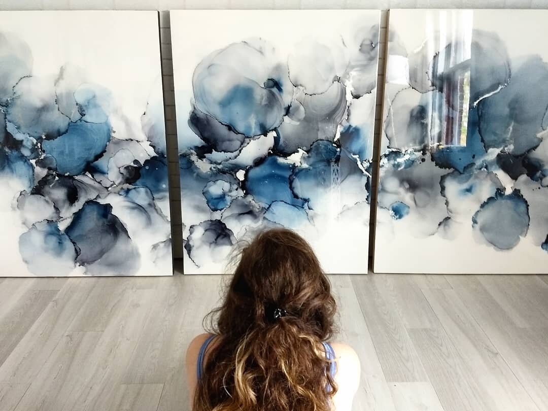
{SG} I usually put my finished work in a pre-cut mat frame, but sometimes I will mount the painting to a cradled wood panel. Once attached, I trim the edges and cover the piece in a glass-like coat of resin.

Any advice for first-time YUPO® users?

{SG} Don't be afraid to try each weight and size! At first, I was hesitant to work with the translucent YUPO, but once I gave it a shot, I fell in love. Also, different weights work best with different projects, so finding the correct weight through experimentation is key.

37343269_239493856865321_7146176550856032256_o.jpg

Ashley Mahlberg, Ink Reel Studio, @Inkreel

Which YUPO® is your go-to?

{Ashley Mahlberg} I typically use the medium weight Yupo paper on a roll. The price point fits with my material budget and I find it easier to cut/manipulate the medium paper weight. If I'm not going to cut the paper I tend to use the pre-cut heavy weight paper. As an artist where the majority of my work comes in the form of commissions I like having a roll of Yupo on hand so I can easily create custom size paintings for my clients.

Which paints do you prefer when using YUPO®?

{AM} Alcohol ink is my preferred medium to work with on Yupo. To achieve the amazing effects that are possible with alcohol ink I need a surface that won't absorb the ink and will allow the medium to move fluidly across the surface - Yupo accomplishes this goal beautifully with its super smooth nonabsorbent surface. It extends the time I have to work on a painting and not have to worry about the ink losing its fluidity due to absorption.

Screen Shot 2019-08-07 at 3.07.52 PM.png

What’s your style of work? Why do you choose YUPO® to help accomplish your style?

{AM} I'm an abstract fluid artist, therefore working quickly to direct the flow of the alcohol ink and add effects in a short period of time is something I'm always working against. Yupo not only extends the time I have to work on a painting as it doesn't absorb the ink but sits on top of the paper this also allows me to reactivate the ink and rework a project or add effects at a later time.

How did you discover YUPO®?

{AM} I discovered Yupo a couple years ago while perusing watercolor videos on Youtube, I came across a video of an artist demonstrating how he achieved exciting effects with alcohol ink on Yupo. The next day after watching his demo I ordered Yupo, ink, and was hooked. I hadn't painted on a synthetic surface before Yupo and I was (and still am) absolutely mesmerized by the beautiful effects that I can create with Yupo and alcohol ink.

What do you do with your finished pieces?

{AM} My finished Yupo paintings are either mounted on cradled board or left loose and placed in a frame.

Any advice for first time YUPO® users?

{AM} Using a heat tool to push alcohol ink around a surface is a popular method to create the beautiful alcohol ink effects and since Yupo is synthetic you want to be careful to not apply direct heat in one area for too long as it can melt your paper. I recommend experimenting on a scrap piece of Yupo to figure out the tolerance the Yupo has when applying heat.


Marissa Recker, @astuaryart

Which YUPO® is your go-to?

{Marissa Recker} I use various Yupo products depending on the piece I am creating. I use large heavyweight sheets the most. I like how resistant they are to warping from my heat gun. I use the large medium weight rolls when I create on a larger scale. I love both products and use each often!

What paints do you use with YUPO®?

{MR} I use a few different media on Yupo. I use alcohol inks the most, but I also love using acrylic inks, spray paint, and resin on Yupo. I love how easily alcohol and acrylic inks move across the smooth surface Yupo has to offer. But, I also love that spray paint and resin both adhere to it beautifully!  

What’s your style of work? Why do you choose YUPO® to help accomplish your style?

{MR} My artist style embraces the movement that comes with fluid art. Yupo is the ultimate surface to achieve this because it is so smooth and non porous. Inks move across Yupo so beautifully. I also love that it is easy to pick up a corner of the paper to move inks across the surface. 

astuary.jpg

How did you discover YUPO®? what was your first experience with it like?

{MR} I discovered Yupo through Legion being an early supporter of my work on Instagram. I remember seeing them like one of my earlier posts almost two years ago and immediately thought they must be a good company with great paper! 

What do you do with your finished pieces?

{MR} I mount most of my pieces to wood panels and then seal them in resin. It creates a great display piece with a beautiful finish!

Any advice for first time YUPO® users?

{MR} My advice to a first time Yupo user is if you are using heat (like a heat gun) I recommend starting with the heavy weight Yupo. I found that it was much more forgiving as I learned how to use my heat gun. Once I was more experienced I was able to move onto the medium weight. Also, don't forget if you want to start your piece over, just flip the Yupo over and work on the back! You get a free redo with Yupo. And of course, have fun! 


Zaria Forman: Illuminating Climate Change Through Art

From the Artists.

Zaria working on Lenox Paper

Tell us about yourself and your art. Where did it all begin? What inspires you to create?

{Zaria Forman} The inspiration for my drawings began in my early childhood, when I traveled with my family throughout several of the world’s most remote landscapes, which became the subject of my mother's fine art photography. I developed an appreciation for the beauty and vastness of the ever-changing sky and sea. I loved watching a far-off storm on the western desert plains, the monsoon rains of southern India, and the cold arctic light illuminating Greenland's waters.

I have very fond memories of our family trips and consider them a vital part of my upbringing and education. I feel very fortunate that I had the opportunity to see so much of the world, and to learn first-hand about cultures so vastly different from my own. This myriad of experiences instilled in me a love of exploring and a need to continue exploring and learning for the rest of my life.

How do you use your art to make a difference in the world?

{ZF} Artists play a critical role in communicating climate change, which is arguably the most important challenge we face as a global community. I have dedicated my career to translating and illuminating scientists’ warnings and statistics through an accessible medium, one that moves us in a way that statistics may not.  Psychology tells us that humans take action and make decisions based on emotion above all else. Studies have shown that art can impact our emotions more effectively than a scary news report. My drawings explore moments of transition, turbulence, and tranquility in the landscape, allowing viewers to emotionally connect with a place they may never have the chance to visit. I choose to convey the beauty as opposed to the devastation of threatened places. If people can experience the sublimity of these landscapes, perhaps they will be inspired to protect and preserve them.

zaria2.jpg

What materials do you use for your art?

{ZF} Lenox 100 paper is not what most pastel artists would want, because it doesn’t have much tooth, and therefore it cannot absorb as much pigment as a toothier paper could. But this is the precise reason why I love it! The smooth texture of the surface allows me to render very fine details. A toothier paper would get in the way of that. Although the amount of pigment I can layer is limited, I actually prefer this challenge as well because it requires me to be a better artist. There is not much room for error or re-working, so every mark must be intentional and precise.

What’s the process like from your travel to beginning a new piece? How is the image chosen you’re going to draw?

{ZF} When I travel, I take thousands of photographs. I often make a few small sketches on-site to get a feel for the landscape. Once I return to the studio, I draw from my memory of the experience, as well as from the photographs, to create large-scale compositions. Occasionally I will re-invent the water or sky, alter the shape of the ice, or mix and match a few different images to create the composition I envision. I begin with a very simple pencil sketch so I have a few major lines to follow, and then I add layers of pigment onto the paper, smudging everything with my palms and fingers and breaking the pastel into sharp shards to render finer details.

The process of choosing which images to draw is long and difficult! But there are always a few moments that stand out on each trip, where the landscape and light line up in magical ways, and I know immediately that I’ll make a drawing of it. I tend to jump right to those moments when I begin a new body of work, so I can start drawing before I go through the rest of my photos and memories.

Pastel on Lenox Paper

Disco Bay, Greenland

What’s your favorite piece and why?
{ZF} Whichever drawing I'm working on. The works are like my babies, they mean more to me than anything else I possess! That said, there are a few drawings that have personal significance, like my drawings of Jakobshavn Glacier or of the icebergs that calved from it into Disco Bay, Greenland. Jakobshavn glacier was the first glacier I ever saw, in 2007 with my family. I returned five years later to spread my mother’s ashes in Disco Bay.

How do you display your finished art? Do you use any fixatives? What about framing?

{ZF} I sometimes use SpectraFix pastel fixative, but mostly on the larger pieces, to minimize pastel dust collecting on the inside of the plexiglass once it’s framed.  I have the paper mounted onto dibond in order to have a rigid and supportive structure transportation and drawing, which also makes it easier to frame when the work is finished. My works are float-framed with museum non-reflective glass.

What do you hope to accomplish with your work in the next few years?

{ZF} I would like  as many people as possible to see my work, and to have a moment in which they feel transported to these remote places at the forefront of climate change. If they can experience these landscapes that otherwise might seem disconnected from our everyday life, but are in fact critical to our global climate system, perhaps they will be inspired to take action to protect and preserve this planet that sustains us, so future human generations may thrive. I hope my drawings can facilitate a deeper understanding of the climate crisis, helping us find meaning and optimism in shifting landscapes.

The Midway Gallery & Artist Studios

The Midway Gallery & Artist Studios

Everyday Watercolor Flowers by Jenna Rainey Sneak Peek!

EverydayWatercolorFlowers_3DBook_small.jpg

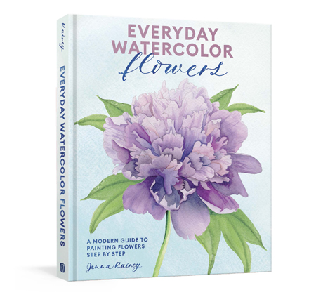
Everyday watercolor flowers is A Modern Guide to Painting Blooms, Leaves, and Stems Step by Step by Jenna Rainey.

Artist, Jenna Rainey, shares easy-to-follow ways to paint a wide range of botanicals, all in her fresh, modern style that appeals to the next generation of watercolor artists and creatives, from beginners to hobbyists. With gorgeously illustrated instructions for both loose and realistic watercolor depictions of more than 25 flowers, leaves, and plants, organized by form and shape, Everyday Watercolor Flowers is every nature-lover’s answer to capturing that beauty on paper.

Jenna uses Stonehenge Aqua Coldpress 140lb for all of her watercolor paintings.

Here’s a sneak peek of drawing Cherry Blossoms in Everyday Watercolor Flowers.


Photorealistic Charcoal Drawings by Emily Copeland

From the Artists.

emily_copeland2.jpg

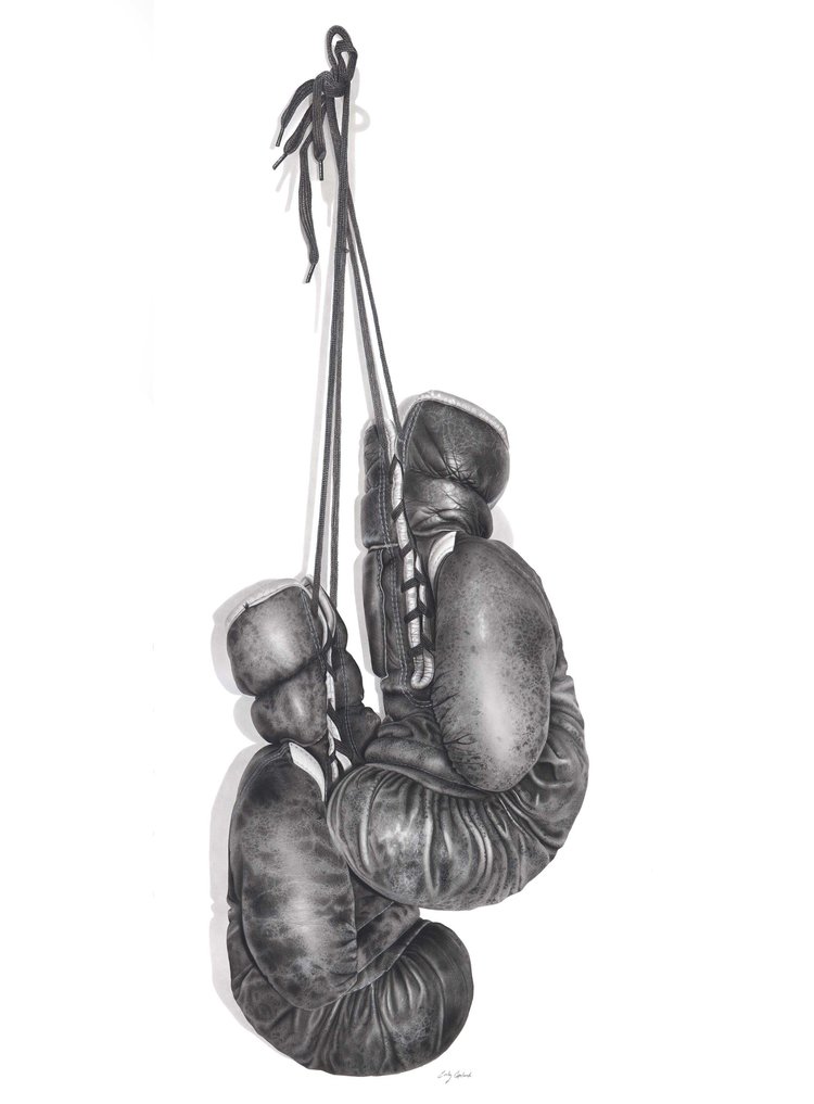
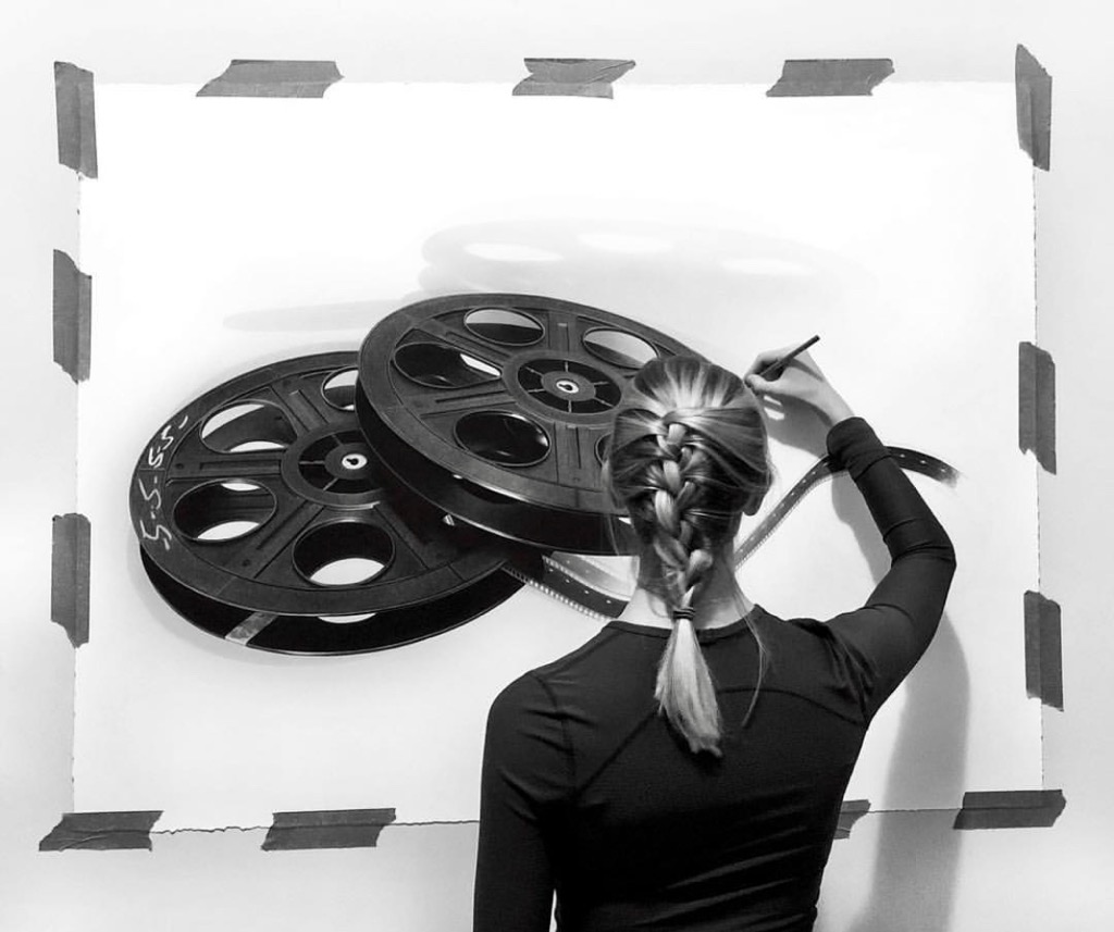
Emily Copeland is a Canadian charcoal artist specializing in realism. Mainly working with charcoal, she focuses on recreating objects on a larger scale.

The detail in Emily’s work is incredible, and we’re proud her work is on Stonehenge. Learn more about Emily Copeland’s work and why she chooses Stonehenge for her vintage charcoal drawings.

Tell us about your yourself and your art. What’s your style of art?

{EC} I concentrate on detailed vintage or retro objects as my subject matter. The elements within my drawings are blown up much larger than life size to give it a surreal effect. This gives the audience a unique viewpoint that exposes detail they wouldn’t normally see. I also attempt to bring vintage objects into a modern context by conveying them on plain, clean backgrounds.

I often choose to let the meaning behind each piece remain anonymous, as this gives each audience members the ability to find their own unique meaning throughout each piece. My intentions behind this is because I think everyone can find their own personal interpretation to each work of art, and it should never be restricted to only one viewpoint.

With each different series, I hope to please a wide range of audiences with the objects I’ve chosen. 

boxing+gloves+small.jpg
emily_copeland.jpeg

Where did it all start?

{EC} I got into art at a very young age, although it was never something that I planned to do as a career. I’ve always attended schools that specialized in the arts, but it was more of a hobby than anything. I was big into painting, but I didn’t really know what direction I was going with it. It wasn’t until my fourth year of university, when I discovered Stonehenge paper and charcoal together, when I knew I had found my mediums that I wanted to continue working with.

FullSizeR.jpg

What is your go-to paper for your work?

{EC} White Stonehenge paper, 250 gsm, is my go to paper, and has been for 4 years now. I love that it comes in pre-cut sizes and in rolls, so I can work in any size I desire. I’m the type of person who finds something that I like/ that works, and I stick with it, so Stonehenge paper is always my desired choice.

How does this paper work for your specific style?

{EC} Stonehenge paper is a fantastic paper to work with all around. I love that it’s versatile and thick, so when I am working on a larger scale, I don’t have to worry as much about ripping or creasing as easily as thinner papers. It’s also durable in the sense that erasing rarely ruins its soft texture. As far as paper goes, it’s pretty forgiving in that way. You can make light mistakes and still recover. Stonehenge’s even surface also has a slight grip to it. It allows my charcoal to go on smoothly and for me to capture small detail, while also allowing me to layer my charcoal without having any build up. The cotton fibers really absorb your medium, making shading really easy. Additionally, the texture leaves the tiniest specks of untouched paper throughout which help to give volume to the objects I'm drawing. This is the perfect paper for my photorealistic drawings.

What do you look for in a paper? Do you have specific requirements?

{EC} I look for paper that receives my medium well. The 100% cotton fibers in Stonehenge really absorb the charcoal that I use, and allow easy layering and shading. I also rely on versatility. The paper has to be thick and sturdy, while also being light and thin enough that I can roll it into a tube for shipping purposes. Additionally, I look for paper that is acid free with a neutral pH, because it ensures me that my drawings will be preserved for long periods of time.

emily_copeland.jpg

What are your future plans for your art? Any upcoming events?

{EC} I just finished having my second solo show at Bernarducci Gallery in Chelsea, Manhattan. The show ran for 6 weeks, starting at the beginning of March. Now the focus is to rebuild my portfolio for the next 1 or 2 years so I can take part in more group shows and be on my way to having my third solo show in NYC.

I’m preparing to start working larger than I ever have before, so I’m really excited for the challenge. I just received my 50-inch by 10-yard roll of Stonehenge from Legion Paper and I’ve already photographed several objects that are going to be larger than life. I’m looking forward to pushing myself with these next few projects.

In the next couple of years, I’m eager to start showing my work more internationally as well, hopefully over seas in some art fairs and group shows. I’m only in the 3rd year of my career, so I’m excited to see what the future holds. 

Rise + Wander: Paper for Block Prints

From the Artists.

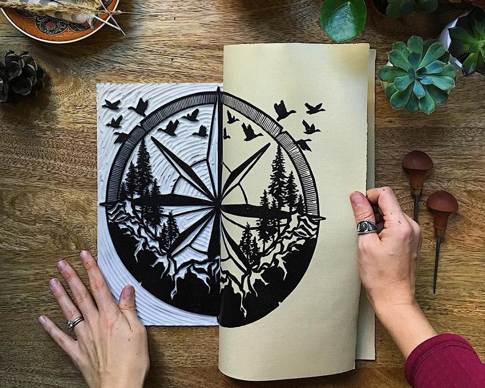
Aftyn Shah, founder of Rise + Wander, is a self-taught printmaker and painter with a mission to move others and inspire adventure. She discovered the importance and power of art during the healing process after a life-changing accident. Aftyn’s work involves nature and landscapes real and imagined, as the outdoors provide inspiration and soothing restoration.

Choosing a paper is large and important part of Aftyn’s art. Through experimenting with several papers, she discovered the papers best for her nature inspiring art.

The process requires a strong paper to withstand the rubbing/burnishing of the surface against the block, but also soft enough to absorb the ink within the grooves. However, as we often recommend, only by experimenting with different substrates will you find the best choice for your project.

More on Block Printing.

r+w.jpg

Aftyn Shah, Rise + Wander

“I think paper can be one of the biggest variations between artists.”

Paper is such a fun topic! The options are diverse and can add something special to a piece or go completely unnoticed while elevating it through simple quality. Whenever someone asks me for a paper recommendation, I always offer the caveat that testing for yourself is the best way to find your favorite, but I definitely have my preferences.

When I first started printmaking, to be perfectly honest, I used cheap cardstock. I had plenty of it from previous projects, in a whole range of colors, and it was durable. As I continued, though, I started to branch out and explore other options—many different options! I tried the dreamily airy papers like Unryu, pulpy ones like Chiri, decorative colorful papers a friend brought from traveling abroad, and a whole host of mould-made cotton papers (Rives BFK, Somerset, Stonehenge, Arches, and so on).

In the end, I fell in love with the Stonehenge line as my go-to option. It’s velvety, with a hint of soft texture, and takes prints smoothly. I still burnish each piece by hand, which means I love a paper that takes ink easily and I like seeing the slight indentation in the paper as I press onto the block. It’s light, but durable, and works equally well for a single-color print and multiple layers without warping or getting weighed down.

Similarly, when I work in mixed media, especially with watercolors or acrylics, the paper is still able to support the different paint and pen combinations. Having a large amount of versatile paper on hand is convenient.

Block Print on Stonehenge White

Block Print on Stonehenge White

Mixed Media with acrylic, pencil drawing and ink illustration on Stonehenge Paper.

Mixed Media with acrylic, pencil drawing and ink illustration on Stonehenge Paper.

When picking a paper, I consider aspects like how well it will print and of course cost, but I really like a bit of character. I decide if I want the paper to let the art stand on its own or add an additional element, either aesthetically or texturally. The latter is what draws me to bookmaking papers, like Nideggen and India Hemp. I love seeing hints of the fibers that make me think about the papermaking process, an artform in itself! Exploring other options, even if they’re not specifically made for my technique, is exciting. It also opens up options for my customers to become creative in how they display the artwork.

riseandwander3.jpg

Lately, I mostly work with black ink, which means I can go with a simple contrast in white or add some additional visual interest with a colored paper. For the most part, I like to stay neutral (Nideggen or Stonehenge’s Fawn or Natural), as it goes well with my outdoorsy work. Occasionally, though, I use the paper to insinuate the mood of a piece. For instance, I created The Northern Coastline with a moody rocky coast in mind, and a light grey color really seemed to suit that atmosphere. I wouldn’t choose it for every piece, but for this one it worked perfectly.

In the end, I think I’ll always recommend someone try several options before landing on a favorite. Everything from personal technique to weather conditions can affect how materials can work with paper!