Artist of the Month for August: Jenny Kiker

IMG_3352-1.jpg

We’re so excited to feature the first artist of our new program, Legion’s Artist of the Month Program. We’ve been honored to work with incredible artists across nearly every medium we can think of. Part of the excitement has always been introducing artists to new surfaces, planting that seed and watching it grow. Learn more or apply to our program here.

Introducing botanical artist and owner of Living Pattern, Jenny. After exploring several surfaces for Jenny’s block prints, we were able to work together to find her perfect match, Stonehenge. We will be featuring Jenny’s art on Stonehenge White 250gsm and Stonehenge Black 250gsm throughout the month of August. Learn more about Jenny below and follow our social media for featured posts!

LP7.23.18_170.jpg
LP7.23.18_237.jpg

Tell us about yourself and your work.

Hi, my name is Jenny. I go by @livingpattern on social media where I've been sharing my work since 2013. I took my art career full-time that year, it was the best jump I've ever made. Currently, I am exploring watercolor and printmaking. Both mediums are translated similarly, inspired by graphic and minimal block printing with simple shapes that focus on patterns in nature. I am endlessly searching for the eye-catchers of the natural world.

What’s your process like from start to finish?

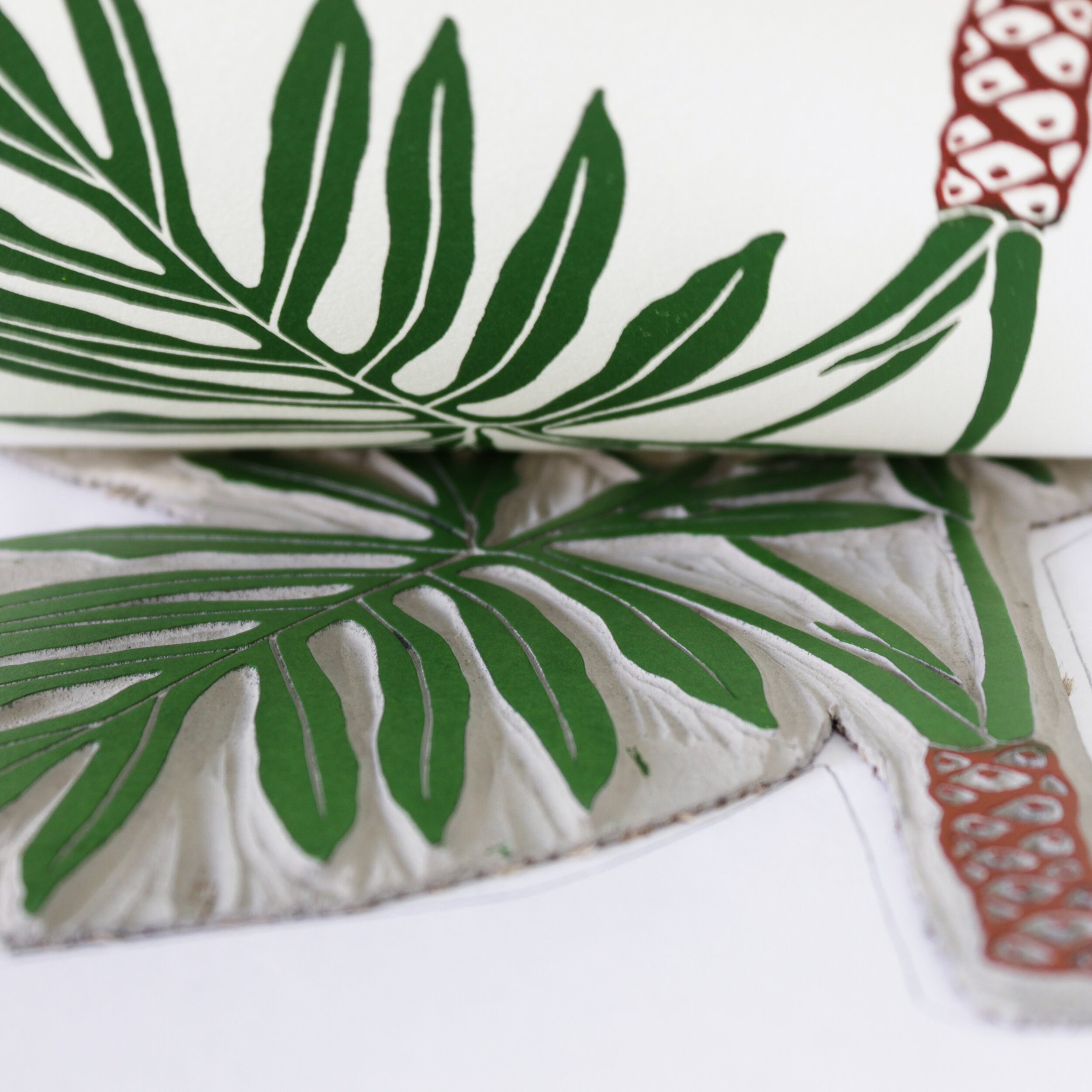
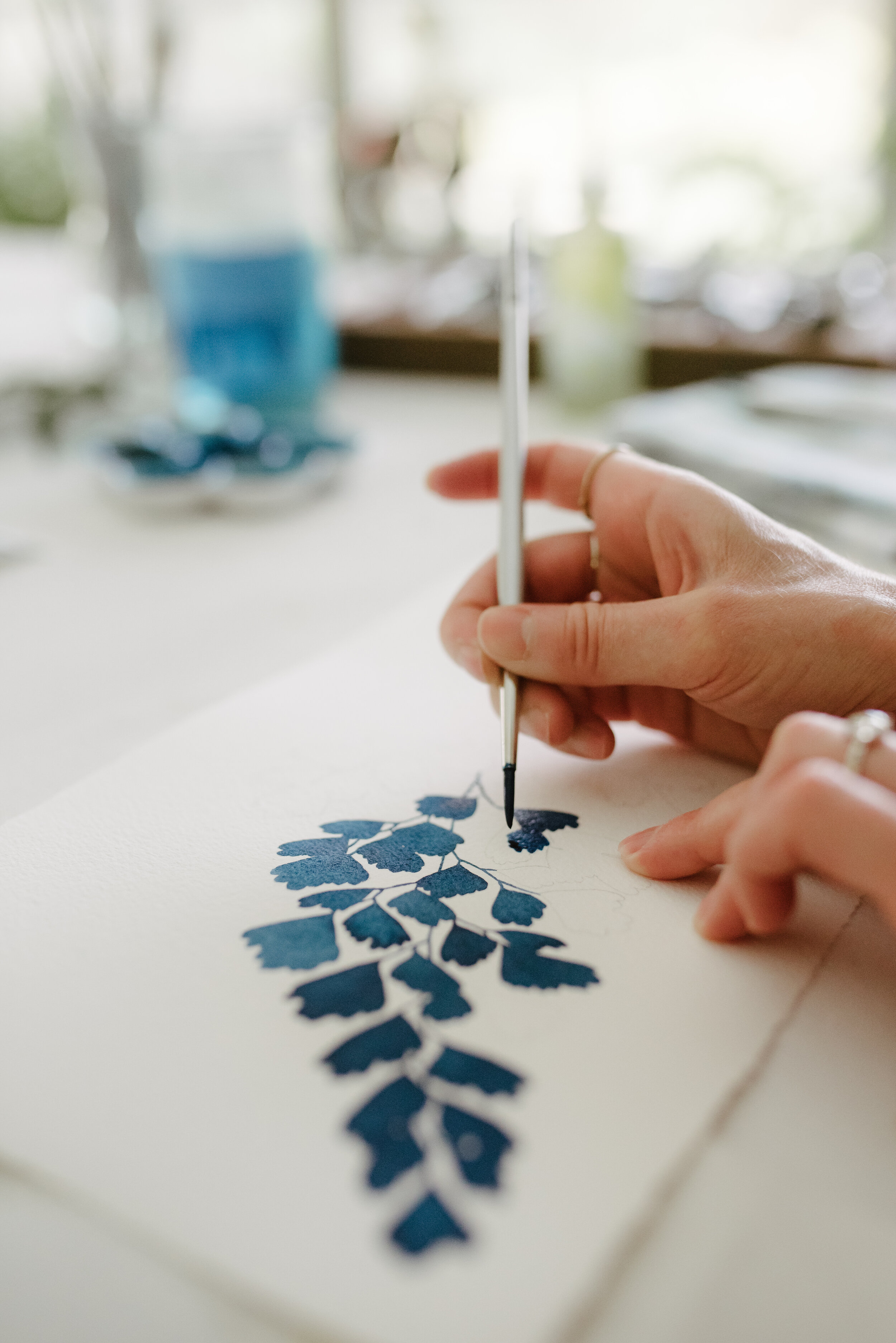
My watercolor and printmaking process both involve a new fascination. Both processes start with a sketch. With watercolor, I simply transfer my design to paper then lay the color in. I flatten all of my watercolors then sign them. With printmaking, my design is transferred onto a linoleum block. I carve the block, then ink the carving. Then test proofing begins to check my carving details. If all looks good, I begin printing the run.

You tested a few different papers to find a favorite. What did you find throughout the testing?

I tested several papers, what I liked about Stonehenge was how smooth and accepting of ink it was. The 250 gsm is also a nice weight, I had trouble with the 115-175 gsm papers arriving with creases or bends that were hard to get out. 

The white of the paper was also a big factor for me because I wanted a paper that wasn't too stark white but not beige or cream either. I was looking for a contemporary white that went well with white mats or white frames found in modern/ minimalist homes.

PlokaDot5.jpg
IMG_3445-1.jpg

Do you use the same paper for your block prints and watercolor prints?

For printmaking, I use Stonehenge White and Black 250gsm paper. For watercolor, I use Arches Cold Pressed 140 lb Bright White paper.

What other materials do you use (aside from the paper)?

For printmaking, I use Battleship Grey linoleum, Flexcut tools, and Cranfield relief inks. For watercolor, I use Mision watercolors and Silverwhite brushes.

Tell us about one of your favorite projects!

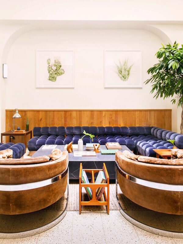
Easy! I worked with an amazing firm, Studio Tack, to design large scale original watercolors for a newly designed hotel. Studio Tack is an extremely talented team and I am honored they chose my work for the hotel. I created 8 large scale pieces for the lobby/ dining areas and each room has Living Pattern prints in it! Click here for the link.

What do you hope to achieve with your work?

My work aims to bring appreciation to the stunning details found in nature.

Any advice to artists first starting out?

You never arrive, your art is ever-evolving just like you! Do not question your art, do not listen to other people's opinions of your art and share it without hesitation straight from your soul. 

Tilden Hotel

Tilden Hotel
Part II: Framing Zaria Forman’s Art.

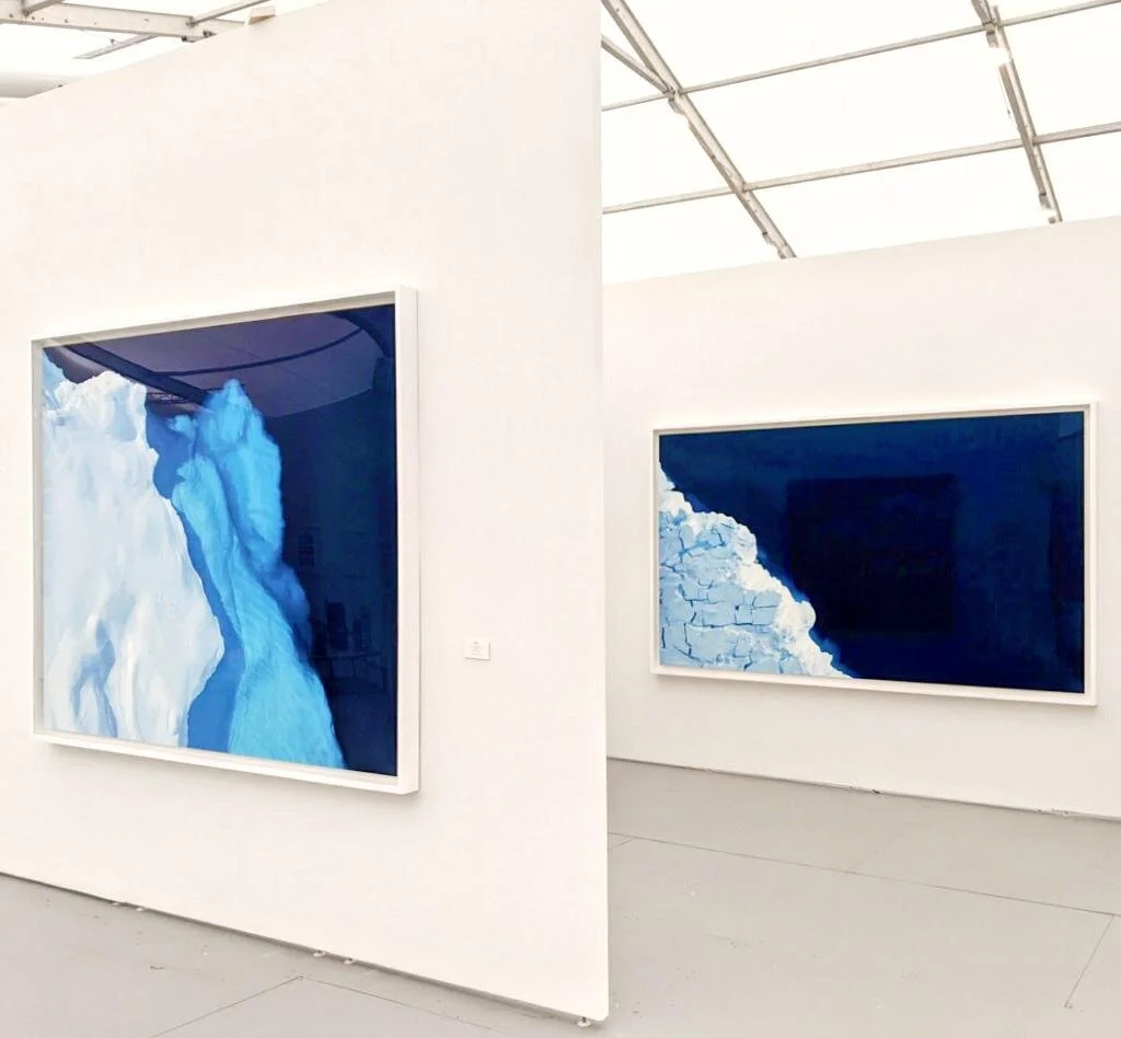
Winston Watcher Booth at Untitled Art Fair Miami

Winston Watcher Booth at Untitled Art Fair Miami

There’s a lot to know and many ideas to consider when framing your artwork. Framing is an art within itself. Both Paul Baumann, from Handmade Frames, and Zaria Forman gave us their insight when it comes to framing.

Why should artists frame their work?

{PB} I would say first that not all artworks should be framed. Artworks that should not be framed include some with aesthetic considerations, such as many contemporary paintings on stretched fabric, and others that should not be framed due to the artist’s sense of how the artwork needs to be presented, even though this invites vulnerabilities which then can be addressed through environmental controls.

However, many, if not most artworks have vulnerabilities that call for framing. Placing an artwork in a frame in a carefully designed manner always provides protections. These include protection from simple physical mishaps, such as spills and other physical harms.

Less well known generally, is the grime in the air. It's invisible, except for the way it builds up on horizontal and even vertical surfaces, such as windowpanes. It’s everywhere worldwide, and in a case like Zaria's, this grime can be quite destructive to artworks, as it settles deep among particles and into pores of paper, and of course would be impossible to clean, and it's both oily, and acidic. The primary function of a frame with glazing is actually to keep this grime off of the artwork.

Why do you frame your finished work?

{ZF} Soft pastel is a very delicate medium so if you touch the surface of the drawing after it is all done it can smudge. In this way framing actually acts as a protective casing for my drawings. It is also a great way to finish the piece and formalize the completion of a drawing. It is a nice way of saying, "I'm done!"

Who does your framing? Why do you choose them?

{ZF} Brooklyn Handmade Frames and they are the best! Framing works on paper is always a challenge, but framing my large scale, extremely delicate works on paper is a whole next level of challenge! Handmade Frames has not only successfully risen to that challenge, but makes it look seamless and easy.

F8AC3BA1-DDD1-496E-AA33-A19F45EF8EF9-58594-00001705EAFD9A08.JPG

What materials are used for the framing?

{ZF} I always use a white wood frame with a floating white mat board (Rising Museum Board) and plexiglass. I use a white frame and mat because I feel it frames the work without distracting from my drawing. The white of the mat and frame sort of meld into the whiteness of the walls, allowing the drawing to be front and center. The plexiglass rather than glass is for practical reasons. At a certain scale - the scale I work in - glass becomes too heavy and the frame is no longer capable of holding such weight. Plexiglass allows for the same protection glass provides, but is much lighter.

{PB} Rising has been known for many years as a preeminent museum board product in relation to its chemistry, and I would add, beauty. It is acid and lignin-free, and generally also buffered, meaning that there is calcium carbonate or some similar chemical added to protect against acids that may come from other sources, such as the artwork itself. 

We use Rising museum board almost exclusively and have since we were founded, about twenty-five years ago. We use the 4-ply and 8-ply products in all available sizes, as well as 2-ply in some cases. We stock every available color and use mostly the white, warm white, and antique, but also the warmer colors quite often. We find that in almost all cases the available colors will provide one that works well with the artwork at hand. We also sometimes make our spacers out of Rising museum boards. We find that the performance is outstanding, it's packed well, the available sizes are sufficient in almost all cases as well. I’ve never seen a chemical issue with Rising. When a frame returns after twenty years, the board still is in pristine condition.

68884767_1099452480243646_7158346662811795456_n.jpg
Rising Board Plys.jpg

Any advice for artists when framing their own work?

{ZF} Always chose a frame that helps the viewer see the artwork. Sometimes if the frame is too loud or busy or if there are too many mat colors it can take away from the artwork itself. The frame is just another visual tool, use it to help tell the viewer how to see, read, and understand your work.

{PB} Well, everyone has to consider budget. We do work hard at providing options at lower price points that still to do follow the standards, and we have had more and more success with this. But my advice would be, try to be as well-informed as you can, as to how the framing will affect the artwork over time, and do the best you can to go to a framer that will take good care of the artwork.

There are good sources out there for learning the true method of conservation hinging, but it is much more time-consuming and has many steps, and so is not very common. It also takes years to get really proficient in it, because you have to learn to make judgments about which mulberry paper is the right one for a particular artwork, and what size the hinges should be, etc.

Read Part I: Illuminating Climate Change Through Art.

More about Handmade Frames.

More about Rising Museum Board.

Lightfast Black Surface: Stonehenge Aqua Black Paper

final-pic-768x512.jpg

Written by Clare McNamara on Jackson’s Art Blog

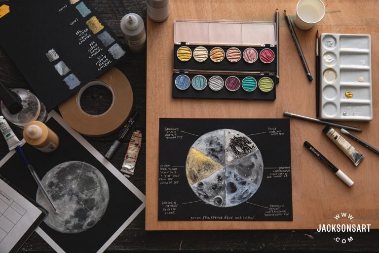
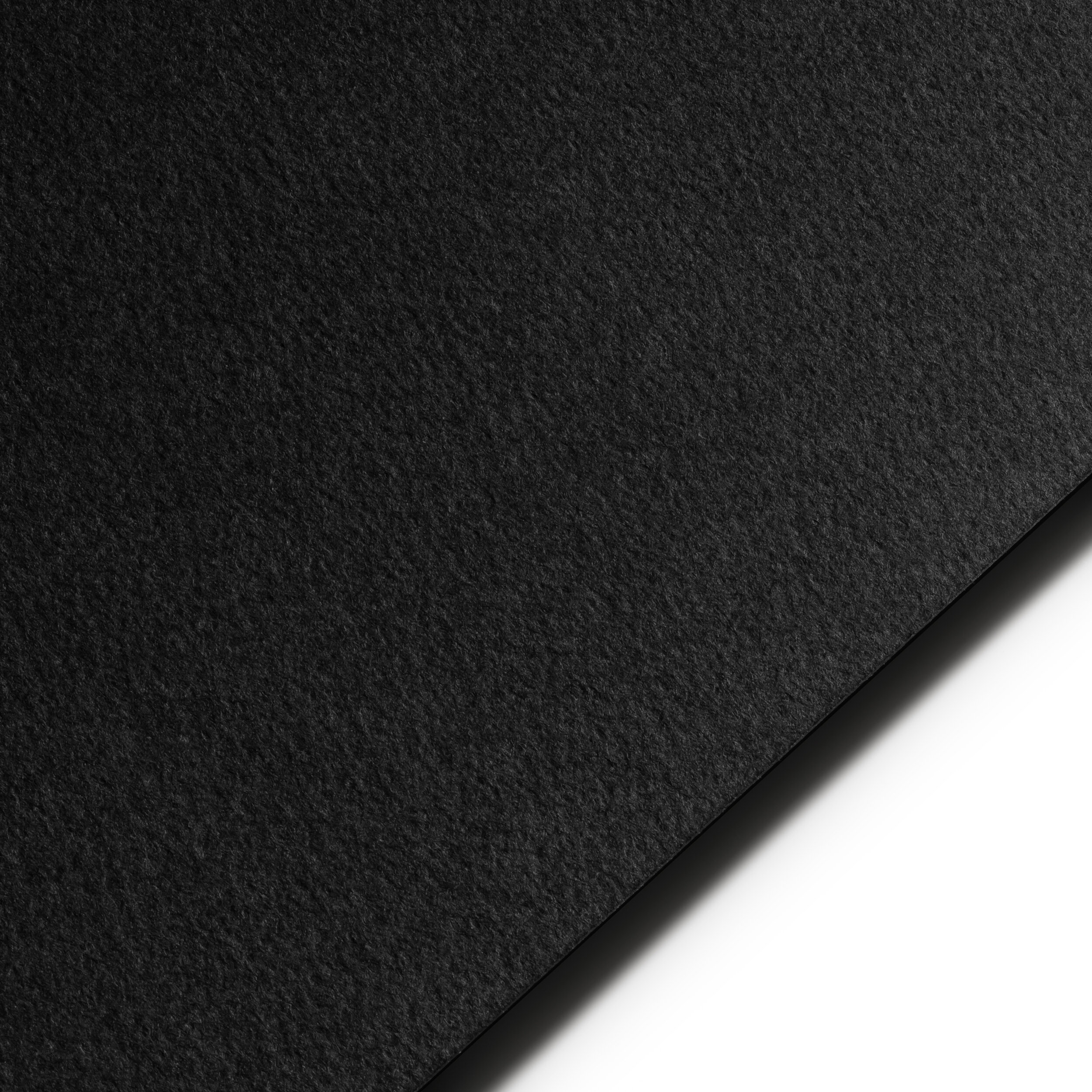
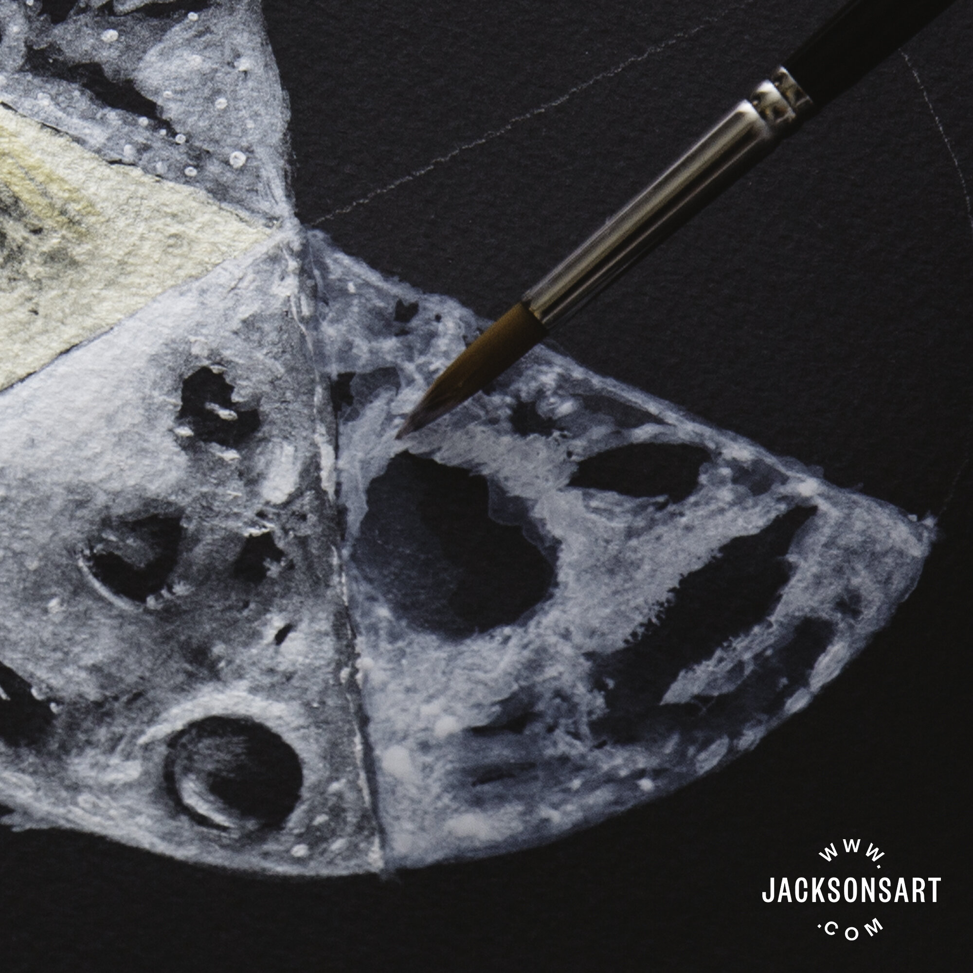
The newest addition of Legion’s watercolor papers: Stonehenge Aqua Black. This 100% cotton paper, produced in 300 gsm, is a hard-wearing watercolour surface. Cold-pressed, with a medium-rough surface texture, the paper is the same quality on each side and is acid, chlorine, OBA (Optical Brightening Agent) and lignin free. This is an archivally sound watercolour paper that provides a mirror world of possibilities when painting light and shadow using water-based materials.

StonehengeAqua_Black_family.jpg

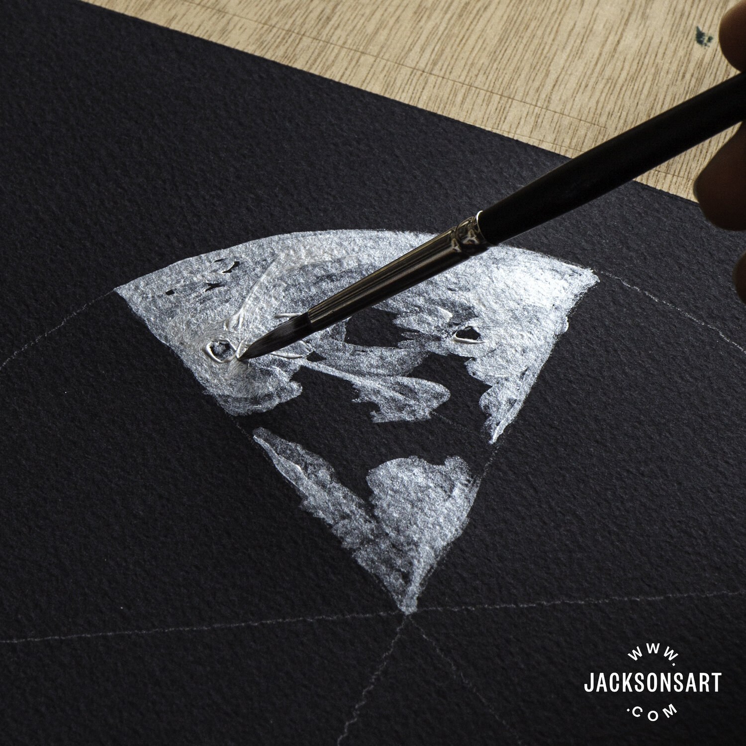
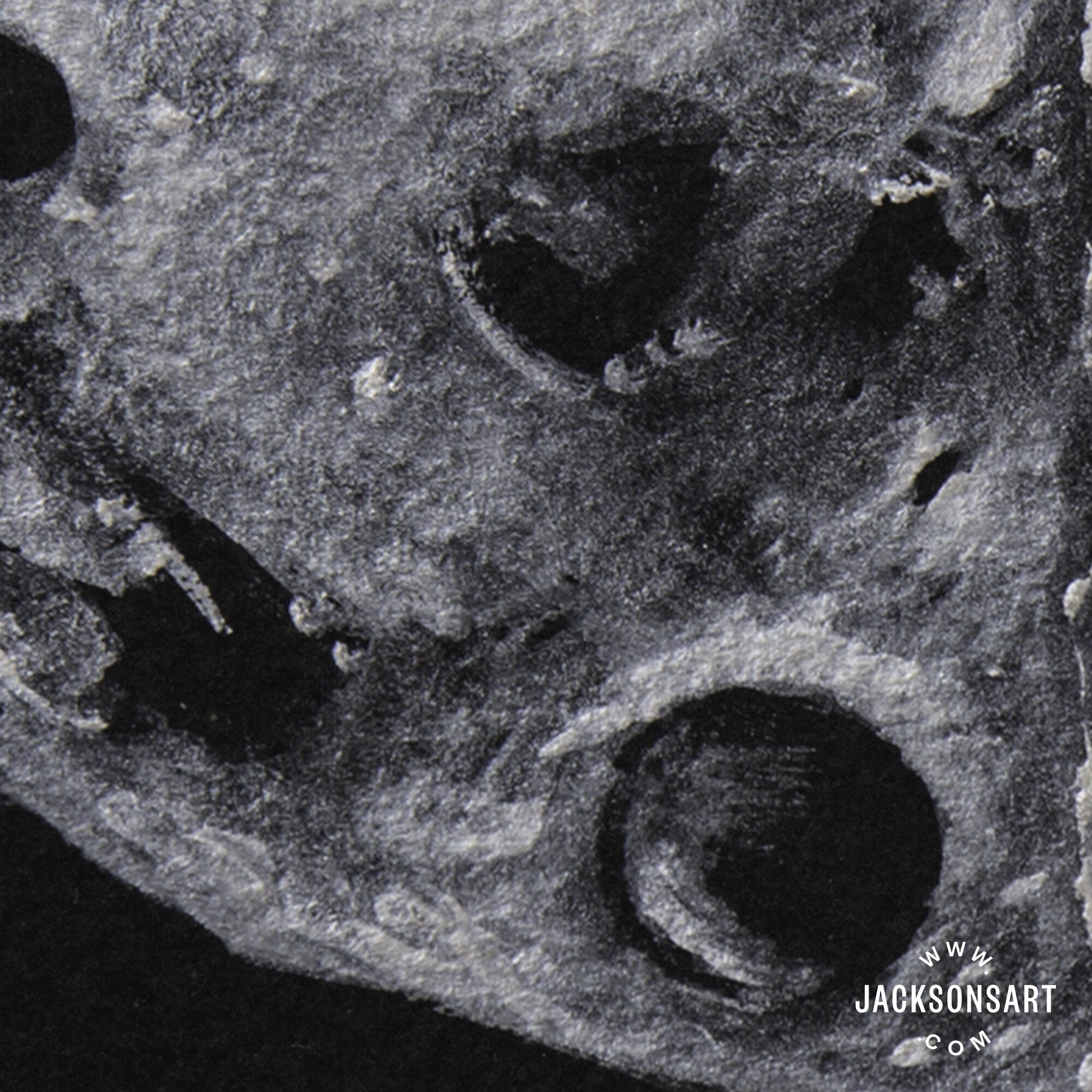
Because it is a dense, cotton paper, with a fairly hard size, Stonehenge Aqua Black has an exceptionally short bleed that allows for superb control of almost every water-based medium, whether applied directly or diluted in a wash. When painting on a black surface, the surface itself will most likely be the darkest tonal value of your image, so you need to work in reverse to achieve a depth of tone—drawing out areas of light and building up layers from the dark. Due to the restrained bleed of Stonehenge Aqua Black and the blending control this allows, tonal values can be obtained by layering varying dilutions of paint, without them bleeding into one another.

Stonehenge Aqua Black comes as a pad or sheets rather than as a pre-stretched block. While it claims to be buckle-resistant, it is prone to very slight warping with the addition of water, when using gouache, watercolour paint, and watercolour pencil. That being said, it eventually dries to a relatively flat state, similar to that of other 300 gsm watercolour papers. Therefore, you may still want to stretch your paper before you begin painting. Samples that were left in water overnight remained black and were able to withstand scrubbing without wearing away. It would take excessive scrubbing for this paper to deteriorate.

Stonehenge_Aqua_Black.jpg

As it has a medium-rough texture and hard size, the paper has the right level of absorbency for wet media as it can take washes while keeping pigment on the surface. This feature is very important with black paper, as it can often absorb lighter colours so much that they disappear. We found the paper’s absorbency was suitable across the variety of mediums we tested.

Jackson’s Studio Acrylic – Silver 972

This was one of the most satisfying mediums to apply. Because it was so easy to control, I was able to build up several layers of paint and produce a wide range of tonal values, by diluting with plenty of water. I noticed a small amount of buckling in the paper while I was working, but this flattened out once it dried. The vibrancy of the silver colour remained bright and reflective both wet and dry.

Jackson’s Studio Acrylic – Silver 972

Jackson’s Studio Acrylic – Silver 972

Finetec Coliro: Mica Watercolour Paint – Moon Gold and Tibet Gold from the Vintage Pearlcolours Collection

With the addition of a little water, these paints burst to life, sparkling in pools in the valleyed grooves of the pan. While they are a little less easy to control than the acrylic or gouache, they handled well on the paper and had an exceptional amount of lift. Many layers could be applied without damaging the paper, though I found it had warped slightly upon drying. Stonehenge Aqua Black seems made for metallic watercolours of this kind—the bright sheen of the paint remains just as strong when dry, and is further accentuated by the matt black of the paper, which appears even darker by contrast.

coliro-2.jpg

Winsor & Newton Designer Gouache – Silver

This was another excellent medium to work with on Stonehenge Aqua Black as it was easy to control and with an equally metallic luminescence to the acrylic. The gouache, when built up in dense layers, resembled hammered silver on the texture of the paper, or applied sparingly as a wash, appeared like distant stars. Once dried, it could be almost completely lifted from the paper and there was no sign of warping or buckling whatsoever.

gouache-1.jpg

Jackson’s Artist Watercolour – Chinese White 471

Applying watercolour paint thickly was the most effective way to avoid it absorbing into the paper too much. On the Stonehenge Aqua Black, the paint dried to a ghostly pale blue rather than a white. Unlike the metallics, the watercolour paint dried unpredictably, with irregular pooling in the texture of the surface and some slight warping in the paper. With the combination of the paper’s dry rough textured finish and the various drying tones, I found the results of the watercolour paint harder to predict, but full of potential for experimentation.

watercolour-3.jpg

Derwent Graphatint Pencil – Cloud Grey 22 and White 24

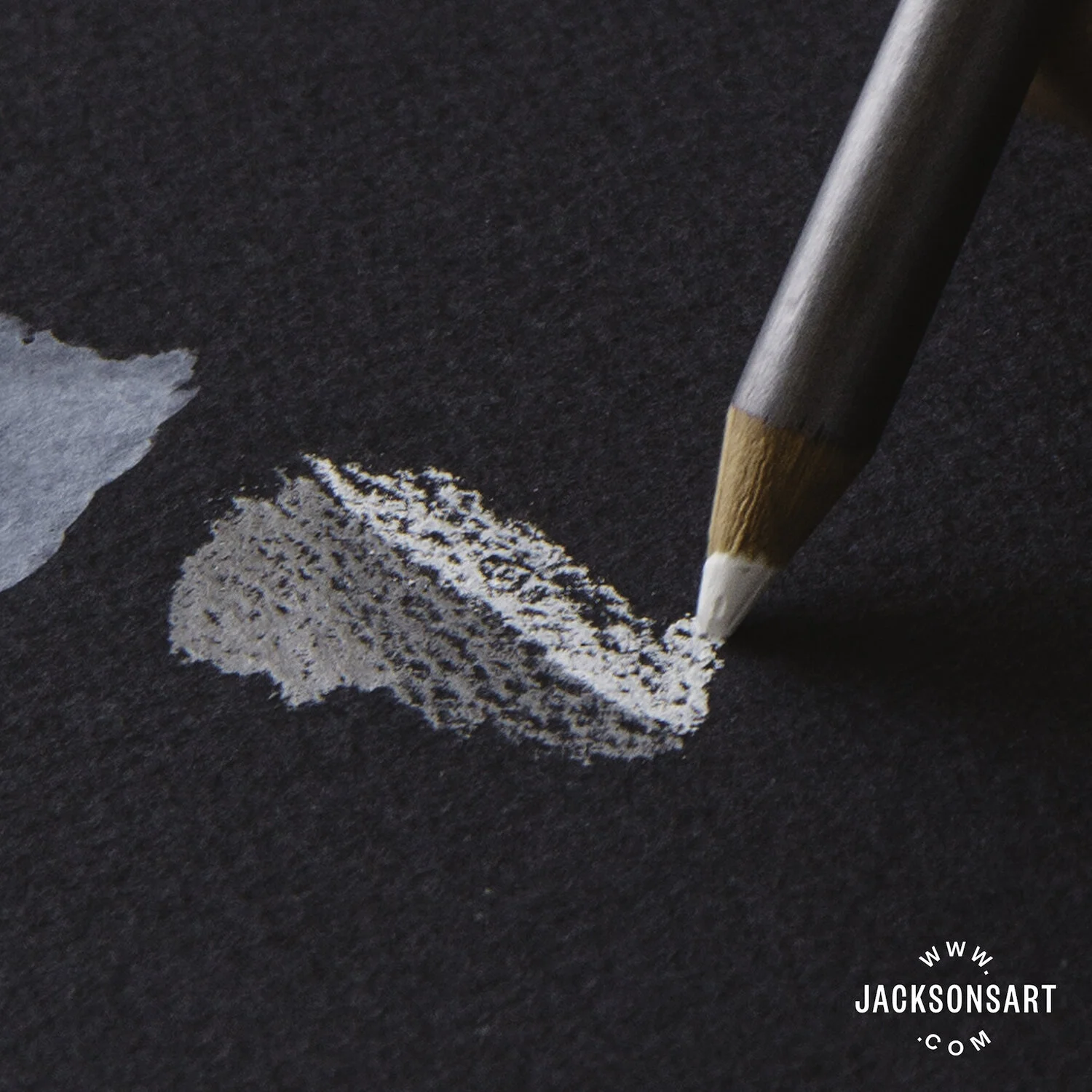
Applying the watercolour pencils with a light pressure prevented them from rubbing the texture of the paper flat, so it retained it’s shape, texture and absorption qualities. The pigment remained visible when wet and absorbed with a lot of coverage into the paper. Once dried to a matt finish, it was harder to lift back to the original black tones of the paper, without leaving grey smoky patches.

pencil-2.jpg

Uni Posca Marker Pen – Silver 26 (bullet shaped 0.7 mm) and White 1 – (pin type 0.7 mm)

Using these pens on black watercolour paper felt definitive, as it was harder to conceal your marks and impossible to lift them back off the paper with water. The ink sat on the surface and lines remained sharp and clear, without bleed. Occasionally and unpredictably, the friction between the semi-rough texture of the paper and the plastic pen tip caused the nib to scratch, splatter, and spit out ink.

pen-1.jpg

Fluid Art on Yupo by Briar West

"This fluid art can be really tough on the paper. When I'm making a piece, I'm continually pouring rubbing alcohol over it, and it doesn't even phase the Yupo. It's the only thing I've found that works." - Briar West

Fluid art by Briar West (@briarweststudio)

Film by Rob Mills Film & KNHO Film (@robmillsfilm @khno_film)

YUPO® is a synthetic (polypropylene) substrate with a non-porous surface that repels water. YUPO® gives visual artists an amazingly beautiful canvas to work with. Its bright white, smooth finish gives artists the flexibility to work in several different mediums to achieve unique and creative results.

Learn more about Yupo.

Crystal Wagner Creates Exotic Paper Sculptures Viewed Around The World

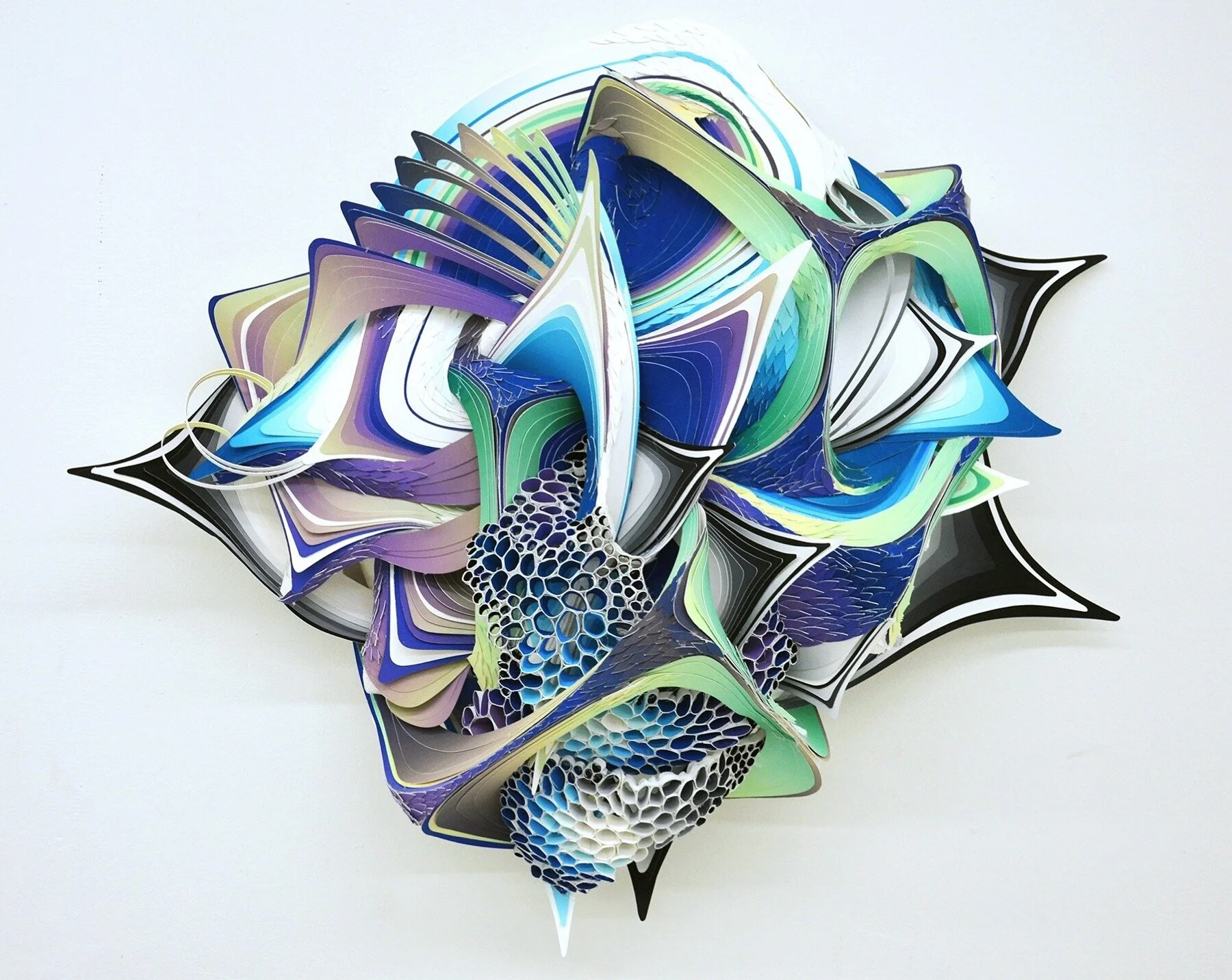
Crystal Wagner’s paper sculture using Stonehenge Paper.

Crystal Wagner is an interdisciplinary artist creating incredible works of art from paper sculptures to installations surrounding castles. She combines 2-dimensional and 3-dimensional works of art using a variety of materials, including Stonehenge Paper, and techniques.

Tell us about yourself and your work. Where did it all begin?

I am an interdisciplinary artist. My practice spans a broad spectrum of medium and processes. I'm interested in what people are capable of with their hands and their imaginations. I grew up in a small suburb of Baltimore, Maryland and then around age 12 moved to rural Pennsylvania. After five years of being a college professor, I left academia to dedicate my time fully to my studio practice. This has given me some of the most incredible opportunities. 

What is your style? What are the different types of work you do? How do the installations, domes, screenprints and drawings relate?

The way I understand style is that it is an individual's vocabulary- their own personal visual language. It's developed through their life experiences, their sensibilities, and their preferences. In my experience, I have always been interested in the relationship between the artificial world and the organic one and a deep love and fascination with ecology. When I am not in the studio, I am usually hiking. I try to drink deeply the world around me. This interest and curiosity, manifests itself differently in each of my bodies of work, and while the difference is usually in scale and material, the stylistic emphasis is always the same.... make something exotic, otherworldly, yet something familiar. 

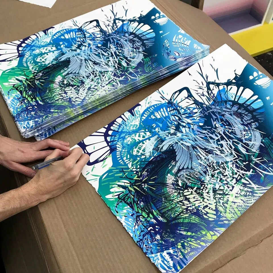
Silkscreen on Stonehenge Paper
Stonehenge Silkscreen Prints

What are the different materials you use for your work?

When I was a college professor, I used to tell my students that being an artist is a way of seeing and thinking as well as making. It's a tool to communicate your distinct experience with the world to others. I personally don't want to be relegated to one mode of making when it comes to my voice. The interior installations are recycled birthday party table cloth, the exterior installations are hot air balloon fabric and the small sculptural works are paper. Each material’s suited for the distinct conditions of their environments.

Stonehenge is the perfect paper for my paper sculptures. I need something that is archival, stiff and flexible. It's thick and durable and can handle all the ink I use and holds it's form beautifully when it is manipulated sculpturally. 

What’s the process like creating the hemispheres?

I work intuitively with all of my work. Each piece is a conversation I am having with the work. Similar to the large-scale installations and the drawings... I make a gesture and respond. The gesture in the case of the paper sculptures is made with wire. Then I cover the armature in paper. The biomorphic paper sculptures require a lot of tedious work. I hand cut every petal with an exacto knife and hand print all of the paper to get create the colors. Ultimately it's about trust. Trusting that every time I put a shape on the piece, that it will provoke me to put another and then another, until finally, it doesn't and the piece is done. 

What’s your favorite piece?
Yikes! I don't have one yet. I probably never will. The thing about being a generator is that creating is a continuum. I'm never working towards an end, just a different moment in the work, a different spot in the evolution to breathe and then it keeps going, keeps growing. With each moment, I learn something new about my language and my particular emphasis in the time in my life. 

What’s next to look forward to?
I'm currently my studio in Los Angeles, CA working on new paper sculptures for the Urban Art Fair this spring in Paris and my solo exhibition with Galerie Openspace also in Paris. 

Crystal Wagner Installation