Stonehenge Oil: Learn from the Artists

Stonehenge Oil is light, durable 100% cotton that welcomes layers and layers of brushwork while retaining every detail.

Stonehenge Oil doesn’t just do what a canvas can do. It allows you to do so much more and to do it without the need for primer or gesso (That’s right: Zero prep required).

Learn from artists how they are using Stonehenge Oil and why.

Courtney Myers

Tell us about yourself and your work.

My name is Courtney Myers and I am an oil painter. I would say that up until this year I have specialized in landscape painting, but recently I have been trying to branch out and improve my skills in still life and portraiture. 

What materials do you use with Stonehenge Oil?

When painting on Stonehenge Oil Paper, I used my typical oil paint (Winsor and Newton Artist Oils) along with my usual underpainting method which consists of using a mixture of oil paint and mineral spirits. 

How does Stonehenge Oil compare to previous surfaces you were using?

In the past, I have painted on stretched canvas, and canvas panels. I found that painting on Stonehenge Oil Paper was much smoother than painting on a canvas surface.

Why does Stonehenge Oil work well for you?

Stonehenge Oil Paper was absolutely incredible because of it's smoothness. One additional quality that I discovered was that photographing/filming my work on Stonehenge Oil was so much easier than a canvas because although my painting was still wet, it looked matte. My experience with canvas is that it can be difficult photographing my work because I get a bright glare off of my artwork.

What’s your process like in creating a piece?

When painting on Stonehenge Oil Paper, I used my normal process that I would use on canvas. First I sketched out my composition with graphite pencils and set the sketch with a workable fixative. Next, I used an imprimatura underpainting method to give the paper an even wash of an orange/brown color to paint on top of. Lastly, I painted on top of that with my oil paints. The only thing that I did not do that I typically would do on canvas was varnish my finished artwork. 

Advice for artists using Stonehenge Oil.

My advice for anyone using Stonehenge Oil would be to be aware of how much it absorbs. The paper held up amazingly when I toned it with oil paints and mineral spirits (there was absolutely no warping) but next time I paint on Stonehenge Oil, I'll use a thinner underpainting mixture so my underpainting isn't too dark. 


Tell us about yourself & your art.

I’m an artist and instructor from South Carolina. I’m a portrait artist who explores the relationship and intertwining Nature of light and shadow and the composition as a whole. 

What materials do you use with Stonehenge Oil?

I’ve used Winsor and  Newton water miscible oil paints and charcoal with Stonehenge oil.

How does Stonehenge Oil compare to previous surfaces you were using?

Stonehenge is a great surface to work with compared to other oil surfaces without the prep. 

Why does Stonehenge Oil work well for you?

Stonehenge paper is convenient. It allows me to create custom sizes without using standard sizes and canvases easily. Stonehenge paper can also be stretched over stretcher bars if I still crave the canvas bounce. 

What’s your process like in creating a piece?

I can’t recall there being anything special I do differently with Stonehenge vs. other oil substrates. I begin my process by figuring out the dimensions for the painting that best works for the overall composition. I start sketching with a soft pencil or charcoal to avoid scratching the paper as it is very soft. I seal my drawing with a fixative if I haven’t drawn the composition directly with oil first, then I paint. 

Advice for artists using Stonehenge Oil.

Stonehenge is very soft as it is 100% cotton, so you have to be careful not to use any hard materials to scratch the surface that could be seen in the finished product. 

Stonehenge oil is very absorbent, so it allows for more time to work the oil paint before overworking it into mud or moving to new layers faster. 


Stephen Bauman

Stephen Bauman is a classically trained artist that spent 12 years as an instructor in the drawing and painting program of the The Florence Academy of Art. In addition to that, Stephen was the director of the Anatomy & Ecorche Department for 6 years, first in Sweden and then in the USA. In 2020 he left the academy to focus on his efforts on my art career & online courses.

Why does Stonehenge Oil work well for your art?

Legion's Stonehenge Oil paper is my undisputed go to for alla prima and direct oil painting. It holds the brushstrokes perfectly and allows me to work up even gradients unlike any other surface I've worked on.

Why do you prefer Stonehenge Oil over a primed Canvas?

The primary difference between stonehenge Oil and oil primed linen is absorbance. Oil Primed Linen is slick and more difficult to get a pure opaque color onto at the 1st application. This means painting alla prima (in 1 session) is more challenging. Stonehenge Oil absorbs the oil more and so you can lay down clear color values better.

Do you stretch Stonehenge Oil?

Yes, the process is very similar to stretching any paper. Here’s a tutorial on stretching Stonehenge Oil and painting on Stonehenge Oil.


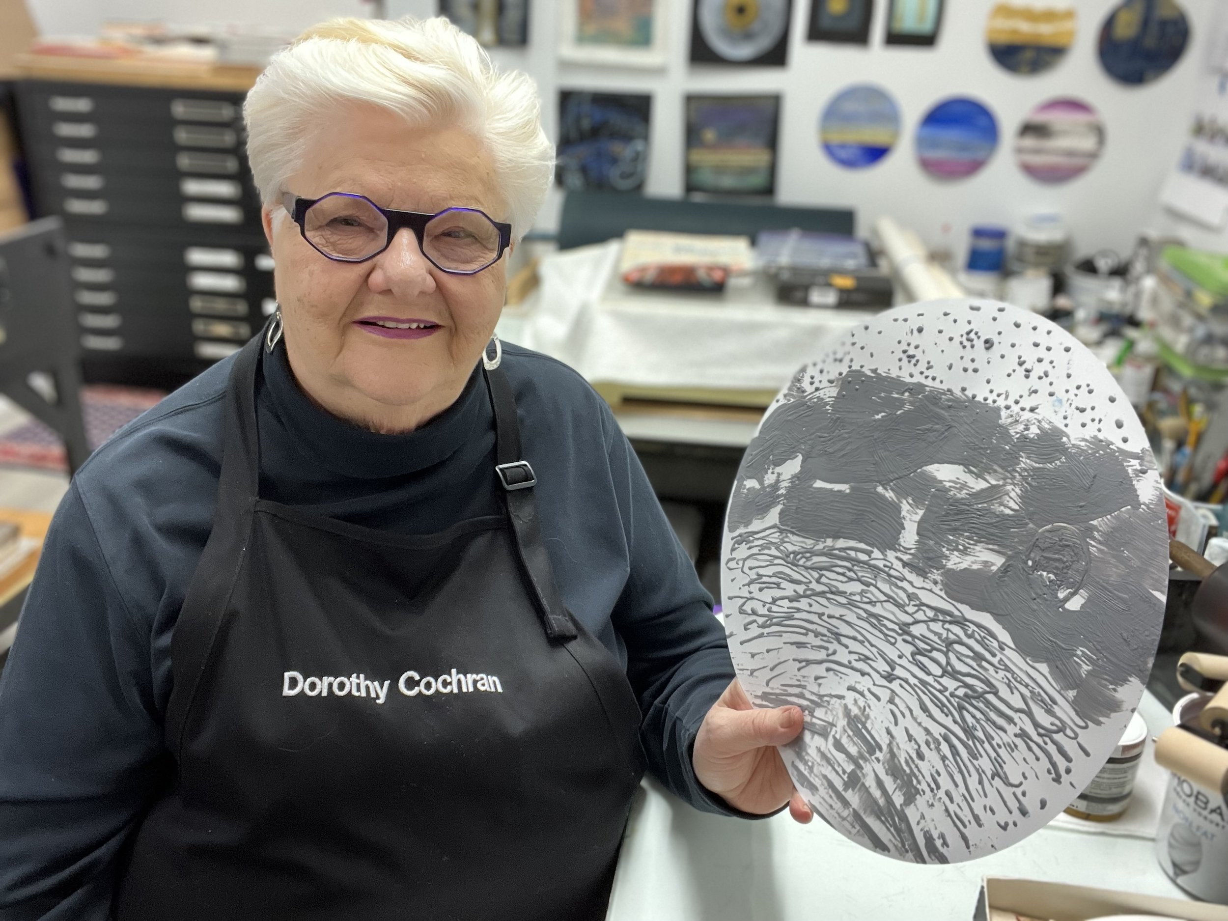
Artist Dorothy Cochran Using YUPO as a Printmaking Plate

Tell us about yourself and your work.

I am a long-time professional painter/printmaker working in a broad range of print techniques. I specialize in using innovative processes to update traditional ways of making a printmaking plate in my studio practice. My works on paper are primarily focused on relief and intaglio methods which include monotype/monoprint and collagraph to name a few. Ten years ago, I discovered encaustic (hot wax) and added those methods to my practice.  Printmaking processes excite me, and I enjoy sharing my knowledge with other artists. There is magic in the pressing of paper to plate, a birth and a marriage all at once.  Experiencing that emotion is like no other and is central to my artmaking. I am inspired by the working of solar systems, metaphysical thought, microscopic science and the bounty of nature.  My teaching experience encompasses universities, museums, art centers and national workshops. I currently work at the Montclair Art Museum in NJ and do online and in person workshops throughout the country.

What are your go-to materials?

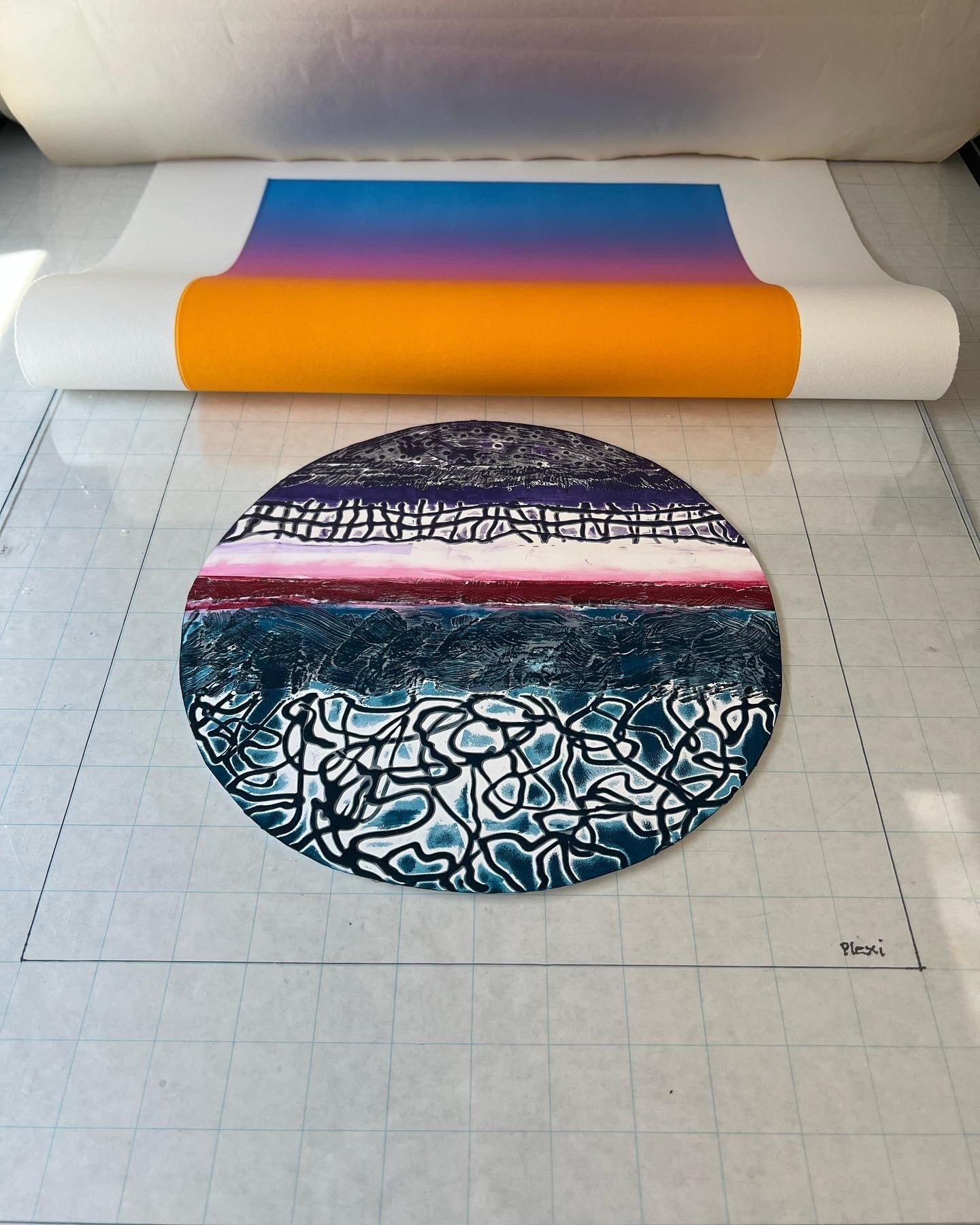
I just love YUPO! More than ten years ago, I happened to view a watercolor done on it while traveling in California. I researched the material and tried to imagine how I could use it with printmaking. I began experimenting with watercolor and various inks using YUPO as a monotype plate, both with a press and hand printed.   Later I combined other types of print plates using the YUPO to print multiple colors and shapes in layers.  Most recently, I have been making encaustic collagraphs with YUPO as the substrate, printing them as intaglio and/or relief using traditional and non-traditional papers including Evolon.

What is the most important characteristic of a paper for you?

There are many reasons why I choose to work with a paper. It must be archival and stand the rigors of the various print techniques I use.  This is even more important when I choose to use it as a plate.

What is it about Yupo. That works well for your artwork/style?

I have been working with YUPO for many years now and enjoy its tough smooth surface. Depending on my process, I will choose either the light or heavy weight to use. My plates are often used over and over making the cleaning and storage of the YUPO plates both easy and a pleasure.  Cutting the YUPO is simple with scissors or knife blade for stencil making and shaped plates.  I like the different sizes which come in pads, sheets and rolls which I find convenient for myself and for my students. As my iconic works are circular in nature, the recent YUPO precut circles save me lots of time when I am layering plates and don’t need to cut them.

Any advice for artists using Yupo?

LOL, yes!! If you are interested in printmaking, take the YUPO and do things to it and then do some more!  I have successfully experimented with creating dry points, adding carborundum, acrylic gels and making shaped plates and stencils. I highly recommend using YUPO to create wax print plates that are collagraph like with their high/low textural surfaces. The wax cools immediately and the plate is ready to ink and print quickly. There is no end to the possibilities with making YUPO work as a plate in print processes. I hope you look me up and take a workshop or let me give one to your group!

Learn more about Dorothy’s work

Learn more about YUPO

Choosing a Paper for Colored Pencil Art

White.jpg

What makes a paper great for colored pencil art? We asked some talented artists why they exclusively use the paper they work on. Whether it’s texture, size or color, each artist requires specific characteristics in a paper to fit their work.

As we suggest with most types of paper, there's no substitute for experimenting yourself. Visit our sample department for our Drawing Paper sampler.

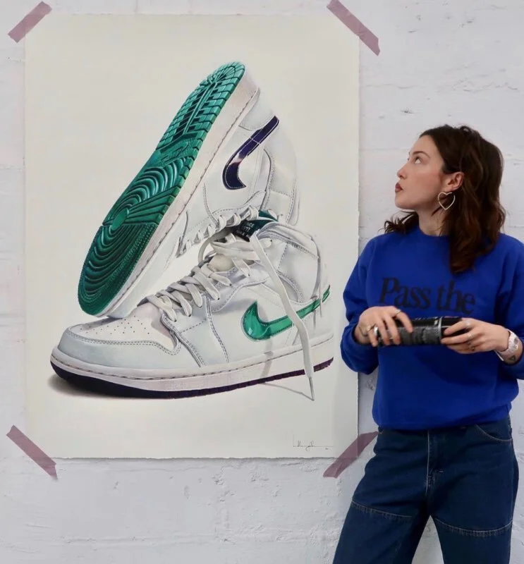
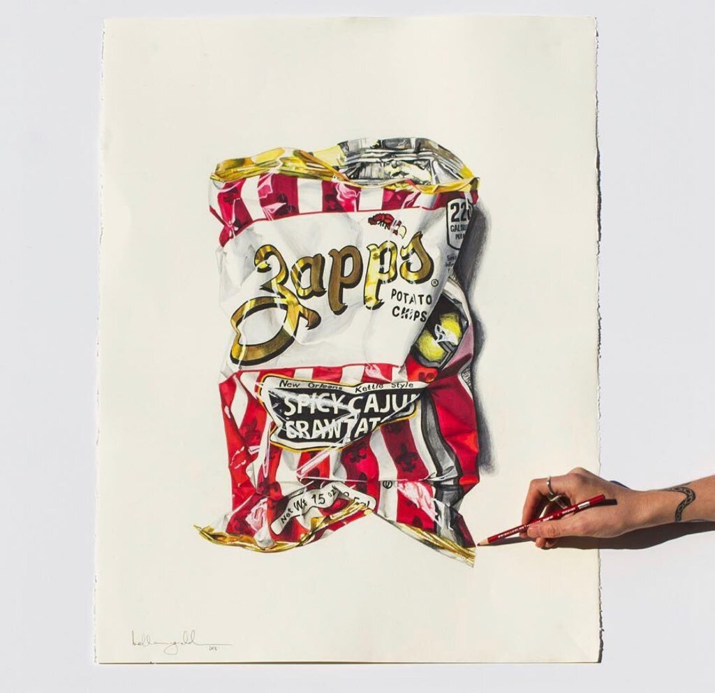
We asked four colored pencil artists about the paper they use and why it works well for their work. Learn from Megan Seiter using Rising Museum Board, Sallann using Stonehenge Paper, Bella McGoldrick using Lenox Cotton and Wendy Hollender using Stonehenge Aqua Hotpress & Stonehenge Kraft.

Megan Seiter using Rising Museum Board

Meg-Studio.jpg

Tell us about yourself and your work.

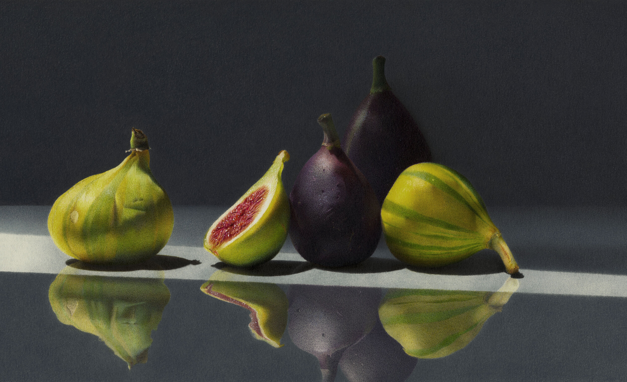
I’m a colored pencil artist specializing in still life realism. I’ve been working with colored pencils for 13 years, and appreciate their ability to create luminous and highly detailed works of art. I’ve recently started experimenting with pan pastels and watercolors, which both work well alongside colored pencils. My most recent body of work is focused on botanicals. Floral subjects offer a breadth of variety in texture, color, and size, which can make for a beautiful and lively composition. I find my subjects at local farmers markets and flower shops, and take photos of the flowers while at their peak to use as a reference for each drawing.

What are your go-to materials?

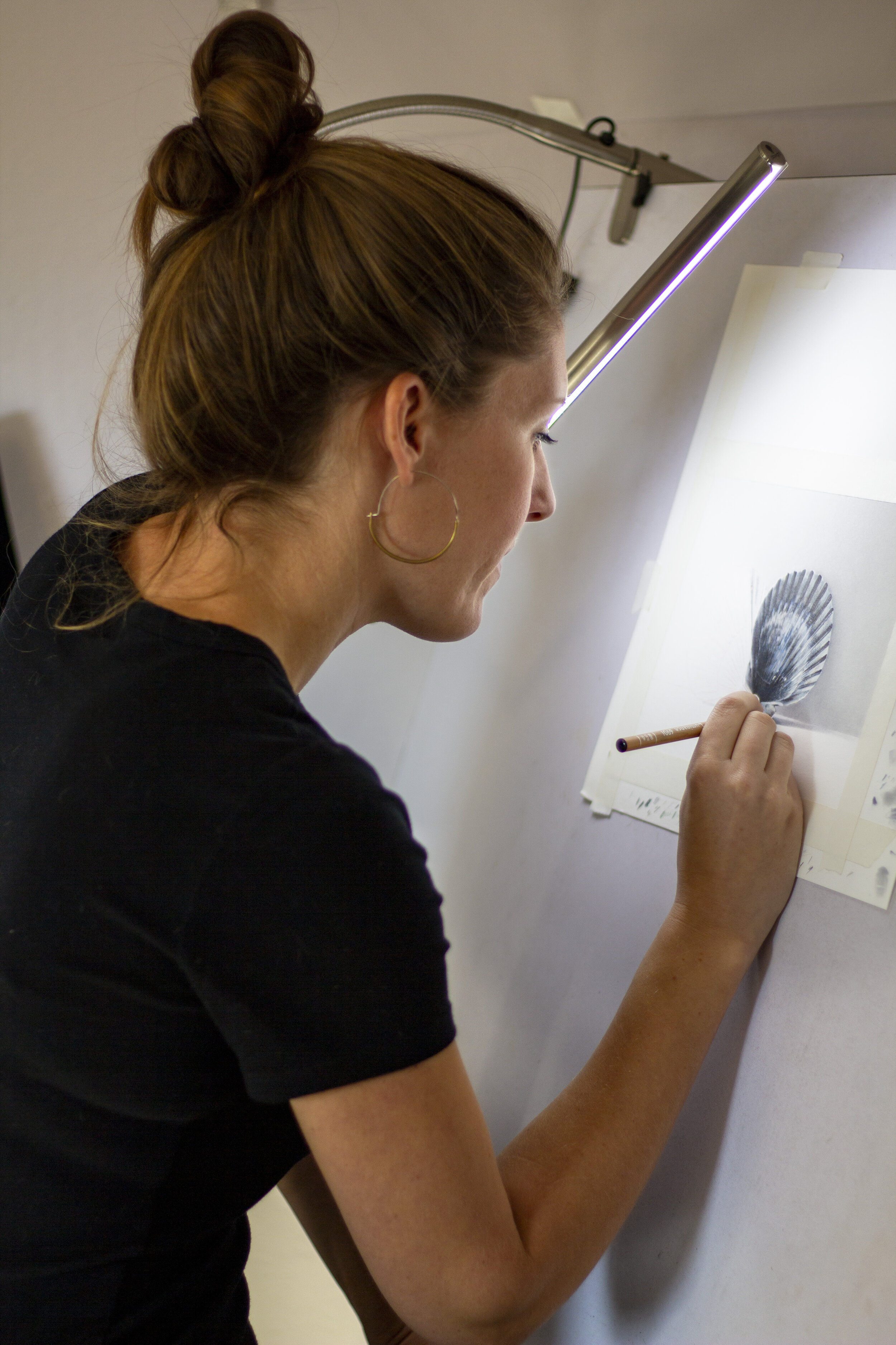
The surface of a colored pencil drawing is incredibly important, and can drastically change the look and feel of a finished work of art. Rising Museum Board is my preferred surface, as it allows me to build each drawing with dozens of light layers of pencil without becoming oversaturated with wax. I use several brands of colored pencils, my favorite being the Luminance line by Caran d'Ache. They are a high-quality, deeply pigmented, soft and lightfast pencil, and they layer very nicely. I work with a Daylight Techne Artist and Drafting Lamp to light my drawing. Lighting isn’t often talked about, but it’s an integral tool that allows me to see fine details clearly under a neutral light. Rubber erasers are useful for lifting layers of pencils, and the Kum hand-held sharpener makes a very sharp pencil point (and the blades are easily replaceable).

What is the most important characteristic of a paper for you?

Layering is at the core of my technique. I build each drawing with dozens of light layers of pencil, which gives depth and luminosity to the work. It takes a specific type of paper to be able to hold on to so many layers of pencil. Some papers will start to flake with too many layers of pencil, and others will become oversaturated with wax after only a few layers (making it impossible to continue applying pencil to the drawing). That being said, the most important quality of a paper is its texture.

Colored Pencil on Rising Museum Board by Megan Seiter

Colored Pencil on Rising Museum Board by Megan Seiter

What is it about Rising that works well for your artwork/style?

I look for a paper surface that’s toothy without being heavily textured. The texture of the Rising surface is ideal for colored pencil work. It comes in several plies, and I appreciate the sturdiness of the board (it won’t buckle with watercolor). I often incorporate oil-based pencils and pastels into my drawings, and both blend beautifully on this surface. The board also works well with the Slice Tool, which is a ceramic blade that I use to lift the top layers of pencil and to carve out the veins of a leaf.

Any advice for artists using Rising?

You can try almost any technique on this board with great success. It can handle a heavy hand, a blade, an electric eraser, a dozen layers of pencils, watercolors, pastels, and I’m sure almost anything else that you throw its way. I find that a light touch and a very sharp pencil is a great way to fill in the grain of the paper with ease. If you’re switching to Rising Museum Board for the first time, I would suggest using a scrap of the board to make a color chart. Your pencil colors will look different from one brand of paper to the next, and a chart will allow you to refer to your colors with accuracy and ease.

How do you use a shade of Rising for each piece?

It all depends on the mood of the drawing. Something light and airy will work best on white, while a dramatic and moody drawing looks great on black. Grey is an excellent option for drawings that have a wide range of values because you can still get bright whites and dark blacks, and it can be quicker to fill in the grain of the paper when you’re not working on a stark white surface.

Learn more about Megan’s work here.

Learn more about Rising Museum Board.


Sallyann using Stonehenge Paper

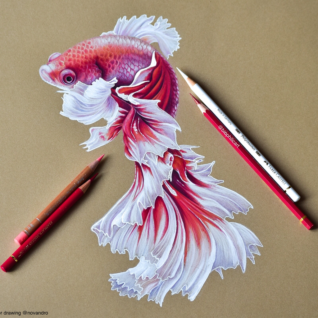
Colored Pencil on Stonehenge Kraft by @biophilicart

Colored Pencil on Stonehenge Kraft by @biophilicart

Tell us about yourself!

My name is Sallyann and l draw the things from nature that l love.

What are your go-to materials?
Always and only Stonehenge paper, l love it. I have tried many papers this is my favourite. Pencils - l use many brands, Faber Castell Polychromos and Caran D’ache Luminance and Pablo’s and Derwent Lightfast are my most used.

What is the most important characteristic of a paper for you?
The paper must allow me to layer colored pencil forever.

What is it about Stonehenge that works well for your artwork / style?
Stonehenge allows lots of layers, it is neither too gritty nor too smooth, it is very high quality and it is strong enough not to get random creases in it (as l am a little heavy handed).

Any advice for artists using Stonehenge?

Just to keep adding layers of color because Stonehenge will keep taking it and the more layers you add the more beautiful the finished piece becomes.

Stonehenge White

Stonehenge White

Stonehenge Steel Grey

Stonehenge Steel Grey

Stonehenge Kraft

Since you use different shades of Stonehenge, how do you choose which shade for each piece?

I always look at the colours in the reference photo and use that as a guide for the color l will work with. It is amazing how colours that look quite similarly neutral can really look completely different when you add the colours you want to work with.

Learn more about Sallyann’s work.

Learn more about Stonehenge Paper.


Bella McGoldrick using Lenox Paper

Colored Pencil on Lenox by Bella McGoldrick

Colored Pencil on Lenox by Bella McGoldrick

Tell us about yourself!

I’ve been drawing as my full time gig for 3 years now. I grew up in New Zealand and Australia and moved to nyc in 2016 which blew me away and inspired all my early works. I create hyper realistic drawings on paper with coloured pencils. Mainly still life but in a modern way I guess, usually just things around me wherever I’m living or things I source out when I’m travelling. These objects all mean something to me, or in their composition with other things tell some sort of a story, these days it’s more about wherever I’m living which changes monthly now. But I like the work to bring a connection to the viewer, either by nostalgia or memories of a place or time.

What are your go-to materials?

Tools are pretty simple and I’m always traveling and working so I have to keep it concise (which is hard with pencils) I use caran D’Ache and prisma color pencils, an eraser, an electric sharpener (essential) a traveling light, and good paper, always Lenox 100 250gsm. It really has to be those brands of pencils and that paper, I cannot veer from those two things. And then fixative when I’m finished, oh and shitty paper to cover my work whilst I’m working on small sections.

What is the most important characteristic of a paper for you?

Hmmm it’s kinda a combination and it’s more of the feel under the pencil. I always layer another sheet under the one I’m working on so as to not get any details from the table or work top coming through the paper. It has to be ever so slightly off white so as the white highlights in the drawings pop. But no yellow-ness. I like it visibly smooth but some tooth that I can feel. Surprisingly I’m not a perfectionist and I’m quite rough also with all the travel the paper has to have a good weight to it so withstand me and the moving around. So as heavy as I can get it, but this sometimes means there’s less tooth so it’s a perfect balance. Honestly it’s just really important to have consistency, things that I’m used to so as I can expect exactly how they’re going to react to my treatment. I spend too long on each piece (100-200hrs) to take any risks. And that also highlights how I need paper that it’s sturdy and strong!

IMG_1942.jpg
IMG_1943.jpg

What is it about Lenox that works well for you art/style?

The reason I first tried this paper was that I was able to get it at such a large size. I was limited by sheets before so that’s the first thing that suits me I get the 60”x20yrd rolls. Then the colour is great, white to the eye but I can still later white pigment on it and it pops off, the smoothness (whiteout being slippery) and sturdiness are perfect and what I’m used to so I won’t change it up now.

Any advice for artists using Lenox paper?

First important thing is be careful on what tape you use if you need to use tape, I usually tape other paper around the white edges of the work to keep them clean and I found out the hard way that some will tear the top layer of the paper off if they’re not good quality tapes. Then also if using coloured pencils be careful not to go to hard, as with any paper buy maybe slightly more with the Lenox because it’s not crazy toothy, there comes a point when the paper will take no more wax, it’s filled up basically, so you have to layer slowly, lightly and patiently. Oh and the third piece of advise is key!! The paper is dense enough that if you want a white highlight in the middle of colour, you can press really hard with the white pencil, in dent into the paper and when you softly shade over that area with another colour the white will shine through (the colour doesn’t go into the dent) this has saved me hours. So I do all my highlights first as the paper can take it.

Learn more about Bella McGoldrick and her work.

Learn more about Lenox.


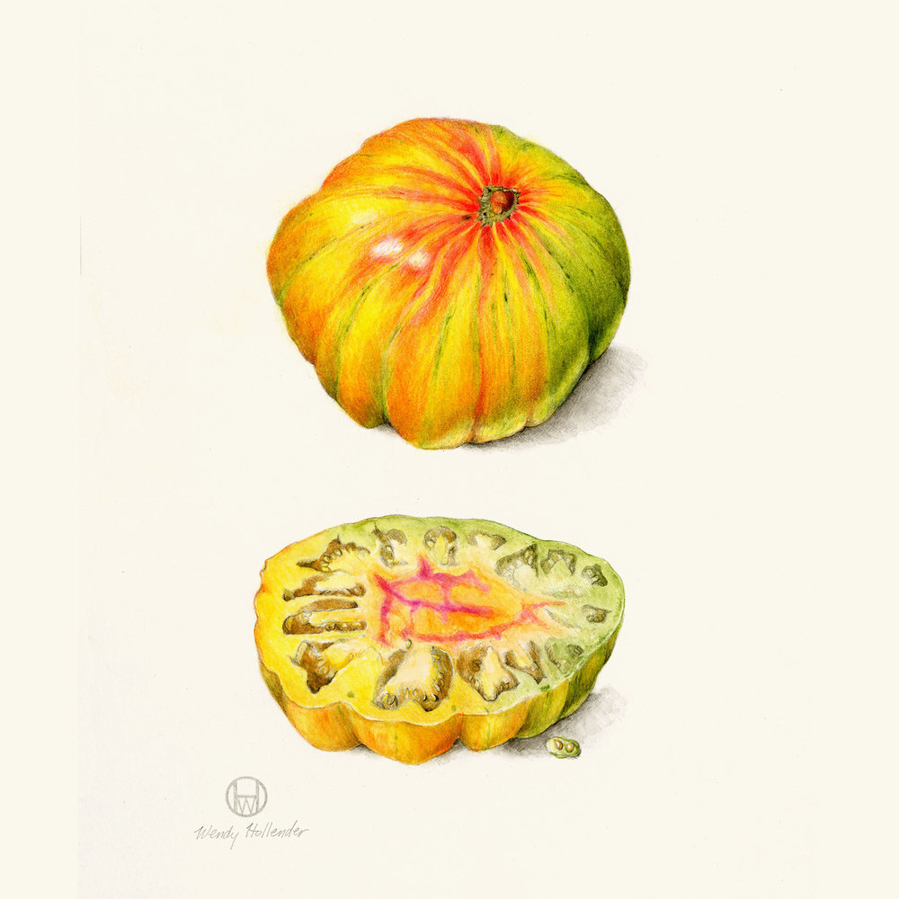
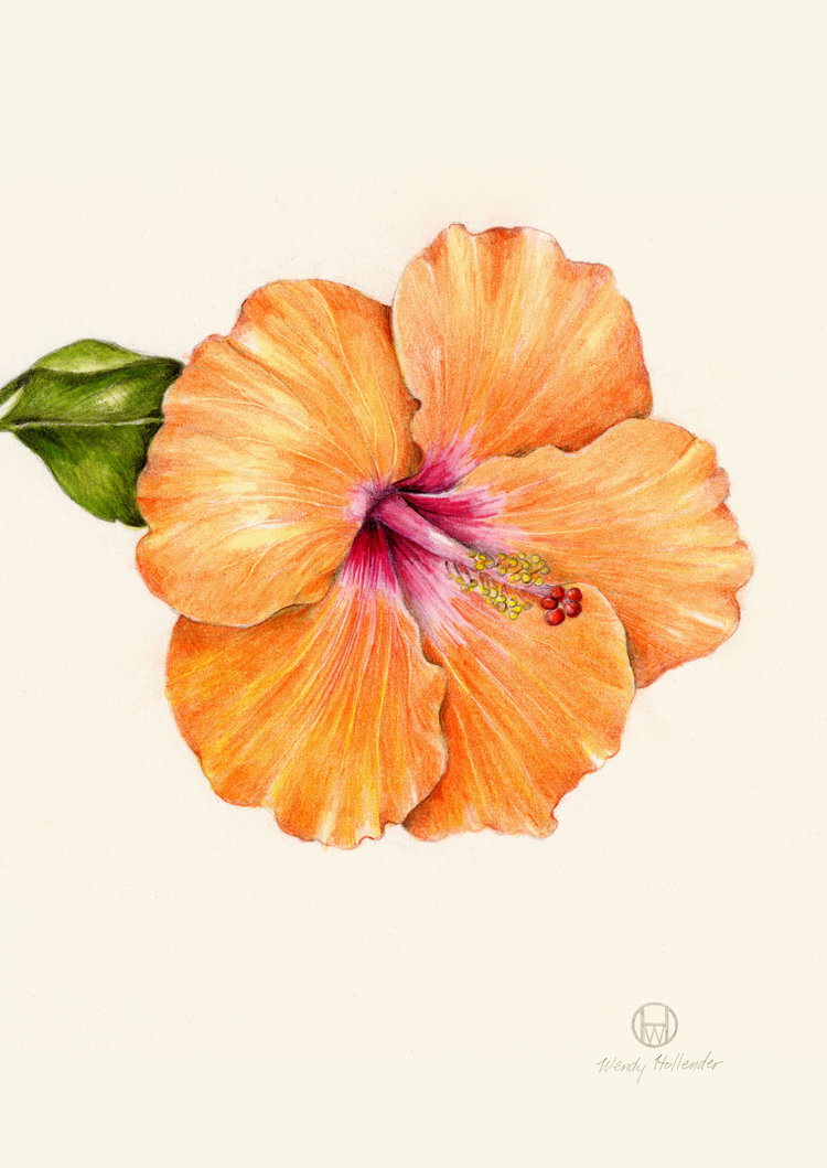
Wendy Hollender using Stonehenge Aqua Hotpress

Elderberryplantpage.jpg

Intro- tell us about yourself and your work!

I am a botanical artist, illustrator, instructor, and author.  I have worked across the world for over 20 years. My specialty is  using colored pencils and watercolor pencils to create detailed botanical drawings and paintings. I live on a small farm in the foothills of the Catskills having started a garden here 12 years ago to provide food and inspiration for my work.

What are your go-to materials?

I work on hot pressed watercolor paper mostly . Stonehenge aqua hot pressed and Stonehenge paper in kraft and white or natural. I work with colored pencils and watercolor pencils.

coplatomato.jpg
Hibiscusorange.jpg

What is the most important characteristic of a paper for you?

Paper needs to take layers of watercolor and pencil.

What is it about the paper that works well for your artwork?

The smoothness of these papers allows me to build layers quickly creating a detailed realistic drawing. Since I switched to using these papers, I can complete my artwork in a shorter amount of time.

Learn more about Wendy Hollender.

Learn more about Stonehenge Aqua Hotpress.

Painting a Galaxy on Stonehenge Aqua Hotpress Black

Try this! @vanessa_paints_ galaxy painting using Stonehenge Aqua Hotpress Black. (not drawn to scale)

Materials used:

Arsenal Handicraft Uses Mirri Sparkle for Space Walk Silkscreen

arsenal-handicraft-about-us-page_1000x.jpg

Who is Arsenal Handicraft? Tell us about yourself.

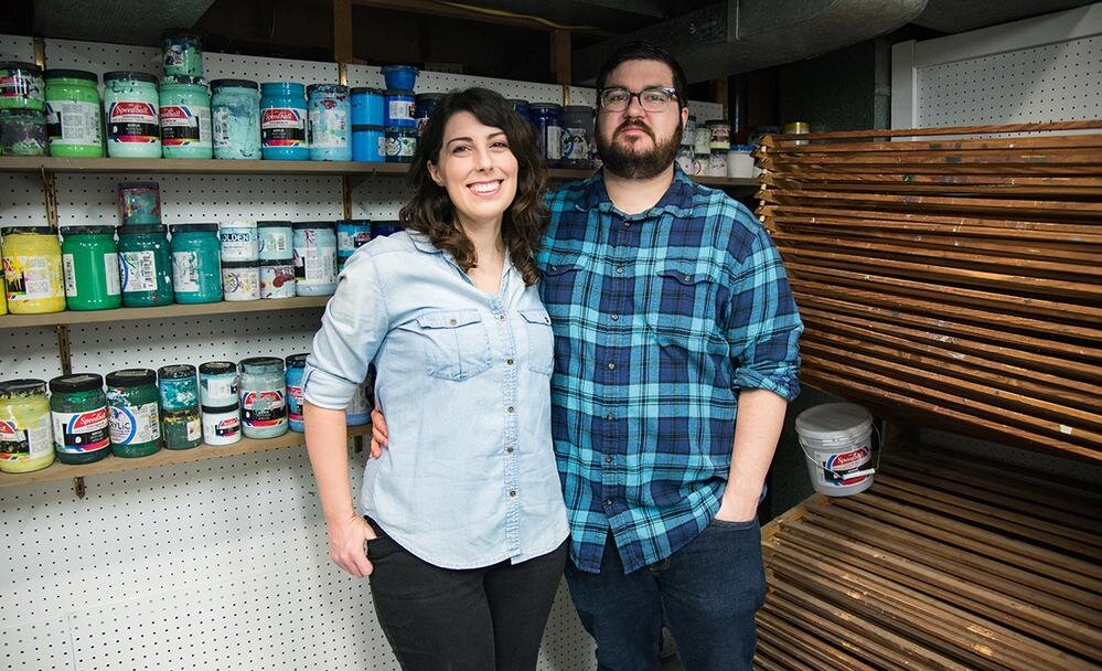
Arsenal Handicraft is husband and wife illustration / screen printing duo Dennis and Christina Jacobs. We work out of our home studio in Madison Heights, just outside of Detroit, MI. We've been printmakers for about 12 years and the first thing we screen printed was our wedding invitations. In addition to art prints we have previously worked on concert posters, album artwork, book covers, and most recently beer labels.

What materials did you use for the recent screen print, ‘Tethered’?

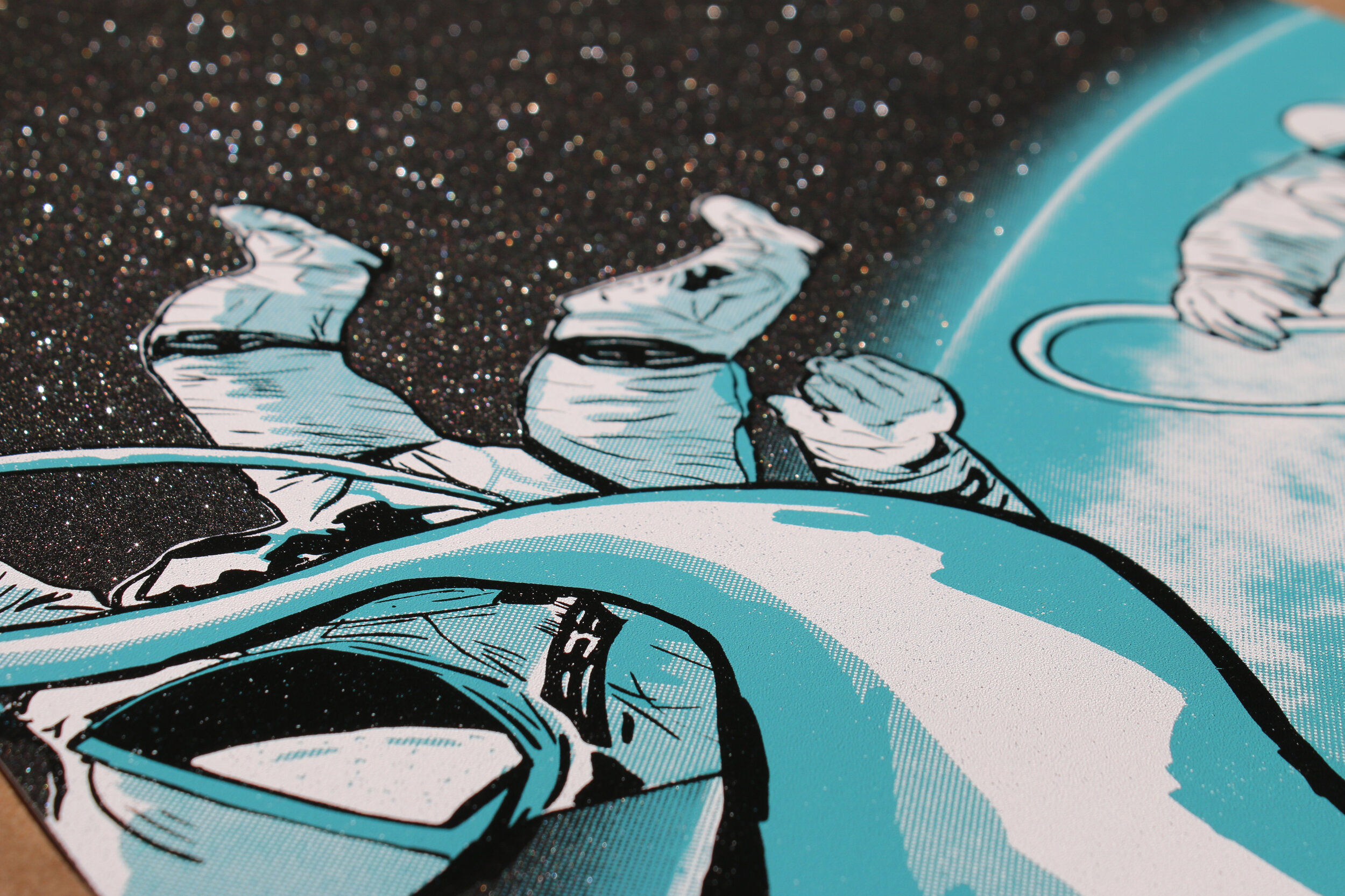
We used Mirri Black Diamond Sparkle Paper and Speedball acrylic screen printing ink.  We design and print everything in house, which allows us to experiment with different pigments and materials, such as this Mirri paper.

silver variant.jpg

Why did you choose Mirri Sparkle for this project?

We've recently been experimenting by printing on different surfaces and mediums.  When we came across the Mirri Sparkle paper, we knew it'd be perfect for a space themed print, which is often the subject matter of our prints.  It looks like outer space littered with stars and adds so much depth to the image.

silver close up 1.JPG
close up 2.jpg

What was your process for creating ‘Tethered’?

Since we knew we wanted to make the most of the glittery finish of Mirri Sparkle paper, we wanted to leave much of the paper exposed.  With this in mind we started by thumbnailing different concepts, landing on this image of two astronauts on a space walk.  It was ultimately Christina's thumbnail that we developed into the final composition.  Once the thumbnail was finalized Christina chose the ink colors, and Dennis began illustrating the full rendering for the print.  During the illustration process we have a bit of a back and forth to make sure we both like the direction it is heading.  Once finished the artwork was separated into three ink layers, white, blue, and black.  These are then outputted to film for use in burning our screens.  Once the screens are made, Christina got to work on mixing the ink colors.  These were printed by us with Dennis pulling the squeegee and Christina racking the paper.

Were there any challenges using Mirri Sparkle for a screen print?

This was our first time experimenting with a paper such as this and we were super happy with the results!  We did notice that the ink sits on top of the paper more than being absorbed, which resulted in slightly longer drying times.  We also noticed that the paper grew a bit when we were printing a large flood of ink.  This is normal, we just approached it by printing one color per day, which allowed for the paper to dry and relax.

What projects are coming up next?

We are currently entering our Fall show season.  Over the next few months we will be set up at various art fairs around the Midwest selling our screen prints.  Additionally, we are working on a poster for Artcrank, a bicycle themed art show held in Minneapolis this September.  We are also working on another print using Mirri Sparkle paper, this time with Mirri Twilight Sparkle.