Introduce yourself! How did you get started as an artist?
{JH} Hi! My name is Julie Hilboldt and I’m a painter/drawer from St. Louis. Growing up, I always had a strong interest in art. My mom would have me making all sorts of projects to challenge me creatively. It was primarily a hobby until I got to college and I started to realize how much I really enjoyed it. After my undergrad I worked for approximately six months in the “real world” before I decided I needed to find a way to make art my career. At that time, I started graduate school for my MFA and I’ve been navigating my way through the art world ever since!
What type of art do you create? What mediums do you work with?
{JH} The majority of my work is representational with moments or marks of abstraction. Typically the subjects are people; the main reason for this is because I went to Fontbonne University for graduate school where there is a strong focus on anatomy and figurative studies. I primarily use traditional mediums like charcoal and oil paint but I’m enjoying experimenting with new materials that can enhance the old ones.
How do you choose a paper for your piece?
{JH} It may sound strange but I have to feel the paper or any surface I’m about to work with. This is why I love a good art supply store. When going through the options there could be a different size, shade, texture, etc that jumps out to me and makes sense for my project. It’s difficult to have that experience online.

Charcoal on YUPO

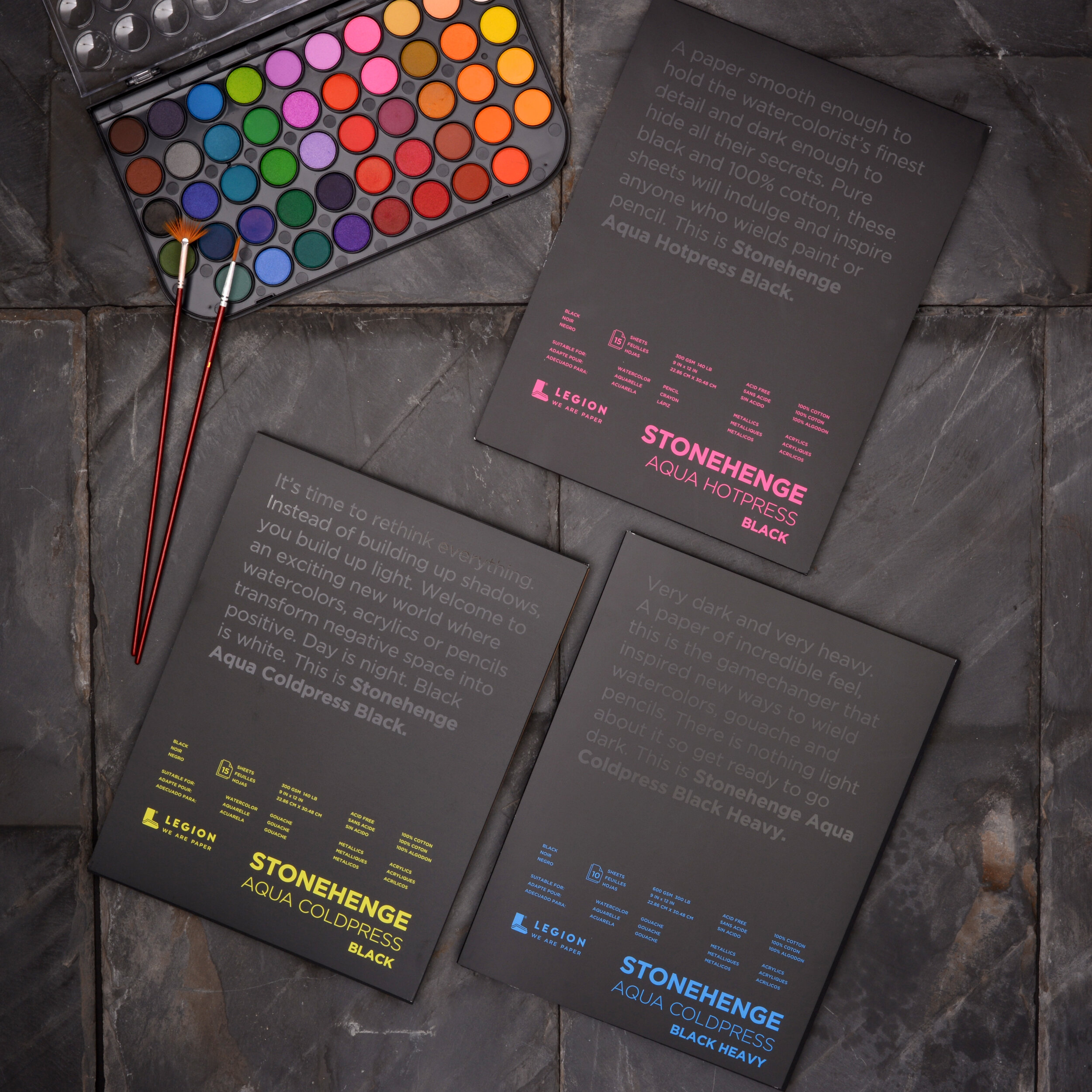
Charcoal & Ink on Stonehenge Aqua Hotpress
How does using YUPO differ from using Stonehenge Aqua?
{JH} There are so many differences between these two surfaces but I think the biggest is that there’s a permanence of Stonehenge Aqua that YUPO doesn’t have. I typically use the same materials on both-- charcoal and water. On Stonehenge Aqua, I can build up the charcoal and erase/blend it in a predictable fashion. On YUPO, when I erase something it may wipe away completely. I think that lack of control adds an interesting element to a piece. I don’t think any of my drawings on YUPO ended up looking the way I originally intended but instead it evolved into exactly what it needed to be.
What’s your process like from the sketch to the final piece?
{JH} Chaotic, incredibly chaotic. I’m terrible at planning pieces out and since I use multiple references this can lead to many challenges. I’ve found that if I sketch and prepare too much, I will lose my energy and the artwork won’t become anything special. Instead I think about the piece I want to make for a few days and then I start sketching it out on the paper or canvas. Occasionally I’ll mark out the composition prior to adding the subject but overall I like to see my idea on the actual surface and size it’s intended to be on so I can adjust from there.
What’s the largest piece you’ve created?
{JH} I’m fairly certain that the largest artwork I made was a painting for a lifesize figure painting class. Typically these paintings would be 6 ft tall but since I did mine independently it was 61”x81”. I absolutely love working large and I’m hoping that one day I’ll get the chance to make a painting that is at least double that size.
You do an incredible job filming while creating! Is this an important part of your process?
{JH} Thank you! It started simply as a way of showing people my work, then it became something I enjoyed doing creatively, and now it’s evolved into part of my artistic process. I’ve recently found myself thinking of the video while also thinking of the piece I want to create. Whether I hear a song or just feeling some emotion deeply, I’ll think of how I can translate that into both my work and my filming. I believe finding this balance between the two ends up making for a stronger, more impactful piece. On the other hand, there’s days that I can’t have an interruption and I won’t allow myself to film so I can focus solely on the art. If you ever see a huge jump in the process that wasn’t included in the video, that’s probably what happened!
What’s next for you?
{JH} This year I will be teaching art to both elementary and college students while also working on my own personal practice. It’ll be a busy year but I’m looking forward to it!
Visit Julie Hilboldt’s Website.