Tell us about yourself and you work.
I’m Alyssa Ingham and I’m a graphic designer, illustrator and hand lettering artist hailing from Houston, TX. My work doesn’t really fit into one particular style, but nature, spirituality, and music are huge sources of inspiration. I enjoy deep-diving into a medium for some time and then move on, holding onto the bits I enjoyed most. Right now, I keep coming back to letterpress printing – it’s such a beautiful process that requires such a high level of attention, and I love being able to offer it to clients as an option for their design needs.
Instagram: @alyssa_ingham
Which papers did you test?
I tested out most of the papers from the Letterpress and Thick Paper Collections.
What was your process in testing these papers?
For the letterpress papers, I used my Chandler & Price letterpress to see out how well each paper held a blind (no ink) impression.
With the thick papers, I used a small DIY press, black ink, and woodcut to print out artwork. Then, I compared the results, focusing on quality of texture and how ink interacted with paper.
Which paper(s) worked well for your work? what did you like about these papers?
I really enjoyed the Arches Cover! It has such a lovely and subtle texture to it, sturdy, yet still able hold ink well when printing by hand. And of course, I love the Lettra, which has been a staple for me in past projects. I’ll definitely be adding the Arches into my favorites for future use.
What are important characteristics of a paper for your particular kind of work?
The paper I work with needs to be substantial and sturdy, as my projects tend to be physical items- like posters or wedding invitations. Ideally, they would also have a nice tactile feel to them that adds to the design without distracting.
Anything else you would like to include!
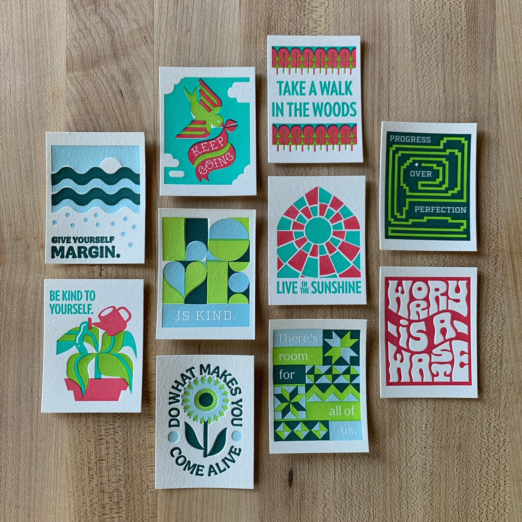
When there’s time, I have a side project where I design and print really tiny posters. I’ve made ten so far and hope to make even more. If you’d like to take a look, you can follow @project_tiny_type on Instagram.


