Paper Cut Artist, Tahiti Pehrson, Uses Lenox 100
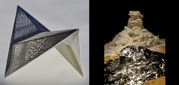
Tahiti Pehrson is a Northern Californian artist that creates large scale installations of geometrical hand cut papers layered into three-dimensional structures using Lenox 100.
How did you get into hand cut paper installations? Where does your inspiration come from?
I started out as a painter on flat surfaces trying to create three dimensional effects, so at a certain point it just made sense to move directly into three dimensions. At the same time I had given up on art school and painting more on the streets. That lead to a practice of stencil making and it sort of evolved from there.
These days Inspiration comes from all over the place. Recently I have been using different materials such as wood and cement to make forms and then re-making those shapes in the paper works.
Is there anything specific about Lenox that draws you in? Does the paper enhance your work?
Yeah, it’s really the only paper I have ever used. The weight works really well for what I do, it holds the detail while keeping a structural rigidity. The 60’ and 72’ rolls enable me to work in the large scale that I need for big spaces.
What other papers have you used for your work?
I really never have. I have run out a few times and had to substitute. I’m a creature of habit
I need my conditions to be uniform and I know what the 100 feels like. Some of my first framed pieces look exactly the same ten, fifteen years later, So I trust it. I could see different weights creating more possibilities, so maybe that’s something to explore.

What kind of characteristics do you look for in paper?
I like a little less texture, just enough to absorb light. I really like the Cotton. People always remark on the way it feels. When you invest so much time in a piece you want it to be made of materials that can trust. Otherwise there is some uncertainty there. As far as color the Lenox 100 is a pretty true white with just a little warmth in a room. That is exactly what I need.
Do you have any upcoming shows?
I’m working on a show for the Joseph Gross Gallery in N.Y. that opens September 10th.
I just finished a large scale install for Facebook’s permanent collection.
Work can also be seen at K.Imperial Gallery in San Francisco and at Salon 91 in Capetown, South Africa.
One last project, I’m working with RVCA right now on a capsule collection of Women's clothing based on the paper cut work. RVCA will translate the original hand-cut pieces into transparent, laser-cut and burn out materials. So that will be out in Spring of 2016. Check it out.

California Takes on Sirio Ultra Black
We were excited to see the new Sirio Ultra Black this year in our 5th annual National Stationery Show scavenger hunt and even more thrilled to hear the reviews from designer Brad Woods at Maginating and printer Ronnie Williams from DeFrance Printing. This intense shade of black performed incredibly to create a clean and rich piece.

Why did you choose this paper?
We chose it because Marc recommended it. For the past couple of NSS/Legion promo pieces, I've contacted Marc, asked him what paper he would recommend, and go with his recommendation. Simple as that!
Is this your first time working with the paper?
It sure is!
How did the Sirio effect your design?
Design wise, it was a blank slate until I knew which paper stock we'd be using. Once we knew it was going to be this ultra-rich 680 GSM Sirio, I felt it would be striking it we kept the design fairly simple: let the contrast between the paper and two colors of foil tell the whole story.
When you're dealing with a colored paper as rich as the Sirio, you know that a large part of the design is the paper itself. And if you know what it's like to work with black stock, the simplicity tells a pretty compelling story. We'd worked with other thick, black stock in the past and it had been a bit of a mess. In fact, with the other paper, we'd had to slip-sheet each piece just to keep things clean. Over time, the paper began to show through both colors of foil! This is not the case with the Sirio. It's very clean and very dark. Initially we wondered if we'd encounter a problem with the white foil, particularly since the edges of the lettering would have nowhere to hide. But it wasn't a problem. Ever. That may partially be due to the fact that we work with one of the best letterpress printers in the country, DeFrance Printing. But Ronnie Williams, General Manager (and master letterpress printer) told me there were simply no issues with either the white or bronze foil - and there's a pretty decent amount of coverage with the bronze foil. It was a low-maintenance paper that was extremely flexible with the foil's adhesive. They didn't have to use any special foil, it was a standard off-the-shelf stock.
Would you recommend Sirio to other printers/designers?
Absolutely - you will not be disappointed!
National Stationery Show Scavenger Hunt Kicks off Tomorrow!
The National Stationery Show begins tomorrow, May 17th. Stop by any of the exhibiting booths for a checklist to begin the search! Once you have successfully visited and collected the designers post cards, head over to the Legion booth (#2774) to stash your cards away and collect the post cards of the participants that couldn't make it to the show this year.
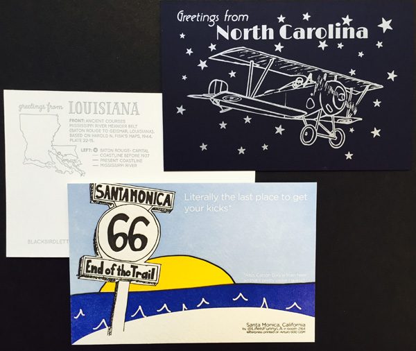
Greeting from: Lady Pilot Letterpress from North Carolina using Plike, Blackbird Letterpress from Louisiana using Savoy, and Life is Funny Press from Sant Monica using Arturo.
5 Days Until the National Stationery Show Scavenger Hunt
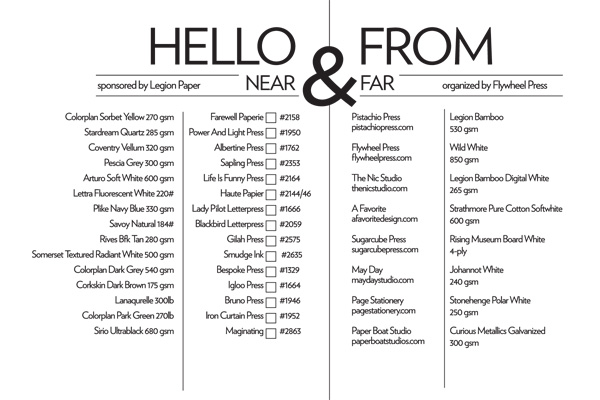
Although we will miss our 'far' participants, we are excited to invite you to visit the booths of the 'near' (exhibiting) particapants. The scavenger hunt card list can be picked up at any of the participating booths noted above. After stopped by the Near booths, come by Legions Booth (2774) to store your post cards in the box designed by Flywheel Press.
 Greetings from: Bespoke Letterpress in Sydney, Australia using Colorplan Dark Grey 540gsm, Igloo Letterpress using Corkskin Dark Brown and Haute Papier from D.C. using Lettra Fluorescent White 220#.