Colorplan Directions II: Permanence

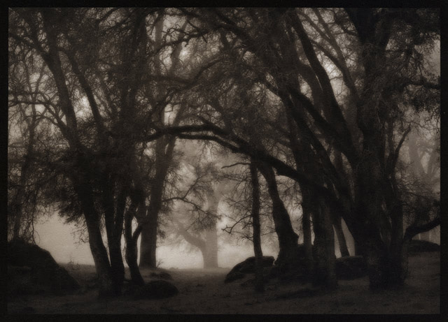
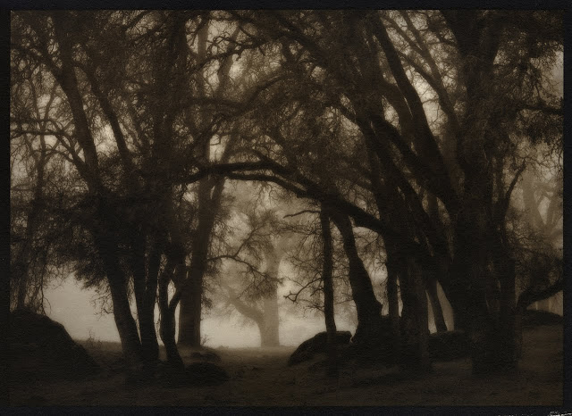
In an era in which we are beginning to re-evaluate what we are consuming and why, and in which ‘luxury’ goods are ever more attainable, we look to brands, products and services that offer a greater sense of permanence and longevity. The rich, weight ‘Permanence’ color palette comprising of black, deep grey and gold accents projects a tone of heritage, quality and durability, while suggesting a message of connoisseurship and expertise.

Psychologically black implies weight, indeed in tests it has been proven people will think a black box weighs more than a white one. The color black has also long been associated with sophistication and power – limousines, judge’s robes, and priests’ attire are all typically black. Drawing color inspiration from natural rocks and minerals that take time and process to form, the ‘Permanence’ palette provides a restful and reassuring sense of quality, evoking a mood of power, potential and possibility.

Card 1: Ebony 540 gsm with Gravure embossing Gold foil 

Card 2: Dark Grey 540 gsm with Coltskin embossing Gunmetal foil

Card 3: Bitter Choc0late 540 gsm with Morocco embossing Bronze foil

Request your Colorplan Permanence set.


Color Direction I: Colorplan Barely There

According to the latest research, your print design doesn’t have to compete with the digital world, but only offer a calmer, more soothing alternative. And that starts with selecting a soft-hued quality sheet. In “Barely There,” the inaugural Colorplan Directions you’ll see first-hand how you can lure weary minds to your work by exercising the power of subtlety. 

Research shows our attention is increasingly overloaded by interacting with the digital world and the real world simultaneously. As we increasingly suffer from a sense of over-stimulation, a predominance of the color white aids mental clarity, and projects a message of calm, cleanliness, and freshness.

As “Barely There” deftly demonstrates, a subtle white-on-white color direction provides a refreshing, minimalist and timeless approach, reinvigorating fashion, graphics, technology and interiors. Bright White, Mist, Natural, Pristine White and Vellum are all Colorplan options that enable you to attract the audience you want as you offer this refreshing alternative to our frenetic world. 

Request your Colorplan Directions I: Barely There. 

Kerik Kouklis on Revere Platinum

Fine art photographer and master printer, Kerik Kouklis, has been testing and using our Revere Platinum paper for quite some time.  Here's his report excerpted from his blog:

"In other very good news, Legion Paper is bringing back one of my all-time favorites, Revere Platinum. Although it used to be somewhat inconsistent, the currently-retired Revere Platinum was one of the best papers I ever used when it was good. Magnani, the 600-year-old Italian paper mill that made the paper went out of business a couple years ago. I don't know who the new manufacturer is, but the few samples I've tried have printed extremely well. It's a little heavier at 320 gsm and has a pleasant off-white color without being too yellow.

I've made both straight platinum/palladium and gum over platinum/palladium prints with this paper that are just beautiful. This paper also required pre-shrinking for multiple layer printing. In fact, double-shrink may be necessary. I am still testing... I believe this paper will also be available in the next 4 to 6 weeks from Bostick & SullivanNY Central Art SupplyTalas and others.

My understanding is that the price of this paper will be roughly 30% less than Arches Platine. Michael Ginsberg from Legion Paper has pursued this tirelessly and my hat is off to him for making it happen. The man is passionate about paper and he's been in the business a long time. Here are a couple of sample prints on the new Revere Platinum."  

All images, Kerik Kouklis

10x12 Palladium Print on Revere Platinum

10x12 Gum Bichromate Over Palladium Print on Revere Platinum