Featured Artist: Watercolor & Charcoal Artist, Jennifer Annesley

About Jennifer.

I am a full-time Canadian painter working primarily with watercolour and/or charcoal on paper, with the goal of creating expressive, luminous and finely detailed paintings of historic architecture, landscape and still life. My professional art career began in 1989 after graduating with Bachelor of Fine Arts from the University of Alberta. My paintings are exhibited and collected worldwide, have received significant awards, and are included in many curated fine art publications. I am an elected member the Canadian Society of Painters in Watercolour (CSPWC), the American Watercolor Society (AWS), and Signature Member of the Federation of Canadian Artists (FCA). I regularly serve as critic and jurist for many arts organizations, served on the board of the CSPWC as director and was Chairperson for the CSPWC’s 96th Annual International Open Exhibition. My work has been represented by prominent Canadian Galleries since 1989, including Canada House Gallery in Banff, Alberta (since 2009.) One of my proudest accomplishments of 2023 is reaching the 30th anniversary of my annual one-night solo exhibition held in Edmonton Alberta since 1994.

“Europe on Time”

Watercolour, Arches CP 640gsm 28 x 40”

“Winter Encore”

Watercolour, Arches HP 640gsm 24 x 36”

My process begins by searching or waiting for light in urban and wilderness landscapes through travel and backcountry exploration, gathering reference and details with a camera and notebook. Back in the studio, the design and drawing stages are the foundation of each work. My technique includes everything from undiluted paint to thin washes, dry brush to wet-in-wet application, and single strokes to repeated layers. Finished paintings take from several days to several weeks depending on size, detail, and depth of colour and complexity of execution.

“Paradise Valley” Charcoal & Gouache, 42 x 15.5” Stonehenge

Which papers did you test?

Since I already use Arches and Stonehenge, I tried the following papers:

Acquerello Italia CP

Coventry Medium 320 gsm

Coventry Smooth 335 gsm

Bockingford CP 200 lb. white

Lanaquarelle Smooth 1114 lb. white

Lanaquarelle CP 1114 lb. white

Legion Bamboo 530 gsm white

Saunders Waterford CP 300 lb. White

Saunders Waterford CP 200 lb. High White

Saunders Waterford smooth 300 lb. High White

Saunders Waterford smooth 200 lb. White

Stonehenge Aqua 275 lb HP white

All of these papers are considered archival, PH Neutral, and made of 100% cotton (except for the Bockingford which is High alpha Cellulose, and the Legion Bamboo.)

To test the papers, I lined them up and used a single stroke of the primary colours across all, as well as pencil marks and charcoal so I could do a side-by-side comparison of the effects. Then I painted patches of paint on the front side, and painted wet-in-wet with the same colours on the other side. This allowed me to compare how the paint applies to the paper, how colour reacts with and appears on the paper, how much lifting, erasing and scrubbing are tolerated, and after leaving them to dry over night, how flat the papers stay.

Next, I made a shortlist of four papers to make four small paintings in order to more completely test their characteristics. I chose still life as the genre as it works well for small paintings, and completed two watercolours, one charcoal and one combination.

Which paper(s) worked well for your work? what did you like about these papers?

“Night Music” Watercolour, 7.5 x 7.5”

Lanaquarelle Hot Press White 640 gsm

I enjoyed this paper the most for its balance of absorbency and lift, the velvety refined texture and bright but warm white colour. It did not warp, and the surface integrity remained intact with erasing and lifting. Edges were easy to blend, lifting was clean, and the colours appear vibrant.


“Map & Compass” Watercolour, 7.5 x 7.5”

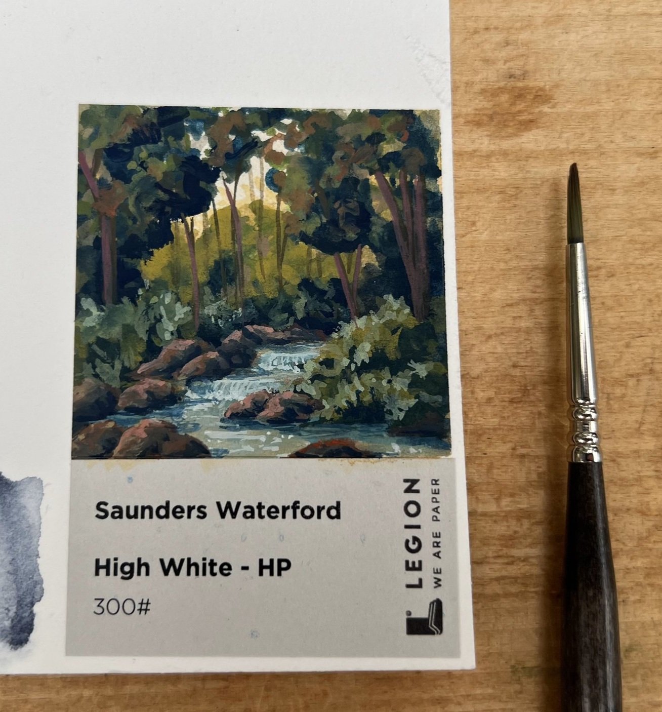
Saunders Hot Press High White 300

Though I liked the surface texture, I found the paint lifted too easily, and so I would not choose this for larger paintings. The creamy colour is useful for the right image, and lends to the warmth of the parchment map in this painting, but would not be my first choice for paintings needing a brighter white. I will try a charcoal on this paper in the future as I think it has the right tooth and texture.


“Silvered Sugar” Watercolour, 7.5 x 7.5”

Stonehenge Aqua Hot Press White 550 gsm

I liked the bright smooth texture for fine crisp detail when using wet brushed charcoal, and the bright white colour which results in clean specular highlights. The hot press doesn’t have quite enough tooth to hold dry charcoal for the deepest blacks, so I will try the cold press next time. The surface tended to pill with scrubbing, erasing and burnishing. (I am rather tough on paper!)


“Operetta” Watercolour, 7.5 x 7.5”

Legion Bamboo 530 gsm

The slightly ivory colour & luxurious feel and weight of this paper is lovely. For me it doesn’t have quite enough absorbency for layering colour, and slightly too much texture for the smooth effects I try to achieve with charcoal. Though it is not an optimum paper for my particular style of painting, I appreciate the use of alternative fibers to produce artist’s quality materials, and I look forward to learning about more innovations in the industry.


What are important characteristics of a paper for your particular kind of work?

  1. Acid-free archival quality paper is a pre-requisite to any paper or surface I use.

  2. Size is always a consideration as I work outside the usual full or half sheets, so I prefer the largest sheets I can get (eg. Arches 40 x 60” 1114 lb, 640 gsm) and always have a roll of Arches on hand.

  3. Sizing: the right balance of absorbency and lift is critical for my technique of repeated washes/ glazing, direct undiluted application and the ability to remove paint for highlights, soften edges or correct mistakes. The paper needs to hold the previous layer enough to allow subsequent layers to be be applied without removing the first layer to achieve luminosity, saturation and a full range of values.

  4. Surface strength: needs to withstand repeated washes, scrubbing, lifting, and erasing without pilling, damage to the surface, or pencil imprints. If using charcoal, the paper also has to withstand the physical application of charcoal with a variety of tools, whether applied directly or with a stomp, fingers, fabric, paper towel, etc…

  5. Texture: I look for certain textures depending on size and subject matter. Generally, I prefer a smoother surface for fine details (still life and refined archicture) and more texture for larger less precise imagery.

  6. Tooth: For charcoal, the paper needs to have the enough tooth for the charcoal to adhere but still be erased.

  7. Stability (dimensional strength) : I prefer a heavy paper that will not cockle with application of water (640 gsm is preferable.) That being said, I soak and stretch all papers regardless of weight to ensure a flat painting.

  8. Colour & brightness: Since watercolour is transparent, the paper colour is part of the paint palette and its brightness is a determinant in creating lumosity and highlights. I gravitate to bright paper with slightly warm undertones.

“Age of Steam” Watercolour, 26 x 39”

Arches CP 640 gsm

What will be your go-to paper moving forward?

I have used Arches hot and cold press papers as well as Stonehenge drawing paper for the past 35 years and will continue to do so. However as a result of this experiment, I look forward to adding the Lanaquarelle hot press 640 gsm for smaller and highly detailed paintings and the Saunders Waterford smooth for charcoal work.

“As a professional working artist, deadlines and demand can be barriers to experimentation. Most often, “tried and true” wins out over experimentation due to time, cost and maybe also fear of the unknown. As any artist does, I know what I like in terms of materials, however I haven’t really thought of why. This partnership with Legion has afforded me the opportunity to experiment with new papers, to think more deeply about what I’m trying to achieve in my work and appreciate how important materials are in process and outcome.”

Learn more about Jennifer Annesley’s work.

Learn more about our Artist Program.

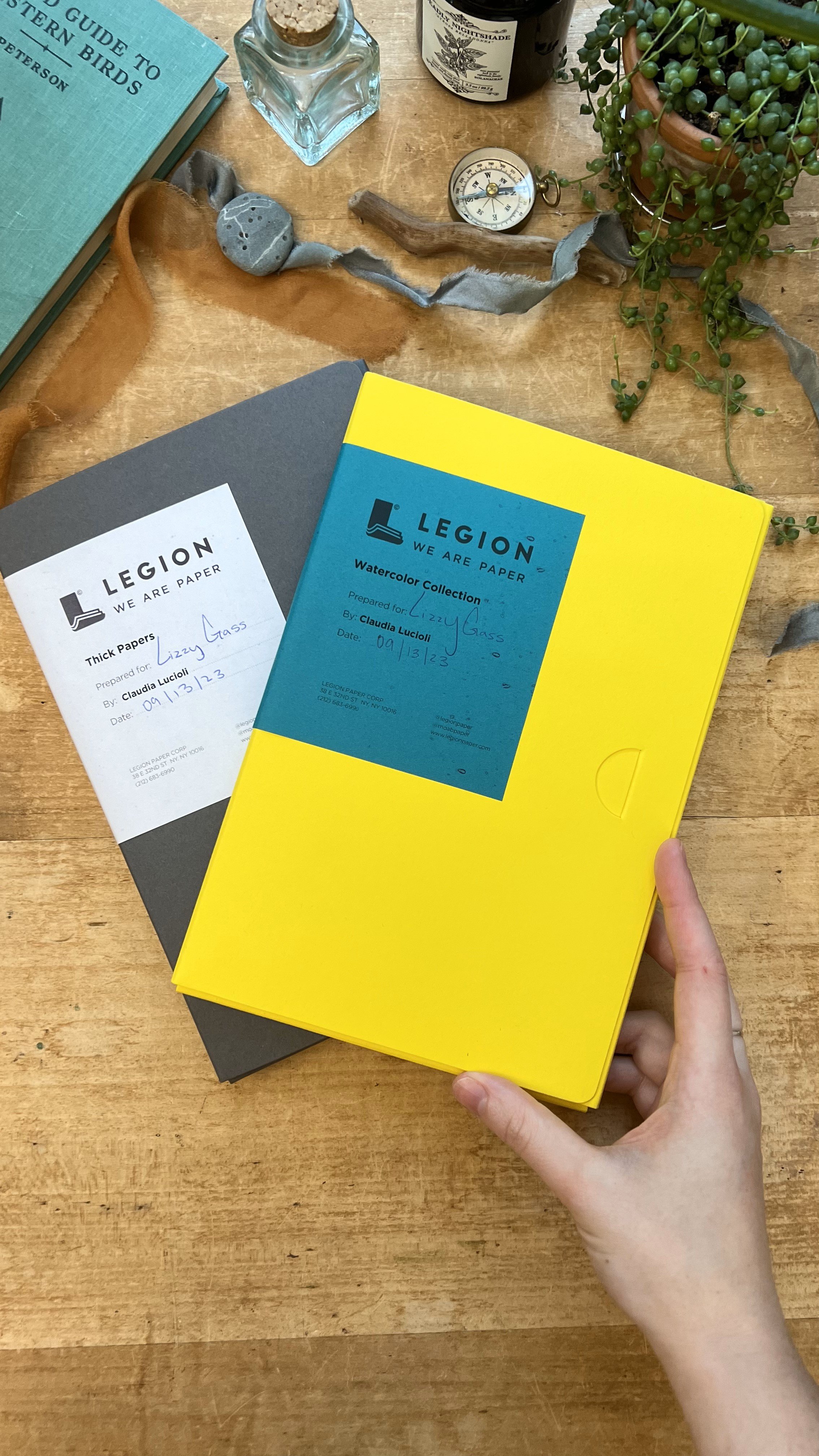
Featured Artist: Lizzy Gass

Artist Program: Lizzy Gass, an artist painting real and fantastical worlds.

Join our experienced artist as she embarks on an insightful journey testing various watercolor papers. Find in-depth reviews, performance assessments, and expert recommendations to select the perfect paper for your watercolor paintings.

Tell us about yourself and your work!
I’m a painter who uses watercolor and gouache to create fantastical worlds and capture treasured memories. With a background in chemistry and nursing, I blend my love of science, fairytales, and the outdoors to create whimsical and detailed paintings that encourage the viewer to step into a new world or glimpse snippets of magic in the everyday. My work is inspired by a childhood spent reading fanciful stories and sci-fi books, building forts, and playing in the woods. I hope to evoke a sense of enchantment through my art, eliciting thoughts of raindrops and wildflowers, cups of tea, and reading books by a cozy fire. My artistic practice includes a range of projects, from detailed watercolor and ink illustrations to gouache landscapes and miniature, layered-paper dioramas.

Which papers did you test in the samplers sent?
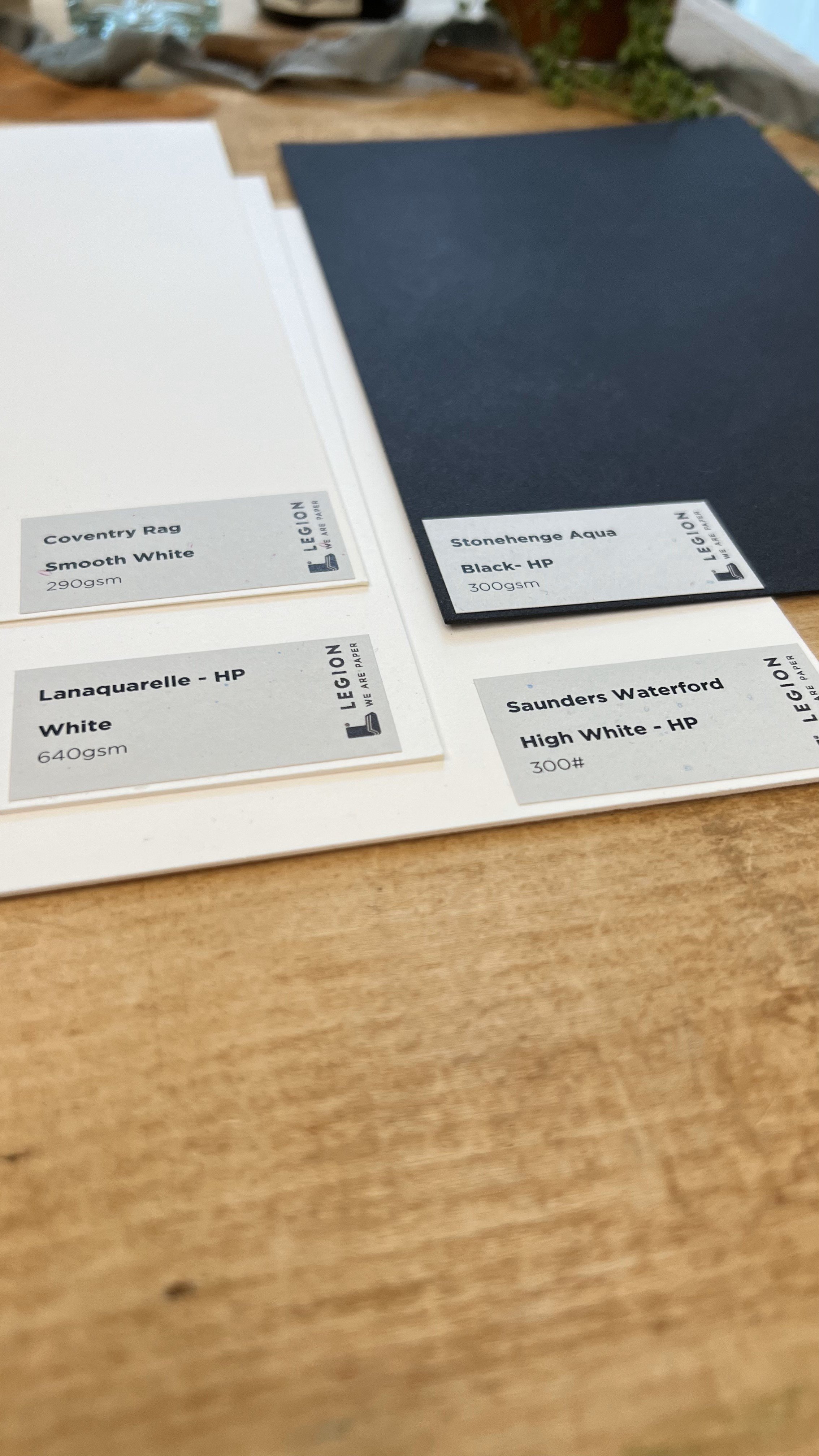
In the watercolor collection, I tested four papers: Stonehenge Aqua Black HP (300gsm), Coventry Rag Smooth White (290 gsm), Lanaquarelle HP White (640 gsm), and Saunders Waterford High White HP (300#).
I've used (and loved) the Stonehenge Aqua (300#) for years, it's been a favorite for larger pieces where I need a sturdy paper that takes paint well. It has just the right amount of texture to add depth to the painting without requiring too much editing when I go to scan a painting and make prints. I didn't re-test the sample, since I already know I love it. 


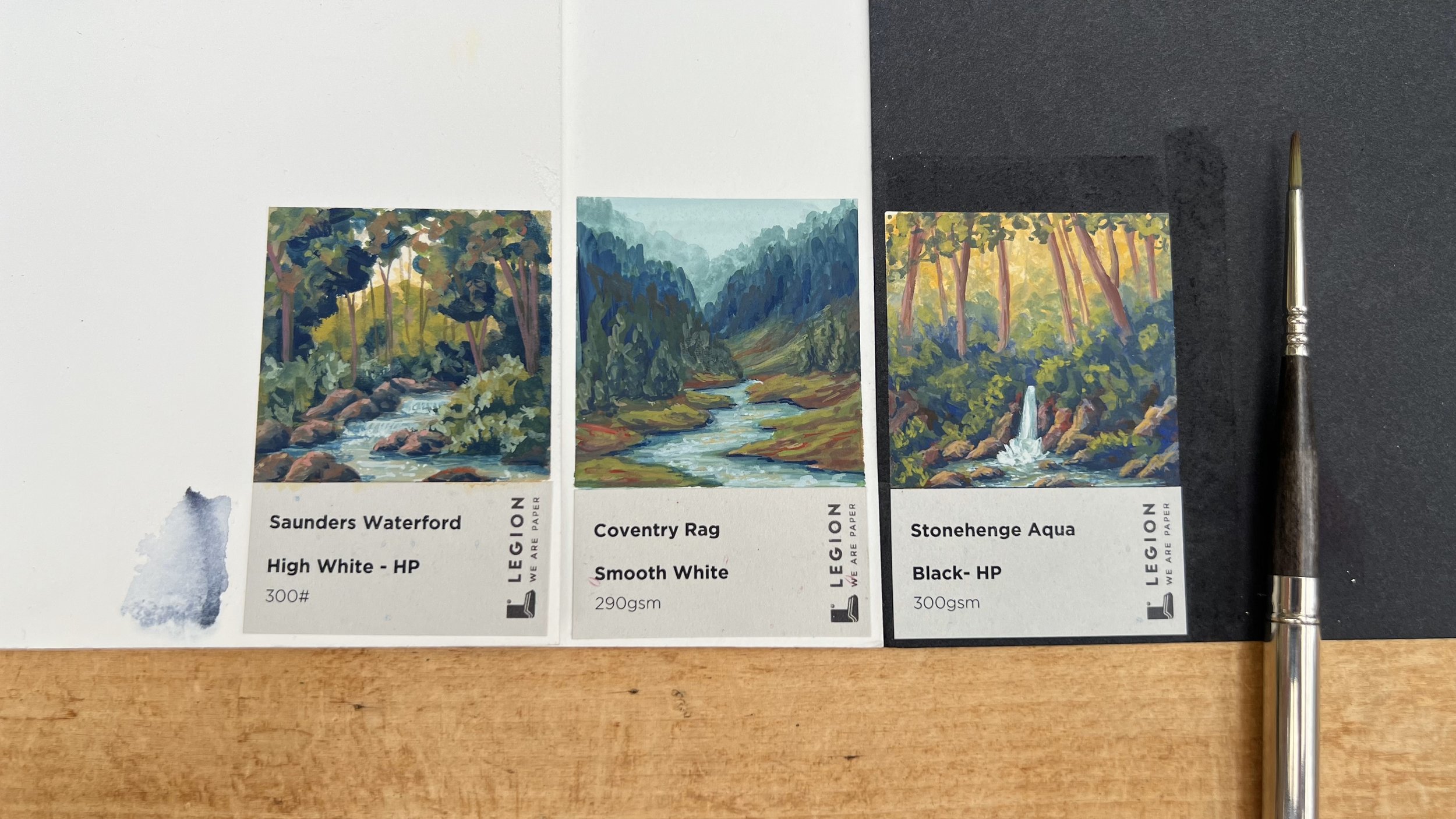
Initially, I tested all four papers by getting an area wet and adding watercolor. The Coventry Rag, Lanaquarelle, and Stonehenge Aqua (black) all worked well with this, but the layers of the Saunders Waterford separated, making bubbles in the paper. I then made a small painting with gouache on each paper, and the Saunders Waterford and Coventry Rag were my favorites.


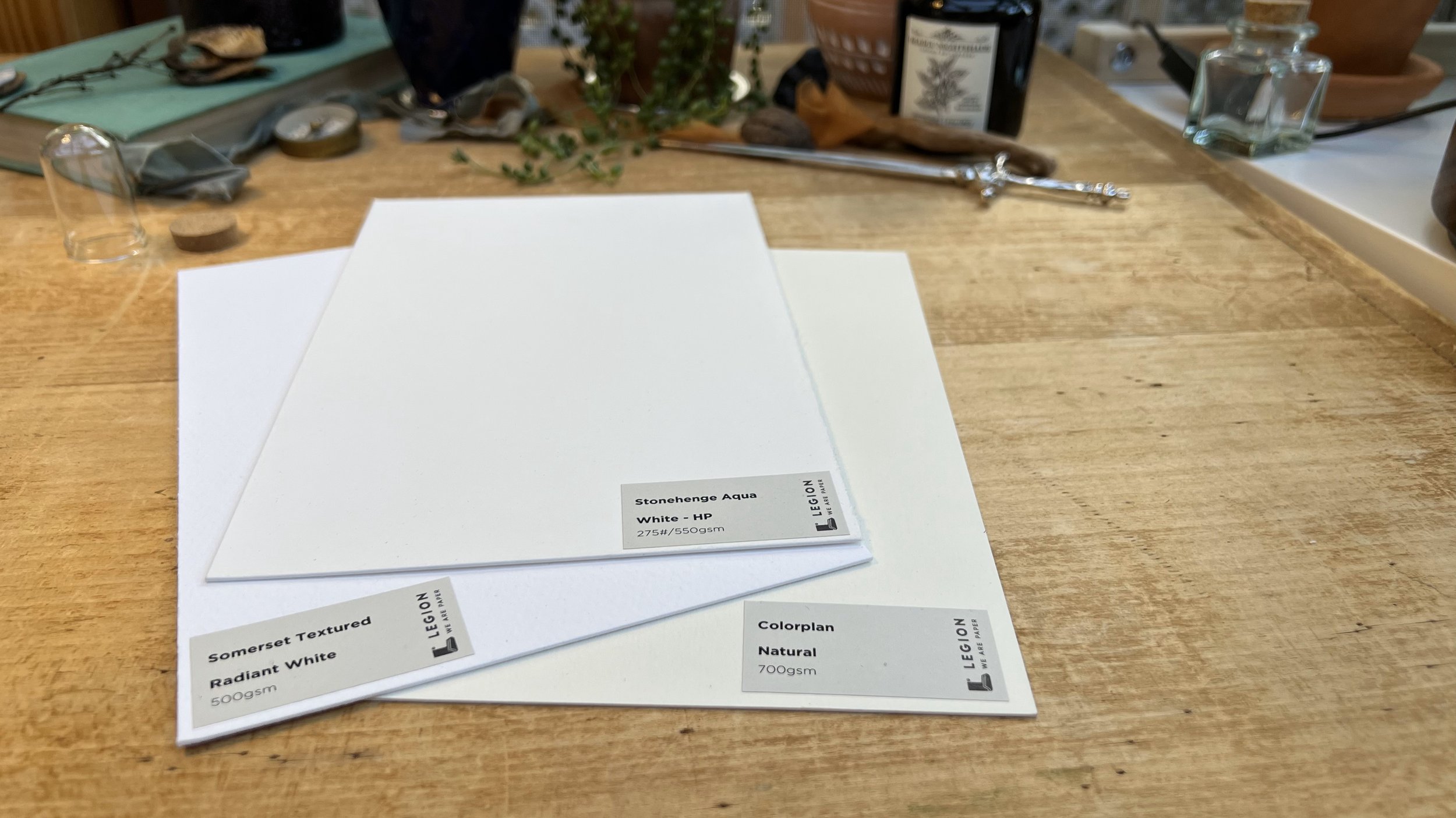
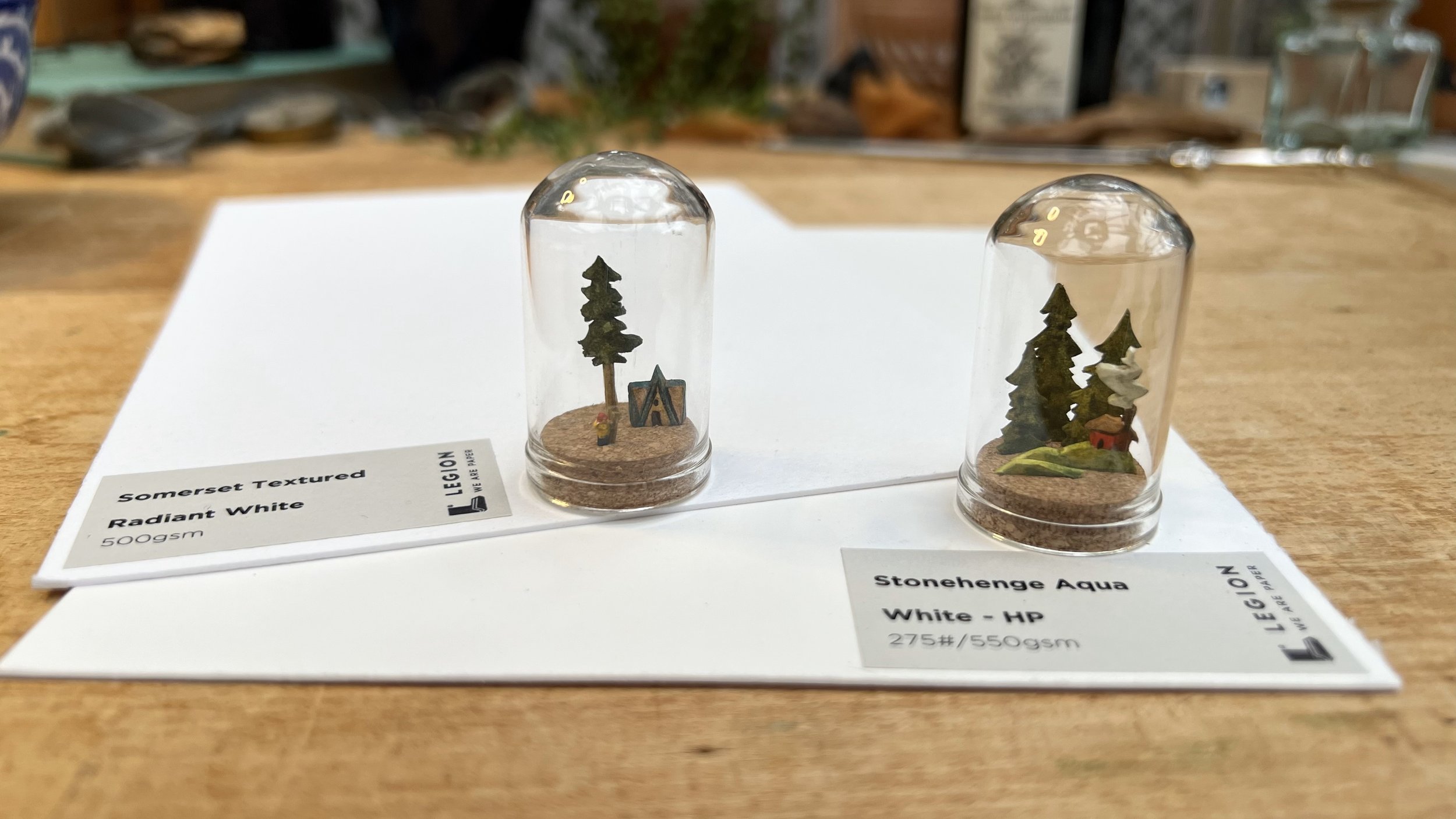
For the thick papers, I tested the Somerset Textured Radiant White (500 gsm), Stonehenge Aqua White - HP (550 gsm), and the Colorplan Natural (700 gsm). Since I use thicker papers for dioramas, which I assemble in wooden boxes and small glass domes, I tested these papers by using them to make small dioramas.

Which papers worked well for your work?
In the watercolor collection, the Stonehenge Aqua, Coventry Rag, and Saunders Waterford worked best for me. They accepted multiple layers of paint without buckling or pilling, and the paint moved beautifully on the papers.

For the thick papers, the Somerset Textured and Stonehenge Aqua both worked very well. The thickness of the papers allowed me to cut at an angle (rather than straight through the paper), which adds dimension to the finished pieces. Both papers also held up well when I cut very narrow pieces - small areas of paper were able to support much larger sections, such as the smoke coming out of the chimney in the diorama I made with the Stonehenge Aqua or the top of the tree being supported by the relatively narrow trunk in the diorama made with the Somerset Textured. 

What are important characteristics of a paper for your particular kind of work?
For my work, it's really important that the paper is sturdy - I work both wet on wet and wet on dry, and I paint in many layers for both watercolor and gouache. I look for paper that can get wet and dry out without changing shape and can withstand repeated brush strokes without pilling or disturbing the fibers that form the paper. It's important to me that an area of the paper that gets wet can dry and look the same as it did before - the Coventry Rag was a great example of this, since I was able to apply a large amount of water to the surface, and when the water dried, the surface of the paper was unchanged. Depending on the project, it can be important for me to remove tape without tearing the paper surface. Some papers that are wonderful to paint on don't hold up well to tape, so it's always something I check before starting a large piece. The surface of the Stonehenge Aqua black tore when the tape was removed, although I didn't test it with Holbein's soft tape, which usually is the least likely to tear paper.
For the dioramas, I also need sturdy paper, and it's important for me to be able to cut tiny pieces of the paper and have it still hold together.

What will be your go-to paper moving forward?
I'm looking forward to working more with both the Saunders Waterford HP and the Coventry Rag; they both held up well with multiple layers of paint and the color and texture of the papers are lovely. I've used (and loved) Legion's Incisioni paper for years, and it's been my go-to for both watercolor and gouache, but I'm looking forward to testing out these new papers further! 


The Stonehenge Aqua White - HP (550gsm) was my favorite of the thick papers, and I'll definitely be using it for more dioramas and paintings in the future. It's the perfect thickness (not too hard to cut, but the individual diorama components can stand up on their own even if they're narrow) and the smooth texture makes it easy to see the tiny details of the painting. 

Anything else you found interesting and want to include.
I'm always amazed by how important it is to choose the right paper for a project, and how small changes, such as watercolor vs gouache, can change which paper is "best" for a given piece. It was hard to guess ahead of time which papers would or wouldn't be ideal for the way I enjoy painting, and I'm looking forward to testing all the different papers over time.


These paper samplers are such a great idea, and it's definitely worth the time to test out different papers to find the best one for a particular project. It's hard to find the perfect paper when you have to invest in a whole block or sheet of each kind in order to try them, but these sets make it easy to pick a few papers to test more in-depth without ending up with large quantities of paper that isn't a good fit.

Featured Artist: Jamie Blicher, Uses IVF Needles to Create Art on YUPO

Artist Program: Jamie Kushner Blicher

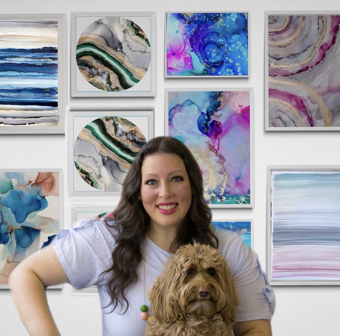
My name is Jamie Kushner Blicher and I am a self taught alcohol ink/mixed media artist. I’ve been creating almost exclusively on YUPO for the past 8 years. I’ve always been artistic and when I started my fertility Journey, which ended up being a long one, I used art to cope. Creating using sterile, IVF needles as a paintbrush on YUPO has been a lifeline in so many ways. I now paint for individuals and fertility centers all over the US to create joy, make beauty and move forward from pain.

What is your inspiration for creating?

My inspiration for creating, and has always been to cultivate community.  

What is your go-to paper?

YUPO 20x26” and 26x40” 144lb. 

What role does YUPO play in your artistic vision and how does it complement your style of work?

I love YUPO because it is forgiving and so much fun to play on. I am constantly drawn to creating abstract pieces that tells a story. YUPO allows me to experiment without worry of mistake, and makes the process just so much more fun and meaningful. I feel like other canvases on paper are more final and doesn’t allow space for fun. 

What is your process like?

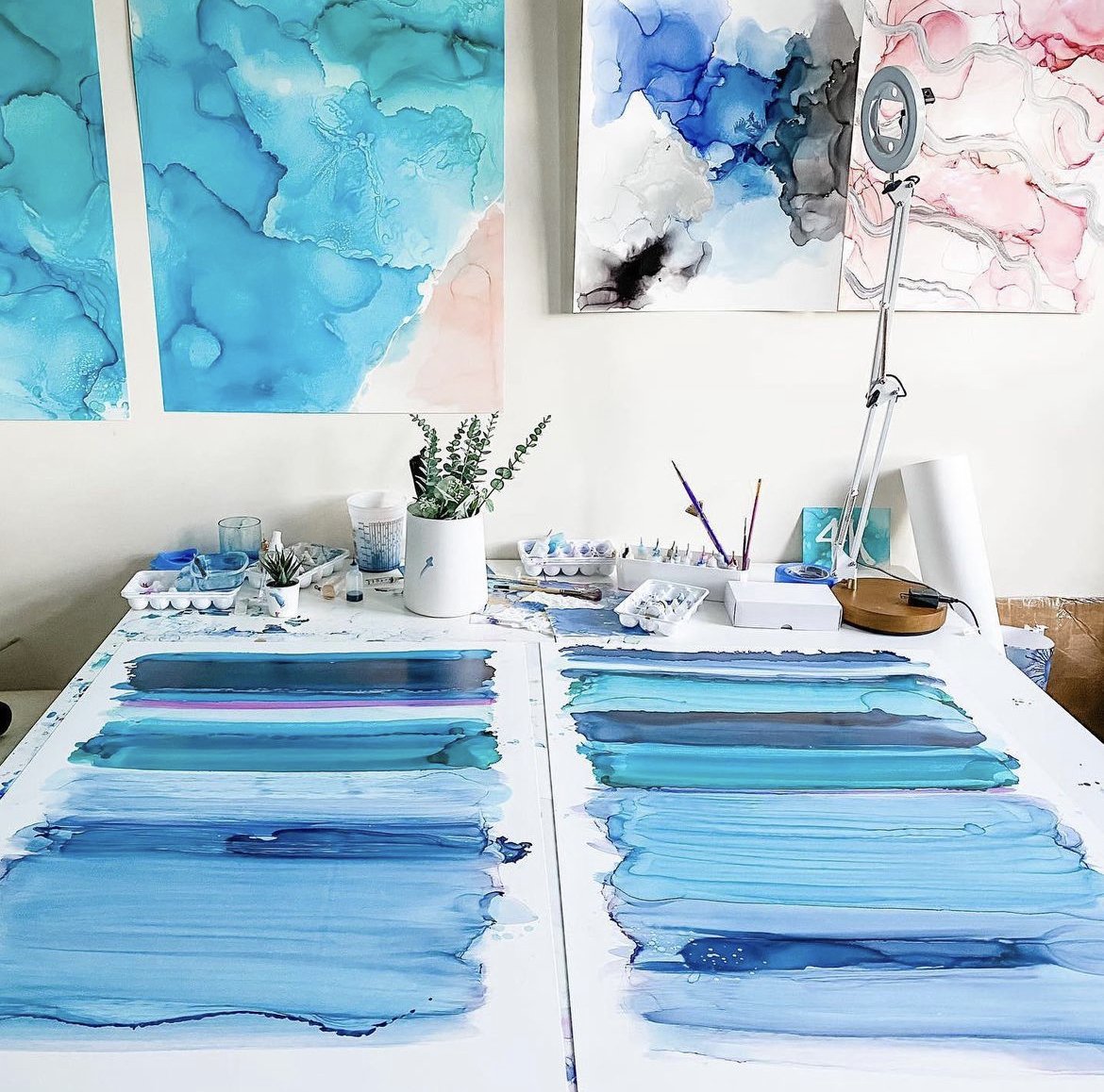
I typically put down alcohol, then alcohol inks, then alcohol in an IVF needle I then spread the ink using various heat tools, as well as the use of my own breath, working to control an uncontrollable medium like alcohol ink on YUPO. This is an obvious metaphor for Fertility journey, where you have a basic plan and then when things go right you get creative and then beauty comes out. 

Can you share some tips or advice for artists looking to explore the potentials of YUPO?

Use all kinds of paint, mediums, different brushes, and different heat tools To explore the magical wonders of synthetic paper before deciding if you love it. YUPO has opened so many possibilities for me, and the best way to get my feelings out on a forgiving paper. 

Can you talk about any challenges you’ve faced with YUPO and how you’ve overcome them?

I've experienced times when my hands or brush on the table have gotten onto the YUPO and other colors have rubbed off that have “ruined” my work. Thankfully YUPO is pretty stain-free and a bit of alcohol can fix the issue quickly. 

Can you tell us about any upcoming pieces you’re excited about?

I am about to create several pieces of work for CRM fertility center in Miami. There will be 6 to 8 pieces up in the clinic and patients will be reminded how strong they are and how they are not alone going through infertility when they see the art. 

Featured Artist: Screenprinter, Arsenal Handicraft

Through the Legion Artist Program, Dennis & Christina Jacobs tested a variety of papers for their screenprints. Read more about Arsenal Handicraft’s findings as they dive into this paper exploration.

Arsenal Handicraft is a husband and wife illustration / screen printing due based in Michigan.  They work in their home studio illustrating and designing hand pulled screen prints with a focus on using unique pigments, such as those that are metallic or glow in the dark.  We have been printmakers for about 15 years and our first printmaking project was our wedding invitations.  We sell our prints in galleries and shops throughout Michigan as well at Midwestern art fairs throughout the Summer and Fall.

What are some important factors you consider when choosing a paper for your screenprints? 

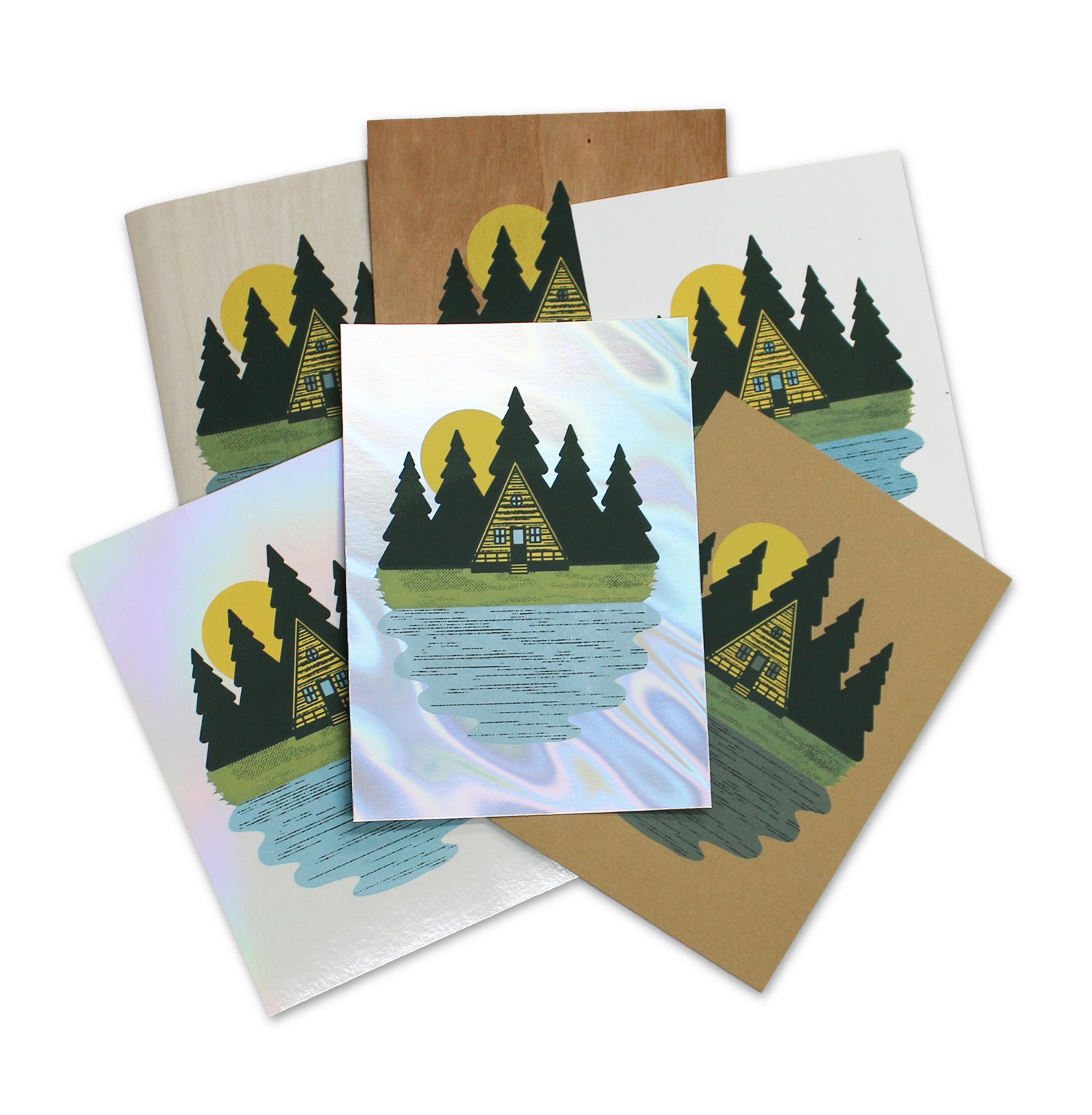
We use water based inks which require study paper to prevent warping when printed with large floods of ink.  Also sturdy papers distort less, making registration of multi color prints easier.  We also like to incorporate the color, texture, and finish of certain papers into the designs of our prints.  For example we've used Mirri paper to simulate outer space and the night sky.  We've also used Colorplan New Blue as the basis for a dusky evening scene.

Which papers did you test? 

We tested: MirrI Holo Blanco Pearl, Timberluxe Cherry, Timberlux Birch, Mirri Sparkle Glitter (Twilight and Black), Coventry Rag White Vellum, Stonehenge Kraft, Mirri Matte Lava, Stardream, and Colorplan.

Other tools used testing: Acrylic screen printing ink, screen printing screen, squeegee.

Coventry Rag

Timberluxe

Stonehenge Kraft

Mirri Lava

What was your process in testing these papers? 

We wanted to test how our acrylic screen printing ink would work on different papers.  This includes the smoothness of the printing, how well the ink adhered to the surface, and how opaque and transparent inks performed on the papers.  We designed a three color screen print of an A-frame cabin in the woods.  The inks used were an opaque yellow, an opaque dark brown, and a transparent blue.

Which papers were your favorites? Why? 

Mirri, Stardream, and Timberluxe were our favorites to use because of the way that their unique appearance can enhance our designs.  Also, the Coventry Rag and Stonehenge were wonderful to print on and produced fantastic results when we needed a standard heavyweight paper.

Did you find any papers didn’t work well for your process? 

The foil paper gave us great results aesthetically, but there were some issue with the ink being somewhat easy to scratch off of the foil sheets.  I believe that this can be fixed with a more robust type of screen printing ink, or additive.  Many print shops print successfully on foils, so the issue we experienced was most likely caused by our ink. 

Possibilities of Paper - Colorplan, Edition 2

Introducing: Possibilities of Paper - Colorplan, Edition 2, produced in collaboration with Imprimerie Du Marais (Paris, France).

View Edition 1 here.

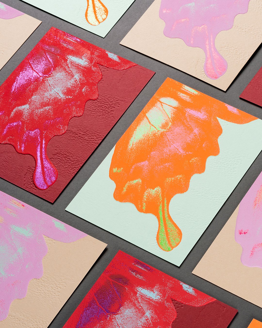
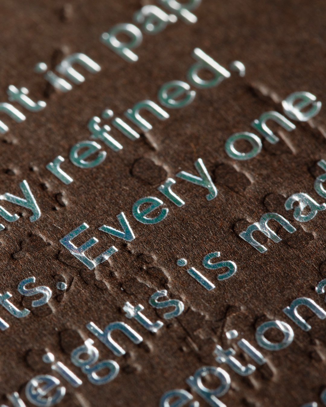
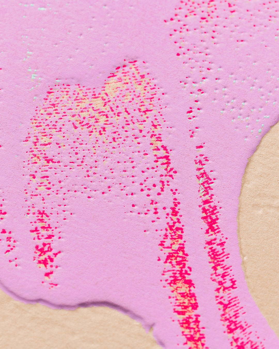
The second edition in a series of three is in collaboration with French print and production house Imprimerie du Marais to showcase the vast potential of Colorplan through unique and unusual color combinations, paired with production techniques such as silk screen printing, hot foiling, and sculpted embossing. 

A natural evolution from Edition 1, Edition 2 steps back from the micro view of the butterfly to reveal more of the concept image. Edition 2 also showcases a selection of different print techniques and finishes to Edition 1.

Each card has a common design but is produced in different colors. The foil, silkscreen and emboss techniques are precisely registered together. The sculpted emboss is produced using a brass die under heavy pressure on the machine; a 3D preview was created before the die was produced to visualise the detail on screen before production.