Alphabet cards food style!
Y is for Yogurt, Pepper Press, Coventry Rag White Vellum 320gsm
A is for American as Apple Pie, Belle&Union CO, Antique Folio 250gsm
S is for Swiss Cheese, Sapling Press, Curious Matter Goyu White 100#C

Alphabet cards food style!
Y is for Yogurt, Pepper Press, Coventry Rag White Vellum 320gsm
A is for American as Apple Pie, Belle&Union CO, Antique Folio 250gsm
S is for Swiss Cheese, Sapling Press, Curious Matter Goyu White 100#C

We are finally starting to see some Spring weather in New York.. just in time for the National Stationery Show coming up in only 12 days!
I is for Iris Germanica, May Day Studio, Saunders Waterford 140lb HP
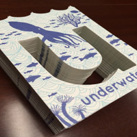
U is for Underwater, Blackbird Letterpress, Pescia White 300gsm
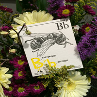
B is for Bee, Maginating & Defrance Printing, Arturo Soft White 600gsm
L is for Lake, Paisley Tree Press, Artistico HP Extra White 140#


Wondering what the next Stationery Show promotional project will be? Hope you know your ABC's for our FOURTH annual Stationery Show project!
Organized by Flywheel Press and sponsored by Legion, we are all super excited to watch this year’s project grow to become our best yet! As 27 different fine art papers were sent out, 26 Alphabet cards are beginning to fly in from amazing designers (who are allNSS exhibitors).
As done in the past, attendees of NSS will participate in a scavenger hunt to collect all 26 letters. Once you have A through Z, stop by Legion's booth (3330) to stack your cards in packaging created by Lady Pilot Letterpress.
The National Stationery Show is just around the corner (May 18th) and we are ready to blow you away with our ABC’s.
To the left is a sneak preview to some of the many cards we are recieving for the 2014 Stationery Show by Albertine Press, A Favorite Design, The Nic Studio and Sugarcube Press.
Stayed posted to our Facebook, Twitter and Blog for more info on our Alphabet cards! Designer list with their booth numbers will be coming soon!
Legion recieved an inquiry from a potential eager zero-profit corp looking for their perfect paper. The purpose is all profit going to programs that support the arts, specifically those that teach art as a healing component, and to redirect troubled youth. They plan to create earning opportunties for those with barriers to employment (e.g. disabilities, seniors).
What were they looking for? A paper that has some tooth to it (e.g.stonehenge or artagain paper, both being perfect for colored pencils), but is sized externally and internally to handle ink, moderate watercolor washes and markers. Essentially, an all media paper that is the same on both sides, in a compact 90# weight or so, perfect for sketchbooks.
Our answer: You mentioned Stonehenge, which is a paper I created in 1971 for a bunch of various applications; primarily printmaking & serigraphy back then, but now the grade has become a real “go to” paper for all mediums, especially colored pencil.
You mentioned 90# - I am assuming you mean cover weight not text or book weight.
You also mention you want a paper that has texture and is the same on both sides: Stonehenge is relatively smooth and has very little texture or roughness – I did this deliberately when I produced it because the market wanted a semi-smooth (not hot press) surface.
With regards to the surface being the same on both sides, you will not be able to achieve that with a machine-made paper, i.e. Stonehenge, Lenox, Coventry Rag by virtue of manufacturing – machine-made papers will always give you a two-sidedness.
Take a look at some watercolor papers:
1.Waterford CP & HP (has some texture) surfaces – 180gsm & 300gsm
2. Legion Multi-media Aquarelle - 300gsm CP (has a medium texture), internally & externally sized, even though it is machine-made it is less two-sided
3.Lanaquarelle CP & HP – 300gsm
Ask an expert for your perfect paper.