Behind the Scenes of Lili Arnold Studios

Lili Arnold

Lili Arnold

Tell us about yourself and your work.

IMG_9639.jpg

{LA} I’m a printmaker/artist based in Santa Cruz, CA. My journey has been a long one, but each part of it has been full of learning and growing. I started creating art as a child; both my parents are visual artists, so inevitably, I was exposed to the arts in many forms. I never imagined I would become an artist myself. I had so many doubts and no clear path of action to pursue my creative dreams. So, I ended up going into graphic design when I graduated with a Studio Arts degree from UCSC. I thought graphic design was the perfect bridge between financial stability and creativity, and it was for the most part; however, after a few years in the field, I was craving experimentation, individuality, and the hands-on satisfaction that fine arts gave me in the past.

At the time, it wasn’t realistic for me to quit my full-time job and pursue my own artistic path, so I began creating art on the weekends, or on quiet evenings during the weeks. I experimented with everything from watercolor, to handmade clay pots, to fine line illustration, to acrylic painting. When I brought my old printmaking tools & materials out from a dusty cardboard box, that’s when things really started to click. I carved my first piece in many years. It was a sperm whale, very small & simple, but it sparked an eventual entire body of work which led to my very first art show. The satisfaction I was getting from carving and printing blocks was unlike anything I had experienced before.

I continued on and eventually discovered my love of cacti and other captivating flora. I ended up taking a leap and leaving my full-time graphic design job to pursue my small block print business which gave me so much more time to print, develop new works, network with shops, create an online presence, and participate in all kinds of artist/maker events. It was scary to leave a steady job and have to figure out all the intricacies of running a business, but it’s been the best decision of my life yet. It’s been three years now since I’ve been creating my art full time, and I am so grateful every day for the people who have supported me along the way.

What is your process like from start to finish?

  1. My process starts from an idea inspired by being exposed to something beautiful in the natural world. For the past couple years I have been intrigued by colorful botanicals, and all the intricate textures & gradients that exist so effortlessly in each part of the plant.

  2. I begin by sketching, following by a freehand drawing onto a rubber block. I prefer rubber blocks because they are very easy to carve and cut up into "jigsaw" pieces for multiple colors prints.

  3. After the drawing is completed, I then move onto carving my rubber block with linocut tools, then I separate the flower pieces by cutting them out with an excel pink grip knife (like an xacto knife).

  4. When the pieces are separated and ready for printing, I then choose my ink colors and begin mixing on my palettes, using palette knives and brayers.

  5. When the inks are mixed, I then roll the different colors onto my carved block, starting with the simplest pieces first, then adding gradients and finer details toward the end.

  6. When all the pieces of the block are inked, I then assemble the composition like you would a puzzle, and I move it into place inside a template the same size as my paper.

  7. The next step is placing the paper (Stonehenge printmaking paper of course!) on top of the inked block, placing it down on one end and gently guiding it down the rest of the way. I smooth the paper over with my hands, rubbing back and forth and around the edges. Then I either take my baren and do a more thorough burnishing of the entire block or I run it through my Speedball etching press.

  8. The final step (the best part) is peeling the paper off the block and revealing the final work of art! 

What materials do you use for your pieces?

-Stonehenge Paper (mostly in natural hue, but I also frequently use kraft and black as well)

-ReadyCut rubber blocks from Blick Art Materials

-Speedball , Flexcut and/or Pfeil carving tools (I use different tools depending on the detail I'm working with)

-Speedball and Blick Art Materials water based block printing inks

-Speedball ink retarder to help slow drying process

-Speedball rubber brayers for rolling

-Iron Frog Press glass baren for burnishing, or Speedball etching press 

124133192_211035803719823_7682718870861246526_o.jpg
119698598_3664559253577676_9100617532524397080_o.jpg

What do you like about Stonehenge Paper? How do you choose which color paper you’re working with for particular pieces?

{LA} I truly love every aspect of Stonehenge paper. It has a beautiful subtle texture that allows for a high quality feel, but it's smooth enough for the ink to transfer perfectly. It has a wonderful weight to it, and it also has a nice firmness that I love. It also tears beautifully with a tear bar. My default color is natural because of its warmth, which I think compliments botanical prints nicely. When I want to represent a plant that, say, has white or light colored flowers, then I recruit the kraft and black color papers to make the lighter colored plants pop. I also find that customers enjoy having a few choices; sometimes I'll make a variation of the same plant in a few different ink colors, using all three of my favorite paper colors. Having such beautiful paper color options keeps me excited to try new ideas and always stay inspired.

What’s the biggest challenge you face when creating?

{LA} The biggest challenge I find when I'm creating a new piece is figuring out a new way to represent a plant in a manner that celebrates its natural beauty but also incorporates my mark-making style. Staying true to myself in the way I create art and experience the process is so important to me. I think in order to truly love what you do, you need to make whatever it is completely your own. Finding inspiration and learning from others is all part of the process, but when it comes down to creating a finished piece of art I feel it needs to be made from the heart which usually doesn't come quickly. I have to remind myself to be ok with the time it takes to develop a piece that feels truly authentic and properly representative of the subject.

Strelitzia Reginae by Lili Arnold

Strelitzia Reginae by Lili Arnold

Do you have a favorite piece?

{LA} I think my favorite piece of the moment is my newest piece, "Strelitzia Reginae" aka Bird of Paradise. I love this piece mostly because it was a challenge; I pursued an idea that was on my mind for a long time, that I was afraid to embark on because I could never quite visualize how it might work out. I made a decision to just put my head down and give it a shot, working through many sketches and trying to plan out the most efficient way to cut out the "jigsaw" pieces in order to capture all the unique colors and gradients of the flowers. Overcoming challenges is what gives me the most satisfaction in my work, whether it is solely a lesson learned, or whether it results in a piece that I am truly proud of.

Find more about Lili Arnold’s work:

Website: www.liliarnold.com/shop
Email: liliarnoldstudios@gmail.com
Instagram: www.instagram.com/liliarnoldstudios
Facebook: www.facebook.com/liliarnoldstudios

Bev Jozwiak: Putting Miles on the Brush

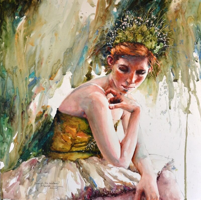
Behind the Curtain by Bev Jozwiak, 2019, Stonehenge Aqua Hotpress 140lb

Behind the Curtain by Bev Jozwiak, 2019, Stonehenge Aqua Hotpress 140lb

The style Bev Jozwiak is currently working in seems to be the direct result of her own personal journey. Art has been in her life for as long as she can remember. She is the first formally trained artist in her family, but by no means the first artist. Her great aunts, grandmother, aunt and father all painted before her. She graduated with honor from Western Washington University, with a Fine Arts degree and an Art History minor.

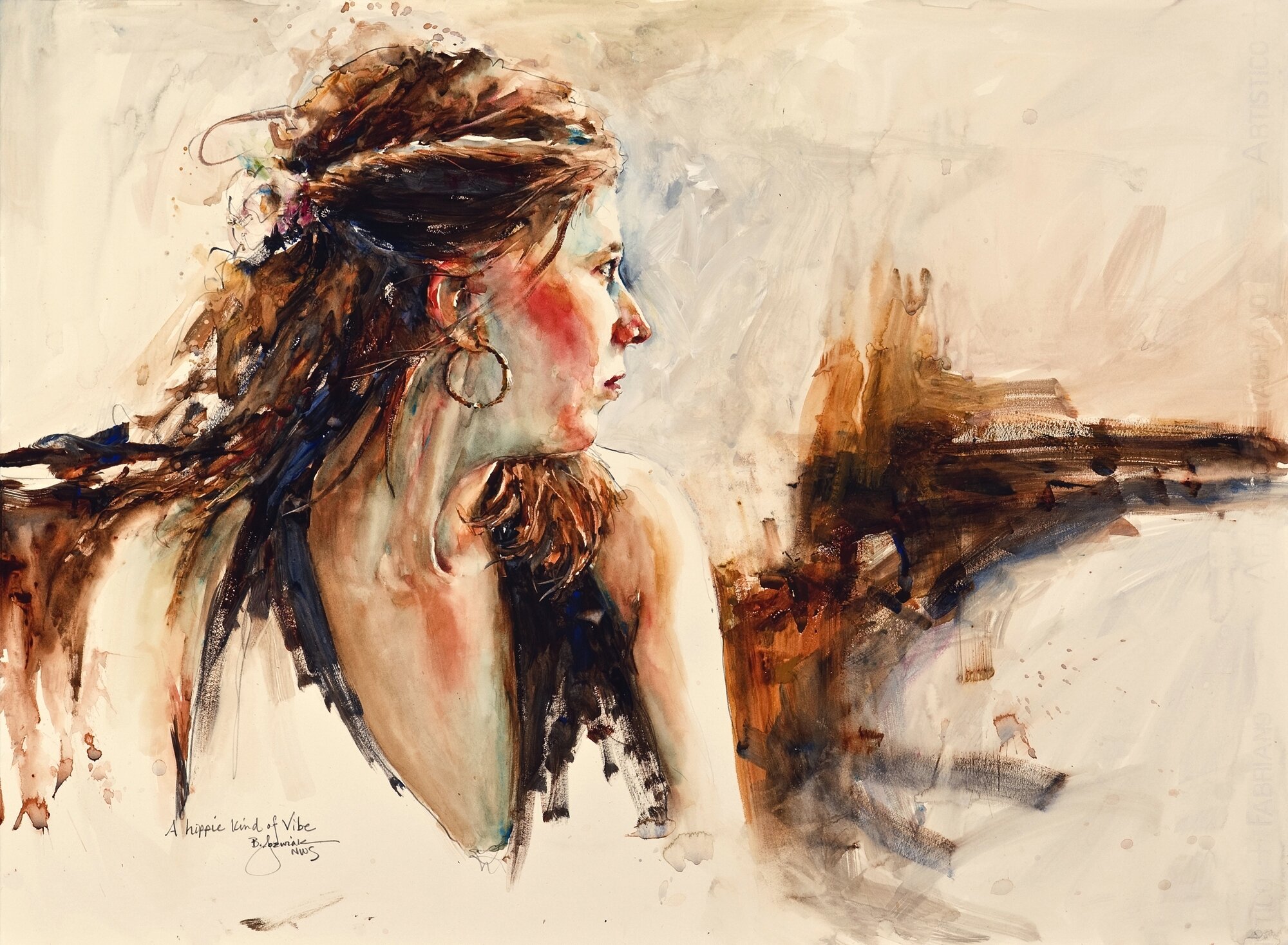
Whether painting in Acrylic or watercolor the goal is the same; to create an impressionistic painting with rich varied color, good design, great values, and to create a piece that will last by using archival materials. She never wants the viewer to think her paintings look like photographs, but rather to see the brushwork, and the love and energy that goes into each and every piece.

Jozwiak’s skill as a painter has garnered her national acclaim as one of America’s premier painters. The result of hard work and years of painting has not gone unrewarded. Bev has had a plethora of successful one woman shows for prestigious galleries. She has lost count of how many articles in major art magazines she has had. She is the author of “Painting Life with Life, a 164 page watercolor book, and has her signature status in every major watercolor society, including the American Watercolor Society in New York. Bev believes in keeping original art affordable and accessible to everyone. She does not foresee a time when she would ever quit painting, or become complacent with what she does. She hopes to always study, grow, and continue on this personal artistic journey.

A Hippie Kind of Vibe by Bev Jozwiak on Stonehenge Aqua Hotpress 140lb

A Hippie Kind of Vibe by Bev Jozwiak on Stonehenge Aqua Hotpress 140lb

What paper do you use for your work? what do you like about this paper?

Stonehenge Aqua 140lb. Hotpress is my go to paper. And Occasionally 280 lb. too, which has just a bit more tooth. I have had problems with the sizing on other papers, getting batches that were “pilly” and really hard to paint on. I have not had one bad batch with Stonehenge. It is the just the right amount of slickness.

Why do you choose to work on Hotpress paper instead of coldpress or rough?

Unlike some watercolor painters who paint in thin layers building up to their finished pieces, I use a very direct method of painting. Hotpress is made for this, as the paint lays more on the surface, than with cold or rough papers. It is also very easy to lift out areas of paint, either with a brush for a light touch, or with a magic eraser to really get back to the white of the paper.

What other materials do you use for your paintings?

Palette: Alvin Heritage Palette or John Pike Palette

Paints: (Cheap Joes Art supply is where I get most of my supplies) Online.

Winsor and Newton (unless noted)

  • Yellow Ochre

  • Burnt Sienna

  • Sap Green (Holbein)

  • French Ultra Marine Blue (I have been using Daniel Smith lately, but either work)

  • Cobalt Blue

  • Manganese Blue Hue

  • Permanent Alizarin Crimson

  • Rose Madder Genuine (or Permanent Rose)

  • Cadmium Red (or Joes Red from Cheap Joes)

  • Cadmium Orange

  • Winsor Blue (Red Shade)

    • Winsor Green (Blue Shade).

    • New Gamboge or Joe’s Yellow (Cheap Joe’s American Journey)

    • Janet Rose Violet (Cheap Joe’s American Journey)

    • Aureolin

  • Naples Yellow

  • Yellow Gray (Holbein)

  • Verditer (Holbein)

  • Don Andrews Turquois

Brushes: Cheap Joes Golden Fleece 

  • #10 round

  • 1” Flat

  • #4 round for details

·        *I also use the legend or the dream catcher (from Cheap Joes) when I need a brush that holds a more water. #8 round  is my favorite.

·        Kolinsky DaVinci Maestro #12 (A very good mop brush)

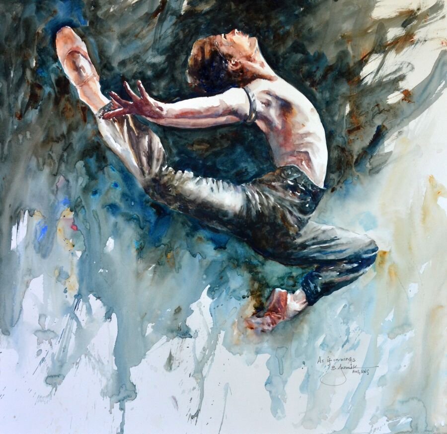
As if on Wings by Bev Jozwiak, 2019, Stonehenge Aqua Hotpress 140lb

As if on Wings by Bev Jozwiak, 2019, Stonehenge Aqua Hotpress 140lb

What is your process like from start to finish?

I am a very fast and direct painter; as a matter of fact I am almost done with my second book, which is called, “Confident brushstrokes”.  While I do have some work that is more layered and “traditional”, my own favorites are the ones with bold confident, purposeful brushstrokes.

Do you have a favorite piece? Why is this your favorite?

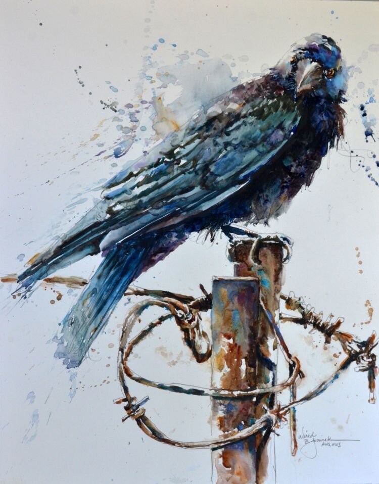
It is hard to choose one piece to be a favorite. It is usually a recent piece, and then in a year, I don’t like it at all. I am always growing in my art, and don’t ever want to paint on rote, or get in a rut of painting the exact same thing. I like my crow/raven pieces simply because I love to paint blacks. I add a plethora of colors next to each other, and yet manage to have it still read as the color black.

My ballet pieces are also some of my favorites. My youngest daughter was a professional ballet dancer. I grew to love ballet and all the rituals involved in that art form.

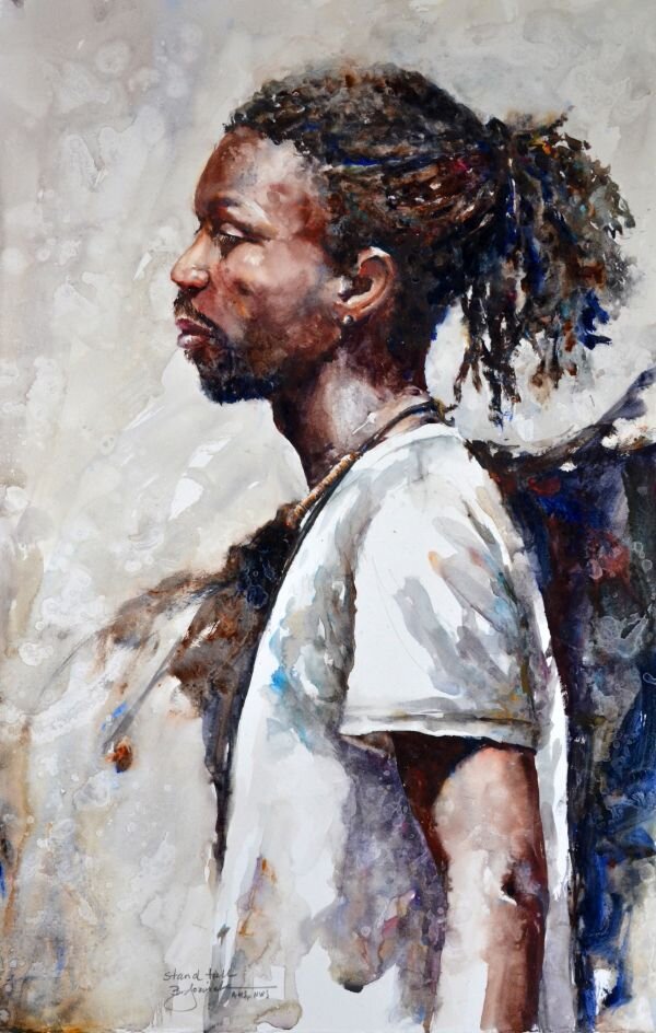
At this very moment my favorite piece is called “Stand Tall”. I was very happy with all the colors in this man’s face. I really wasn’t expecting the painting to turn out, as I was just experimenting with throwing rubbing alcohol at my paper as I was painting. The texture it created was unexpected, and really gave this piece a unique look that I was very pleased with in the end. 

Stand Tall by Bev Jozwiak, 2019, Stonehenge Aqua Hotpress 140lb

Stand Tall by Bev Jozwiak, 2019, Stonehenge Aqua Hotpress 140lb

Ballet Profiles by Bev Jozwiak, 2018, Stonehenge Aqua Hotpress 140lb

Ballet Profiles by Bev Jozwiak, 2018, Stonehenge Aqua Hotpress 140lb

Anything else you’d like to add?

If I could choose to be anything in the world, I would not make another choice. I love to paint. Being an artist is not what I do, it is who I am. Getting to create a thing of beauty, and show the world what I see through my eyes, has been a gift that I am beyond grateful for.

If you have always wanted to be able to paint, what are you waiting for? Start on your journey today. Every day adds a layer of knowledge, brick by brick honing your craft, until you have the skills to say what you want to say. It all starts and ends by putting “miles on the brush”.

Wired by Bev Jozwiak, 2020, Stonehenge Aqua Hotpress 140lb

Wired by Bev Jozwiak, 2020, Stonehenge Aqua Hotpress 140lb

4 New Papers You'll Love for Packaging

The purpose of packaging is not just to protect the product inside, but also to create demand, hint at the quality of its contents and reflect the brand it represents. The design – not just visual but tactile as well - that can be achieved with paper can make the entire experience from first look, opening and to disposal or storage a wonderful experience.

  1. Mohawk Renewal

    Renewal was born out of a desire to redefine the contours of how we source fiber and expand the existing definition of sustainable papermaking. By rediscovering old fiber sources like hemp, straw and cotton rag, we uncovered a new path forward. You might say we looked to the past to discover the future.

    Choose from 3 renewable fibers in 7 colors and 2 gorgeous finishes. Each shade tells its own origin story and breaks new ground in the responsible creation of world-class, fine papers.

    HEMP- Unlike trees, Hemp grows rapidly, maturing in as few as 90 days. Turning hemp into pulp requires less chemicals, water, and energy than wood.

    RECYCLED COTTON- Made from t-shirt and denim scraps diverted from the 10.5 million tons of clothing waste Americans send to landfills every year.

    STRAW- Making paper with straw eliminates the need for the annual "fall burns" set by farmers to clear straw from their fields, creating acrid smoke and carbon emissions.

2. Mirri Lava

Mirri Lava is a wash with color in a random wave-like pattern similar to that of lava. This highly decorative paper is available in a variety of colors in a matte finish.

Manufactured using an exceptionally high quality film, the brightness of the metalized surface provides a mirror finish which is further enhanced by the smoothness of the cast-coated board to which it is laminated. With the metalized surface protected by a polyester film, this construction has a high surface energy that offers an excellent key for inks and adhesives. 

3. Timberluxe

Whether you choose Cherry or Birch, it’s a paper that constantly reminds you that it’s not just a wood in name. It has everything: The grain, the knots, the perfect “imperfections”, the texture, and perhaps most important, the feel. You’ll appreciate it as wood but relish it as paper.

Pliable and welcoming, Timberluxe will add an organic spirit to whatever you create. It’s a unique and unexpected medium perfect for foil stamping, offset printing, silkscreen, letterpress and packaging.

4. Colorplan’s four new colors

Simply stated, Colorplan is the broadest range of premium colored papers we know. The four new crowd sourced ‘favorite colors’ were chosen from GF Smith’s ‘World’s Favorite Color Report’.

Chartreuse is a hue almost halfway between green and yellow and was voted the world’s most popular shade of yellow. Due to the high attention it commands since 1972 following a survey by the International Tennis Federation, it has been the regulated color of tennis balls due to its high contrast on the television screen.

Bright Pink was added to the Colorplan range as ‘bright’ was mentioned over 1000 times when describing color in The World’s Favorite Color survey.

As a paper, both black and white are highly prized and form some of the best selling ranges. Slate is the world’s most popular shade of black from the World’s Favorite Color survey. A shade at the darkest edge of grey, adding even greater depth to our existing night time shades.

Rust was added to embody the natural warmth and tactility that people associate with hope and joy.

For the Love of Art: Behind the Scenes with Anthony Kirk

Artist, lecturer, exhibition curator and master intaglio printer, Anthony Kirk demonstrates the printing of etchings, aquatints and engravings on Somerset paper as well as the preparation of the printmaking paper for intaglio printing. On view in the print studio are examples of his past collaborations with Wolf Kahn, Robert Kipniss, Helen Frankenthaler, Joan Mitchell, Kiki Smith, Frank Stella and Donald Sultan. The technique of etching and printing a copper plate is unchanged since Rembrandt's time yet this ancient process continues to be a significant part of the education of an art student as well as being an important medium in the work of emerging artists and artists of international acclaim.

Below are some follow up questions from Tony’s webinar.

How many pounds of pressure are your roller using?

I have no idea how many pounds of pressure the roller of the press is bearing down when I print. Unlike a hydraulic press, which I used frequently at Tyler Graphics and has a pressure gauge. Except for the very smallest table mounted presses which usually come without micro dials at each side of the roller, nearly all larger hand operated and electric driven presses have micro dial pressure gauges at each side of the roller so that visually one can visually see that the pressure is equal on both sides. The turn handles on each side turn to the right to increase the pressure and to the left to decrease the pressure. Righty tighty and lefty loosey.

There are several variable that have to be just right in order to print an excellent impression. The correct number of blankets is very important. If the catching sizer which is closest to the paper become stiff from absorbing the paper's sizing over time, it will not give you a good print in the lightest aquatints for example. This blanket needs to be hand washed once in a while. The paper has to be sufficiently dampened. Somerset if soaked in water for ten to fifteen minutes is sufficient. Then the paper is blotted to remove all signs of wetness. During the demo I felt that the paper I was about to use to print the mezzotint had dried out a bit so I re wet it with a hand water mister, blotted it and the printed it. To get a good impression from a mezzotint I turn my pressure dials all the way down in order to achieve maximum pressure.

One thing you could do is to run the uninked etched plate through the press on dampened paper and if you see the etched lines in relief on the paper you know you have enough pressure.

What ink do you use?

I have been using Gamblin Portland Black for many years and in my opinion it is the best American made ink. However I sometimes use Graphic Chemical 514 Black etching ink, a less expensive ink, for printing etchings that have a lot of different tones of aquatint. This is because this ink has extender or transparent base in it and then the print will show all the differences in the subtle tones of aquatint. The stronger and more opaque Gamblin ink does not show the clear differences between the tones. I often mix 50/50 the Gamblin and Graphic ink together to achieve the correct balance that will give the best print.

Which ink did you use for printing Somerset with a spoon?

When I teach in a place that has limited ventilation I use ink that can be cleaned up with a mixture of water and dawn dishwashing detergent and so for printing monotypes on Somerset with a spoon I use Cranfield Caligo Safe Wash relief inks. I buy mine from Renaissance Graphic Arts.

Which method would you recommend for an absolute beginner?

For an absolute beginner take an evening or weekend class at an open access printmaking studio especially if you want to make an etching because that involves acids the use of which has to be demonstrated by a professional who is teaching the workshop. Non acid techniques that can be done at home include mezzotint and drypoint. Then you need to take the plates  to where you can access an etching press.

Did this in high school but would love to go to a course extensive! Where could I go for an extensive workshop and then invest in a small press?

(See answer above). You could also google Printmaking workshops in their area. A local art school or University art department might be offering non credit adult evening classes. One thing to do is to call Renaissance Graphic Arts and tell them where you live and that you want to take some printmaking classes. Ask them if they have schools or printmaking classes in your geographic area to which they sell printmaking supplies to. Of course this customer would have to be a place that offers classes and not an individual artist working out of their own studio.

How many prints on average can you pull from a copper plate mezzotints?

An artist can spend days and even weeks working on a mezzotint plate. The plate can only be printed about six times before the lightest tones become lighter through the abrasive action of wiping the plate and the pressure of the press. That would be very unfortunate. Therefore the plate has to be "steel faced". This coating of infinitesimal thin steel  protects the image on the plate from wearing out. This coating itself does not in any way affect the quality of the print. If a mezzotint is plated this way one can print as many as 50 to 60 without any decline in quality. At any time the plating shows a sign of wearing off ( you will see the copper beginning to show through, then the plate should be re-steelfaced. From the webinar you will have noticed that I use the softer tulle fabric to wipe the plate instead of the more abrasive tarlatan.

View more ‘For the Love of Art’ Webinars on our YouTube Channel.

Register for Upcoming Webinars!

Artist, Hannah Rose, Creates Nature Inspired Work on YUPO

Blog 1.JPG

Introducing our Artist of the Month for September, Hannah Rose! We’re so excited to feature Hannah’s work using Yupo. Stay tuned on our Instagram for more of Hannah’s work, tutorials and an introduction to new Yupo products.

Tell us about yourself and your work.

My name is Hannah Rose and I am a mixed media artist from England. I specialize in fluid media, and I can be inspired by anything from music to landscapes. Most of my inspiration comes from nature. I started working with fluids because I immediately enjoyed what I was doing, and I believe that is so important for an artist.

How did you find Yupo and starting with it?

I started using Yupo a year ago. I had come across it by looking at other fluid media artists on Instagram, and watching YouTube tutorials to teach myself what I needed to be able to create the beautiful marble like patterns. I started with a light weight Yupo but now use the full range.

How does Yupo make your style unique?

It allows me to create textures and depths to my fluid work that I have never seen before. The paper is unlike anything I had ever used. The fact I can then layer different media on top of the Yupo means I can create some really unique pieces for example. I feel I have no limitations when using Yupo.

Blog 3.JPG
Blog 2.JPG

Why do you use Yupo?

Mostly it’s because of the texture and flexibility of it. It is by far my favourite paper I’ve ever worked with. The range of sizes are so helpful in allowing me to work across a range of pieces. Also, it was immediately an enjoyable experience to work with, this was really important to me, and so I’ve never looked back.

What’s your process like working on Yupo?

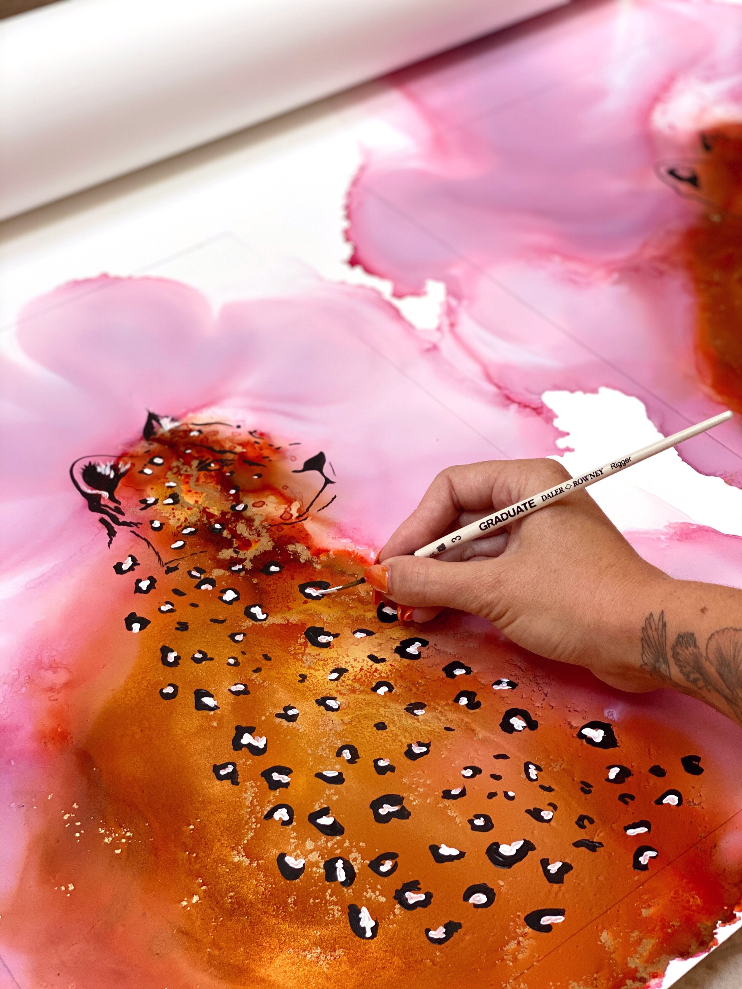
Depending on the commission, I will work slightly differently. For the larger ones I love to spread out the large rolls across my studio floor. This allows me to free paint and without restrictions. For smaller works, the pads are perfect. I like to clean the surface of the paper down first with paper towel and a little bit of alcohol, then get painting.

Blog 7.JPG

What other materials do you use with Yupo?

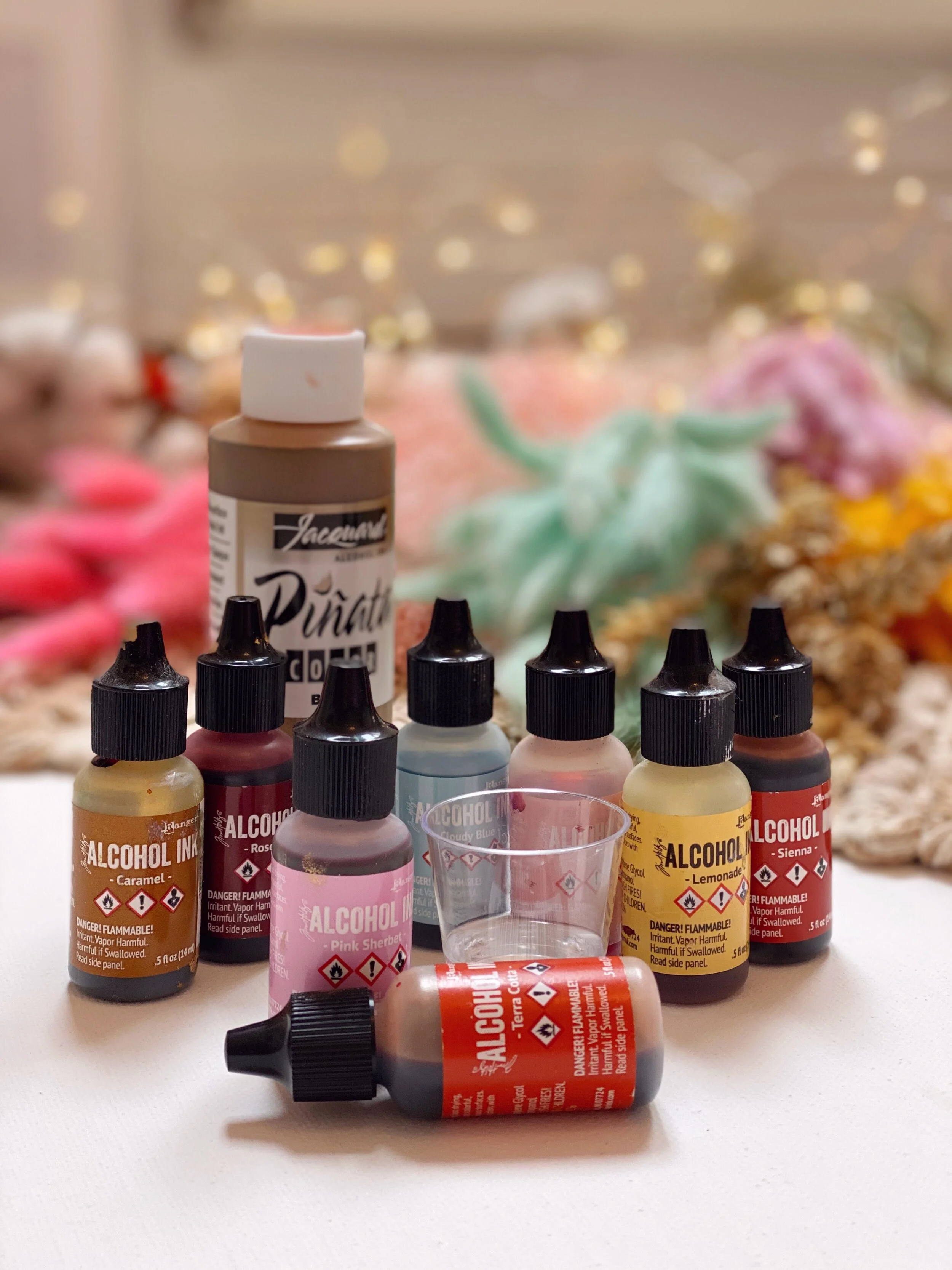
For inks I always use Tim Holtz and Jacquard Piñata. I adore Tim’s colour range, and the pigments are beyond beautiful. I cannot live without Jacquard’s brass ink. For acrylics I always use Daler Rowney, for the range of colours and ease of use. I will then seal my work with 3 layers of Krylon Kamar Clear Varnish. I will then apply 3 coats of Krylon UV Resistant Clear Acrylic Coating (Gloss). This helps the inks set and keeps them protected.

What advice do you have for artists starting with Yupo?

Starting with Yupo I would say there’s a massive range in sizes, so you don’t have to get a big roll to start. I started on light then worked my way through the different options. My advice is to get the paper and just play. Don’t pressure yourself to try and create something beautiful, it is important to enjoy what you are doing, and the different techniques you could use. Art should be enjoyed and not a forced chore, there are no rules.

Do you have a favorite project or piece?

That’s really hard! My favourite projects at the moment are the mountains I am working on for Autumn and Winter. The new Yupo Medium Rounds are the perfect base.

Blog 9.JPG
Blog 8.jpg

Anything else you’d like to share?

I have been so lucky to have a wonderful supportive relationship with Legion paper. To me, their customer service is brilliant. They support artists by creating such wonderful papers for us to explore on. I believe the Yupo range is second to none.

Learn more about Hannah Rose’s work on her Instagram.

Learn more about Yupo.

Apply to our Artist of the Month Program.